react-arborist to create tree components for React
While developing a React application, you may want to showcase hierarchical data in a visually appealing, tree-like structure. This type of structure, also called a tree view, helps ensure users can easily understand and navigate data.

In this lesson, we will delve into the process of implementing a tree view system within a React project by harnessing the power of a library known as react-arborist. We will cover:
Tree componentreact-arborist packagereact-arborist libraryTree componentsTree component propsTree componentTree componentTree views are UI components that present hierarchical data, also called items or nodes, in a structured and visually intuitive manner. Within this hierarchical structure, each node maintains a connection to a parent node while potentially branching out to other child nodes.
Nodes with child nodes are known as branch nodes, while those without are designated as leaf nodes.
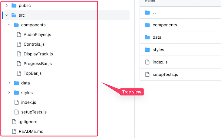
In software development, we often create this type of system to organize data that provides nested levels of information. An example is a document management system where we display the structure of files and folders, such as in the GitHub sidebar below:
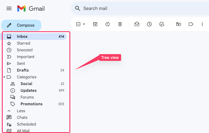
The Gmail sidebar is organized in a similar way:
Every node within the tree has a text label and the option to be accompanied by an icon. The tree can also expand or collapse the branch node, as denoted by the caret icon.
Tree views have many other use cases. For example, companies that manage structured data can use a tree view to display the organization’s hierarchical structure. In ecommerce applications, tree views can display shop product categories and subcategories, allowing users to browse and filter products.
Tree componentThere are various ways to integrate a Tree component into a React project. We can build it from the ground up, leverage a UI framework like Material UI, or employ an npm library.
In this lesson, we’ll be utilizing the react-arborist library. This library offers a comprehensive set of features essential for creating a tree-like component within a React project.
Using this library, we’ll craft a Tree component similar to the one found in the CodeSandbox project sidebar. See a demo of our final project below:

You can explore the live project here. To follow along, ensure you have a basic understanding of React.
Let’s get started!
react-arborist packageWe’ll start by installing the library in our React project:
npm install react-arborist
We’ll also install an icon library for React so that we can use icons in our project as shown in the demo above:
npm install react-icons
We’re all set to start using this library in our project. Let’s see how to do that in the following sections.
react-arborist libraryTo generate a tree view, we require data. Therefore, we’ll create a data.js file within our project to store the following content:
export const data = [
  {
    id: "1",
    name: "public",
    children: [{ id: "c1-1", name: "index.html" }]
  },
  {
    id: "2",
    name: "src",
    children: [
      { id: "c2-1", name: "App.js" },
      { id: "c2-2", name: "index.js" },
      { id: "c2-3", name: "styles.css" }
    ]
  },
  { id: "3", name: "package.json" },
  { id: "4", name: "README.md" }
];
If you intend to add your own data, ensure you create it as an array of objects, similar to the structure demonstrated above. Even if your data is extensive, the library is designed to efficiently manage large datasets without causing performance issues, as demonstrated in this official project.
Each data object represents a node in the tree. A branch node has a children property with a value representing the nested levels of information. As mentioned earlier, a node without a children property is a leaf node.
With this data in place, we can import a Tree component from the react-arborist package and subsequently pass initialData prop along with the data:
import { Tree } from "react-arborist";
import { data } from "../data/data";

const Arborist = () => {
  return (
    <div>
      <Tree initialData={data} />
    </div>
  );
};

export default Arborist;
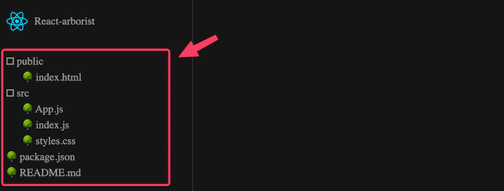
By default, we only need to provide the initialData prop to render a functional Tree component. After that, we should have a tree with the following structure:
Be aware that in the CSS file, we added CSS styles for the page background color. This CSS file will also contain all the necessary widget styles, but we won’t go over this in depth so we can focus on the library instead.
The Tree component is accessible to screen readers, and users can interact with them using their keyboards to adhere to W3C’s accessibility standards for trees. We can toggle folders by pressing the spacebar and navigate between items using the Arrow Up and Arrow Down keys.
Furthermore, while using the keyboard to navigate within the tree, a visual indicator will show which item is currently in focus to provide a clear reference for the user.
Tree componentsCurrently, when we engage with the widget, we have access to key functionalities. For instance, we can rearrange items by simply dragging and dropping them. We can also use keyboard shortcuts to:
A keyShift + ADelete keyEnterThese features are available because the Tree component is designed as an uncontrolled component thanks to the inclusion of the initialData prop. In an uncontrolled implementation, the Tree component automatically handles all state and data modifications internally.
However, we can manually control all mutations of the tree data outside of the Tree component through a controlled implementation. In such a case, we assume responsibility for the tree’s logic and features.
For instance, we can eliminate data mutations entirely if we wish to showcase and collapse nested content.
We will discuss this alternative approach in an upcoming section. For the moment, let’s proceed with the uncontrolled implementation.
Tree component propsUsing props allows us to control a component’s behavior. Consequently, the library offers several valuable props that we can pass to the Tree component. In our example, let’s provide the following props:
<Tree
  initialData={data}
  width={260}
  height={1000}
  indent={24}
  rowHeight={32}
  // openByDefault={false}
/>
These options are straightforward in their purpose. The width and height allow us to adjust the widget’s dimensions, while the indent option controls the indentation. If you prefer the widget to be initially closed, you can uncomment the openByDefault configuration prop.
Tree componentSince the default appearance of tree nodes offers limited features, let’s see how to create a custom node.
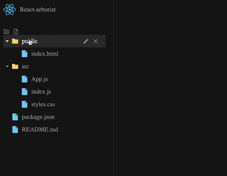
Currently, each node includes some text, an associated icon, and an Edit input field that becomes visible when the node is in edit mode. In our custom node, we also aim to include Edit and Delete icon buttons.
Node componentThe react-arborist library allows us to pass a Node renderer as children prop to the Tree component, thereby granting us complete control over the visual appearance of the tree node:
// ...
import Node from "./Node";

const Arborist = () => {
  return (
    <div>
      <Tree
      // ...
      >
        {Node}
      </Tree>
    </div>
  );
};

export default Arborist;
Since we’ve imported the Node component, let’s create it and start rendering a custom tree node:
const Node = ({ node, style, dragHandle, tree }) => {
  // console.log(node, tree);
  return (
    <div className="node-container" style={style} ref={dragHandle}>
      {/* node content here */}
    </div>
  );
};

export default Node;
Within the Node component, we can utilize a couple of props. The dragHandle prop facilitates the drag-and-drop functionality for each node and should be linked to a ref prop associated with the container element. The style prop ensures the appropriate padding for indentation.
Both the node and tree API instances provide a range of methods, state properties, and objects that we can utilize to enhance functionalities and access tree data. These APIs offer extensive possibilities for implementing various features.
Now, let’s update the Node component to incorporate these APIs:
import { AiFillFolder, AiFillFile } from "react-icons/ai";

const Node = ({ node, style, dragHandle, tree }) => {
  // console.log(node, tree);
  return (
    <div className="node-container" style={style} ref={dragHandle}>
      <div
        className="node-content"
        onClick={() => node.isInternal && node.toggle()}
      >
        {node.isLeaf ? (
          <AiFillFile color="#6bc7f6" />
        ) : (
          <AiFillFolder color="#f6cf60" />
        )}
        <span className="node-text">
          <span>{node.data.name}</span>
        </span>
      </div>
    </div>
  );
};

export default Node;
In the code, we’ve employed some properties, a method, and an object provided by the node instance to implement specific logic.
We’ve highlighted below what each of the APIs do:
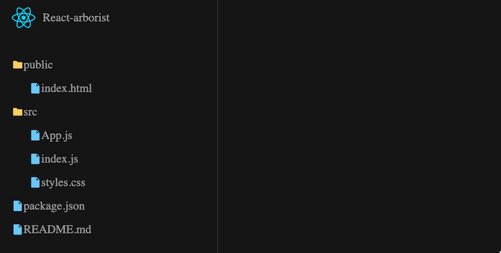
node.toggle() allows us to toggle the node’s open and closed statenode.isInternal checks whether the node is a branch, such as a folder, and returns true. We utilized this API to ensure the toggle handler is activated only for nodes with childrennode.isLeaf returns true if the node is a leaf node, like a file. We used it to display a file icon. If the node is not a file, we display a folder iconnode.data.name provides access to the file and folder names. Within the node.data object, we have access to the data we passed to the Tree component, which includes the id and childrenThe result should now look like so:
Now the custom icons can help users scan the content types and understand or navigate through the files and folders more quickly.
We will incorporate a caret icon next to the folders so users know they can expand or collapse them. Let’s modify the conditional statement inside the Node component.
Let’s find the following code in our file:
{node.isLeaf ? (
  <AiFillFile color="#6bc7f6" />
) : (
  <AiFillFolder color="#f6cf60" />
)}
We’re going to update the code above to the following instead:
{node.isLeaf ? (
  <>
    <span className="arrow"></span>
    <span className="file-folder-icon">
      <AiFillFile color="#6bc7f6" />
    </span>
  </>
) : (
  <>
    <span className="arrow">
      {node.isOpen ? <MdArrowDropDown /> : <MdArrowRight />}
    </span>
    <span className="file-folder-icon">
      <AiFillFolder color="#f6cf60" />
    </span>
  </>
)}
Let’s ensure we import the caret icons from the top of the page:
import { MdArrowRight, MdArrowDropDown } from "react-icons/md";
We have dynamically rendered both the arrow down and arrow right caret icons based on whether the folder is open or closed. You can observe the outcome below:
Previously, when working with the default tree widget, we discussed using the Enter key to rename a selected item. Upon pressing the key, the default edit input field will appear, as shown below:
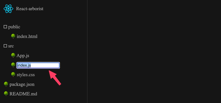
While the particular node is in edit mode, it’s essential to be aware that a node property called node.isEditing will yield a true value.
Given that we’ve crafted a customized Node component, we will take charge of generating the input field ourselves. We’ll make use of the node.isEditing property to dynamically render a custom renaming form for the node.
Now, rather than displaying the node text using the following code:
<span className="node-text">
  <span>{node.data.name}</span>
</span>
We will dynamically display the text when the node.isEditing state is false. If it is true, we will render an input field instead. The modified code should appear as follows:
<span className="node-text">
  {node.isEditing ? (
    <input
      type="text"
      defaultValue={node.data.name}
      onFocus={(e) => e.currentTarget.select()}
      onBlur={() => node.reset()}
      onKeyDown={(e) => {
        if (e.key === "Escape") node.reset();
        if (e.key === "Enter") node.submit(e.currentTarget.value);
      }}
      autoFocus
    />
  ) : (
    <span>{node.data.name}</span>
  )}
</span>
In the code, we’ve introduced additional APIs:
node.submit() enables us to submit the updated value and exit the editing statenode.reset() cancels an update and takes the node out of the editing statereset() activates when the user presses the Escape key or when the field loses focusThe renaming form field now appears as follows:
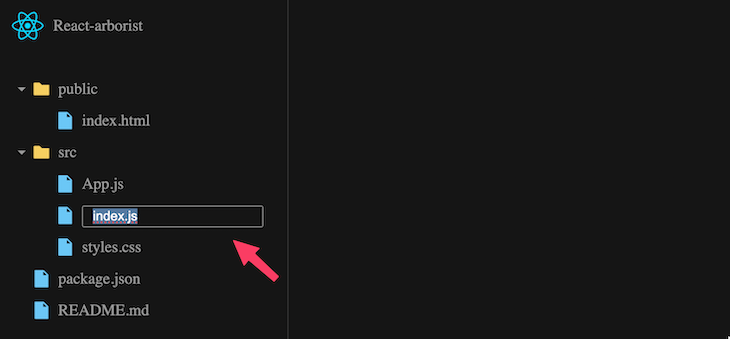
Like the default, the input field is fully functional.
Let’s incorporate clickable icons that allow users to delete and rename items. In this step, we will introduce Edit and Delete buttons and assign click events to them.
We will link the Edit button to the node.edit() API, which ensures that the node enters the editing state. From there, the uncontrolled Tree component will handle how the node is updated internally.
Similarly, we will connect the Delete button to the tree.delete() API instance. The delete() method will activate the handler responsible for managing the deletion logic.
Within the Node component, you can insert the following code just before the closing </div> tag:
<div className="file-actions">
  <div className="folderFileActions">
    <button onClick={() => node.edit()} title="Rename...">
      <MdEdit />
    </button>
    <button onClick={() => tree.delete(node.id)} title="Delete">
      <RxCross2 />
    </button>
  </div>
</div>
Let’s ensure we import the icons component:
import {
  // ...
  MdEdit
} from "react-icons/md";
import { RxCross2 } from "react-icons/rx";
The GIF below demonstrates the behavior:
As you may have observed, we hide the icons until we hover over the node. For the styling details, please refer to the CSS file.
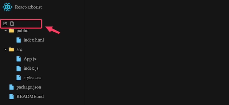
Just like in the previous implementation, we’ll add buttons to create new files and folders and connect them to their corresponding API methods.
Although we could add these buttons within the Node component once more, I’ll demonstrate how we can access the tree and node API instances outside of the Node component.
To begin, let’s render the icon buttons in the parent component of the Tree:
// ...
import { TbFolderPlus } from "react-icons/tb";
import { AiOutlineFileAdd } from "react-icons/ai";

const Arborist = () => {
  const createFileFolder = (
    <>
      <button onClick={() => {}} title="New Folder...">
        <TbFolderPlus />
      </button>
      <button onClick={() => {}} title="New File...">
        <AiOutlineFileAdd />
      </button>
    </>
  );

  return (
    <div>
      <div className="folderFileActions">{createFileFolder}</div>
      <Tree
      // ...
      >
        {Node}
      </Tree>
    </div>
  );
};

export default Arborist;
The icons should now display:
To generate new files and folders, we will utilize the createLeaf() and createInternal() API methods, respectively, from the tree API instance.
To gain access to the tree API instance within the parent component, we will supply a reference to the Tree component:
import { useRef } from "react";
// ...
const Arborist = () => {
  const treeRef = useRef(null);
  // ...
  return (
     // ...
      <Tree
        ref={treeRef}
        // ...
      >
        {Node}
      </Tree>
    // ...
  );
};
After that, we can then extract the corresponding methods from treeRef.current, resulting in the following:
const createFileFolder = (
  <>
    <button
      onClick={() => treeRef.current.createInternal(treeRef.current.root.id)}
      title="New Folder..."
    >
      <TbFolderPlus />
    </button>
    <button
      onClick={() => treeRef.current.createLeaf(treeRef.current.root.id)}
      title="New File..."
    >
      <AiOutlineFileAdd />
    </button>
  </>
);
We can also pass the root ID from the tree instance, as depicted in the code. You can observe the behavior in the GIF below:
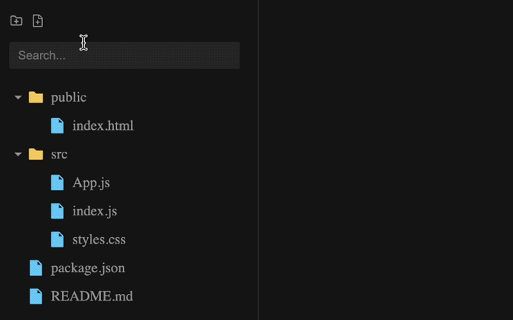
To enable users to filter through folders and files in the tree by inputting search terms, we must incorporate a useState() Hook to handle the search field. Additionally, we need to introduce extra props named searchTerm and searchMatch into the Tree component.
Let’s implement this functionality within the parent component of the Tree:
import {
  // ...
  useState
} from "react";
// ...
const Arborist = () => {
  const [term, setTerm] = useState("");
  // ...
  return (
    <div>
      {/* ... */}
      <input
        type="text"
        placeholder="Search..."
        className="search-input"
        value={term}
        onChange={(e) => setTerm(e.target.value)}
      />
      <Tree
        // ...
        searchTerm={term}
        searchMatch={(node, term) =>
          node.data.name.toLowerCase().includes(term.toLowerCase())
        }
      >
        {Node}
      </Tree>
    </div>
  );
};

export default Arborist;
The code above is relatively straightforward. The searchMatch function prop contains the logic required for tree filtering.
You can observe the behavior illustrated in the GIF below:
To display icons corresponding to each node, we need to include the respective icons in the data file.
import {
  SiHtml5,
  // ...
} from "react-icons/si";

export const data = [
  {
    id: "1",
    name: "public",
    children: [
      {
        id: "c1-1",
        name: "index.html",
        icon: SiHtml5,
        iconColor: "#dc4a25"
      }
    ]
  },
  // ...
];
For simplicity, we are currently showing just one item. To see the complete dataset, please refer to the data file.
Additionally, we have included icon colors via the iconColor property. You can disregard this property if your icons already come with the appropriate colors. As you may have noticed, we haven’t included icons for the branch nodes. We will introduce a default folder icon in the code.
Now, let’s navigate to the Node component file and retrieve the icons from the node.data object:
const Node = ({ node, style, dragHandle, tree }) => {
  const CustomIcon = node.data.icon;
  const iconColor = node.data.iconColor;

  // ...
};

export default Node;
Please observe that we have capitalized the variable CustomIcon. This is because the react-icons library we are utilizing returns icons as components.
Now, let’s locate the following conditional statement:
{node.isLeaf ? (
  <>
    <span className="arrow"></span>
    <span className="file-folder-icon">
      <AiFillFile color="#6bc7f6" />
    </span>
  </>
) : (
  <>
    <span className="arrow">
      {node.isOpen ? <MdArrowDropDown /> : <MdArrowRight />}
    </span>
    <span className="file-folder-icon">
      <AiFillFolder color="#f6cf60" />
    </span>
  </>
)}
We’ll modify the conditional statement above to the following code:
{node.isLeaf ? (
  <>
    <span className="arrow"></span>
    <span className="file-folder-icon">
      {CustomIcon ? (
        <CustomIcon color={iconColor ? iconColor : "#6bc7f6"} />
      ) : (
        <AiFillFile color="#6bc7f6" />
      )}
    </span>
  </>
) : (
  <>
    <span className="arrow">
      {node.isOpen ? <MdArrowDropDown /> : <MdArrowRight />}
    </span>
    <span className="file-folder-icon">
      {CustomIcon ? (
        <CustomIcon color={iconColor ? iconColor : "#f6cf60"} />
      ) : (
        <AiFillFolder color="#f6cf60" />
      )}
    </span>
  </>
)}
In the updated code, all we do is verify whether we have provided a file or folder icon, then use the respective icon accordingly. Otherwise, we utilize a placeholder icon.
Now, the Tree component should appear as follows:
Let’s enhance the user experience by introducing a custom background color for the selected node. When a node is selected, a state property on the node called isSelected will be set to true.
We can leverage this state property to apply a custom class that we can style. Let’s modify the class name of the wrapper element in the Node component file as follows:
const Node = ({ node, style, dragHandle, tree }) => {
  // ...
  return (
    <div
      className={`node-container ${node.state.isSelected ? "isSelected" : ""}`}
      // ...
    >
      {/* ... */}
    </div>
  );
};

export default Node;
In the project’s CSS file, we’ve included styling rules for the isSelected class name. The project should now function as anticipated.
You can refer to the complete source code on CodeSandbox.
Tree componentAs mentioned earlier, within a controlled implementation, we assume control over the tree’s logic and functionality. This approach can enhance flexibility, but makes us responsible for setting up the tree’s logic and features.
Let’s delve into how to transform the tree into a controlled component. To start, we will utilize a data prop instead of initialData:
<Tree
  data={data}
  // ...
>
  {Node}
</Tree>
At this juncture, we will no longer be able to utilize the built-in edit, move, delete, and create functions present in the uncontrolled implementation. This tradeoff may be suitable for specific use cases, especially if our sole intention is only to display and collapse nested tree contents.
Let’s understand that in an uncontrolled implementation, the library automatically invokes specific callbacks when actions are initiated. For example, it triggers the onRename handler for editing, onDelete for deleting, onCreate for creating files and folders, and onMove for repositioning node items.
Similarly, in a controlled implementation, the library enables us to use these same callbacks for their intended purposes. However, the way we manage the logic is left to our discretion.
We will commence by creating the handlers and then passing them to the Tree component as shown below:
const Arborist = () => {
  // ...
  const onRename = ({ id, name }) => {};
  const onDelete = ({ ids }) => {};
  const onCreate = ({ parentId, index, type }) => {};
  const onMove = ({ dragIds, parentId, index }) => {};

  return (
    <div>
      {/* ... */}
      <Tree
        data={data}
        // ...
        onRename={onRename}
        onDelete={onDelete}
        onCreate={onCreate}
        onMove={onMove}
      >
        {Node}
      </Tree>
    </div>
  );
};

export default Arborist;
With these handlers in place, you can define their logic. To illustrate this, the following code demonstrates an example of the editing logic:
const onRename = ({ id, name }) => {
  const node = treeRef.current.get(id);
  if (node) {
    node.data.name = name;
  }
};
Within the handler, we can access the ID of the node currently being edited as well as the updated node name. We utilize the ID to obtain a reference to the node object, from which we extract the node name and assign the updated name accordingly.
This implementation ensures the edit feature’s functionality. You can observe the result on CodeSandbox.
In this tutorial, we covered how to use the react-arborist library to structure hierarchical data in a visually appealing, tree-like structure. Throughout the journey, we developed two projects to showcase the implementation of this package.
If you found this tutorial valuable, we encourage you to share it online. Should you have any questions or wish to contribute, please feel free to share your thoughts in the comments section.
Install LogRocket via npm or script tag. LogRocket.init() must be called client-side, not
server-side
$ npm i --save logrocket

// Code:

import LogRocket from 'logrocket';
LogRocket.init('app/id');
// Add to your HTML:

<script src="https://cdn.lr-ingest.com/LogRocket.min.js"></script>
<script>window.LogRocket && window.LogRocket.init('app/id');</script>

Explore 15 essential MCP servers for web developers to enhance AI workflows with tools, data, and automation.

Learn how contrast-color() automatically picks accessible text colors using native CSS, without JavaScript.

Learn how to build a harness-style AI workflow using Claude Code with specialized Dev, QE, and Ops subagents, gated handoffs, MCP telemetry, and LEARNING.md.

Learn how to build smooth staggered animations in CSS using modern features like sibling-index(), complete with practical examples, fallbacks, and accessibility tips.
Hey there, want to help make our blog better?
Join LogRocket’s Content Advisory Board. You’ll help inform the type of content we create and get access to exclusive meetups, social accreditation, and swag.
Sign up now

 Learn more →
