In this article, you will learn how to use the React Icons library to display icons in your React project.
One of the best ways to enhance your React project’s user experience is to use bright and colorful icons. Not only do they make your app look better, but they also give your website a more modern and sleek feel.
Icons even allow designers to save screen space. Moreover, icons are universal and their usage is familiar to both developers and users.
For example, what do you think looks better? This text:
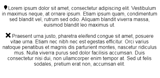
Or these icons:
To render icons in React, the most commonly used library is React Icons. It is an easy-to-use library for rendering icons in your application.
In your React project, run the following terminal command:
npm install react-icons
First, import your desired icon into your project:
import {FcHeadset} from "react-icons/fc"
And then render it in your React component:
return (
    <div>
        <p>
            For coding, you need some good <FcHeadset />
        </p>
    </div>
);
As you can see, you can display an icon as a child element.
Note that each icon package has its own subfolder. For example, if you want to get icons from the Game Icons package, then you should use the following import:
import { IconName } from "react-icons/gi";
As before, import your icons like so:
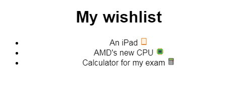
import { FcIpad, FcElectronics, FcCalculator } from "react-icons/fc";
Here, we have imported our icons from the Flat Color package.
To render it, write the following code in your component’s return block:
return (
    <div>
        <h1> My wishlist</h1>
        <ul>
            <li>
                An iPad <FcIpad />{" "}
            </li>
            <li>
                AMD's new CPU <FcElectronics />
            </li>
            <li>
                Calculator for my exam <FcCalculator />
            </li>
        </ul>
    </div>
);
import { FaGoogle, FaRegSun } from "react-icons/fa";
export default function SimpleButton() {
    return (
        <div>
            <p>Login With Google:</p>
            <a href="/auth/google">
                <FaGoogle />
            </a>
            <br />
            <button onClick={() => alert("Settings page")}>
                <FaRegSun />
            </button>
        </div>
    );
}
On line 1, we import two icons from the Font Awesome package. On line 7, we render the FaGoogle icon between the a tags. This means that this icon is now a link. Later on, on line 11, we render the FaRegSun icon between the button tags, consequently turning the icon into a clickable button.
import { FcAndroidOs } from "react-icons/fc";
export default function ConditionalRendering() {
    const usesAndroid = true;
    return (
        <div>
            {usesAndroid ? (
                <p>
                    {" "}
                    I use <FcAndroidOs />
                </p>
            ) : (
                <p> Does not use Android</p>
            )}
        </div>
    );
}
On line 3, we declare the usesAndroid Boolean, which will make conditional rendering possible. Moreover, the code on lines 6–13 states that if the usesAndroid value is true, then render the FcAndroidOs icon like so:
Otherwise, render a standard p element.
When you set the usesAndroid Boolean to false, this will be the result:

Let’s say that you want to change from a Google+ icon to an Apple icon. You can use React Hooks to solve this problem:
import { useState } from "react";
import { AiFillApple, AiOutlineGoogle } from "react-icons/ai";
export default function SwappingIcons() {
    const [icon, setIcon] = useState("apple");

    const changeIcon = (state) => {
        if (state === "apple") {
            return "google";
        }
        return "apple";
    };

    return (
        <div>
            <button onClick={() => setIcon((old) => changeIcon(old))}>Change</button>
            <p>
                {" "}
                I work at:{icon === "apple" ? <AiFillApple /> : <AiOutlineGoogle />}
            </p>{" "}
        </div>
    );
}
First, we declare an icon Hook that decides which icon to render. The initial value is apple.
From lines 6 to 11, we then create the changeIcon function, which swaps the icon value between apple or google.
Later on, we create a simple button element. If the user clicks this button, then run the changeIcon function to interchange values.
Finally, on line 18, we specify that if the icon Hook is apple, then render the AiFillApple icon. Otherwise, render the AiOutlineGoogle icon.
Here, you will use the Formik library since it is easier to work with. To install Formik, run the following command:
npm i formik
Now to build a form with icons, write the following code:
import React, { useState } from "react";
import { Formik, Field, Form } from "formik";
import { AiFillApple, AiOutlineGoogle } from "react-icons/ai";

export default function FormExample() {
    const [icon, setIcon] = useState("");
    return (
        <div>
            <h1>Sign Up</h1>
            <Formik
                initialValues={{
                    picked: ""
                }}
                onSubmit={async (values) => {
                    setIcon(values.picked);
                }}
            >
                {({ values }) => (
                    <Form>
                        <div id="my-radio-group">Picked</div>
                        <div role="group" aria-labelledby="my-radio-group">
                            <label>
                                <Field type="radio" name="picked" value="Apple" />
                                <AiFillApple />
                            </label>
                            <label>
                                <Field type="radio" name="picked" value="Google" />
                                <AiOutlineGoogle />
                            </label>
                        </div>
                        <button type="submit">Submit</button>
                    </Form>
                )}
            </Formik>
            You work at:{icon}
        </div>
    );
}
On line 12, we tell Formik that if the form is not submitted, then the value returned from this form is a blank string. Then from lines 14 to 17, we tell React that when the user submits the form, set the icon Hook to the selected value.
Later on in lines 23–29, we create our radio buttons. They both have the name property set to picked so that Formik can identify these elements and retrieve the form’s submitted values.
Finally, on line 35 we display the value of the icon element.
Notice that in our app so far, all of the rendered icons were minuscule. Luckily, the React Icon library allows us to customize the size and color of these icons.
To do so, you will need to use React’s Context API. First, create a separate component that will design your icon:
import { IconContext } from "react-icons";

export default function ConfigIcon({ children }) {

    return (
        <>
            <IconContext.Provider value={{ color: "green" }}>
                {children}
            </IconContext.Provider>
        </>
    );
}
According to line 7, the IconContext.Provider will change the properties of our icon. Here, we have specified that the color property will be green.
Finally, on line 8, we tell React to render the children elements of the GreenIcon component. This means that if you have an icon as a child element of GreenIcon, then your icon will be green colored.
It is time to use our component:
import "./styles.css";
import GreenIcon from "./GreenIcon";
import { AiFillFastForward } from "react-icons/ai";
export default function App() {
    return (
        <div className="App">
            <ConfigIcon>
                <AiFillFastForward />
            </ConfigIcon>
        </div>
    );
}
Our AiFillFastForward component will now be green colored.

return (
    <>
        <IconContext.Provider value={{ color: "green", size: "4em" }}>
            {children}
        </IconContext.Provider>
    </>
);
On line 3, we set the size to 4em. The default icon size is 1em.

The customized icon now looks bigger and better!
All of the code examples are in CodeSandbox.
The React Icon library has been an absolute breeze to use. Not only does it provide all popular icons needed for your project, but it also is extremely fast and small to ensure that your app does not lag at all.
Thank you so much for reading!
Install LogRocket via npm or script tag. LogRocket.init() must be called client-side, not
server-side
$ npm i --save logrocket

// Code:

import LogRocket from 'logrocket';
LogRocket.init('app/id');
// Add to your HTML:

<script src="https://cdn.lr-ingest.com/LogRocket.min.js"></script>
<script>window.LogRocket && window.LogRocket.init('app/id');</script>

Learn how to build smooth staggered animations in CSS using modern features like sibling-index(), complete with practical examples, fallbacks, and accessibility tips.

Compare the top AI development tools and models of July 2026. View updated rankings, feature breakdowns, and find the best fit for you.

Learn how to detect unused and ghost dependencies in JavaScript projects using Knip, a project-level linter that keeps your dependency graph accurate.

Learn how Storybook MCP enables AI agents to understand your component library, generate accurate UI, and validate code using documentation, stories, and automated tests.
Hey there, want to help make our blog better?
Join LogRocket’s Content Advisory Board. You’ll help inform the type of content we create and get access to exclusive meetups, social accreditation, and swag.
Sign up now

 Learn more →
