
Backdrop and background have similar meanings, as they both refer to the area behind something. The main difference is that a backdrop is more of a strategically placed background that enhances the main subject.

In CSS, the backdrop-filter property can be used to apply a filter to the background of an element. In this post, we’ll explore all the interesting effects we can create with this property, like blurring, drop shadows, saturation, opacity, and more.
The Replay is a weekly newsletter for dev and engineering leaders.
Delivered once a week, it's your curated guide to the most important conversations around frontend dev, emerging AI tools, and the state of modern software.
backdrop-filter property.We have a standalone CSS filter property, which shares many of the same attributes and values, with the key difference being that it is applied to the main element. The CSS filter property is a subset of another group of filters, the SVG filters, used on images and SVGs with the HTML <filter> element.
There are 10 values — 11 if you count none — you can use with the backdrop-filter property. They are:
blur()grayscale()invert()sepia()contrast()brightness()hue-rotate()opacity()saturate()drop-shadow()Most of them use percentages while some use attributes like offsets and angles. Generally, they are fairly straightforward to use and understand. Let’s dive in.
blur()The blur()filter adds a Gaussian blur to the area behind an element. We can use this to create glassmorphism or a frosted glass effect.
First, we need an image for the background:

Next, we create a card on top of the background:
<div class="content"></div>
Now we’ll give it a semi-transparent background:
.content {
  border: 3px solid rgba(255, 255, 255, 0.1);
  background-color: rgba(255, 255, 255, 0.2);
}
Here’s the result:
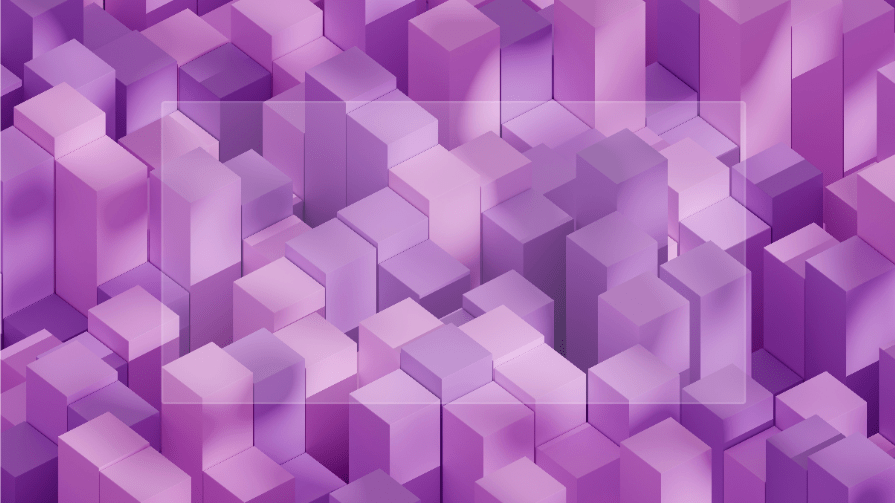
Next, add the blur() filter to create the frosted glass effect:
.content {
  border: 3px solid rgba(255, 255, 255, 0.1);
  background-color: rgba(255, 255, 255, 0.2);
  backdrop-filter: blur(2px);
}
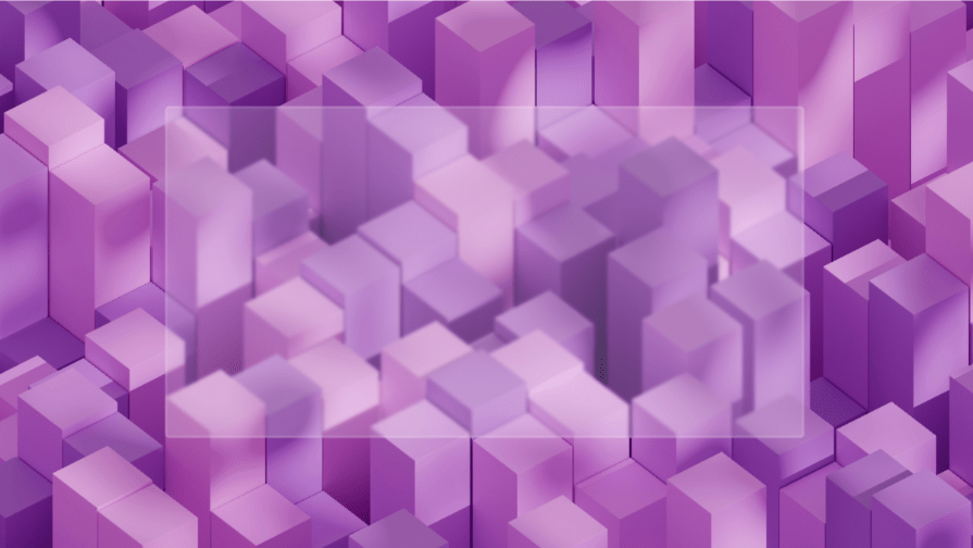
With the filter, the background behind the card is blurred and semi-opaque.
The blur radius ranges from zero pixels to infinity. The background color is optional, but it helps enhance readability if there’s text on it, and you can use a color that matches the overall theme of your website.
Let’s say you have a modal or popup notification when a user clicks a link on a landing page. The blur() filter can direct focus to the popup’s content.
Here’s the HTML for a popup:
<section id="main">
    <!--Navigation-->
    <nav>
      <div class="logo">
        <a href="#">LOGO</a>
      </div>
      <ul class="menu">
        <li><a href="#main">Home</a></li>
        <li><a href="#">Blog</a></li>
        <li><a href="#">Services</a></li>
        <li><a href="#">Contact</a></li>
      </ul>
    </nav>
    <div class="main-text">
      <p>Hello there!</p>
      <p>
        Are you ready to fly?<br>
        Click the button to join us!
      </p>
      <a href="#" class="btn-primary show-popup">Take Flight!</a>
    </div>
    <img src="rocket.png" class="rocket" alt="Rocket" />
    <div class="popup-container">
      <div class="popup-box">
        <h1>You're in!</h1>
        <p>Lorem ipsum dolor sit amet consectetur adipisicing elit. Placeat saepe quas voluptate eius, delectus ab nihil
          fugiat sint. Fugit odio incidunt fuga, voluptates nulla molestiae?</p>
          <button class="close-btn">OK</button>
      </div>
    </div>
  </section>
You can style the page any way you want, but here’s a screenshot to give you a general idea of how it should look:
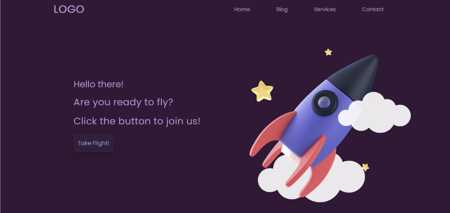
The full code will be linked below.
Next, we style the popup container and box:
.popup-container{
  position: absolute;
  width: 100%;
  height: 100%;
  display: flex;
  justify-content: center;
  align-items: center;
  pointer-events: none;
  backdrop-filter: blur(5px);
  background-color: rgba(85, 60, 154, 0.1);
  opacity: 0;
}
.popup-container .popup-box{
  width: 500px;
  background-size: cover;
  background-position: center;
  background-color: rgba(85, 60, 154, 0.5);
  backdrop-filter: blur(10px);
  border-radius: 5px;
  padding: 30px;
  scale: 1;
}
The popup container will cover the entire viewport, so we add the backdrop-filter to blur out the main content on the page. It also has a semi-transparent background-color.
The popup box is at the center of the page with a semi-transparent background-color and a bigger blur radius to create the frosted glass effect.
We’re setting the opacity to 0 so it’s hidden until you click the button. This will be done with some JavaScript:
const showPopup = document.querySelector('.show-popup');
const popupContainer = document.querySelector('.popup-container');
const closeBtn = document.querySelector('.close-btn');

showPopup.onclick = () => {
  popupContainer.classList.add('active');
}
closeBtn.onclick = () => {
  popupContainer.classList.remove('active');
}
Now we add the styling for the active class, which becomes valid after you click on the button:
.popup-container.active{
  opacity: 1;
  pointer-events: auto;
  transition: .2s ease .25s;
}
.popup-container.active .popup-box{
  scale: 1;
  transition: .5s ease .25s;
}
Here’s a screenshot of the popup with the blur() filter active:
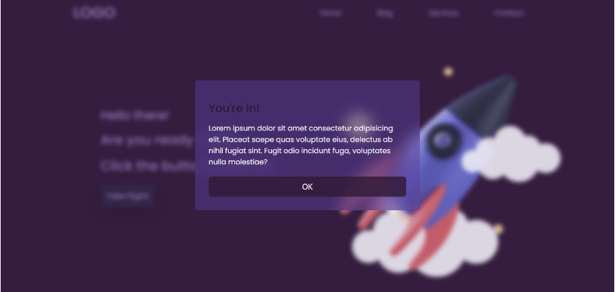
And that’s one way you can use glassmorphism on a webpage. You can find the code and interact with the page in the CodePen below:
See the Pen
Frosted Glass Effect by Oscar-Jite (@oscar-jite)
on CodePen.
grayscale()The grayscale() filter removes color from the background. You can use it to create a black-and-white or monochromatic effect.
This filter uses percentage values from 0-100 percent. At 100%, the background loses all its color:
content {
  backdrop-filter: grayscale(100%);
}
Here’s the result:
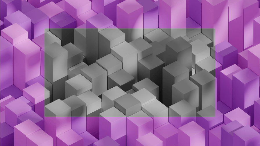
If you want some text on the card, add a translucent background-color to improve readability:
.content {
  border: 3px solid rgba(255, 255, 255, 0.1);
  background-color: rgba(255, 255, 255, 0.2);
  backdrop-filter: grayscale(100%);
}
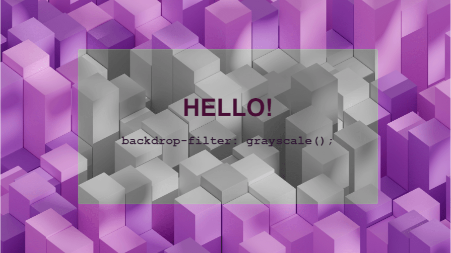
Now let’s see it in action.
We can build a gallery with an overlay with the grayscale() filter covering the images. The filter will be removed when hovering so the true colors of the images are seen.
Here’s a screenshot of what we want to achieve:
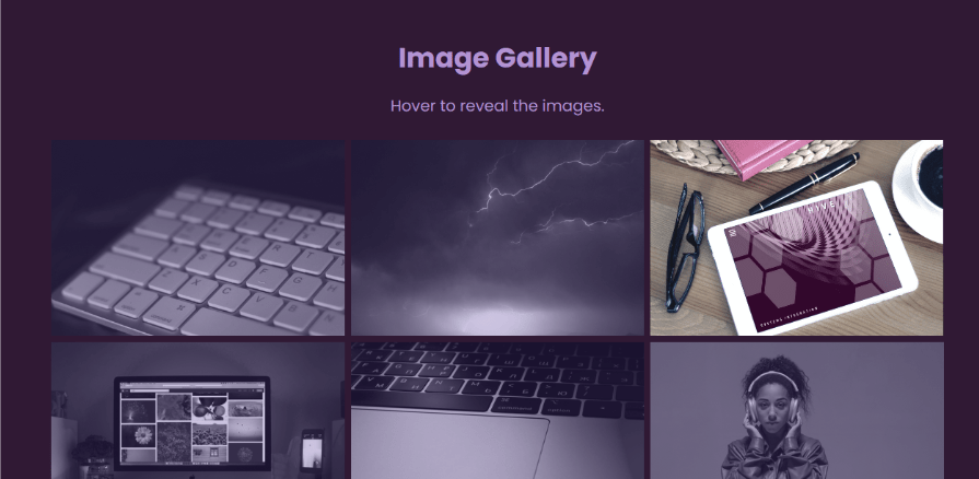
Here’s the HTML for this image gallery:
<section class="container">
    <header class="main-head">
      <h1>Image Gallery</h1>
      <p>Hover to reveal the images.</p>
    </header>
    <div class="gallery">
      <div class="item">
        <img src="/images/1.jpg">
        <div class="overlay"></div>
      </div>
      <div class="item">
        <img src="/images/2.jpg">
        <div class="overlay"></div>
      </div>
      <div class="item">
        <img src="/images/3.jpg">
        <div class="overlay"></div>
      </div>
      <div class="item">
        <img src="/images/4.jpg">
        <div class="overlay"></div>
      </div>
      <div class="item">
        <img src="/images/5.jpg">
        <div class="overlay"></div>
      </div>
      <div class="item">
        <img src="/images/6.jpg">
        <div class="overlay"></div>
      </div>
    </div>
  </section>
Each image is nested in a div with the class name item alongside another div that will serve as the overlay. The overlay doesn’t have to be a div — you can use other HTML elements like span or the CSS pseudo-elements:before and :after.
Again, styling is up to you and the code for this example will be provided below. The most important part is the backdrop-filter being added to the overlay:
.item .overlay{
  backdrop-filter: grayscale(100%);
  background-color: rgba(85, 60, 154, 0.3);
  transition: opacity 0.2s ease-in-out;
}
.item:hover .overlay{
  opacity: 0;
}
The background-color on the overlay helps to maintain a uniform tint on the images.
Here’s the result in a CodePen you can interact with:
See the Pen
Image Gallery Overlay with Grayscale by Oscar-Jite (@oscar-jite)
on CodePen.
We can go even further by combining it with the blur() filter. Having more than one backdrop-filter can create more interesting effects.
Since we’re adding a blur effect, we can introduce captions:
<div class="item">
  <img src="/images/1.jpg">
    <div class="overlay">
      <p class="caption">Caption</p>
     </div>
</div>
The filters don’t have to be separated by a comma or any operator:
.item .overlay{
  display: flex;
  justify-content: center;
  align-items: center;
  backdrop-filter: blur(15px) grayscale(100%);
  background-color: rgba(85, 60, 154, 0.3);
  transition: opacity 0.2s ease-in-out;
}
.item:hover .overlay{
  opacity: 0;
}
.overlay .caption{
  color: #301934;
  font-weight: 600;
  font-size: 25px;
}
Now the images are completely hidden until you hover over them:
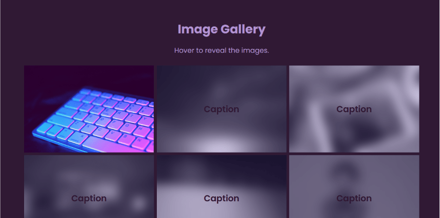
Be sure the colors you use and the intensity of the filters don’t affect the readability of the captions.
invert()This filter creates an effect similar to a negative film from an analog camera. It uses percentage values, but you don’t see the effect until after 50 percent inversion:
.content {
  backdrop-filter: invert(100%);
}
Here’s how the backdrop looks with 100% color inversion:
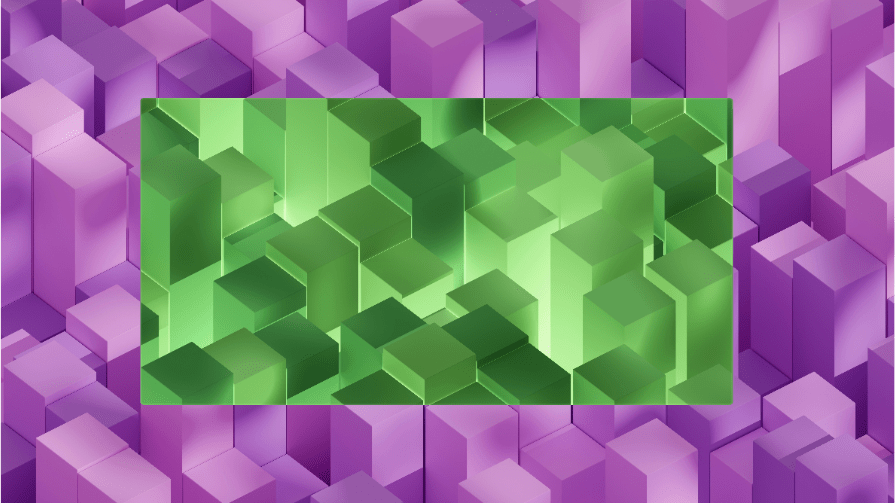
The area behind the card now has a negative effect. The invert() filter can also restore color to a negative image.
Here’s a photo of flowers and some leaves with inverted colors:

Here’s what happens when we add the backdrop-filter with 100% color inversion:
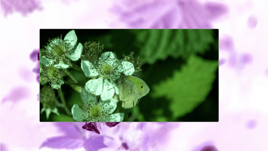
The original colors of the image are revealed when the invert() backdrop-filter() is used. The petals are white and the leaves are green. There’s also a butterfly which you can’t see in the original image.
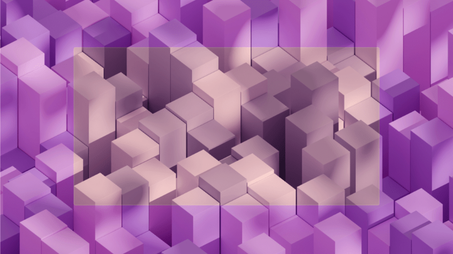
sepia()Sepia is a warm reddish brown tone widely used in vintage photography or Hollywood movies set in Mexico or anywhere with a warm climate.
Its values range from 0-100 percent:
.content {
  backdrop-filter: sepia(50%);
}
contrast()This filter adjusts the contrast of the background. It uses percentage values ranging from 0-200 percent. At 100 percent, the image maintains its original state, while values below 100 percent reduce its contrast and values above do the opposite.
Let’s have a more colorful background image to demonstrate how this filter works:
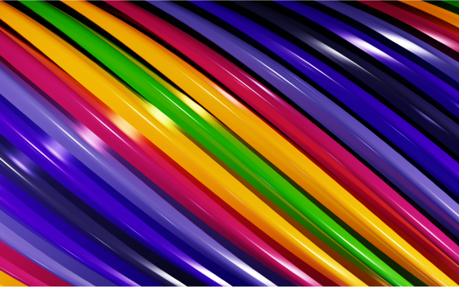
Here’s how it looks when we use the backdrop-filter set to contrast() at 50%, 100%, and 200%.
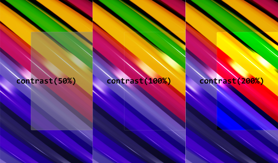
What we’re doing is reducing the contrast of the image by 50% and then increasing it by 100%. The higher the contrast the more vibrant the background becomes.
brightness()The brightness() filter is used to adjust the brightness of the background. It has the same range as the contrast() filter.
We’ll use the same background image as the previous filter and also compare the filter at 50%, 100%, and 200%.
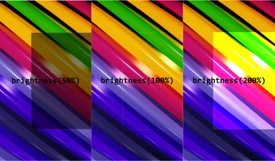
Values lower than 100 percent darken the background, and values above 100 percent increase brightness.
Let’s bring back the popup from the first example and replace the blur()
filter with brightness():
.popup-container{
  position: absolute;
  width: 100%;
  height: 100%;
  display: flex;
  justify-content: center;
  align-items: center;
  pointer-events: none;
  backdrop-filter: brightness(20%);
  background-color: rgba(85, 60, 154, 0.1);
  opacity: 0;
}
.popup-container .popup-box{
  width: 500px;
  background-size: cover;
  background-position: center;
  background-color: rgba(85, 60, 154, 0.5);
  backdrop-filter: brightness(10%);
  border-radius: 5px;
  padding: 30px;
  scale: 1;
}
Here’s a screenshot of the result:
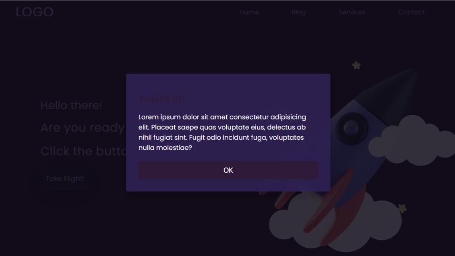
Even without the blur effect, the background is not interfering with the popup’s content.
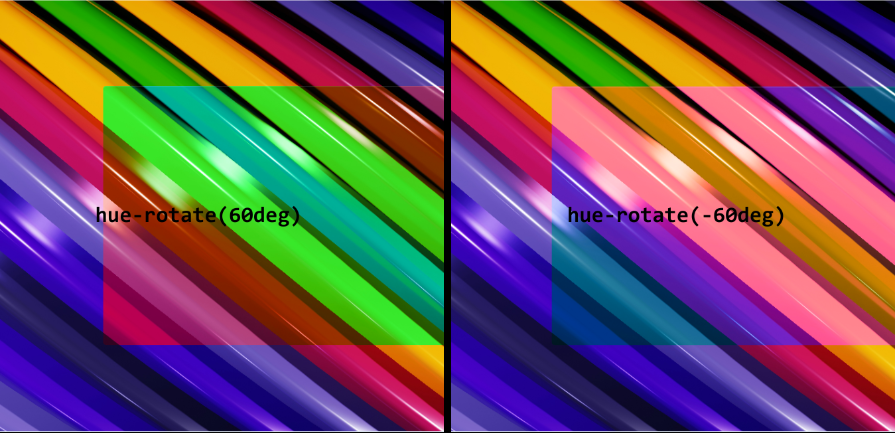
hue-rotate()This an interesting backdrop-filter, as it rotates color hues in the background. Every color is part of a spectrum or color wheel, and their hue is their position on the wheel. So the hue-rotate() filter finds the color and shifts it by a specific angle towards a new position on the spectrum.
Here’s an example of a color wheel from Canva:
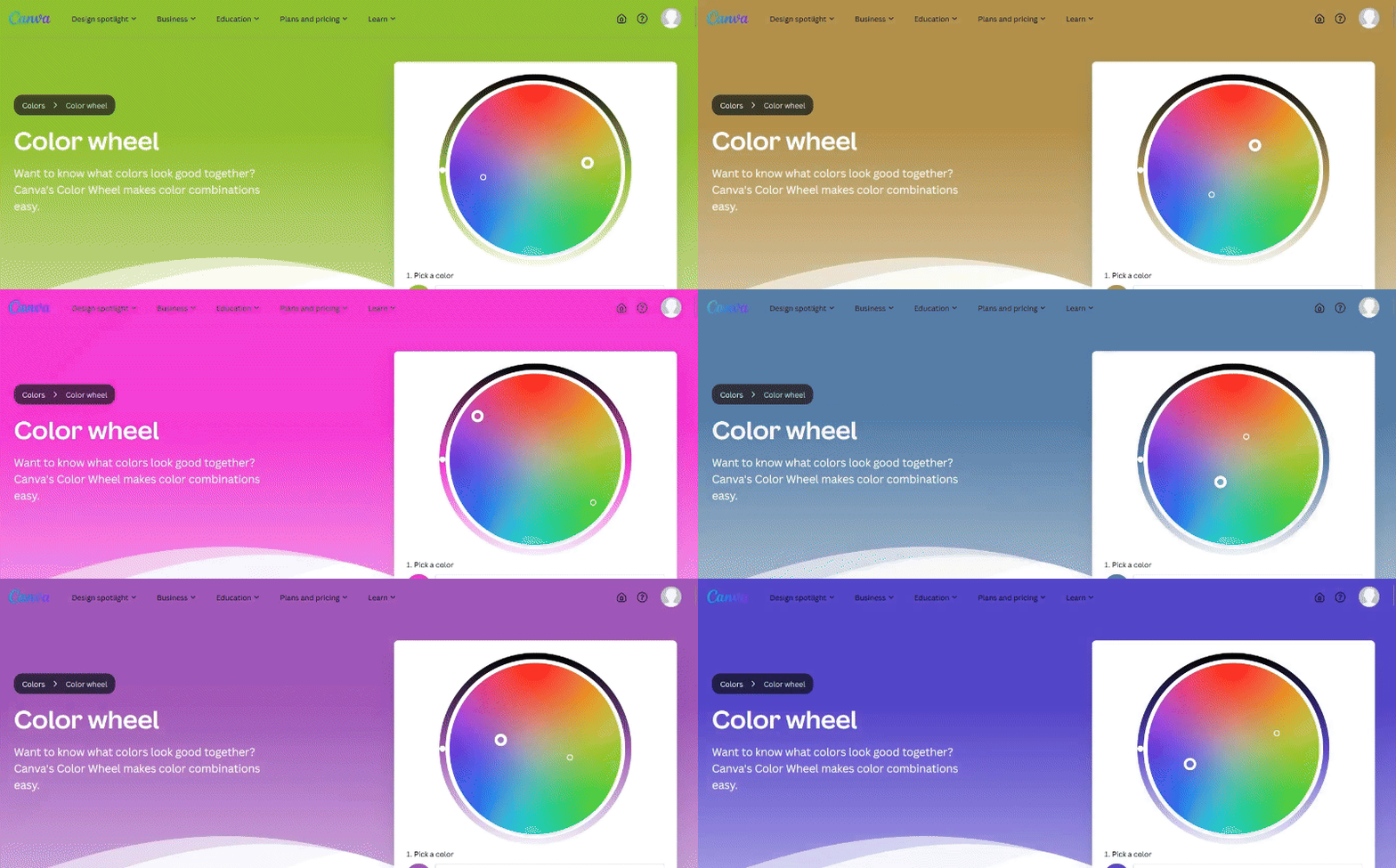
Now let’s rotate the colors on the background image by 90 degrees:
.content {
  backdrop-filter: hue-rotate(90deg);
}
Here’s a screenshot of how it looks:
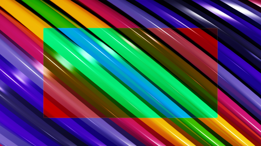
Some of the color changes include blue becoming red, green changing to blue, and yellow becoming green.
You can also use negative angles but -180deg will give you the same result as 180deg. Rotating the hues 180 degrees in one direction is the same as rotating the color in the opposite direction.
opacity()Opacity controls the transparency of the effect created by another backdrop filter. So if we used the blur() filter and opacity(), you’d get a partially transparent blurred background:
.content {
  backdrop-filter: blur(10px) opacity(50%);
}
Here’s the result:
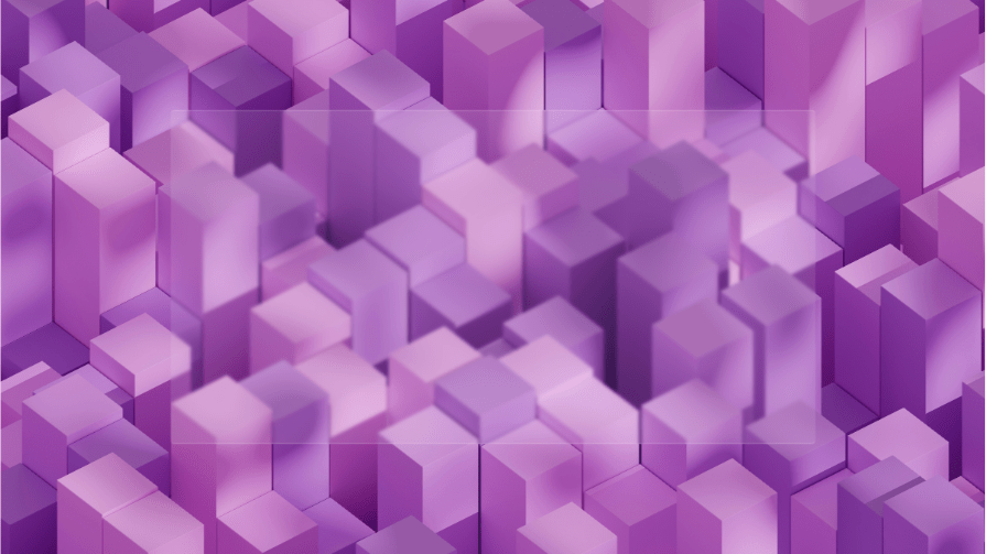
If we remove opacity(), we’ll have a more pronounced blur effect:
.content {
  backdrop-filter: blur(10px);
}
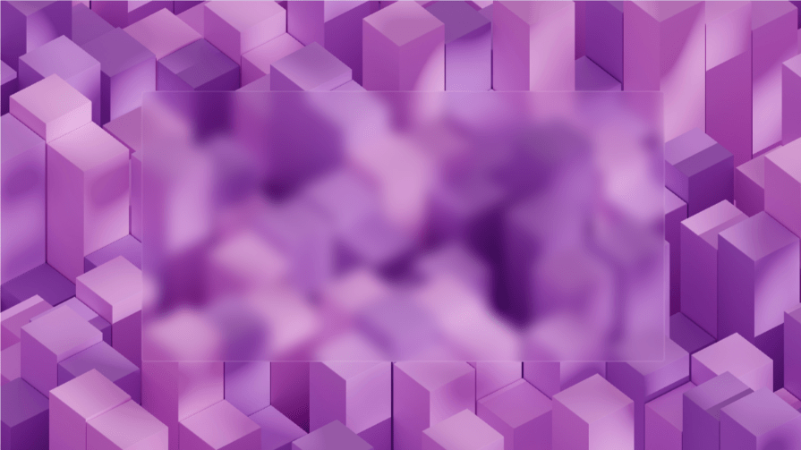
The opacity()backdrop filter essentially controls the intensity of the other filters.
saturate()This filter is very similar to the contrast() filter. It controls the intensity of the background colors and also ranges from 0-200 percent.
Here’s how a saturation of 50% compares to 150%:
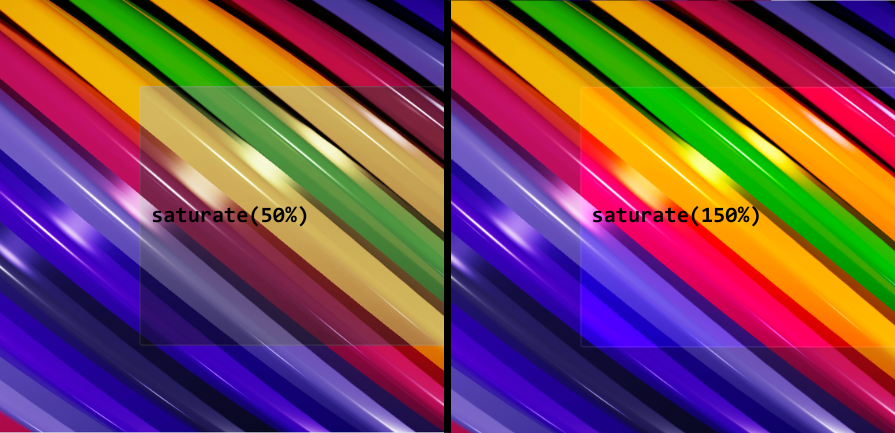
Low saturation results in more muted colors while high saturation makes colors more intense.
drop-shadow()If you want to add a shadow around an element you’ll use the CSS [box-shadow](https://blog.logrocket.com/styling-css-box-shadow-property/) property or the drop-shadow() function that works with the filter property.
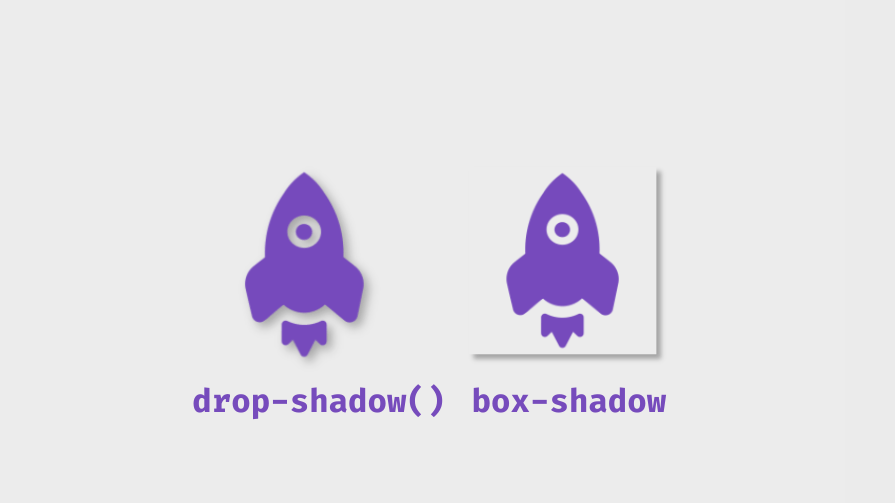
The backdrop-filter property shares the same functions as the filter property, including drop-shadow(). It has four parameters; horizontal offset (x-axis), vertical offset (y-axis), blur radius, and color. You’d have to combine it with opacity() and another filter, like blur() to see its effect.
.content {
  background-color: rgba(255, 255, 255, 0.1);
  backdrop-filter: opacity(50%) blur(100px) drop-shadow(0px 200px 10px red);
}
Here’s a screenshot of the result:
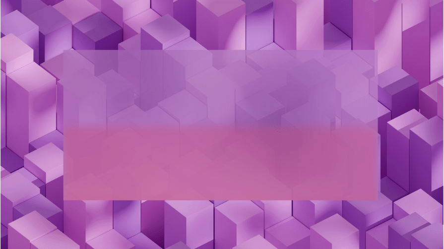
We have a red shadow with a 200px vertical offset and 10px blur radius so it’s soft. Now, having three backdrop filters creates a new problem with positioning because they stack one on top of the other. Here the drop-shadow is on top of the blur filter.
If we moved the blur() filter to the end, like this:
.content {
  background-color: rgba(255, 255, 255, 0.1);
  backdrop-filter: opacity(50%) drop-shadow(0px 200px 10px red) blur(100px);
}
Here’s what happens:
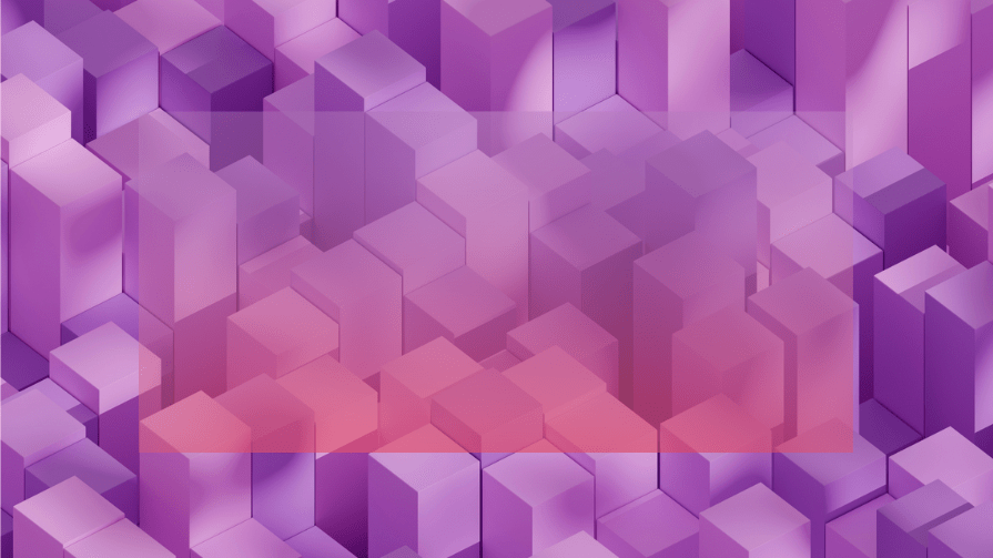
The blur filter is being applied to the shadow and the background. Now you get a better-looking shadow because you can’t see where it starts. However, the blur is less intense, but you can always increase the opacity to fix this.
Having the drop-shadow before the blur presents another benefit because if the blur came before the drop-shadow with increased opacity, the shadow would be hidden.
Let’s increase the opacity to 100% and see what happens:
.content {
  background-color: rgba(255, 255, 255, 0.1);
  backdrop-filter: opacity(100%) drop-shadow(0px 200px 10px red) blur(100px);
}
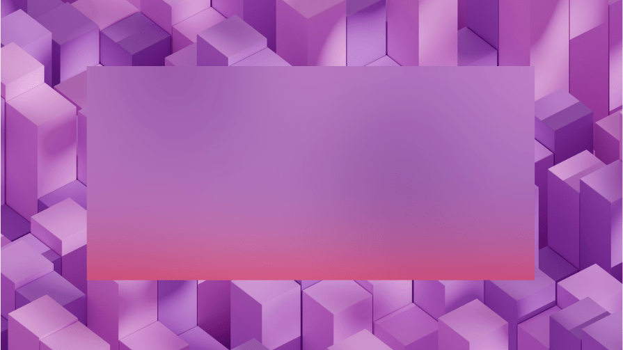
It looks like a linear gradient transition from the blurry top to the red bottom.
If we swapped the positions of the blur() and drop-shadow() functions, the shadow is completely hidden:
.content {
  background-color: rgba(255, 255, 255, 0.1);
  backdrop-filter: opacity(100%) blur(100px) drop-shadow(0px 200px 10px red);
}
Here’s a screenshot of the result:
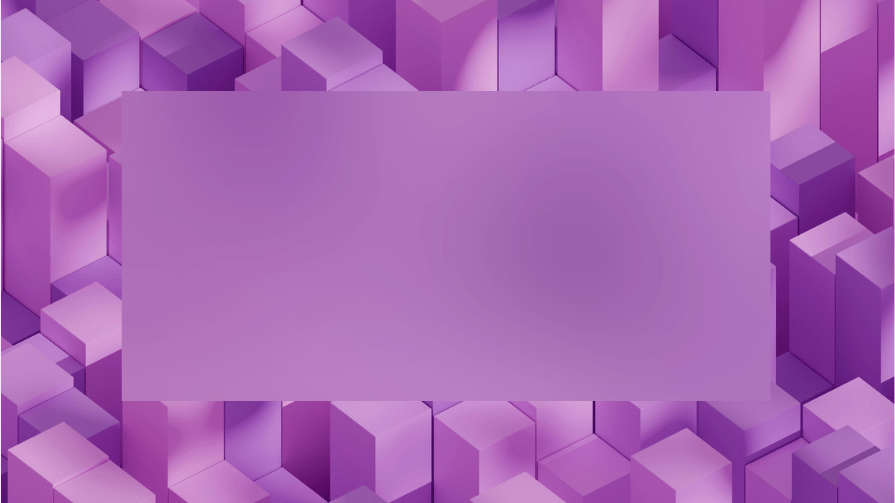
We can’t see the red shadow because it’s under the blur.
Let’s bring back the popup and make some adjustments. We won’t be adding the shadow just yet:
.popup-container {
  position: absolute;
  width: 100%;
  height: 100%;
  display: flex;
  justify-content: center;
  align-items: center;
  pointer-events: none;
  backdrop-filter: brightness(20%);
  background-color: rgba(85, 60, 154, 0.2);
  opacity: 0;
}
.popup-container.active {
  opacity: 1;
  pointer-events: auto;
  transition: 0.1s ease 0.25s;
}
.popup-container .popup-box {
  width: 500px;
  background-size: cover;
  background-position: center;
  background-color: transparent;
  backdrop-filter: opacity(100%) blur(100px);
  border-radius: 5px;
  border: 1px solid rgba(85, 60, 154, 0.1);
  padding: 30px;
  scale: 1;
}
Here’s a screenshot of how the popup looks when it’s active:
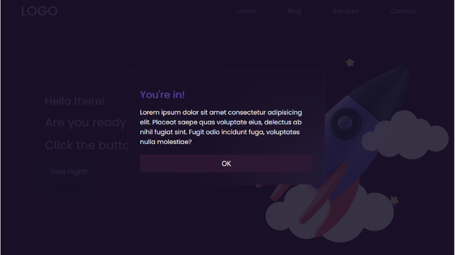
Now let’s add the drop-shadow() filter:
.popup-container .popup-box {
  width: 500px;
  background-size: cover;
  background-position: center;
  background-color: transparent;
  backdrop-filter: opacity(100%) drop-shadow(0px 120px 5px rgba(85, 60, 154, 1)) blur(100px);
  border-radius: 5px;
  border: 1px solid rgba(85, 60, 154, 0.1);
  padding: 30px;
  scale: 1;
}
Remember to place it immediately after the opacity() filter.
Here’s a screenshot showing the shadow on the popup box:
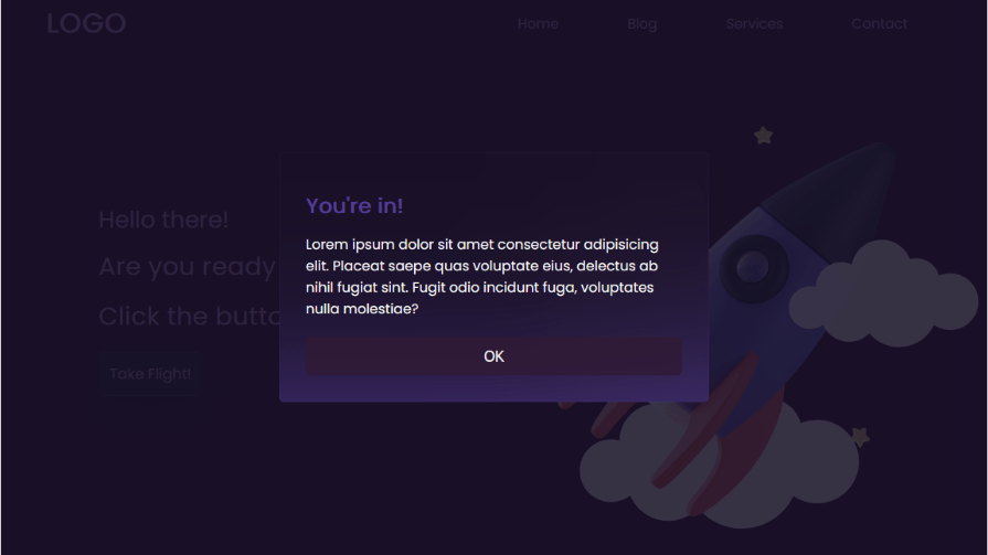
Without an additional filter, it’s difficult to see the effect of the drop-shadow() filter.
If you use this filter with just opacity(), it behaves strangely. The opacity() filter ranges from 0-100 percent, and it increases the intensity of the other backdrop filters accordingly. However, the drop-shadow() filter is an exception because its highest visibility is at 50 percent opacity.
So, increasing or decreasing the value of opacity() reduces the effect of the drop-shadow() filter. For this filter, 10 percent opacity is the same as 90 percent, 20 percent is the same as 80 percent, and so on. At 0 percent and 100 percent, you won’t see the shadow at all.
It can work with other filters, but blur() is the only one that doesn’t change the shadow’s color and allows it to work at 100 percent opacity.
The backdrop-filter property is supported on all modern browsers. However, older versions of Safari, 17.6 and older, require the -webkit- prefix:
.content {
  backdrop-filter: blur(10px) opacity(50%);
  -webkit-backdrop-filter: blur(10px) opacity(50%);
}
Also, it’s not supported on Internet Explorer, and if you are a developer who still cares about the vast minority of those still using this browser, consider using feature queries.
There are 10 backdrop-filter functions, some of which will be more useful than others based on your needs.
In this guide, you’ve learned the basic ways you can use the backdrop-filter in CSS. We saw a few practical examples with the popup modal and image gallery overlay.
Some other web components that can have a backdrop-filter include the navbar, dropdowns, buttons, highlights, and more. You can also use multiple filters to create more interesting visual effects.
The backdrop-filter can vastly improve the visual appeal of a site if used correctly.
As web frontends get increasingly complex, resource-greedy features demand more and more from the browser. If you’re interested in monitoring and tracking client-side CPU usage, memory usage, and more for all of your users in production, try LogRocket.

LogRocket lets you replay user sessions, eliminating guesswork around why bugs happen by showing exactly what users experienced. It captures console logs, errors, network requests, and pixel-perfect DOM recordings — compatible with all frameworks.
LogRocket's Galileo AI watches sessions for you, instantly identifying and explaining user struggles with automated monitoring of your entire product experience.
Modernize how you debug web and mobile apps — start monitoring for free.
Learn how sibling-index() enables clean, JavaScript-free stagger animations using native CSS.

useEffect breaks AI streaming responses in ReactSee why useEffect breaks AI streaming in React, and how moving stream state outside React fixes flicker and stale updates.

A real-world debugging session using Claude to solve a tricky Next.js UI bug, exploring how AI helps, where it struggles, and what actually fixed the issue.

CSS wasn’t built for dynamic UIs. Pretext flips the model by measuring text before rendering, enabling accurate layouts, faster performance, and better control in React apps.
Hey there, want to help make our blog better?
Join LogRocket’s Content Advisory Board. You’ll help inform the type of content we create and get access to exclusive meetups, social accreditation, and swag.
Sign up now