Overlays are visual effects that add a layer over content, often enhancing design, readability, or interactivity. Image overlays add a semi-transparent layer over images to improve text visibility, emphasize details, or enable hover effects.
This guide begins with the basics of applying image overlays in CSS and gradually explores more interactive techniques like hover effects and animations.
Editor’s note: This blog was last updated by Ibadehin Mojeed in March 2025 to provide more concise, streamlined information on CSS image overlays.
A common way to create an overlay effect in CSS is by using pseudo-elements (::before or ::after) or an additional <div> wrapper.
Let’s explore both.
::before pseudo-elementTo create an overlay using the ::before pseudo-element, wrap the image inside a container:
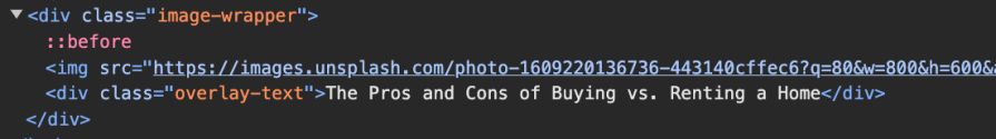
<div class="image-wrapper">
  <img
    src="https://images.unsplash.com/photo-1609220136736-443140cffec6?q=80&w=800&h=600&auto=format&fit=crop"
    alt="Sample Image"
    width="800"
    height="600"
  />
  <div class="overlay-text">
    The Pros and Cons of Buying vs. Renting a Home
  </div>
</div>
Next, we apply the overlay using ::before on the .image-wrapper container. The pseudo-element is positioned absolutely and given a semi-transparent background:
.image-wrapper::before {
  content: "";
  position: absolute;
  top: 0;
  left: 0;
  width: 100%;
  height: 100%;
  background: rgba(0, 0, 0, 0.3);
}
Since ::before is absolutely positioned, we set the .image-wrapper to position: relative; to ensure proper placement:
.image-wrapper {
  position: relative;
  /* Other styles */
}
Check out the live demo on CodePen:
See the Pen
image overlay ::before pseudo by Ibaslogic (@ibaslogic)
on CodePen.
You can customize the overlay color and transparency by adjusting the rgba values in the CSS.
Even though the ::before pseudo-element is applied to .image-wrapper, the text inside remains visible. This happens because .overlay-text is also positioned absolutely within .image-wrapper, placing it in the same positioning context as the overlay.
In the stacking order, elements are layered based on their order in the HTML. Since .overlay-text appears after ::before in the DOM, it naturally sits on top of the overlay, ensuring the text remains readable:
We can explicitly control the stacking order using the z-index. Assigning a higher z-index value to an element ensures it remains above others, while a lower z-index keeps it beneath.
<div> overlayInstead of using ::before, we can add a <div> element specifically for the overlay inside the .image-wrapper container:
<div class="image-wrapper">
  <img
    src="https://images.unsplash.com/photo-1609220136736-443140cffec6?q=80&w=800&h=600&auto=format&fit=crop"
    alt="Sample Image"
    width="800"
    height="600"
  />
  <div class="overlay"></div>
  <div class="overlay-text">
    The Pros and Cons of Buying vs. Renting a Home
  </div>
</div>
The .overlay <div> is styled similarly to the ::before pseudo-element, with absolute positioning and a semi-transparent background:
.overlay {
  position: absolute;
  top: 0;
  left: 0;
  width: 100%;
  height: 100%;
  background: rgba(0, 0, 0, 0.3);
}
You can see this example in action on CodePen:
See the Pen
image overlay <div> overlay by Ibaslogic (@ibaslogic)
on CodePen.
In this setup, .overlay-text naturally appears above .overlay due to its placement later in the HTML. However, we can explicitly control the stacking order using z-index.
There are times when layering one image over another is necessary, whether for watermarking, branding, or displaying previews and thumbnails. One way to achieve this is by placing two images inside a wrapper, then positioning the top layer absolutely.
Place the images inside a wrapper like so:
<div class="image-wrapper">
  <img
    src="https://images.unsplash.com/photo-1609220136736-443140cffec6?q=80&w=800&h=600&auto=format&fit=crop"
    alt="Background Image"
    class="background-image"
  />
  <img
    src="https://images.unsplash.com/photo-1697229299093-c920ab53bfb1?q=80&w=800&h=600&auto=format&fit=crop"
    alt="Overlay Image"
    class="overlay-image"
  />
</div>
Then, go ahead and position the top layer absolutely:
/* Other styles */
.overlay-image {
  position: absolute;
  top: 50%;
  left: 50%;
  transform: translate(-50%, -50%);
  width: 50%;
  border: 2px solid white;
  opacity: 0.7;
}
You can see this example in action on CodePen:
See the Pen
image layer in CSS by Ibaslogic (@ibaslogic)
on CodePen.
You can adjust the size and position of the overlay image to suit your design.
Now that you’ve learned how to create basic overlays and layer images, let’s explore ways to make them more interactive with hover effects and animations.
One simple approach is adjusting the overlay’s opacity when the user hovers over the image:
.overlay {
  /* Other styles */
  transition: background 0.3s ease-in-out;
}
.image-wrapper:hover .overlay {
  background: rgba(0, 0, 0, 0.6);
}
This creates a subtle effect where the overlay darkens on hover, enhancing visual feedback. Try hovering over the image in the CodePen below to see it in action:
See the Pen
image hover overlay div overlay by Ibaslogic (@ibaslogic)
on CodePen.
Another common technique is layering images so that a different picture appears when hovering over a product. This is widely used on ecommerce websites to showcase product variations dynamically.
To achieve this, place two images inside a wrapper:
<div class="product-image">
  <img
    src="https://images.unsplash.com/photo-1676291055501-286c48bb186f?w=900&auto=format&fit=crop&q=60"
    alt="Product Front"
    class="default-image"
  />
  <img
    src="https://images.unsplash.com/photo-1676303679145-8679f5ceeb16?w=900&auto=format&fit=crop&q=60"
    alt="Product Hover"
    class="hover-image"
  />
</div>
The .hover-image will be positioned absolutely and hidden by default with opacity: 0:
/* Other styles */
.hover-image {
  position: absolute;
  inset: 0;
  opacity: 0;
  transition: opacity 0.5s ease, transform 2s cubic-bezier(0, 0, 0.44, 1.18);
}
.product-image:hover .hover-image {
  opacity: 1;
  transform: scale(1.12);
}
.product-image:hover .default-image {
  opacity: 0;
}
On hover, it smoothly fades in and scales up while the .default-image fades out, creating an engaging transition effect ideal for product previews.
Try hovering over the image in the CodePen below to see it in action:
See the Pen
image layer hover by Ibaslogic (@ibaslogic)
on CodePen.
Adding an overlay to a background image enhances the visual appeal of hero sections and banners. This effect can be achieved using various methods, including pseudo-elements, extra <div> elements, CSS properties like background-image, background-blend-mode, and mix-blend-mode, or even a trick with border-image.
In this section, we’ll explore two straightforward methods: one using a pseudo-element and another leveraging linear-gradient() with a background-image.
Similar to how we applied the ::before pseudo-element to the <img> container earlier, we can also use it to create an overlay on top of a background image.
To apply an overlay to a background image, use the following HTML structure:
<section class="hero-section">
  <div class="content">
    <h1>Hero title</h1>
    <p>Hero description here</p>
  </div>
</section>
In the CSS, we apply the background image to .hero-section and use ::before to create an overlay:
.hero-section {
  position: relative;
  background-image:
    url("https://images.unsplash.com/photo-1609220136736-443140cffec6?q=80&w=800&h=600&auto=format&fit=crop");
  background-size: cover;
  background-position: center;
  color: white;
}
.hero-section::before {
  content: "";
  position: absolute;
  inset: 0;
  background: rgba(0, 0, 0, 0.5);
}
/* Other styles */
The overlay spans the entire .hero-section, covering all its contents, including .content. To ensure the text remains visible above the overlay, we will apply z-index: 1 to .content and set its position to relative, allowing the z-index to take effect:
.content {
  /* ... */
  position: relative;
  z-index: 1;
}
See this example in action on CodePen below:
See the Pen
CSS ::before pseudo-element overlay your background images by Ibaslogic (@ibaslogic)
on CodePen.
With the same HTML structure as before, we can use CSS to add a linear gradient overlay directly on top of the background image:
/* Other styles */
.hero-section {
  background-image: linear-gradient(rgba(0, 0, 139, 0.5), rgba(139, 0, 0, 0.5)),
    url("https://images.unsplash.com/photo-1609220136736-443140cffec6?q=80&w=800&h=600&auto=format&fit=crop");
  background-size: cover;
  background-position: center;
  color: white;
}
The linear-gradient() function overlays a gradient on top of the background image, transitioning from dark blue to dark red with 50 percent opacity. This effect helps improve text readability while adding a stylish effect.
See this example in action on CodePen below:
See the Pen
CSS linear gradient overlay your background images by Ibaslogic (@ibaslogic)
on CodePen.
Image overlays enhance visuals, improve readability, and add interactivity. This guide covered key techniques such as the ::before pseudo-element, linear-gradient() for gradient overlays, and interactive hover effects. Mastering these methods allows you to create stunning hero sections, banners, and dynamic product previews. You can experiment with colors, opacities, and animations to tailor overlays to your needs.
If you found this guide helpful, feel free to share it. Also, let us know in the comments which overlay technique is your favorite.
As web frontends get increasingly complex, resource-greedy features demand more and more from the browser. If you’re interested in monitoring and tracking client-side CPU usage, memory usage, and more for all of your users in production, try LogRocket.

LogRocket lets you replay user sessions, eliminating guesswork around why bugs happen by showing exactly what users experienced. It captures console logs, errors, network requests, and pixel-perfect DOM recordings — compatible with all frameworks.
LogRocket's Galileo AI watches sessions for you, instantly identifying and explaining user struggles with automated monitoring of your entire product experience.
Modernize how you debug web and mobile apps — start monitoring for free.
Would you be interested in joining LogRocket's developer community?
Join LogRocket’s Content Advisory Board. You’ll help inform the type of content we create and get access to exclusive meetups, social accreditation, and swag.
Sign up now
Which AI frontend dev tool reigns supreme in July 2025? Check out our power rankings and use our interactive comparison tool to find out.

Learn how OpenAPI can automate API client generation to save time, reduce bugs, and streamline how your frontend app talks to backend APIs.

Discover how the Interface Segregation Principle (ISP) keeps your code lean, modular, and maintainable using real-world analogies and practical examples.

<selectedcontent> element improves dropdowns

 Learn more →

2 Replies to "A guide to image overlays in CSS"
I used the same techniques, but still confused how to defer image as background. Thanks
Hi, what overlay effects do you want to achieve? If you are more specific, I will try to assist. Thanks.