
Filters are extremely popular in photography. You can find them on nearly every photo editing app or website, and some cameras have inbuilt filter options so you don’t have to edit the photos later.

CSS has several filters that help improve the visual aspects of a website. You can apply them directly to a web element using the filter property, as well as to the area behind the element with the backdrop-filter property.
With these filters, you can blur an image, adjust contrast and saturation, change the hue, reduce opacity, and more!
In this post, we’re specifically going to learn about a unique and powerful set of tools: SVG filters. But before we proceed, let’s have a little introduction to SVGs.
The Replay is a weekly newsletter for dev and engineering leaders.
Delivered once a week, it's your curated guide to the most important conversations around frontend dev, emerging AI tools, and the state of modern software.
SVGs, or Scalable Vector Graphics, are an XML-based vector image format for displaying two-dimensional graphics. XML is another fancy acronym that stands for Extensible Markup Language. XML is used to store and transmit data, and define your tags.
Back to SVGs. An SVG doubles as both an image and document format. Regular image formats like JPEG and PNG are made up of pixels that generally lose quality when they’re zoomed in.
What makes SVGs different is that they maintain their quality no matter how much you zoom. This is possible because they’re made up of mathematical formulas.
Let’s have a look at what’s under the hood of an SVG.
First, open an SVG image in a code editor. Here’s a screenshot of what you might find:
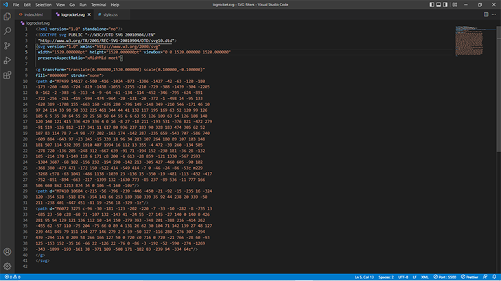
This code makes up a complex shape. We can control the color, size, and other features of the image within the lines of code. Let’s create a simpler shape, a circle:
<body>
  <svg width="400" height="400">
    <circle cx="200" cy="200" r="100" fill="#553c9a">
  </svg>
</body>
And we have a purple circle!
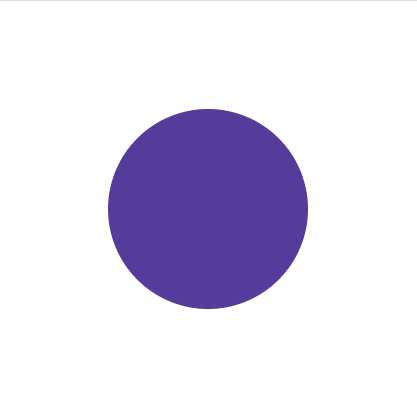
We can turn this circle into a ring by adding a stroke value. A stroke is the border, and we can set the fill color to transparent.
<body>
  <svg width="400" height="400">
    <circle cx="200" cy="200" r="100" fill="transparent"
    stroke="#553c9a" stroke-width="20px">
  </svg>
</body>
The result is this:

Complex images can be created by combining different SVGs. SVGs are used for icons, logos, or as background images. They can also be animated!
CSS filters are mostly limited to images and are fairly easy to use. SVG filters, on the other hand, can be applied to images (both SVGs and other formats), text, and every other HTML element. CSS filters are actually a subset of SVG filters.
SVG filters work with the <filter> element and a set of functions called filter primitives. These functions are child elements that create effects.
The <filter> element will be referenced by the CSS filter property through an id.
To get started, create an svg element with a filter element nested inside it. Then, add the primitives before the image (or whatever element you want the filter applied to).
There are 17 filter primitives, and they are:
feGaussianBlurfeDropShadowfeMorphologyfeTurbulencefeDisplacementMapfeColorMatrixfeConvolveMatrixfeComponentTransferfeOffsetfeMergefeFloodfeCompositefeImagefeBlendfeDiffuseLightingfeSpecularLightingfeTile“fe” stands for filter effect. From the names, we can get an idea of what effects they’ll produce. Let’s look at a basic SVG filter syntax:
<svg>
   <filter id="">
   <!--Filter Primitives go in here-->
   </filter>
</svg>
Each SVG primitive has its own unique set of attributes used to create the effects. Some of these filter primitives work fine on their own, but some have to be combined with other primitives.
There’s a lot to cover, so let’s get started.
feGaussianBlurSVGs are based on mathematical formulas, so it’s only right to get things going with a Gaussian blur filter. This filter is named after the late mathematician Carl Friedrich Gauss and applies a mathematical function to blur the image.
First, you’ll need an image. Here’s one from freepik.com:

Next, we’ll create the SVG syntax in the HTML file:
<svg>
  <filter id="blur">
    <feGaussianBlur stdDeviation="5" in="SourceGraphic" result="BLUR"></feGaussianBlur>
  </filter>
    <image
       xlink:href="2833.jpg" filter="url(#blur)"></image>
</svg>
Now, we’ll have the SVG filter primitive, feGaussianBlur, within the filter element. There are some attributes inside the primitive that’ll have an effect on the blur produced.
The first attribute is stdDeviation, which regulates the amount of blur.
Next is in, for input, that defines where the filter will be applied. In this case, it’s the SourceGraphic, which is our image. The SourceGraphic can also be text.
The final attribute in this example is result. We use it to name the filter. This is useful as a reference for in when working with multiple filters.
Here’s the resulting image with the filter applied:
As mentioned earlier, SVG filters can be applied externally using the filter property and a url pointing to an id:
<svg>
    <filter id="blur">
      <feGaussianBlur stdDeviation="5"></feGaussianBlur>
    </filter>
</svg>
Finally, apply it with the filter CSS property:
img{
  width: 1000px;
  height: auto;
  filter: url(#blur);
}
feDropShadowThis filter is pretty straightforward and adds a drop shadow behind an element.
Start with the syntax:
<svg >
  <filter id="blur">
    <feDropShadow in="SourceGraphic" dx="10" dy="10"></feDropShadow>
  </filter>
</svg>
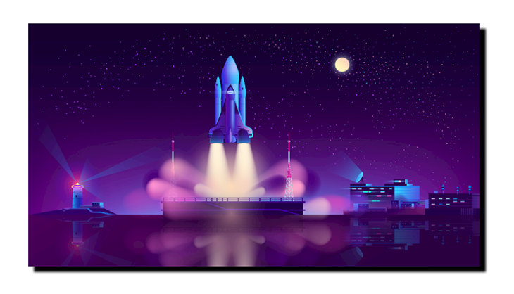
The dx and dy attributes define the shadow’s position along the x and y axis, respectively. The result is a really dark shadow behind the image:
feMorphologyMorphology is the study of form, shape, and structure. The feMorphology primitive is used to change, or morph, the form of elements.
It works with the operator attribute that accepts any one of two values, dilate or erode, and a radius that defines the amount of dilation or erosion. For dilate, the pixels of the SourceGraphic are spread outwards. erode does the opposite.
Let’s compare both. First up is dilate:
<svg>
  <filter id="blur">
   <feMorphology in="SourceGraphic" operator="dilate" radius="5">
   </feMorphology>
  </filter>
</svg>
The result:
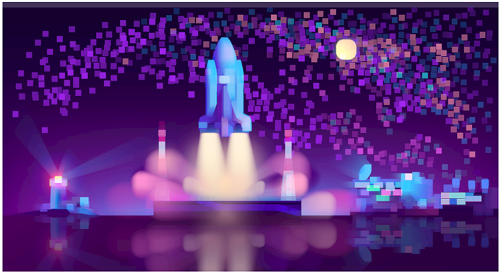
Now let’s see erode:
<svg>
  <filter id="blur">
   <feMorphology in="SourceGraphic" operator="erode" radius="5">
   </feMorphology>
  </filter>
</svg>
The result:
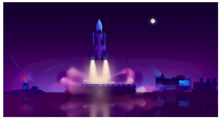
Where did all the stars go?🤔
From these results, we can see that dilate produces a more vibrant image compared to the darkened and subdued image from erode. The brightness is due to the image’s pixels expanding and vice versa.
feTurbulenceThe only real explanation this filter primitive’s effect is right there in its name: turbulence. It uses two attributes: baseFrequency and numOctaves.
<feTurbulence in="SourceGRaphic" baseFrequency="0.01 0.02"
              numOctaves="1" result="NOISE">
</feTurbulence>
The result is a noise effect on the image:
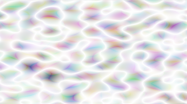
Let’s explain the attributes.
The baseFrequency controls the amount of distortion, or noise, in the x and y directions. A high baseFrequency value reduces the size of the distortion pattern. It can contain two values, and if one value is used, it covers both the x and y axis.
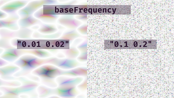
numOctaves is also a noise function and controls the number of octaves in the filter effect. Using a baseFrequency of "0.01 0.02", we get the following:
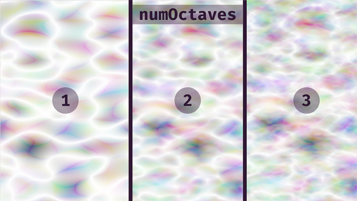
Ultimately, it’s up to you to decide the number of octaves and amount of frequency. Play with the values and see what you come up with. Keep in mind that they don’t accept negative values.
feDisplacementMapA displacement map is an image used to change the content of another element. The texture of one element can be applied to another.
For this SVG filter primitive, we’ll need two inputs: in and in2. One will hold the original graphic and the other will be the image serving as the displacement map.
<svg>
 <filter id="turbulence">
   <feTurbulence type="turbulence" baseFrequency="0.01 0.02" numOctaves="1" result="NOISE"></feTurbulence>
   <feDisplacementMap in="SourceGraphic" in2="NOISE" scale="50">
   </feDisplacementMap>
 </filter>
</svg>
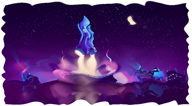
Now for the result. The image follows the distortion pattern created by the feTurbulence filter:
We can go a step further by adding some wavy animation to complete the watery look:
<svg>
  <filter id="wavy">
  <feTurbulence id="turbulence" type="turbulence" numOctaves="1"
  result="NOISE"></feTurbulence>
   <feDisplacementMap in="SourceGraphic" in2="NOISE" scale="50">
   </feDisplacementMap>
  <animate xlink:href="#turbulence" attributeName="baseFrequency" dur="60s" keyTimes="0;0.5;1"
values="0.01 0.02;0.02 0.04;0.01 0.02" repeatCount="indefinite"></animate>
 </filter>
</svg>
Notice that the first filter primitive now has an id. This is what we’re animating.
Next, we’ll use the <animate> element to define the animation. This element will contain xlink:href , pointing to the filter that’ll be animated. After that is attributeName, and the primitive attribute we’re animating is the baseFrequency.
Next, we set the duration with dur and the keyTimes. These are essentially @keyframes.
values contain the new baseFrequency values for the stop points set up with keyTimes.
Finally, we have repeatCount set to indefinite so the effect runs in a loop.
And this is the result:
See the Pen
Water/Wavy Effect turbulence and displacement map by Oscar-Jite (@oscar-jite)
on CodePen.
We can also use the regular animation and transition CSS properties or some JavaScript for animation.
feColorMatrixThis SVG filter is used to modify the hue and saturation of an element. It works with a type attribute and four possible values: matrix, saturate, hueRotate, and luminaceToAlpha.
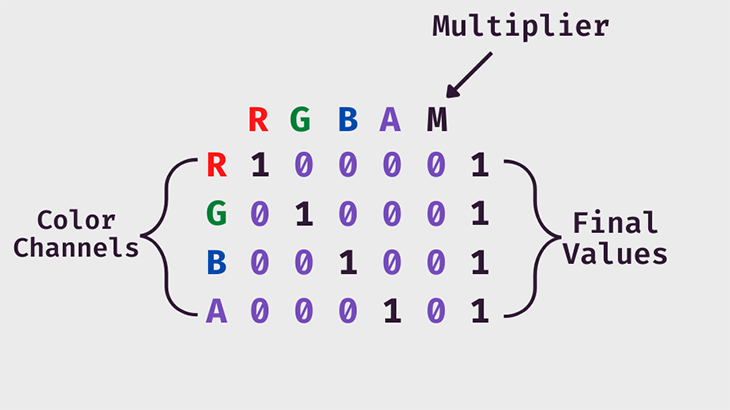
For matrix, the filter effect is applied using an RGBA color matrix, or grid, for its value.
<svg>
<filter>
  <feColorMatrix in="SourceGraphic" type="matrix"
                   values="1 0 0 0 0
                           0 1 0 0 0
                           0 0 1 0 0
                           0 0 0 1 0">
</filter>
</svg>
The syntax above will not change the color of the image. Let’s look at each color channel.
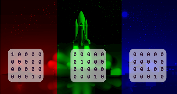
Play with the values and see what hues, shades, and tints you can come up with!
Next, we have saturate. This uses values between 0 and 1 to control the amount of black and white in the image.
<svg>
  <filter id="saturate">
      <feColorMatrix in="SourceGraphic" type="saturate" values="0.5"/>
    </filter>
</svg>
The result:

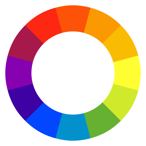
Next up is hueRotate. This attribute rotates the colors of the image around the color wheel by a specific angle. Let’s start by showing you the color wheel:
Now let’s use the attribute:
<feColorMatrix in="SourceGraphic" type="hueRotate" values="60"/>
The browser detects every color in the image and rotates each one by 60 degrees along the color wheel. This will be the resulting image:

The final type is luminaceToAlpha. This basically turns the image into a translucent negative by removing the alpha channel.

The matrix can achieve the same effects as the others if given the right values for the grid.
feConvolveMatrixFrom one matrix to the next! This filter primitive adds a convolution effect, or kernel, to an image. It’s used for blurring, edge detection, sharpening, embossing, and beveling using a combination of pixels.
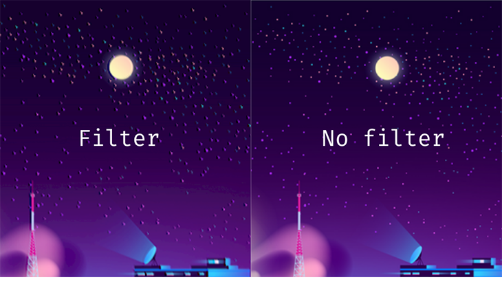
We can demonstrate a subtle glitch effect using some random values in the grid:
<svg>
      <filter id="convolve">
        <feConvolveMatrix kernelMatrix
        ="1 -4 1
          1 0 -8
          1 0 -4" />
    </filter>
</svg>
The result:

Let’s compare with the original to see the effects clearly:
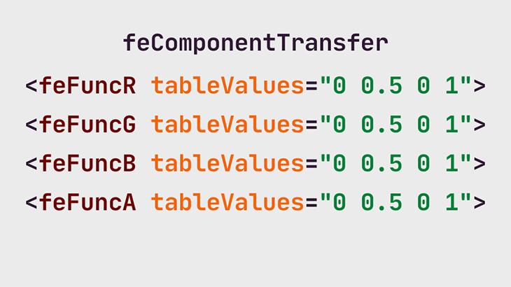
feComponentTransferThis primitive is similar to feColorMatrix, but, in place of a grid, each color channel (RGBA) is a separate function. And just like with the matrix, we can adjust the contrast of the image by manipulating the color intensity across those channels.
This is what it looks like:
And here’s how it works using the values given in this example:
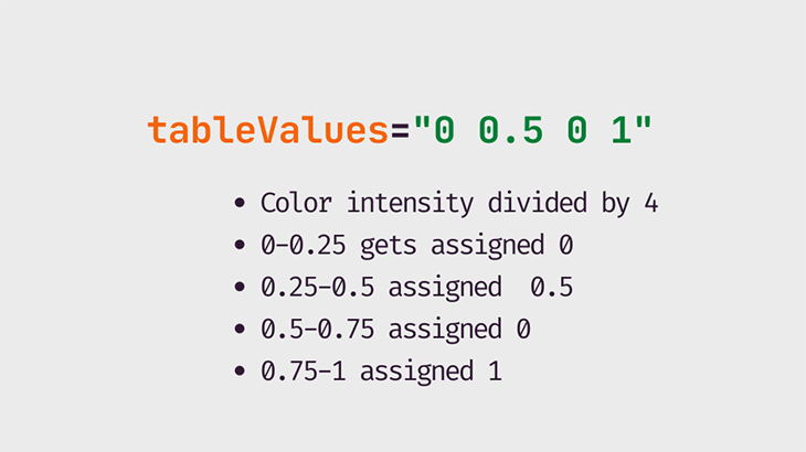
In the red channel, for instance, the color intensity ranges from 0 to 1. We’ve gone with four values, so 1 is divided by 4. Now we have four equal ranges of red: 0–0.25, 0.25–0.5, 0.5–0.75, and 0.75–1.
Any red value between 0–0.25 gets assigned the first value in the tableValues and so on. The same principle is used for as many as 10 values.
There are various functions that can be used with this filter primitive, and the first one we’re going to look at is discrete. This reduces the amount of color in an image.
<svg>
      <filter id="discrete">
        <feComponentTransfer>
          <feFuncR type="discrete" tableValues="0 0.5 0 1"/>
          <feFuncG type="discrete" tableValues="0 0.5 0 1"/>
          <feFuncB type="discrete" tableValues="0 0.5 0 1"/>
          <feFuncA type="discrete" tableValues="0 0.5 0 1"/>
      </feComponentTransfer>
    </filter>
</svg>
The result:
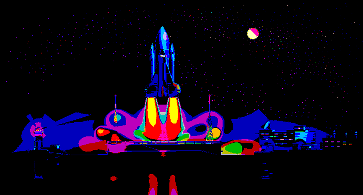
The next type is table, which makes more subtle changes to the image’s contrast. So, using the same tableValues as above…
<svg>
   <filter id="convolve">
      <feComponentTransfer>
          <feFuncR type="table" tableValues="0 0.5 0 1" />
          <feFuncG type="table" tableValues="0 0.5 0 1" />
          <feFuncB type="table" tableValues="0 0.5 0 1" />
          <feFuncA type="table" tableValues="0 0.5 0 1" />
      </feComponentTransfer>
   </filter>
</svg>
…we get this:
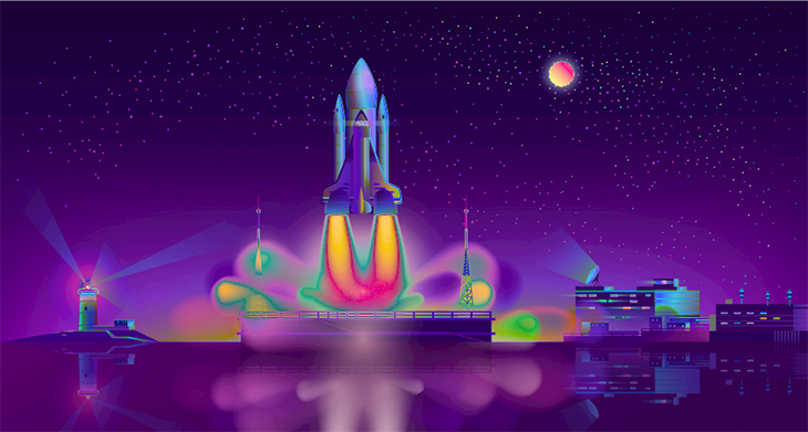
We can create a duotone effect using this primitive. Duo means two, so we’re using two color values for each channel in tableValues.
We need two colors, let’s go with #A91C93 and #8EE3FF. Now, we need the RGB color values — #A91C93 is equivalent to (169,28,147) and #8EE3FF is equivalent to (255,142,227).
Next, we need to divide the values in the red, green, and blue channels by 255 to get a value in the 0–1 range. This goes into tableValues.
<svg>
    <filter id="duotone">
       <feComponentTransfer>
          <feFuncR type="table" tableValues="0.662745098 1" />
          <feFuncG type="table" tableValues="0.109803922 0.556862745" />
          <feFuncB type="table" tableValues="0.576470588 0.890196078" />
       </feComponentTransfer>
    </filter>
</svg>
And we get this:

There’s a third way to control the contrast of the image, and that’s the type, gamma. This comes with three other attributes: exponent, amplitude, and offset.
Increasing the exponent makes darkened areas of the image even darker. It’s the opposite with amplitude, brightening the already bright areas of the image.
offset adds a white tint to the image and its values are between 0 and 1.
<svg>
  <filter id="amplify">
    <feComponentTransfer>
       <feFuncR type="gamma" exponent="1.9" amplitude="1.9" offset="0" />
       <feFuncG type="gamma" exponent="1.9" amplitude="1.9" offset="0" />
       <feFuncB type="gamma" exponent="1.9" amplitude="1.9" offset="0" />
    </feComponentTransfer>
   </filter>
</svg>
Let’s compare with the original image:
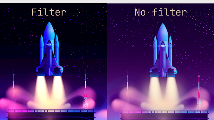
Try out other values to find more ways to spice up an element. There are so many possibilities at your finger tips with this SVG filter primitive!
feOffsetThis primitive is quite simple. We’re offsetting the image along the x and y directions, similar to what we did with the drop shadow.
<svg>
    <filter id="convolve">
      <feOffset in="SourceGraphic" dx="10" dy="10"></feOffset>
    </filter>
</svg>
feMergeThis SVG filter lets us layer two or more elements. Each layer is a feMergeNode within the main feMerge primitive.
Now is the perfect time to introduce the SourceAlpha, a black copy of the SourceGraphic. So, using our image, the SourceAlpha is a black rectangle with the same dimensions as the image. We can use this to create a better drop shadow.
We’ll start by offsetting the SourceAlpha:
<svg>
    <filter id="drop-shadow">
      <feOffset in="SourceAlpha" dx="10" dy="10"></feOffset>
    </filter>
</svg>
Next, we’ll apply a blur and reduce the opacity using feColorMatrix:
<svg>
    <filter id="drop-shadow">
      <feOffset in="SourceAlpha" dx="10" dy="10"></feOffset>
      <feGaussianBlur stdDeviation="10" result="BLUR"></feGaussianBlur>
      <feColorMatrix
          type="matrix"
          in="BLUR"
          result="DROPSHADOW"
          values="1 0 0 0 0
                  0 1 0 0 0
                  0 0 1 0 0
                  0 0 0 0.5 0"></feColorMatrix>
    </filter>
</svg>
At this point, we have a blurry translucent rectangle:

Now, we’ll layer our image on top of this shadow using feMerge. The first feMergeNode will be the top layer and the others will follow in that order.
<feMerge>
    <feMergeNode in="FINALSHADOW"></feMergeNode>
    <feMergeNode in="SourceGraphic"></feMergeNode>
</feMerge>

Now, we have a better drop shadow by combining four SVG filters!
feFloodWith this filter primitive, we’re simply flooding the filter area with color.
<svg>
      <filter id="convolve">
        <feflood flood-color="#00c2cb" flood-opacity="0.1" />
      </filter>
</svg>
The result:

feCompositeThis filter combines an image with its background. We’ll switch to text to demonstrate the effect of this filter primitive.
We’re also going to work with two other SVG filters, feFlood and feMorphology, to create some knockout text.
This is our h1 text:

And here’s the SVG syntax:
<body>
  <svg>
    <filter id="knockout">
      <feMorphology operator="dilate" radius="2" in="sourceGraphic"
      result="DILATE" />
      <feFlood flood-color="#301934" flood-opacity="0.5" result="FLOOD" />
        <feComposite operator="out" in="FLOOD" in2="DILATE" />
      </filter>
  </svg>
    <h1>HELLO! I'M A KNOCKOUT...</h1>
</body>
This is the result:
First, we used feMorphology with the operator as dilate to expand the text. Next, we flooded the text area with the color. And finally, we used feComposite to blend the text with the white background.
We used out as the value for the composite operator. Can you guess what happens when we use in?
Let’s see:

It does the opposite! This time, the flood color stays within the letters of the text.
feImageThis primitive fills up the the filter area with an image. This is exactly what we did with feFlood. We’re sticking with the text example, so let’s see how this SVG filter works.
<feImage xlink:href="2833.jpg" x="0" y="0"
        width="100%" height="100%"
        preserveAspectRatio="none" result="IMAGE">
</feImage>
Right now, this is the result:

Now, we can use feComposite to add this image to the text.
<svg>
  <filter id="knockout">
    <feImage xlink:href="2833.jpg" x="0" y="0"
       width="100%" height="100%"
       preserveAspectRatio="none" result="IMAGE"></feImage>
    <feComposite operator="in" in="IMAGE" in2="SourceGraphic" />
  </filter>
</svg>

feBlendLike the name suggests, this primitive blends the image with its background. To demonstrate this, we’ll create a noise effect with feTurbulence and combine it with the image.
<svg>
  <filter id="blend">
     <feTurbulence in="SourceGraphic" type="turbulence"
     baseFrequency="0.01 0.02" numOctaves="1" result="NOISE">
     </feTurbulence>
    <feBlend in="SourceGraphic" in2="NOISE" mode="multiply" result="BLEND">     </feBlend>
  </filter>
</svg>
The result is a cloudy image:

Let’s look at an animated demo:
See the Pen
feBlend and feTurbulence by Oscar-Jite (@oscar-jite)
on CodePen.
feDiffuseLightingDiffuse lighting is light coming from a large, outside source. It uses the alpha channel of the image as a bump map. Bump mapping is a graphical method of adding texture to an image.
There are three light sources that work with this primitive: feDistantLight, fePointLight, and feSpotLight.
feDistant defines a light source that’s coming from a distance.
<svg>
  <filter id="knockout">
     <feDiffuseLighting in="SourceGraphic" lighting-color="#00c2cb"
     diffuseConstant="2">
      <feDistantLight azimuth="100" elevation="15" />
     </feDiffuseLighting>
     <feComposite in="SourceGraphic" operator="arithmetic" k1="1" k2="0"
          k3="0" k4="0" />
  </filter>
</svg>
From this snippet, the light source is blue. diffuseConstant defines the light’s diffusion reflection constant, and that’s how the light reflects off the surface. Lower values will dim the light.
For the feDistantLight attributes, azimuth is the clockwise direction of the light on the xy plane and elevation is the angle direction on the z axis.
This is the resulting effect using the code above:

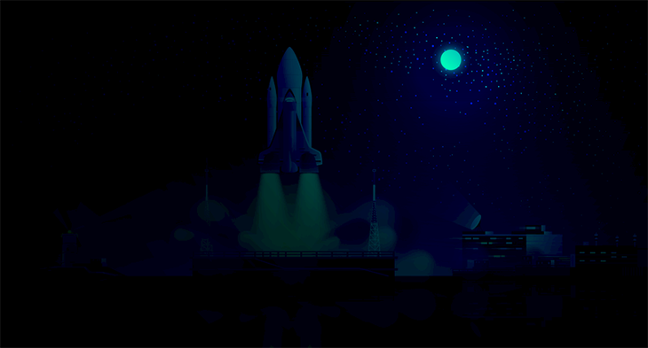
Next up, fePointLight. We’re essentially pointing the light on a particular spot in the image. Looking at our image, the moon seems to be the best spot to shine light on.
To get this, we’re moving the light along the x, y, and z axis.
<svg>
<filter id="point">
  <feDiffuseLighting in="SourceGraphic" lighting-color="#00c2cb" diffuseConstant="2">
     <fePointLight x="580" y="100" z="40"/>
  </feDiffuseLighting>
  <feComposite in="SourceGraphic" operator="arithmetic" k1="1" k2="0"
          k3="0" k4="0" />
</filter>
</svg>
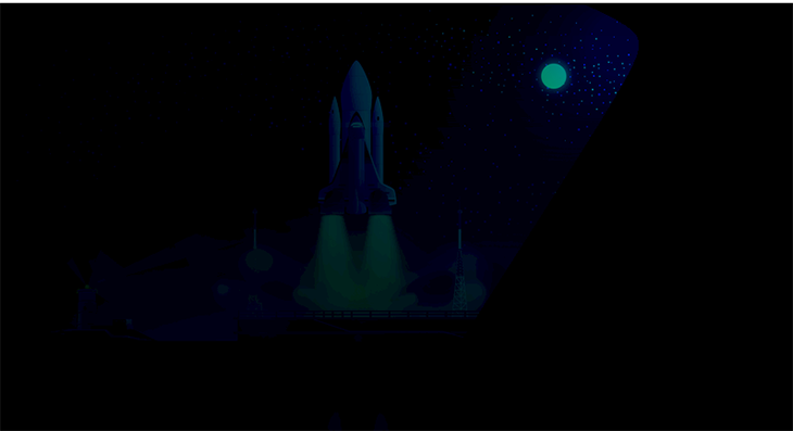
Now we have a nice blue moon in the starry night sky:
Finally, for this SVG filter, we have feSpotLight. It’s right there in the name, there’s an invisible spotlight pointing a beam at the image. As for us, we can control the position, angle, and intensity.
<svg>
<filter id="point">
 <feDiffuseLighting in="SourceGraphic" lighting-color="#00c2cb"
 diffuseConstant="5">
    <feSpotLight x="680" y="20" z="30"
              limitingConeAngle="60"
              pointsAtX="100" pointsAtY="100"
              pointsAtZ="0" />
        </feDiffuseLighting>
  <feComposite in="SourceGraphic" operator="arithmetic" k1="1" k2="0"
          k3="0" k4="0" />
</filter>
</svg>
The limitingConeAngle controls how wide the spotlight will be. pointsAtX, pointsAtY, and pointsAtZ control the direction the spotlight is pointing.
The result:
feSpecularLightingSpecular light is used for highlighting. This filter primitive uses the same light sources as feDiffuseLighting.
<svg>
<filter id="point">
<feSpecularLighting specularExponent="5" lighting-color="#00c2cb"
          surfaceScale="1" in="SourceGraphic" specularConstant="1.5">
          <fePointLight x="570" y="100" z="200" />
        </feSpecularLighting>
  <feComposite in="SourceGraphic" operator="arithmetic" k1="1" k2="0"
          k3="0" k4="0" />
</filter>
</svg>
Let’s look at the attributes. specularExponent controls the brightness of the highlight and surfaceScale is the height of the image’s surface. specularConstant does the same thing as diffuseConstant and brightens or dims the color of the light.
The result:

We used fePointLight, but try it out with others and see what you can come up with!
feTileWe have arrived at the end, the final SVG filter that is feTile. This filter primitive creates a repeating pattern on an element, just like tiles on the floor.
<svg>
  <filter id="tiles">
     <feTile in="SourceGraphic" x="50" y="50" width="50" height="50" />
      <feTile />
  </filter>
</svg>
In this snippet, we’re selecting the part of the image on the x and y axis that will be on displayed on each tile. All we have to do is set the width and height of the tiles.
And voila!
There we have it, all 17 SVG filter primitives. Who needs Photoshop when you can edit on the go? You can combine many primitives to get more complex effects.
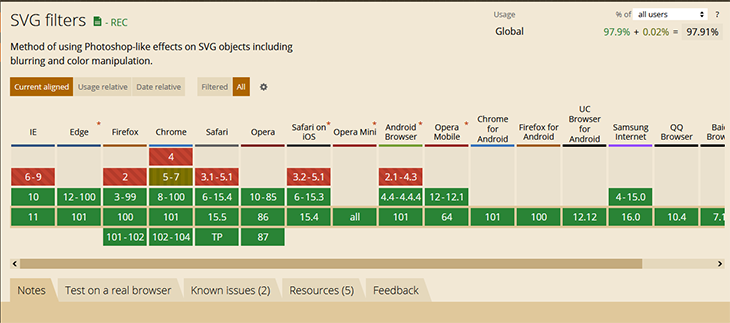
SVG filters have good support across all modern browsers. Here’s a screenshot from caniuse showing their range of compatibility.
SVGs can do a lot of incredible things, and we’ve just gone over how to enhance images, as well as other graphical elements, with SVG filters.
We also demonstrated the 17 primitives available with SVG filters. Distortion, color manipulation, blurring, color inversion — you name it, you can achieve these effects with a few key strokes!
Now, a few things to remember:
result values should be all caps to distinguish them from primitive attributesGo forth and create magic one code, one line, one pixel at a time!
As web frontends get increasingly complex, resource-greedy features demand more and more from the browser. If you’re interested in monitoring and tracking client-side CPU usage, memory usage, and more for all of your users in production, try LogRocket.

LogRocket lets you replay user sessions, eliminating guesswork around why bugs happen by showing exactly what users experienced. It captures console logs, errors, network requests, and pixel-perfect DOM recordings — compatible with all frameworks.
LogRocket's Galileo AI watches sessions for you, instantly identifying and explaining user struggles with automated monitoring of your entire product experience.
Modernize how you debug web and mobile apps — start monitoring for free.

When should you move API logic out of Next.js? Learn when Route Handlers stop scaling and how ElysiaJS helps.

Explore how Dokploy streamlines app deployment with Docker, automated builds, and simpler infrastructure compared to traditional CI/CD workflows.

A side-by-side look at Astro and Next.js for content-heavy sites, breaking down performance, JavaScript payload, and when each framework actually makes sense.

AI-generated tests can speed up React testing, but they also create hidden risks. Here’s what broke in a real app.re
Would you be interested in joining LogRocket's developer community?
Join LogRocket’s Content Advisory Board. You’ll help inform the type of content we create and get access to exclusive meetups, social accreditation, and swag.
Sign up now