Have you ever wanted to recreate that typical frosted glass effect/background blur from iOS devices on the web? The newest release of Google Chrome makes it possible with just a couple lines of CSS, thanks to the implementation of the backdrop-filter property!
The Replay is a weekly newsletter for dev and engineering leaders.
Delivered once a week, it's your curated guide to the most important conversations around frontend dev, emerging AI tools, and the state of modern software.
As the self-descriptive name tells us, backdrop-filter allows us to apply a CSS filter to the element’s backdrop. But how do we define the backdrop?
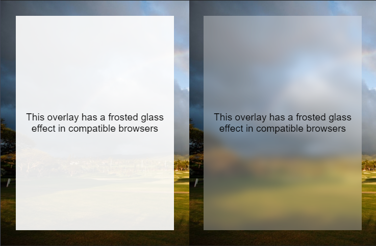
In CSS “backdrop” stands for whatever is painted behind the element . This means, of course, that the first thing we should do to use a backdrop-filter is add some kind of transparency to allow us to see through it.
For this purpose, we might either apply no background to the element, set it as a semi-transparent one via RGBA, or apply an opacity to the whole element. Remember that the latter will also affect the element’s text node and all the descendants, so this is probably not the right choice for most scenarios. Let’s start with a semi-transparent white background:
.frosted{
      background: rgba(255, 255, 255, 0.3);
    }
Next, we will want to declare the filter itself. Backdrop-filter accepts exactly the same values as the filter property, so we can affect the backdrop in many ways. From the simple blur to grayscale or sepia, or even any fancy Instagram-like filters shifting the image hue, brightness, saturation, and contrast.
Let’s apply the blur for our frosted-glass effect:
.frosted{
  background: rgba(255, 255, 255, 0.3);
  backdrop-filter: blur(8px);
}
And that’s pretty much it. I said “a couple lines” and I meant it. With some positioning magic, we can get results as follows:
See the Pen
Frosted glass effect by Facundo Corradini (@facundocorradini)
on CodePen.
At first, only Safari and Edge supported this property, with Chrome and Chromium-based browsers joining now. But we still should make our code safe for Firefox and other minor browsers and devices.
The good news is that, as with anything in CSS, if a browser finds a declaration that it doesn’t understand it will simply ignore it. So the approach we used above is safe-ish, as any browser that lacks support for backdrop-filter will provide a semi-transparent white background with no effect instead.
But there are situations where that won’t be enough. Perhaps the semi-transparent background without a blurred backdrop fails to provide enough contrast for the text, or we want to provide a completely different style to the element for browsers that don’t support backdrop-filter.
The safer way to do this is by using the @supports query and progressive enhancement. We should start by declaring the styles for browsers that don’t support it.
In this case, I’ll be using an almost-opaque white background to increase readability when no blur is applied.
.frosted{
  background: rgba(255, 255, 255, 0.9);
}
Then using the @supports query, we can apply the effect on any browser that supports it, plus dial down the alpha channel to increase transparency.
/* sets default styling */
.frosted{
  background: rgba(255, 255, 255, 0.9);
}

/* applies semi-transparent background for browsers that support backdrop-filter */
@supports (backdrop-filter: none) {
  .frosted {
      background: rgba(255, 255, 255, 0.3);
      backdrop-filter: blur(8px);
  }
}
Notice I’m using “backdrop-filter: none” as the condition. It’s generally considered a good practice to use the simplest value of a property when checking for browser support. I could have used something like “@supports (backdrop-filter: blur(8px))”, but that would be repetitive and can look extremely confusing if someone changes the filter in the future.
I focused on the frosted glass as that’s one that I’ve been wanting to use for eons, but we can apply any filter we’d like to, including:
Furthermore, we can even combine them to form advanced ones. To do so, we just have to define all filters in the property (bear in mind that the values must not be comma-separated… quite an inconsistency between different CSS properties there).
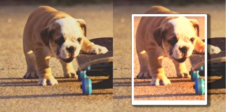
For instance, to recreate the Walden effect, we could use:
.walden{
  backdrop-filter:
    contrast(100%)
    brightness(110%)
    saturate(160%)
    sepia(30%)
    hue-rotate(350deg)
  ;
}
(values from Una Kravets’ CSSgram)
See the Pen
Walden backdrop-filter by Facundo Corradini (@facundocorradini)
on CodePen.
Of course, backdrop-filter is just one of the many improvements on this new release. Other great news includes the support for prefers-color-scheme media query, a new button in the omnibar to simplify installation of PWAs, updates to numerous APKs, and more. You can read about them at Chrome’s blog.
Install LogRocket via npm or script tag. LogRocket.init() must be called client-side, not
server-side
$ npm i --save logrocket

// Code:

import LogRocket from 'logrocket';
LogRocket.init('app/id');
// Add to your HTML:

<script src="https://cdn.lr-ingest.com/LogRocket.min.js"></script>
<script>window.LogRocket && window.LogRocket.init('app/id');</script>

Learn how Vite+ unifies Vite, Vitest, Oxlint, Oxfmt, Rolldown, and Node.js management in one CLI.

AI companies are buying developer tools as coding agents turn runtimes, package managers, and linters into strategic infrastructure.

Learn how AI-assisted development governance uses rules, agents, hooks, and protocols to help AI coding tools produce safer, more consistent code.

A step-by-step guide to building your first MCP server using Node.js, covering core concepts, tool design, and upgrading from file storage to MySQL.
Hey there, want to help make our blog better?
Join LogRocket’s Content Advisory Board. You’ll help inform the type of content we create and get access to exclusive meetups, social accreditation, and swag.
Sign up now

