As developers, we have numerous CSS properties available at our disposal that we can leverage to create functional, visually appealing websites and applications. However, not all CSS features are supported on every browser.

By designing for cross-browser compatibility, we can ensure that our website functions the same across all modern browsers. This is not an easy task, but fortunately, we have CSS feature queries, a powerful tool that allows us to test browser support for CSS features.
In this article, we’ll explore how to use feature queries to ensure our website is accessible to all users — regardless of their choice of browser.
Jump ahead:
The Replay is a weekly newsletter for dev and engineering leaders.
Delivered once a week, it's your curated guide to the most important conversations around frontend dev, emerging AI tools, and the state of modern software.
Feature queries are used to test if a browser supports a CSS feature. We can create feature queries using the @supports rule, which is similar to the media queries @media rule. We can use feature queries to test browser support for a single CSS feature, as well as for multiple features.
A feature query works in a similar way as a media query does. With media queries, we’re telling the browser to use specific code when the browser window is at a certain size. With feature queries, we’re telling the browser to check if it supports a particular CSS feature, and if it does, to apply the feature:
@supports (property: value){
  /*Use this code if property is supported*/
}
A feature query must have at least one property. The property’s value will be tested before the nested code can be used by the browser. Here’s an example:
@supports (display: grid){
  div{
    display:grid;
    grid-template-columns: 1fr 1fr;
    grid-gap: 20px;
  }
In this example, if the browser supports the display property with a value of grid, it will run the code in the curly braces.
The @supports rule also allows us to test browser support for multiple CSS features. One way to do this is with the and keyword:
@supports (display: grid) and (grid-gap: 20px){
  div{
    display:grid;
    grid-template-columns: 1fr 1fr;
    grid-gap: 20px;
  }
}
In this example, if the browser supports both display and grid-gap with their respective values, it will apply the CSS code in the feature query (within the curly braces).
Another way to test multiple CSS features with feature queries is by using the or operator. This approach is especially useful when dealing with vendor prefixes, which are special characters added to the beginning of a CSS property to make it specific to a particular browser.
There are four vendor prefixes available: -webkit-, -moz-, -ms-, and -o-. Chrome and Safari use -webkit-, and Firefox uses -moz-. Both Edge and its predecessor, Internet Explorer, use the -ms- prefix. Opera uses the -o- and -webkit- prefixes.
One limitation of feature queries is that it doesn’t really recognize vendor prefixes. So, if there’s a fallback (i.e., an alternative option) for an unsupported feature, that fallback will be also used by browsers that have support through vendor prefixes. We’ll discuss fallbacks in more detail later in this article.
Feature queries only test if a browser has full support or no support; it does not test for partial support. Fortunately, the or keyword can help us here:
@supports (display: grid) or (-webkit-display: grid){
  div{
    display:grid;
    grid-template-columns: 1fr 1fr;
    grid-gap: 20px;
  }
}
In this example, the browser checks if the browser supports the standard display: grid, or the prefixed -webkit- version.
Both the and and or keywords can be used together in a feature query. This will create a more complex condition that we can use to test for different combinations of features. Here’s an example:
@supports ((display: grid) or (display: flex)) and (gap: 20px){
  div {
    display: grid;
    grid-template-columns: 1fr 1fr;
    gap: 20px;
  }
}
In this example, if the browser supports all three properties (display: grid, display: flex, and gap: 20px), the code will be applied. The code will also be applied if the browser supports either display: grid or display: flex, and gap: 20px. However, if the browser does not support any of the three properties, the code will be ignored.
Here’s an example of an even more complex feature query:
@supports ((display: grid) or (display: flex)) and ((gap: 20px) or (justify-content: center)){
  div{
    /*Code to be applied*/
  }
}
Here, we’re dealing with two conditions. The first group is checking if the browser supports grid or flex. The second group is testing if the browser supports the gap property with a value of 20px and justify-content with a value of center. The code will only run if the browser supports at least one feature from each group.
We can use the not keyword to check if a browser does not support a CSS feature. This is called negation; we can use it to create a fallback for unsupported features.
Here’s an example of a feature query testing for lack of support:
@supports not (property:value){
  /*Use this code if the browser doesn't support this feature*/
}
A fallback is an alternative option the browser can use if it doesn’t support a feature. A fallback could be using a different property or using a particular technique that will produce a similar result to the unsupported CSS feature.
Fallbacks are great for older browsers because they help ensure that the webpage design or layout remains consistent for all users. With a fallback, users may not get anything fancy, but they’ll still get functional features.
Let’s say grid isn’t supported by a particular browser, we could use CSS Flexbox as a fallback:
@supports not (display: grid){
  div{
    display: flex;
    flex-wrap: wrap;
    justify-content: space-between;
  }
}
In the above code, we use the not keyword, but this isn’t always necessary. To create a fallback without using the not keyword, we simply add the fallback code outside the feature query:
@supports (display: grid){
  div{
    display:grid;
    grid-template-columns: 1fr 1fr;
    grid-gap: 20px;
  }
}

/* Fallback CSS */
div{
  display: flex;
  flex-wrap: wrap;
  justify-content: space-between;
 }
The not keyword is useful in more complex scenarios. Here are two examples from MDN Web docs:
@supports not (not (transform-origin: 2px)) {}
@supports (display: grid) and (not (display: inline-grid)) {}
In the first feature query, there’s a double negation, meaning the feature query is basically checking if the browser supports the transform-origin property with a value of 2px. For the second feature query, the CSS rules will only be applied if the browser supports display: grid but does not support display: inline-grid.
The most problematic browser, in terms of support, is Internet Explorer. It has been replaced with Microsoft Edge, but we can switch this browser to IE mode to test compatibility.
To demonstrate how feature queries work, we need to consider a CSS property that’s not well supported. The filter property, with a value of blur, is a great example. We can use this to create a frosted glass effect, also referred to as glassmorphism.
Here’s some HTML to get started:
<section id="main">
    <nav>
      <div class="logo">
        <a href="#">LOGO</a>
      </div>
      <ul class="menu">
        <li><a href="#main">Home</a></li>
        <li><a href="#services">Services</a></li>
        <li><a href="#about">About</a></li>
        <li><a href="#contact">Contact</a></li>
      </ul>
    </nav>
    <div class="content">
      <h1>Testing browser support</h1>
      <p>With CSS Feature Queries</p>
    </div>
  </section>
</body>
We can style the page in any way that we’d like. For this example, we’ll add a background image to the page and then add the frosted glass effect to the navbar and the content div.
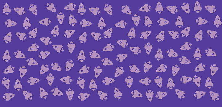
Here’s an image for the background:
Now, let’s add the glassmorphism effect to the navbar and content div:
nav,
.content {
  backdrop-filter: blur(2px);
  border: 2px solid rgba(255, 255, 255, 0.1)
}
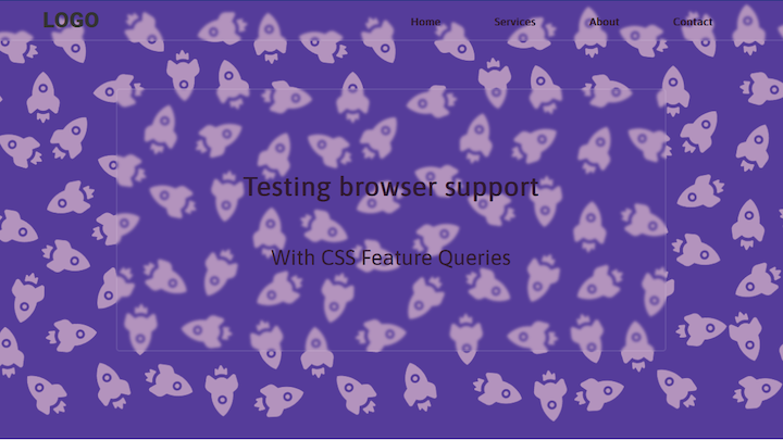
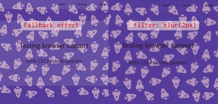
Here’s how the page will look on Chrome, Firefox, Opera, Edge, and all other browsers that support this CSS feature:
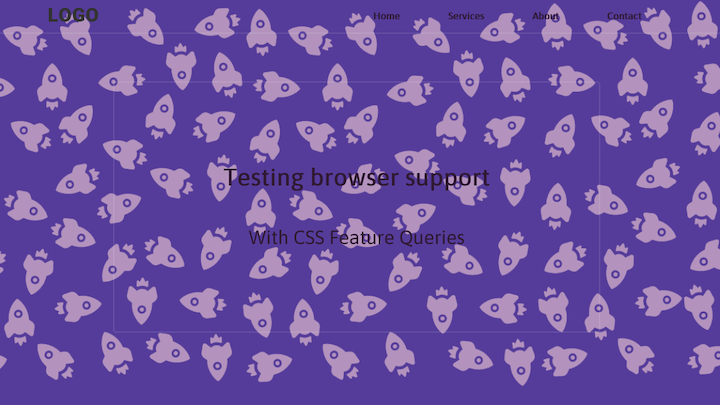
Here’s how the page will look on a browser that doesn’t support filter: blur(), such as Internet Explorer:
Now, let’s create a fallback. It will have to be a property that can create a similar visual effect on the backdrop and background elements. This is a job for the background-color property. We can use this property to create a frosted glass effect by using a transparent color:
nav,
.content {
  backdrop-filter: blur(2px);
  border: 2px solid rgba(255, 255, 255, 0.1);
  background-color: rgba(255, 255, 255, 0.1);
}
@supports (backdrop-filter: blur()) {
  nav,
  .content {
    background: transparent;
  }
}
In this example, we’ve added the fallback outside the feature query. If the browser supports the filter property and blur value, the background will be transparent; otherwise, it will use the provided default fallback.
Here’s the page on Internet Explorer, after using the feature query with fallback:
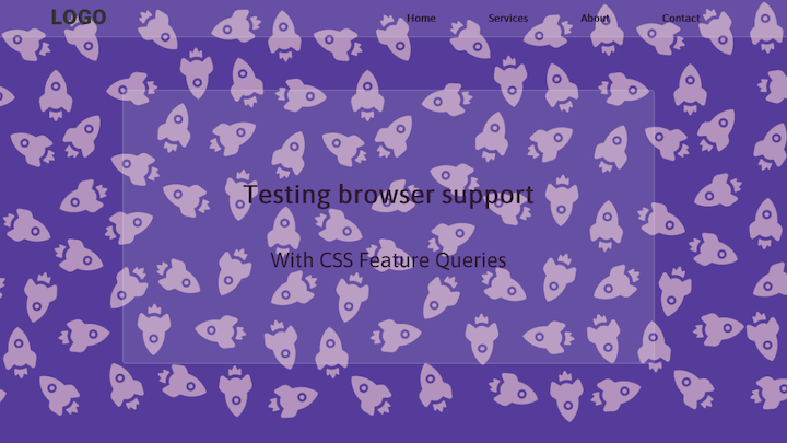
We get the glass effect, but no blur. For contrast, let’s compare it with the other browsers that support the filter property:
It’s not enough to produce code that works on your computer. As a developer, you need to consider all users (even those still using Internet Explorer). Not sure how to proceed? Try this:
With this approach, users with modern devices and those with older devices will get the same layout and will all have a good experience. It’s a win-win situation!
As web frontends get increasingly complex, resource-greedy features demand more and more from the browser. If you’re interested in monitoring and tracking client-side CPU usage, memory usage, and more for all of your users in production, try LogRocket.

LogRocket lets you replay user sessions, eliminating guesswork around why bugs happen by showing exactly what users experienced. It captures console logs, errors, network requests, and pixel-perfect DOM recordings — compatible with all frameworks.
LogRocket's Galileo AI watches sessions for you, instantly identifying and explaining user struggles with automated monitoring of your entire product experience.
Modernize how you debug web and mobile apps — start monitoring for free.
When should you move API logic out of Next.js? Learn when Route Handlers stop scaling and how ElysiaJS helps.

Explore how Dokploy streamlines app deployment with Docker, automated builds, and simpler infrastructure compared to traditional CI/CD workflows.
A side-by-side look at Astro and Next.js for content-heavy sites, breaking down performance, JavaScript payload, and when each framework actually makes sense.
AI-generated tests can speed up React testing, but they also create hidden risks. Here’s what broke in a real app.re
Hey there, want to help make our blog better?
Join LogRocket’s Content Advisory Board. You’ll help inform the type of content we create and get access to exclusive meetups, social accreditation, and swag.
Sign up now

 Learn more →
