Growth designers turn user behavior into business results, bridging UX and revenue with data-driven strategies that deliver conversions and retention.

CRO isn’t just marketing fluff — UX designers who get it can turn clicks into revenue and have bolder impacts in sales.

Oftentimes when looking at something, you can tell what looks good or bad, however struggle to verbalize why.

For when you’re stuck in a UX design rut next, bring in lateral thinking. Lateral thinking will take your designs in fresh directions, solving tricky problems with unexpected creativity.
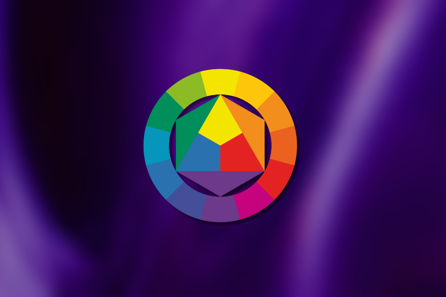
Colors in UI aren’t just decoration. They’re the key to emotional impact, readability, and accessibility. This blog breaks down how to pick colors that don’t just look good — they work for your users.

It’s time to ditch those sneaky UX traps and actually connect with your users. In this blog, I talk all about transparency, informed consent, and why trust isn’t something you can fake as a UX designer.
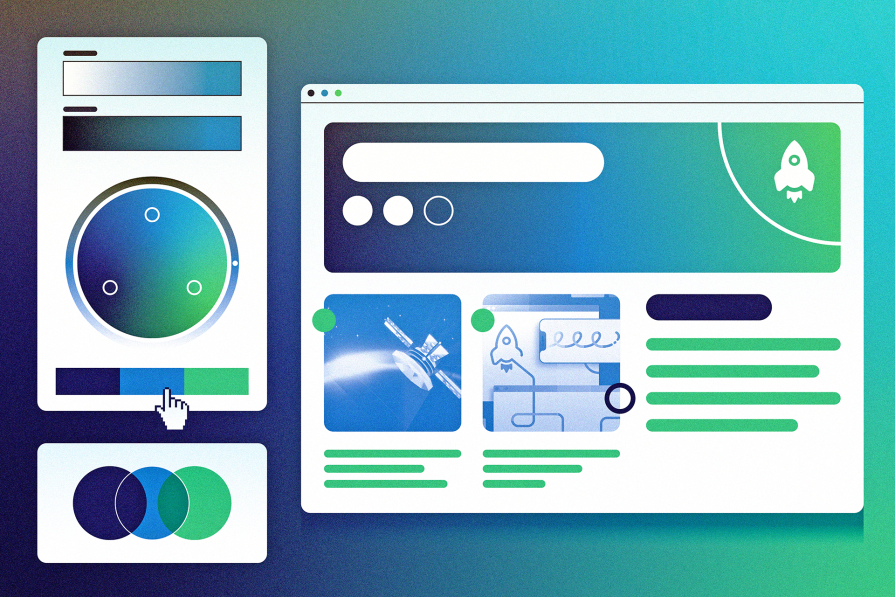
Analogous color schemes offer a powerful way to guide user emotions and behavior. This guide shows you how to make colors do the good work of improving UX.
The need for human centered design will only grow as technology evolves. Embracing these principles now will set you up to not meet but exceed the expectations of your users.
Signifiers are not just fancy signs in UIs. They are crucial communication tools for UX designers that hint users about specific actions by enhancing usability factors.

The most magical thing about the golden ratio is how artists and architects have considered the problem of proportion in history.
Let’s talk about how to find the right balance when implementing valuable AI into products without impeding human creativity.

Both UX and SEO are critical for any business. But did you know that they are also closely related? In this blog, I explore how UX designers can use SEO to improve search result positioning.