Conversion design, or CRO-driven design, is becoming increasingly popular in the realm of UX design. After the VC bubble burst around 2022, companies realized that a great value proposition isn’t enough — products also need to learn money.
While monetization models might seem like something only the C-suite should worry about, designers can significantly influence revenue by integrating CRO principles into their work. And trust me, it’s worth the effort.
In this article, I’ll break down what CRO is, how designers can build a UX/UI design for conversion, and how to become a CRO-oriented designer.
Editor’s note: We updated this article in September 2026 to reflect how CRO practices are evolving. The refresh adds guidance on guardrail metrics, accessibility, experiment quality, personalization, AI-assisted testing, and the difference between improving conversion and manipulating users.
CRO, which expands as conversion rate optimization, is the process of using research, experimentation, and behavioral data to improve the likelihood that users complete meaningful actions.
The important word there is meaningful. CRO isn’t simply about getting more clicks, signups, or purchases at any cost. A successful change should help users move through an experience more clearly while also improving a business outcome. If conversion goes up but complaints, cancellations, accessibility issues, or regret go up with it, you probably haven’t optimized the experience as much as the dashboard suggests.
For example, if only 5 percent of visitors to a landing page purchase the marketed product, a UX/UI design for conversion would need to be on improving design elements like the header, visuals, call to action, and layout to move this 5 percent conversion metric as high as possible. In the end, this would result in more sales without changing the product itself.
That said, “as high as possible” shouldn’t literally be the goal. The job is to improve conversion without damaging the rest of the experience.
For example, alongside purchase conversion, you might monitor refund rates, cancellations, customer support contacts, retention, accessibility issues, or user satisfaction. These are often called guardrail metrics because they help you make sure a win in one number isn’t creating a loss somewhere else.
CRO lies in the realm of “optimizations” and not “new opportunities,” but these little improvements can add up enough to double or triple a company’s revenue.
CRO is often considered a marketing function, but designers not only have a great influence on conversions but can benefit greatly from focusing on it. I’ll tell you why and how to design a website that converts:
It is very important for us not to associate CRO with only copywriting, advertising assets, and communication channels — design itself plays a critical role in shouldering CRO. The clarity of your UI design, the message it delivers, how it makes people feel, and whether or not it sparks credibility are all critical components of CRO.
In one of my projects, a simple UI redesign of one of the content blockers resulted in a 30% lift in conversions.
Design matters.
I’ll say it out loud — one of the most common challenges of being a designer is how organizations tend to treat one. UI/UX designers rarely get a seat at the table; their opinions, although heard, are not always taken into consideration. They often just get pre-defined and pre-decided requirements to, well, paint in Figma.
But tie your design decisions to revenue, and you’ll quickly find yourself earning more respect and influence within the organization.
And I’ve learned that from experience. I was working with two designers who had competing opinions about designing the checkout page for a project. One proposed making the discount field on the checkout more prominent, while the other wanted to make it minimalistic. The first mentioned various UX principles and why they are better for the user. The second brought in data and showed how a similar change before boosted conversions on the checkout page.
Who do you think we listened to?
We have now established that designers have a big impact on products’ and websites’ conversions and can benefit greatly from focusing on conversion.
Let’s talk about a few strategies that’ll help you incorporate CRO principles into your design process and use your UX/UI design for conversion:
One thing I’d add before we jump into tactics: CRO works best when it’s treated as experimentation, not guesswork.
Changing a CTA and seeing conversion increase doesn’t automatically prove that the CTA caused the improvement. Traffic mix, seasonality, sample size, returning visitors, marketing campaigns, and plain randomness can all affect the result.
Start with a hypothesis. Decide what metric should change, what guardrails you’ll watch, and how long you need to run the experiment before looking at the outcome. CRO is about learning what actually changes behavior, not just spotting a number that moved.
Great designers are funnel designers, not just screen designers.
Whenever you work on any UI element or page, always review what happens before and after that screen. Make sure any changes you make improve not only the screen but the funnel as a whole.
One time, we were working on a new post-registration offer screen. We spent a lot of time perfecting it and almost fell in love with it. But then, when we put everything together, we realized it didn’t fit in the flow. The key messaging we included on the screen was too repetitive, especially regarding what happens in the next steps. Instead of adding more credibility and USP, we just added more repetition. We ended up back at the drawing board.
Looking at UX design from a funnel perspective is critical because each step either adds or takes from the visitor’s willingness to convert. People rarely make the final decision on a single screen. It’s always a combination of steps that moves the user from the starting point to the desired outcome, a purchase.
Also, be careful with the assumption that every bit of friction is bad.
Friction can be frustrating when it’s unnecessary, but sometimes it protects the user. Confirming a high-value purchase, explaining a subscription renewal, reviewing permissions, or making cancellation terms clear might technically add another step, but removing those moments purely to boost conversion can create a worse experience.
The better question isn’t always, “How can we make this faster?” Sometimes it’s, “What information or reassurance does the user need before making this decision?”
There’s a big difference between helping someone make a decision and designing the interface so they struggle to make any other decision.
CRO can go wrong when teams optimize a metric without asking how that metric was achieved. Hiding the “no thanks” option, making cancellation difficult, preselecting an expensive plan, disguising an ad as navigation, or manufacturing urgency might increase conversion in the short term. But those tactics work by limiting informed choice rather than improving the experience.
Good conversion design makes the value clearer, removes unnecessary confusion, and helps users act on what they already want to do.
A useful test is to ask: Would the user still feel good about this interaction if they understood exactly how we were trying to influence them?
If the answer is no, the experiment probably crossed the line from persuasion into manipulation.
To get high conversion rates, your product or website must:
Accessibility should also be part of your experiment guardrails. If a variation increases overall conversion but makes completion harder for users relying on assistive technology, that isn’t a clean win.
The order of these elements in the conversion funnel map matters, too. No matter how much credibility signals and testimonials you put into establishing trust, if people don’t find the product relevant, convenience won’t do anything if users aren’t motivated to convert. The motivation alone is insufficient if users don’t know what to do next.
Go through the above list on every single step of your funnel. Visit a page, and ask yourself if the page signals relevancy to visitors. If not, fix it. If yes, ask whether the user has a reason to trust the statements made.
And, of course, conduct user tests to ask such questions. Auditing your funnel and pages for those seven aspects can already reveal numerous areas for improvement.
People don’t make decisions based on information alone. Emotion, trust, perceived risk, familiarity, and previous experiences all shape how users interpret a product.
That means emotional design can absolutely be part of CRO, but the goal shouldn’t be to manufacture an emotional response that pushes users past their better judgment. Use emotion to communicate value, build confidence, and reduce uncertainty — then give users enough information to make the decision for themselves.
Start by figuring out what emotions are most important to your target group. Bring in emotional design to your drawing board.
Once you’ve discovered the emotions most relevant to your key buyer persona, ensure your design targets these. The colors you use, the pictures you add, and what the header says all contribute to emotional perception.
But — the farther you are in the funnel, the less you should focus on emotions (hopefully, users have made the initial decision by then). At this point, shift your focus to addressing anxieties and providing relevant facts. Help the buyer justify the decision they made.
Users think in two ways:
Designs that win system 1 thinkers are minimalistic, to the point, and with only the absolutely necessary amount of copy, distractions, and steps.
Designs that win system 2 thinkers are more elaborate, explain the value proposition in more detail, and addresses concerns at every step.
And you can’t design for both.
The best way to discover what thinking system to focus on is to research and understand the decision-making process of your visitors. But if you don’t have that yet, there’s a rule of thumb:
There are four main awareness levels a visitor or user can have:
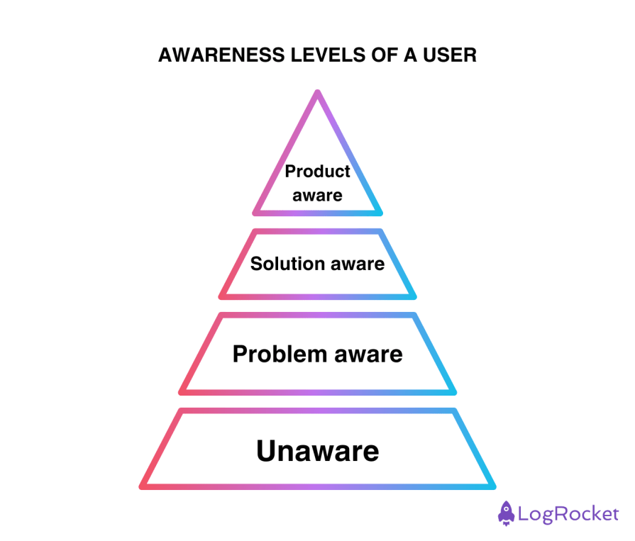
Designing and writing copy differs for each category. If most of your visitors are unaware that they have a problem, you need to start by explaining what it is and move to the next steps. If they are solution-aware, you need to explain how your product is the best solution. And if they are product-aware, you just need to let them finish the purchase ASAP while addressing any anxieties on the go.
This is also where personalization can become useful.
Instead of showing every visitor exactly the same message, teams can tailor parts of an experience based on what they already know — for example, whether someone is a first-time visitor, an existing customer, a returning trial user, or someone who previously abandoned checkout.
But personalization needs boundaries. Users shouldn’t feel like the interface knows more about them than they expected, and targeting shouldn’t exploit sensitive characteristics or vulnerabilities simply because doing so improves conversion.
Personalization works best when it makes an experience more relevant, not more invasive.
User research might not be something new to you, but CRO is a slightly different beast. Key principles are the same, but CRO-oriented research requires some specific methods:
1. Send a post-purchase survey
One of the quickest CRO research wins is to ask customers one question after the purchase — Is there anything that almost stopped you from buying today?
By asking this after a successful purchase (rather than on dropoff), you will gather insights from your most valuable customers — those actually willing to pay. You can learn a lot about their worries and anxieties.
You can use these survey results to improve your funnel pages and address those concerns.
2. Do an on-site survey
On-site surveys are automatic surveys that show on-page visits that typically have just one question. These are an excellent tool for discovering your visitor’s awareness levels.
Just ask a simple “What’s bringing you here today?” question, and you’ll understand if they are exploring solutions, trying to understand the problem, or just popped in incidentally.
You can also invite a few of them to an interview to dig deeper with qualitative methods.
3. Run five-second tests
Five-second tests are my favorite tool when it comes to CRO research. A clear website optimized for conversion tells you immediately what it’s all about and evokes the right emotions.
If users can’t grasp key concepts in five seconds or can’t name the emotion the site evokes, you have some improvements to make.
At the end of the day, changing a single word or design element can triple your conversion.
And I’m not exaggerating. A few years ago, we were building a live tutoring service where users could connect with a tutor for a few minutes to get their academic doubts answered. We changed the CTA from “Talk to tutor” (action-oriented) to “Get an expert answer” (outcome-oriented), and our conversions increased by more than tenfold.
Results like this are exactly why CRO can be exciting — but they’re also why it’s worth being careful. A dramatic lift should make you curious, not end the investigation. Look at whether the effect holds over time, whether the users you converted actually become valuable customers, and whether anything else changed during the experiment.
The point isn’t to distrust good results. It’s to understand them well enough that you can repeat them.
AI is making CRO faster. Designers and marketers can now generate dozens of headline variations, experiment concepts, audience segments, landing-page drafts, and personalization ideas in a fraction of the time it used to take.
That can be genuinely useful. AI can help you explore more hypotheses, summarize survey responses, identify patterns in behavioral data, and create prototype variations for testing.
But more variations don’t automatically mean better experimentation.
If you generate twenty versions of a page and simply choose whichever one happens to win, you increase the risk of learning the wrong lesson from noisy data. You still need a clear hypothesis, sensible sample sizes, predefined success metrics, and enough time to understand whether the effect is real.
AI can accelerate the mechanics of experimentation. It shouldn’t replace the thinking behind the experiment.
AI also makes personalization more dynamic. Instead of testing a single variation against a control, products can increasingly adapt content, recommendations, and interfaces based on individual behavior. That opens up powerful opportunities for CRO, but it also makes measurement harder. When every user receives a slightly different experience, teams need even stronger guardrails to understand whether the system is improving long-term user value rather than simply maximizing the next click.
Even though CRO is often associated with marketing, designers significantly impact conversion, too. They can build their standing within the organization by showcasing the CRO (thus, money) focus in their process.
CRO gives designers a powerful way to connect UX decisions with measurable business outcomes. But being conversion-oriented doesn’t mean blindly chasing whatever variation makes the biggest number go up.
The best CRO designers combine research, experimentation, accessibility, behavioral data, and business thinking. They look at conversion alongside guardrail metrics, question suspiciously dramatic results, and understand the difference between helping users make decisions and manipulating them into one.
And as AI makes experimentation and personalization faster, that judgment becomes even more important. We can test more ideas than ever before. The real skill is knowing which results actually represent a better experience — for the business and for the user.
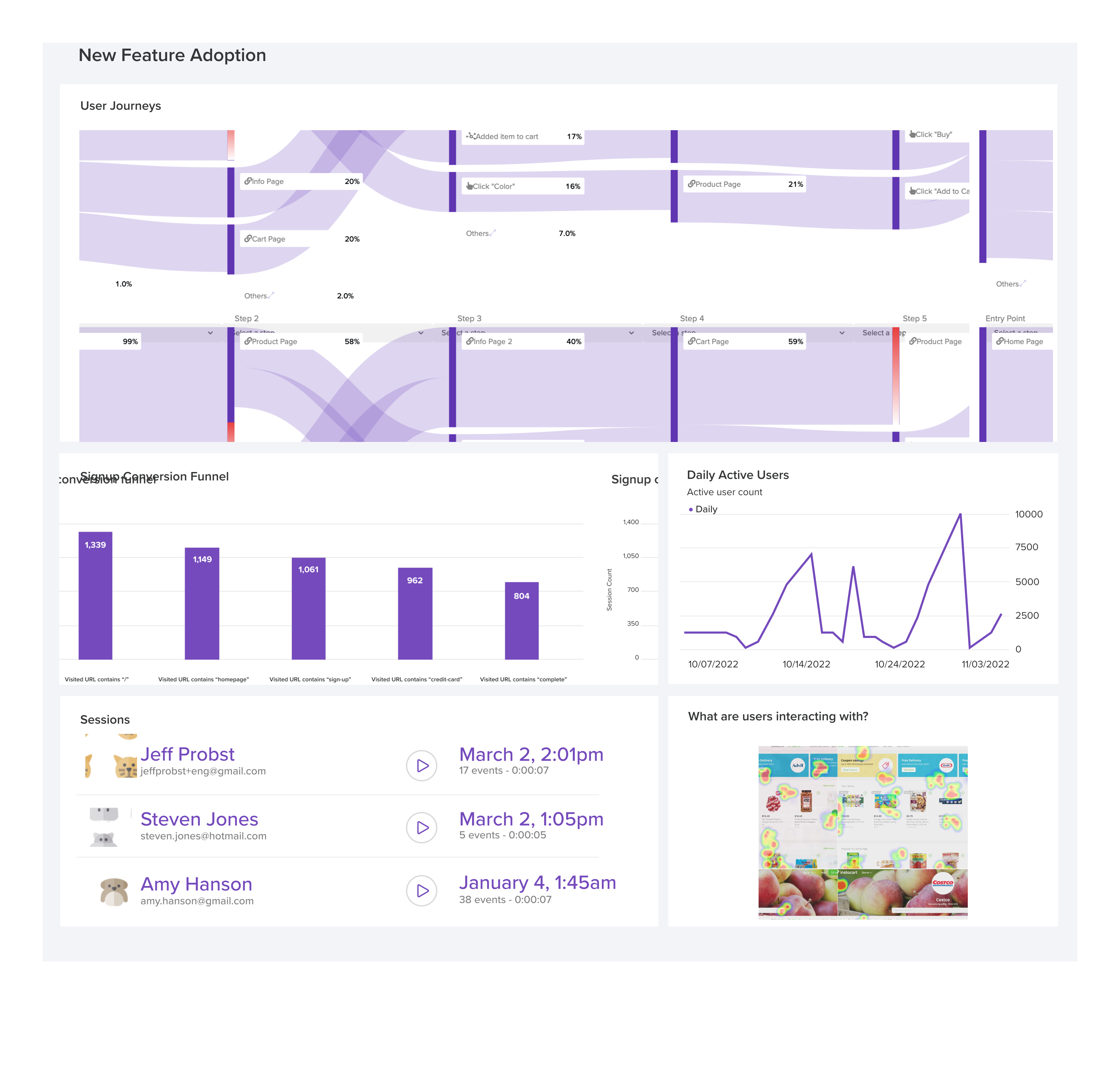
LogRocket's Galileo AI watches sessions and understands user feedback for you, automating the most time-intensive parts of your job and giving you more time to focus on great design.
See how design choices, interactions, and issues affect your users — get a demo of LogRocket today.
Giving designers AI tools is the easy part. I share how our team used office hours, small experiments, hackathons, and shared failures to build better AI habits together.
Through this step-by-step guide, you can learn how to easily import files from Adobe Illustrator to Figma.
Growth design isn’t just about getting more users to convert. It’s about using research, experimentation, and data to improve activation, retention, and long-term user value without sacrificing trust or the quality of the experience.
Starting with proto-personas can be better than a blank page, but don’t forget — they’re assumption-driven placeholders for the real thing. Research is key to turning them into true personas.

 Learn more →