The world is naturally painted with color, from the greens of the trees to the blues of the ocean. Think of the emotions you feel when looking at a rainbow or a sunset during the golden hour. The harmony of colors in nature often inspires many of the color schemes we use in the digital world.

A color scheme is a carefully chosen selection of colors used in design to create visually aesthetic UIs. These schemes can evoke specific emotions in users and influence user behaviors.
But without a strong understanding of color theory, your designs might miss the mark. So it’s essential not only to understand which colors work well together but also the emotions and perceptions these color schemes elicit from a user.
In this article, I’ll talk about analogous color schemes, including examples and a guide to creating your own for your designs.
It’s helpful to look at a color wheel to fully understand color schemes to visualize the relationships between colors.
A color wheel is based on three main colors — typically red, green, and blue (RGB) — and maps out the secondary and tertiary colors that arise from mixing them.
The term “analogous” refers to similar or comparable things, and an analogous color scheme draws from this concept. It’s a color palette that uses colors adjacent to each other on the color wheel. For example, an analogous scheme might combine blue, green, and cyan or red, blue, and magenta.
Analogous color schemes create a sense of harmony and cohesiveness — the colors naturally blend well together and reduce visual strain, unlike a complementary or triadic contrasting color scheme.
The analogous nature of the color scheme makes it easy to implement, even for those without extensive color theory knowledge. Additionally, these schemes evoke specific emotions, allowing designers to pair warm and cool colors without causing mixed or conflicting feelings.
Now that we understand the characteristics and benefits of an analogous color scheme, let’s go through the steps to create one.
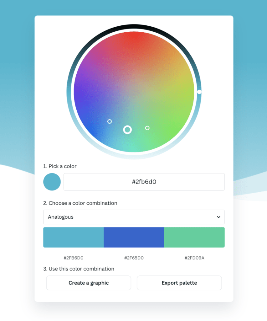
First, have a color wheel open in front of you. There are many online color wheels that can help you create color schemes, such as Adobe or Canva. These tools are especially helpful once you’ve selected your main color — they will automatically suggest the adjacent colors that complete your scheme, allowing you to fine-tune and perfect the palette.
Here’s one from Canva as an example:

When choosing your main color, start by thinking about the hue of color that you want to use. The hue refers to the brightest, pure color on a color wheel, such as red, green, or blue.
Once you’ve decided on a hue, adjust the saturation and brightness to your desired levels. Saturation measures the intensity of a hue on a scale of gray to pure, vivid color, and brightness defines the lightness or darkness of a hue from black to white.

Play around with the saturation and brightness levels of your main color until you’ve found one that suits your design.
Once you’ve selected your main color, the next step is to select the neighboring colors. Think about the needs of your design — what different use cases might you need a color for? For example, you might want different colors for background, text, headers, or borders.
Select one or two colors on each side of the main color, depending on how many colors you may need.
Aim to keep your color scheme to no more than five colors, as your designs may start to lose their visual cohesiveness. Adjust the hue, saturation, and brightness of each one. The more saturated your colors, the more space you should allow between them on the color wheel to avoid blending. Avoid selecting colors that are too similar, as this can lead to contrast issues in your designs.
Once you’ve finalized your colors, test the color scheme by applying it to your designs. Assign a color to each design element to ensure the scheme supports your design goals.
Watch out for potential accessibility issues, such as low color contrast, especially with analogous color schemes. Using similar colors together may result in designs that are hard to read or don’t meet accessibility standards. You can always go back to the color wheel and adjust your colors.
Analogous color schemes are widely used in UX design to convey a brand’s message. Let’s look at some examples of brands that use analogous color schemes and what makes them so effective.
This mental health brand focuses on sleep, meditation, and relaxation.
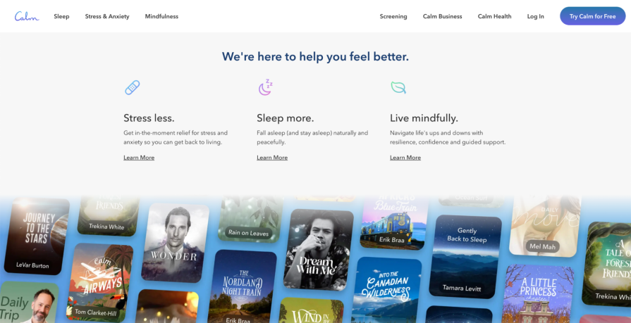
Their website uses an analogous color scheme consisting of blues, purples, and greens. The Calm logo combines blue and purple into a gradient, which exudes calmness and relaxation due to its cool colors and cursive font. Aside from the logo, the color scheme can be seen in their iconography, call-to-action (CTA) button, and featured imagery.
Combined with a neutral gray background, the colors add to the visual hierarchy, attracting the audience’s attention to key areas on the page:

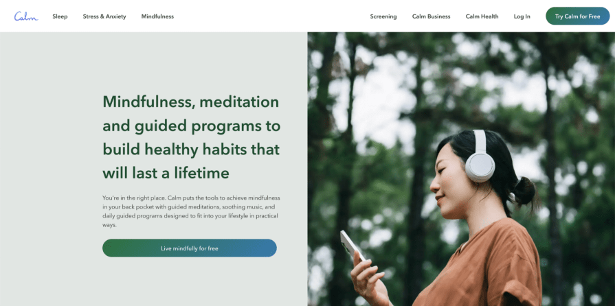
An interesting design choice by the brand is how they’ve visually segmented each offering with a different color combination. Instead of using the color scheme uniformly, each of their three segments — Sleep, Stress & Anxiety, and Mindfulness — uses two of the three colors.
For example, its Mindfulness segment omits purples and focuses on green and blue, as shown in the header text, CTA buttons, and imagery. This is an effective strategy to visually differentiate each segment of the brand, giving each a unique feel while maintaining the same overall emotional effect of its color scheme:

Klaviyo, a marketing automation platform, also utilizes an analogous color palette on its website, prominently featuring sienna and lavender. By mixing warm and cool colors, Klaviyo creates an energetic and visually engaging experience, particularly with its gradients.
The color scheme draws attention to key elements like the top banner, information cards, and a chat assistant, with sienna as the primary color and lavender highlighting secondary information.
As you scroll down the page, Klaviyo continues to blend solid backgrounds and gradients in their design elements. The gradient blur effectively directs the reader’s focus to headers and CTAs, demonstrating the color scheme’s versatility across light and dark backgrounds while maintaining visual appeal:

Colors can convey different meanings and evoke various emotions — color language changes by culture. For example, blue, a cool color, is often associated with calmness and is frequently used in industries like banking, travel, and technology to promote professionalism and trustworthiness.
In North America, red is often linked to urgency or excitement, such as in danger symbols or heart imagery. However, in China, red symbolizes luck and wealth, especially during Lunar New Year celebrations.
Understanding your audience, how they perceive colors, and color psychology is crucial when designing with an analogous color scheme.
Your designs shouldn’t be restricted to the hues in your color scheme. Incorporate neutrals, such as black, gray, or white, to give your designs room to breathe.
Without neutrals, your designs may overwhelm users and strain their vision. Using neutrals for your background allows the colors on top to stand out rather than compete for attention.
When selecting colors for your color scheme, think about how they might be applied in your designs. Too many colors with the same saturation or brightness levels may be jarring and difficult for the eyes.
You may want to have one or two primary colors as accents and use the rest to support them. Try to maintain a visual hierarchy when applying the colors to your design elements so they don’t distract or take away from the content.
Always test your designs to ensure that they are accessible to all users. When selecting your colors, test them for color contrast UX accessibility by applying one to text and another to a background.
Your designs must have enough color contrast so your users can easily read the content and have a pleasant experience when using your website or application.
There are countless ways to combine colors into a cohesive color scheme. An analogous color scheme, with its harmonious blending of similar colors, provides a balanced yet effective palette for your designs.
Use online color wheel tools or draw inspiration from nature to experiment with different hues, saturations, and brightness levels.
The key to effectively using an analogous color scheme lies in identifying your design goals and understanding how users will perceive the colors. Once you align your color choices with the behaviors and emotions you want to evoke, your color scheme will naturally come together.
LogRocket's Galileo AI watches sessions and understands user feedback for you, automating the most time-intensive parts of your job and giving you more time to focus on great design.
See how design choices, interactions, and issues affect your users — get a demo of LogRocket today.

Let’s explore why and when to use drag and drop, discussing real-world examples, platform-specific considerations, and accessibility tips.

We’re told to reduce friction, but sometimes friction builds value. This blog explores how scarcity, when designed well, sharpens focus and strengthens user trust.

Discover how to craft UX-friendly hero sections with examples, design tips, and strategies that drive engagement and conversion.

While Apple’s Liquid Glass can’t yet be perfectly recreated with CSS or Figma, we can still think about how to adopt the effect thoughtfully in our designs.