As a product manager, data can either be your best friend or the cause of many headaches and poor decisions.

Using data to your advantage requires a solid statistical, or analytical background. While this may seem overwhelming, there are a number of quantitative analysis tools and strategies that will help you feel comfortable.
In this article, you will learn what quantitative analysis is, the different types of analysis tools, and how to successfully implement them within your team.
Quantitative analysis is a research method that relies on numeric data to prove insights about a parameter that you’re interested in understanding. This involves empirical investigation of observable events and uses statistical tools to measure and come to conclusions based on recorded data.
The accuracy of quantitative analysis depends on the quality of data collected. You need to make sure that your models are correct before making a decision on the basis of potentially flawed information.
Quantitative and qualitative analysis differ in the way each approaches data collection and the type of insights they try to determine. Quantitative analysis deals with numbers and measurable outcomes. You can think of this as explaining what or how many.
On the other hand, qualitative analysis looks at data that is not easily measured — for example, unpacking the underlying reasons behind a certain behavior or sentiment. This can be time-consuming and inaccurate because of the inherent subjectivity involved in its interpretation. You can think of this as explaining why and how.
Ultimately, product management is a game of bets. You make a bet, hope it works, and then make another bet.
However, relying purely on intuition to make bets is a losing strategy. It’s like playing poker without understanding the rules of the game and calculating your risks — occasionally, you might win, but it won’t take you very far.
The same goes for making bets as a PM. Don’t leave your product’s future, and thus, your career, to sheer luck. Instead, use data to guide your decisions.
Using data will help you:
Although quantitative analysis doesn’t guarantee success, it does maximize the chances of a positive outcome and reduces the chances of flawed decisions and priorities greatly.
There are multiple ways to run data-driven studies. Some of the most common include:
A/B tests, also referred to as split tests, measure the difference between two versions of a product.
Say you want to change the placement of your CTA button, but you aren’t fully confident if that’s the right move.
Instead of guessing, you can show the CTA in the old placement for half of the traffic and the CTA in the new placement for the other half.
You can then measure the difference in the performance of both placements and make a data-informed decision on which is a better choice.
Different groups of users experience your product differently. You cannot expect to gain actionable insights if you examine your users as a lump grouping. Rather, you should segment your users into categories that provide you with more useful insights.
You can use data points, such as:
You can distinguish separate groups of users. You can then use this information to:
Understanding how changes in one variable can predict changes in another variable is valuable insight for product management.
For example, by analyzing relationships between variables you could discover that the more people use a feature X the better they tend to retain.
While this doesn’t necessarily mean retention is directly caused by feature X, digging deeper with subsequent analysis might help you uncover what drives user retention and how the usage of feature X is related to that.
These insights can then help you plan your roadmap and objectives based on proven data, rather than gut feeling.
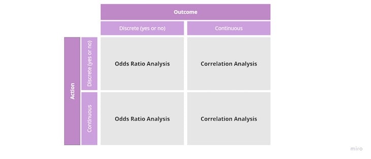
There are two main tools for analyzing relationships between variables:

If you want quick insights into where to focus on with your discovery efforts, or which pain points you should address first, consider mass surveys.
By mass surveys, I mean one’s that give you hundreds, if not thousands, of replies. These give you a large enough sample to distinguish which points are raised on occasion, compared to the ones that concern users most.
You can then use your survey data as a prioritization factor or follow up with qualitative analysis.
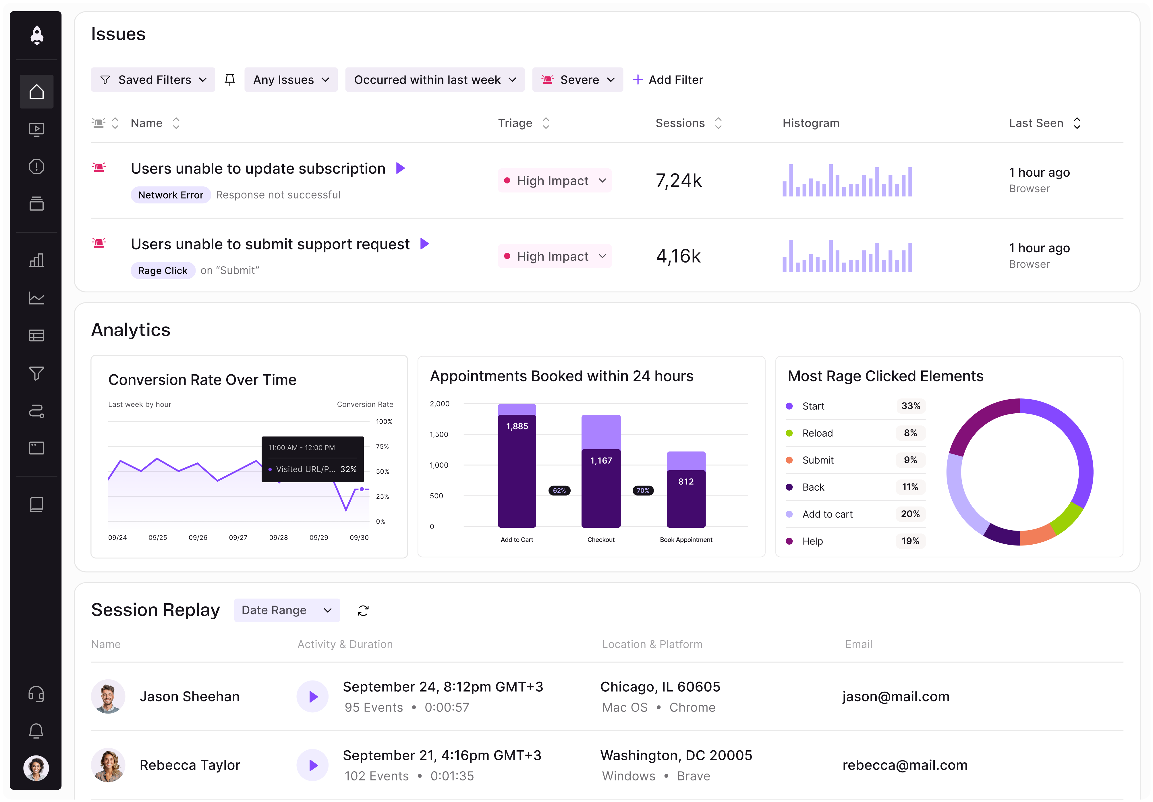
Tools such as LogRocket can help you track user behaviors over time. These can give you a snapshot of how your customers behave and potential areas for improvements.
From behavioral tracking, you can learn:
You can use this information to plan your next steps.
Using data incorrectly is worse than not using data at all. A flawed use of data can lead to false confidence and push you to draw wrong conclusions from your experiments and releases.
Luckily, you don’t need to be a data scientist to use data correctly. Focus on avoiding the three most common data mistakes and you should be good 90 percent of the time:
While doing your data analysis, you might notice that people using feature X tend to convert better. That’s a great insight!
But pause before you invest the next quarter in optimizing feature X’s adoption.
The fact that these two variables are correlated doesn’t necessarily mean that usage of feature X causes increased conversion.
There’s a high chance that other variables influence both factors.
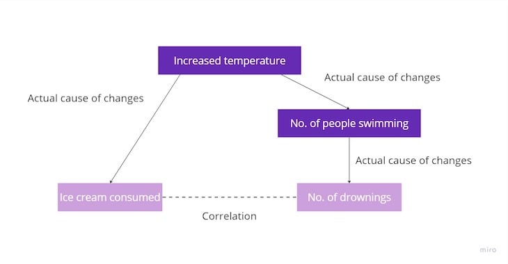
Let’s use an example. Imagine a correlation between the amount of ice cream consumed and the number of drownings. But it doesn’t mean that banning ice cream would reduce the number of drowning.
Other factors impact both ice cream consumption and the number of drownings at the same time:

So before making any conclusions from correlation analysis, dig deeper and look for other variables that could be correlated with the two in question. There’s a chance different factors lead to the aforementioned correlation.
When you test something with data, especially an A/B test, you must also measure the probability that the results are actually caused by the tested change.
For example, there’s a chance to get tails ten out of ten times when tossing a coin. But it’s just a coincidence, and it doesn’t prove that all coin tosses end up with tails.
The same goes for data tests.
That’s why you should also run probability simulations whenever doing quantitative analysis. Probability simulations tell you the probability that the measured outcome is a result of the tested action/change, or just pure luck.
We won’t go into details of these simulations — most analytical tools do it for us out of the box. But there’s one tricky part — you might think 80 percent probability is a lot.
Let’s put it in perspective. If all your tests end with 80 percent probability, it means one in five tests is a falsified statement of reality. One alone is enough to harm you, but even worse, you never know which test produced a false result.
Why run quantitative tests if you can’t trust them?
The good rule of thumb is to consider tests with 95 percent probability as reliable (or, in other words, “statistically significant”). It usually means you have to run more extended tests on larger samples, but that’s the price worth paying for reliable results.
It doesn’t mean results with, say, 83 percent probability are not valuable. But treat them as signals, not definitive facts.
Proper data collection requires instrumentation. Instrumentation means adjusting the product to send accurate data to your analytical platform of choice.
But sometimes, the instrumentation fails. It can manifest as:
The best practice here is to sit down with your analysts and developer and regularly assess the instrumentation together. Before trusting the data you get, you should know how it works, what is missing, and where the potential data errors are.
Quantitative analysis is one of the most potent tools in PM’s toolset. Use it to:
There are various quantitative analysis tools, the most common ones include A/B tests, segmentation, behavioral traffics, correlation/odds ratio analysis and surveys.
However, be careful when drawing definitive conclusions. It’s easy to misinterpret the data and make flawed decisions.
Make sure you understand how your instrumentation works, differentiate caution from correlation and know what probability means before making data-driven decisions.
Featured image source: IconScout

LogRocket identifies friction points in the user experience so you can make informed decisions about product and design changes that must happen to hit your goals.
With LogRocket, you can understand the scope of the issues affecting your product and prioritize the changes that need to be made. LogRocket simplifies workflows by allowing Engineering, Product, UX, and Design teams to work from the same data as you, eliminating any confusion about what needs to be done.
Get your teams on the same page — try LogRocket today.

Learn a 3-lens framework that helps product managers shift stakeholder requests from feature ideas to real problems and outcomes.

CPO and PhD Jen Wang covers “The Zone of Absorption” and why product teams are struggling to build when AI is shifting faster than anyone can keep up.

Explore four product team structures, when each works best, and how to choose the right model for speed, ownership, and clarity.

Learn how code-style reasoning helps product managers make sharper decisions, surface edge cases, and write clearer requirements.