You’ve probably heard the old adage, “Don’t judge a book by its cover.” Even with that warning, you likely place a good amount of weight on first impressions. When you see a dog you think looks scary, you’re probably scared (as most people would be).

Because of this, I think it’s better to focus on the saying, “You can only make one first impression.” This is especially true for yourself, but it’s equally important for your product and the ways you communicate it to potential customers.
You need to quickly and successfully present your offering, get the lead hooked, and deliver all the important information in hopes of getting a conversion. Your product’s/service’s “cover” is your website and more specifically your “landing page” which should make a great first impression and secure the transformation of a lead into a client.
But what makes for a great landing page? To learn that and much more, continue reading!
A landing page is simply a web page created specifically for a marketing or advertising campaign. It’s where a lead is sent after they click on a link from an email, an advert, or another source. Unlike a typical web page, a landing page is focused on getting the user to interact with a call to action (CTA) on that page that converts visitors into leads or customers.
A landing page might be a crucial part of a marketing campaign or an MVP test in the following ways:
An effective landing page usually follows a formula that’s been tried and tested millions of times already by different products and services. The ingredients of this formula include the following elements. To better illustrate what I mean, I will use the example of this Lord of the Rings Kickstarter campaign that functions as a landing page.
This is your eye-catcher and the first thing the lead will see. It needs to be interesting enough to incentivize the visitor to stay on the page and explore the full value proposition:

On the page, the text needs to highlight the lead’s problem that the product/service is fixing. The user needs to be assured of the quality and given enough reasons to invest in the presented offer:
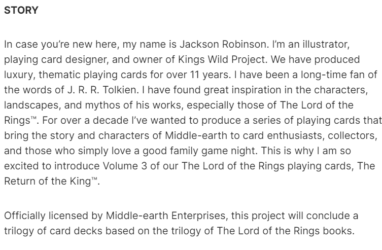
A button or a form that’ll allow the user to “commit” by either buying a product or sharing contact details:

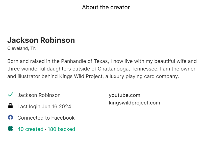
Testimonials, reviews, or logos of well-known clients can build trust and credibility. While in our example, reviews and clients are missing, as it’s looking to fund a product, at least the creator page adds an element of social proof to the campaign:
Images or videos of high quality that reinforce the headline, copy, and social proof:

Proper use of keywords, meta tags, and descriptions can help the landing page rank higher in search engine results.
Using landing pages is a long-standing practice used in marketing for several good reasons:
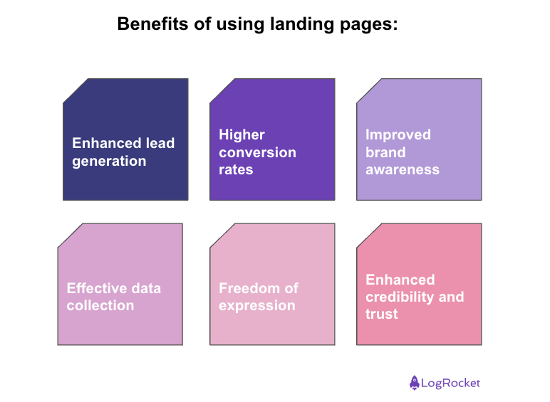
Landing pages are optimized, easy to optimize value proposition pitch. There should be no additional pages or things to distract the lead, only condensed reasons on why the person should use the call to action.
Focusing your value proposition focus will naturally guide the user journey to the intended call to action. When you do this, it’s far more likely to achieve the goal that the lead was sent to the landing page for in the first place.
It’s easy to make a landing page beautiful and functional on every device and promote the brand behind the page and intended action. A great landing page will stick with the user and even if the conversion doesn’t happen, there’s a chance that a different page for another product with the same brand will do so in the future.
Landing pages should follow a specific UX flow to the CTA and thus, it’s easy to create tracking to verify the effectiveness of this funnel. Also, as it’s just a single page, the number of data points is limited and easy to verify on a technical level.
Unlike ads on popular ad platforms, your own landing page doesn’t need to follow a predefined template with limited characters. You can build it as you wish and focus on the selling points you believe will resonate well with your leads.
Testimonials, endorsements, and security badges on landing pages became an element that builds trust and credibility with your leads. While social proof isn’t a concept limited to landing pages, it can help to strengthen the effectiveness of them.
While all landing pages focus on getting the lead to interact with the CTA, there are two common types of landing pages.
Those pages are designed to collect user data, such as name and email address. The main purpose is to build a database of leads to convert into customers in the future. Thus, the CTA is a contact form with as few fields as possible. Use cases include:
Click-through landing pages are used in e-commerce either as a simple shop with the landing page as the product/service main page or as an intermediate page between a short ad and the actual shop. The use cases include:
Here are some expert principles to follow to make your landing page successful:
However, the most important advice would be to monitor your landing page using analytics and see what works and what doesn’t. If you can’t do A/B testing, still ask around for feedback to learn what images/text can be improved.
I did that for months on my landing page before I settled on the current design. The only reason I stopped is that I reached Pareto levels of success and I decided my focus should be placed elsewhere.
Here are three highly regarded landing page providers that you might consider, as recommended by Forbes:
Now, while a landing page is called a single page in this article, this doesn’t need to be the case. Very often, the homepage will act as a landing page and different subsections will be added in a way not to distract needlessly from the main marketing message of the home/landing page.
You could say that a landing page is the modern equivalent of flyers, but not limited to their static, limited form. Still, all in all, it’s just an advertisement and to make sure your landing page works, you need a great product or service to be in its spotlight.
Featured image source: IconScout
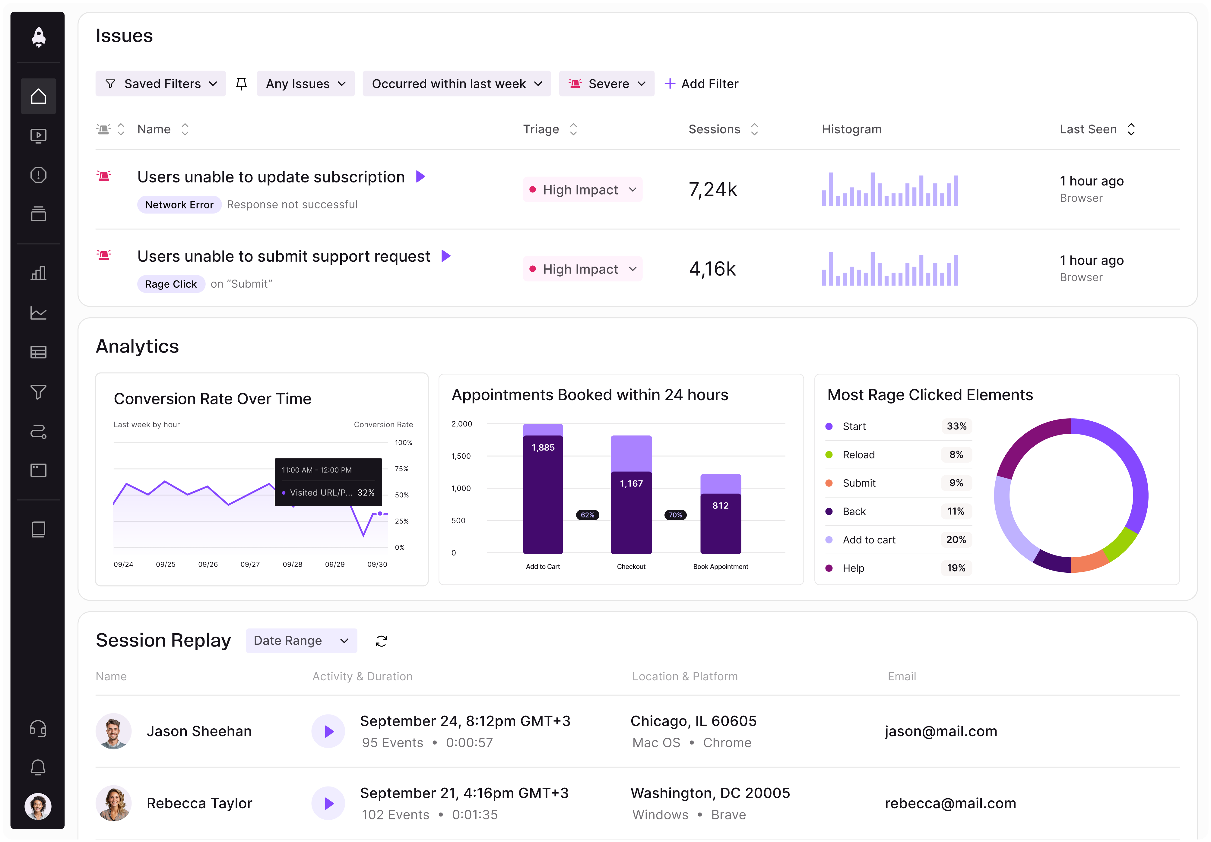
LogRocket identifies friction points in the user experience so you can make informed decisions about product and design changes that must happen to hit your goals.
With LogRocket, you can understand the scope of the issues affecting your product and prioritize the changes that need to be made. LogRocket simplifies workflows by allowing Engineering, Product, UX, and Design teams to work from the same data as you, eliminating any confusion about what needs to be done.
Get your teams on the same page — try LogRocket today.

Learn a 3-lens framework that helps product managers shift stakeholder requests from feature ideas to real problems and outcomes.
CPO and PhD Jen Wang covers “The Zone of Absorption” and why product teams are struggling to build when AI is shifting faster than anyone can keep up.

Explore four product team structures, when each works best, and how to choose the right model for speed, ownership, and clarity.

Learn how code-style reasoning helps product managers make sharper decisions, surface edge cases, and write clearer requirements.