The S-curve is a widely used project management tool across multiple industries. Most commonly, is used to track and analyze a project’s progress over time.

Understanding the S-curve helps product and project managers identify potential issues quickly and make decisions to get the team back on track before it’s too late. It also aids in predicting the adjusted completion date based on progress made over time.
An S-curve is a graph that represents the progress of a project over time. As the name suggests, it forms a loose S shape:
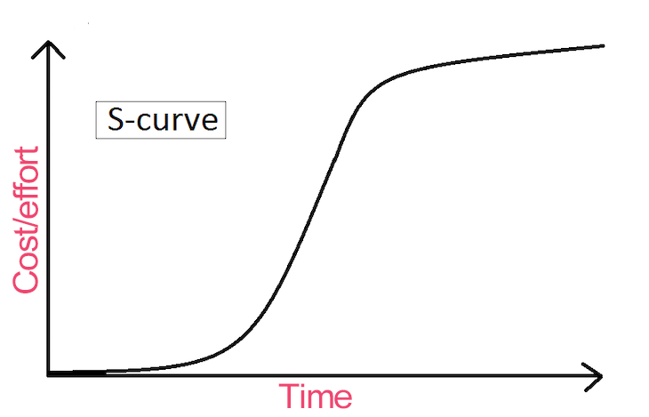
When an S-curve is used in product and project management to track progress, man-hours or effort/cost is plotted on the y-axis against time, which is plotted on the x-axis.
Initially, when the project starts, the team spends a significant amount of time researching the tasks at hand. This the lower part of the S to increase slowly over time. Once the team starts working intensively on the project, a rapid acceleration in progress forms the middle part of the S.
This point of maximum growth is called the ‘point of inflection’. After this stage, the project enters a mature phase, and the upper part of the S-curve begins to plateau as the team wraps up the final touches.
An S-curve has the following characteristics:
The S-curve displays the cumulative progress of a project over time. Comparing this graph with the projected timeline helps product and project managers determine whether the project is running behind or ahead of schedule.
S-curves can also assist project managers in identifying potential risks and obstacles, which helps them get the project back on track by making the right decisions at the right time.
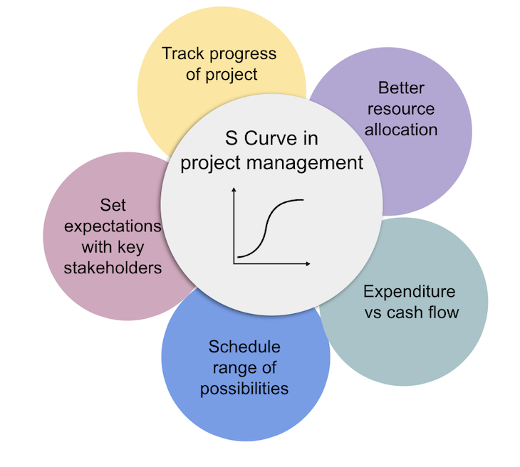
The S-curve is for activities including but not limited to:
To track the progress of a project, plot the projected progress against available resources and time, which creates a baseline curve.
Once the project starts, plot the actual resources consumed over time. Comparing the two graphs can help you determine whether you are on track, lagging, or ahead of schedule.
If the project is falling behind, you’ll need to make crucial decisions at this point, such as increasing the size of your team or fast-tracking activities to get the project back on track.
Being aware of the project’s progress compared to the baseline, along with potential issues or challenges, can help you prepare before communicating the project’s status to stakeholders. Presenting the S-curve to stakeholders provides a platform to explain the current status of the project and present it visually.
The S-curve can help you identify the optimal time to allocate the required resources to different stages of the project.
By analyzing the S-curve, you can ensure that the necessary resources are available at each phase, reducing the risk of timeline delays. As a result, resources are optimized and not wasted or lacking.
Typically, project budgets are released in phases. In addition to indicating the cost needed for the project over time, the budget release can also be displayed over time.
This provides a visual representation of the comparison between the cost required at each phase and the funding available at that phase. In this way, project managers can gain a complete view of any potential risks of running low on cash flow throughout the project’s timeline.
A banana curve can be created by generating two overlapping S-curves. The first S-curve is created using the early start date and early finish date, while the second S-curve is created by inputting the late start and finish dates. This generates a graph that looks like a banana by joining these two S-curves.
Project managers often use this ‘banana curve’ to estimate the earliest and latest start times for tasks within the schedule, without impacting the overall project timeline. This displays the flexibility that can be allowed in the schedule during project execution. If the actual progress of the project aligns more with the lower S-curve, which includes late start and finish dates, it is time to look into steps that can be taken to correct the project’s progress path.
Depending on what you are trying to monitor, there are different types of S-curves you can use. The types of S-curves most commonly used in product and project management are:
The cost S-curve is a graphical representation of the planned and actual costs of a project over time.
A cost S-curve is useful for projects involving labor, non-labor, and material costs, capturing the cumulative cost of the project against the planned cost. It is helpful in determining the project’s total cost and cash flow.
An effort S-curve displays the cumulative effort required against the planned effort for a project. Also known as the man-hours-vs.-time S-curve, the effort S-curve is ideal for labor-intensive projects.
The curve shows the actual effort below the planned effort if the actual effort is less. If the actual effort is more than the planned effort, then the actual effort line is above the planned effort line.
Every project has a planned timetable defining the required resource allocation and schedule of activities as the project progresses with time.
This optimal progress of the project, aligned with the planned activities needed to finish the project within a predetermined timeline, is called a baseline S-curve. It is created based on projections before a project begins.
Now that we understand the importance of S-curves in project management and how they can help you make the right decisions at the right time, let’s delve into the steps to create an S-curve:
The first step is to identify the project’s scope — i.e., what needs to be covered as part of the project. Clearly outline any items as descoped or out of scope to avoid confusion. This will help set the right expectations with your team and key stakeholders and avoid ambiguity regarding the project’s scope.
Once the scope is identified, list all the activities covered under the scope and the duration required for each activity.
Determine the sequence of activities that must be completed on time to ensure the project is finished within the required timeline. This sequence of activities, which is used to lay down the optimal or baseline S-curve, is the critical path.
To determine the baseline S-curve, you will also need to determine the duration of each activity. This information will help capture the project’s progress over time.
The next step is to calculate the percentage of completion for each activity — i.e., indicate how much a project has progressed since it started after completing a set of activities.
This information will help capture the project’s progress over time in terms of percentage until it is completed or reaches 100 percent.
By this step, you should have all the information required to plot the S-curve using the percentage of completion and the duration of the project.
You can use the baseline S-curve, plotting the planned activities’ effort and duration before the project begins. Then compare the cumulative graph of the actual activities against the baseline S-curve to gauge the project’s progress.
There are several tools, both free and paid, you can use to create an S-curve graph. Some of the most common types of solutions include:
Microsoft Excel has various built-in functions that can be used to calculate the cumulative man-hours or cost and the duration of a project to plot the S-curve.
Functions like SUM, COUNT, and AVERAGE can be used for basic calculations, while more advanced functions like VLOOKUP and INDEX can help with retrieving and organizing data from different sources. Excel also provides charting tools that can be used to visualize the S-curve.
These operations can also be carried out using alternative spreadsheet tools such as Google Sheets, which offers similar functions to Excel. Google Sheets has the added benefit of being cloud-based, which allows for real-time collaboration among team members.
Other alternatives, such as LibreOffice Calc and Apache OpenOffice Calc, provide similar functionalities that can be used to create S-curves as well.
Many project management software offerings have built-in features to calculate the percentage of effort completion or cost incurred and plot an S-curve accordingly. Some popular paid tools include:
These tools often provide advanced features for tracking progress, managing resources, and generating reports.
There are also some free tools that provide S-curve functionality, such as GanttProject and ProjectLibre. These tools may have fewer features compared to their paid counterparts, but they can still be helpful for small projects or teams with limited budgets. At the very least, you can create Gantt charts and track project progress using S-curves, making these open-source tools suitable for basic project management tasks and even some advanced use cases.
Before you start using S-curves to make decisions you should understand its limitations.
The S-curve indicates any project timeline deviation from the planned timeline, but does not provide insight into the causes of such deviations. Identifying the causes of any deviations might require more effort and time.
The project’s scope may change over time, so you’ll need to adjust the S-curve accordingly.
The S-curve is beneficial only if the data is entered and analyzed frequently. Additionally, the data entered to calculate the plot must be accurate to represent the project’s actual progress. Any data manipulation will not present an accurate picture.
As a result, using a S-curve graph might not be the most suitable technique for complex projects or projects with a high degree of uncertainty in terms of scope, timeline, or resources.
A S-curve graph can be a valuable tool to help you track, analyze, and predict project progress. Understanding the various types of S-curves, how to create them, and the tools available can significantly enhance your ability to make informed decisions and improve product outcomes.
While there are some disadvantages and limitations to using S-curves, being aware of them can help ensure that the technique is used effectively and in appropriate situations.
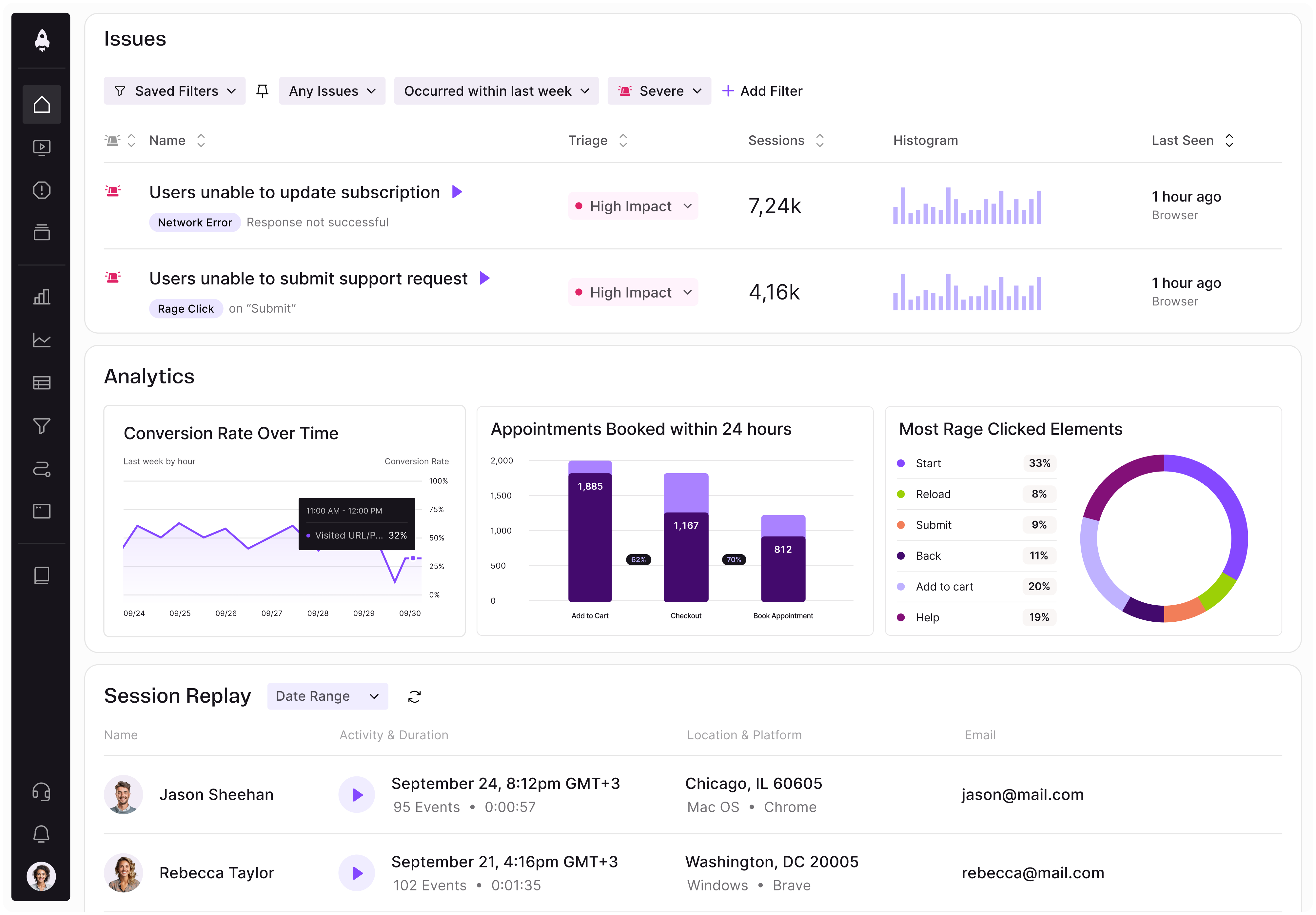
LogRocket identifies friction points in the user experience so you can make informed decisions about product and design changes that must happen to hit your goals.
With LogRocket, you can understand the scope of the issues affecting your product and prioritize the changes that need to be made. LogRocket simplifies workflows by allowing Engineering, Product, UX, and Design teams to work from the same data as you, eliminating any confusion about what needs to be done.
Get your teams on the same page — try LogRocket today.

Learn a 3-lens framework that helps product managers shift stakeholder requests from feature ideas to real problems and outcomes.

CPO and PhD Jen Wang covers “The Zone of Absorption” and why product teams are struggling to build when AI is shifting faster than anyone can keep up.

Explore four product team structures, when each works best, and how to choose the right model for speed, ownership, and clarity.

Learn how code-style reasoning helps product managers make sharper decisions, surface edge cases, and write clearer requirements.