Sprint reviews are an intriguing topic.

The underlying idea seems great, but the reality is often completely different.
Various aspects, such as company culture, the software delivery process, and human factors often cause sprint reviews to become boring status updates for stakeholders.
Sprint reviews are ridden with so many anti-patterns that ineffective reviews become the status quo. We often don’t care about challenging it anymore.
In this article, you will learn what a sprint review is and better approaches to avoid wasting your time on ineffective reviews.
Officially, a spirit review is one of the scrum ceremonies. The goal of this meeting is to inspect the increment delivered in the previous iteration and determine the direction of further iterations.
In reality, however, sprint reviews look completely different in different companies. The only part that holds true is holding them every sprint.
And honestly, there’s nothing wrong with it.
Any meeting, whether it’s part of the scrum guide or not, should be tailored for the specific needs of a specific time in a given time.
So why are sprint reviews so ineffective?
After working on numerous teams and companies and talking with various product managers and scrum masters alike, I identified the four of the most common antipatterns. Let’s explore each of them to know what to avoid:
PPT driven reviews are somewhat a surprising anti-pattern.
On the one hand, it’s often discussed that you should show instead of telling and that the product is more important than the presentation. Yet, I’ve still seen powerpoint based reviews more often than not.
In full honesty, that’s how we ran our reviews for the last couple of months!
I believe they are common for the following reasons:
However, carefully-crafted slides don’t encourage discussion and collaboration. PPT driven reviews often end up with the product team talking for 90 percent of the time, and if you’re lucky, other participants ask questions and give comments for the remaining 10 percent.
Usually, if a team doesn’t fall into the PPT driven review trap, they tend to fall into the demo trap.
They share their production environment and walk through the features they delivered, showing various use cases and clicking every possible button.
The intention here is usually to showcase the work, teach others how the new feature works, and gather some feedback.
Demos are often relatively valuable meetings, but you still can do better.
Demos tend to focus too much on the past and present, completely ignoring the future, and the feedback given during the demo is already overdue and expensive to implement.
Whether with PPT or not, many reviews often default to a status meeting.
The team shares what they did, what they’re working on, and what they will work on in the future.
Although it works well for alignment purposes, you could just send an email.
Last but not least, treating the review as an internal meeting is a wasted opportunity.
There’s just too little fresh perspective and feedback you can elicit from your own silo to be effective.
Truth be told, I often fell for these anti-patterns myself.
Not so recently, our reviews were focused on preparing beautiful slides and giving a big status update on what we are doing, sometimes with demo parts.
We didn’t get any relevant feedback, discussions were scarce, and the overall ROI from this meeting didn’t even compensate for the time we spent preparing. We also had two or three external visitors at best.
At some point, we decided to change something.
Let me share three changes that helped us improve the value we get from reviews tenfold:
In the past, our reviews ranged from twenty to forty slides.
We didn’t want to spend time every sprint preparing a new PPT deck, but we also understood the value of having a quick summary in the form of slides.
We found balance in defaulting to three slides. No more, no less. Well… five if we count the default welcome and goodbye slide.
The first slide was the bullet-point list of relevant updates. We found that it’s worth sacrificing three minutes or so to give a recap of big changes, such as:
Although we shared these updates asynchronously on dedicated channels, we found that a solid, periodic refresher is a worthy enough investment.
Similarly to the previous slide, we created a bullet-point list of our current focus, both from a development and product discovery perspective.
We quickly recap what we focus on and close with two questions:
It’s a great conversation starter and one of the main value drivers of the meeting.
We often get feedback from customer support if there’s a potential priority issue that they see and we are ignoring, and people usually point out where we can find support or extra resources to help us out.
It fosters both alignment and collaboration.
Instead of doing demos of past increments, we spend the vast majority of the meeting discussing upcoming initiatives.
We found that live-sharing design files work best for us.
We briefly describe what initiatives we want to launch in upcoming features, and then team members walk the audience through the design file.
To ensure we foster valuable discussions rather than just deliver a boring overview, we always go through the files before the review and put comments in places where we’d like to get extra insight and feedback. Then, during the presentation, we stop every now and then and ask questions to kickstart the discussions we need. Examples include:
Presenting concepts in the design phase helps us get valuable feedback before we invest in development. It also helps us foster cross-company buy-in. Everyone has a chance to have their say and contribution, so later, they tend not to complain or critique our decision
Demos have great value, but we wanted our reviews to focus on the future, not the past.
We also noticed that some people tended to multitask during our demos. We can’t blame them. Not everyone is equally interested in each part of the product.
So here’s how we tackled it.
For smaller changes, we just record a semi-detailed Loom video walking the audience through the feature. We then post it on a dedicated channel and open a Slack thread for any questions and doubts.
For more complex changes that might be hard to grasp, we host a separate, open-for-all meeting.
I learned that the audience for backward-looking product demos and forward-looking product reviews differ, so doing these two activities in a single meeting doesn’t make much sense.
Surprisingly, changing the name of the meeting was game changing.
Since our reviews became fundamentally different from how other teams held reviews, the “sprint review” was strongly associated with a slide show and product demo.
We experimented with different names, such as “alignment meeting,” “open check-in,” and so on, but the one that worked the best was “direction planning.”
It positively influenced the attendance rate. As silly as it might sound, no one wants to sit through another team review, but everyone wants to be included in strategic planning sessions.
It also changed the mindset of people coming to the meeting. Since they expected to participate in “planning,” they were more willing to give their feedback, discuss designs with us and help us course-correct on our current initiatives.
Keep in mind that we first changed the format of the meeting and then the name to reflect it. It shouldn’t work the other way around.
The gap between a poor review and a great review is enormous. It can be a waste of time or the most valuable meeting of the week.
Don’t default to the status quo, and cover the topic of sprint reviews on your retrospectives regularly. Odds are you have plenty of low-hanging fruits that can help you make the most out of reviews.
I don’t encourage following our path blindly.
For example, our review didn’t cover roadmap discussions and plannings at all and focused more on specific initiatives and specific designs.
We did that because that’s what we needed the most. Our company-wide roadmap planning process was so robust that covering that on the review didn’t make sense, and our biggest challenges were last-minute design changes and fixes.
So we designed our review to accommodate what we needed the most.
You might need different things.
Your starting point should be to map areas that are most challenging for your team or areas where you could really use extra pairs of eyes and input and then design the review agenda to address these challenges.
Don’t waste time on reviews that are there just because “scrum guide says so.” Instead, identify the problems you have and use this meeting as an opportunity to address them. We did just that, and it worked like magic.
Featured image source: IconScout

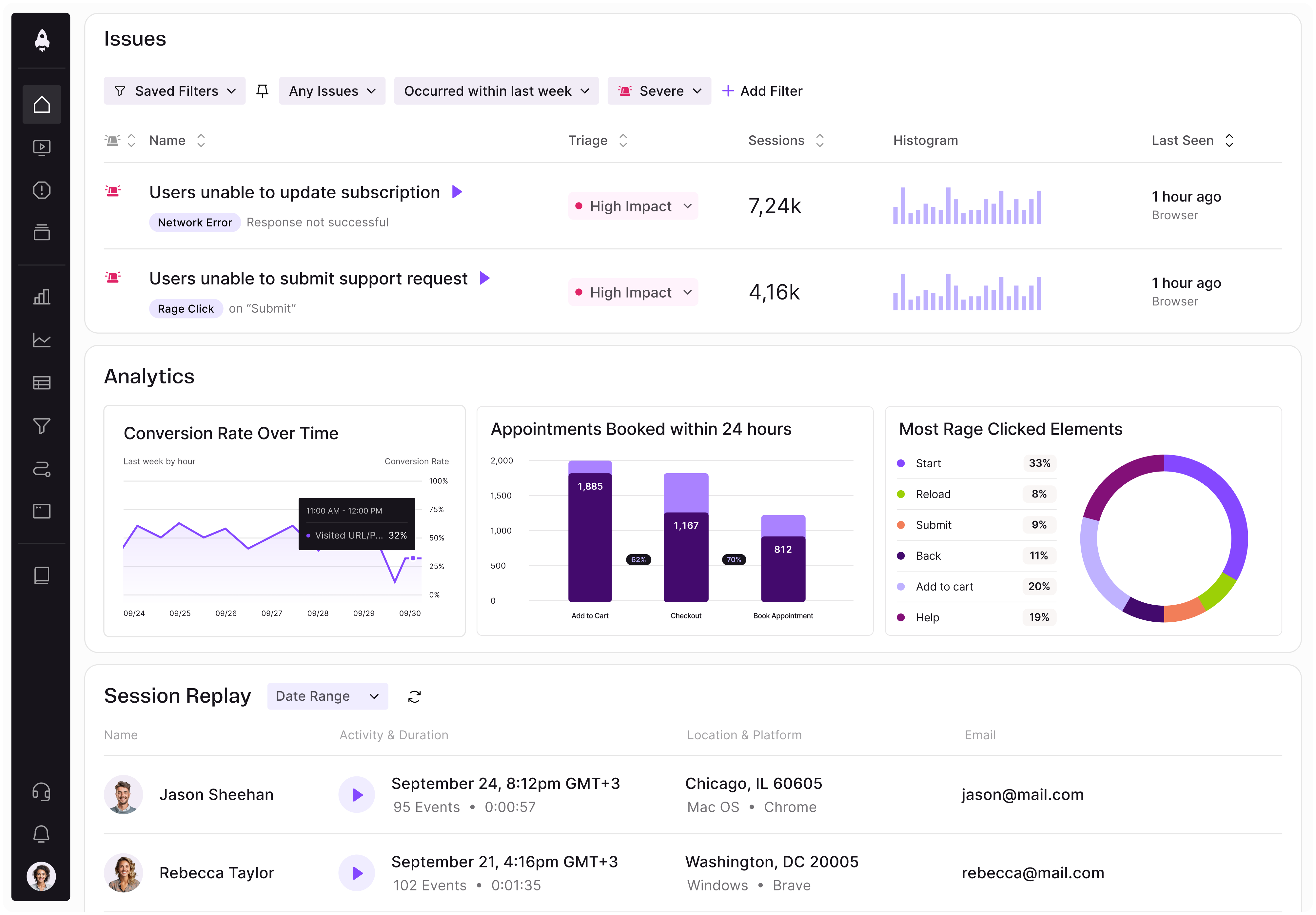
LogRocket identifies friction points in the user experience so you can make informed decisions about product and design changes that must happen to hit your goals.
With LogRocket, you can understand the scope of the issues affecting your product and prioritize the changes that need to be made. LogRocket simplifies workflows by allowing Engineering, Product, UX, and Design teams to work from the same data as you, eliminating any confusion about what needs to be done.
Get your teams on the same page — try LogRocket today.

Map AI data risks, vet vendors, run safer pilots, and build legal buy-in for AI tools without creating security gaps.

SVP of Product Sriram Iyer visits to chat about how he uses AI to launch the “thinnest slice of pizza” product and shift mindsets around AI.

Controlled scope creep can help PMs use capacity buffers, AI tools, and clear guardrails to turn new ideas into better outcomes.

According to SVP Julia Dalton, managing humans at scale and managing AI agents have a lot more in common than most people realize.