Oji Udezue is a Principal at ProductMind, a product management and product practice consulting firm. He is co-author of a product management book — tentatively titled Building Rocketships — that he wrote with his partner, Ezinne Udezue, and is slated to “ship” in summer 2024. Oji was recently Chief Product Officer at Typeform.com, a product that enables marketers to build interactive forms and surveys, and led content, creation, and conversation at Twitter. He was also Chief Product Officer at Calendly in the era when it achieved unicorn status, served as Head of Product of Atlassian’s communication division, and has worked in various product leadership positions at Spiceworks, Bridgewater Associates, and Microsoft.

In our conversation, Oji talks about the importance of “taking advantage of how humans behave,” i.e., understanding the psychology behind customer onboarding and carrying that through the experience. He shares lessons learned through A/B testing, including how providing more options is not always better. Oji also discusses the “holy grail” of personalization strategy: threading account activity directly into the personalization engine to create a customized experience for each customer.
Many people believe that a product-led approach is about self-serve or being able to quickly sign up for a product, but I don’t think that’s what is core to that ethos. Being product-led is an emerging art in building software companies where you match the evolution of how people want to purchase software today with the customer-centric ease of functionality that is becoming the norm. This is in contrast with say 10–15 years ago when the CIO made purchases for people by proxy. That person would be primarily concerned with cost and having a feature list that seems to cover all the bases, but rarely with usability.
As people become more used to really good software — especially in their consumer life — and know whether this app works for them or not, the purchasing power has moved to the edges of a corporation. People who actually use these applications have relatively more power now to make or inform purchase choices. So you have to build software that is as refined and functional as consumer software, with the user or customer at the center. It’s about understanding how they think about it, how they approach it, how they discover it, how they use it, and using that to deliver on the software.
I want to emphasize that onboarding isn’t just some rote growth thing. In the book that my partner and I are writing, we think about onboarding as supporting the purchasing that people do for software — their journey when they purchase software that solves a problem for them. If you walk into a grocery store, things are strategically and psychologically placed. Fruit is often in the back because if you need it, you have to walk through the whole store to get to it. The cold storage is in a very specific place and, as you’re checking out, you see the impulse buys.
This mirrors growth very well. Onboarding is how to support discovery and purchase. Someone comes from the internet to get information about your software — what are they feeling when they see your value proposition, which is the first thing they see? How easy is it for them to get in to taste what you provide? Do you tell them to get a demo? Do you give them a freemium taste? It’s important to understand that it’s not just about building a growth product in a funnel; it’s about how your customers feel and how to nudge them to get them to where you want them to be. You want to optimize this so there’s cognitive clarity all the way through and you’re taking advantage of how humans behave.
In terms of what you measure, there are steps that you don’t see. You measure how each step converts or drops off, but the layer that people don’t pay attention to is whether you can measure the confidence and clarity people have at each stage. Optimizing is about looking at the actual physical drop-off if it’s instrumented, but also the confidence level that people have for each screen. You should see high confidence and that people think, “I understood what that said before I clicked ‘next’. I had a good idea about what was going to happen after.” If you correlate those two things, that’s very helpful.
Onboarding should be quick. Making it drawn out is its own goal, so it has to be spare. One of the things that growth product managers can do is give themselves a constraint, only doing this in three screens, because constraints unlock creativity. In our book, we map the psychological steps a customer goes through before a purchase. There are six main steps:
One of the consistent things I’ve found through A/B testing is that having fewer smart options — and I don’t mean the onboarding steps — is really important. In Calendly, when you were done with onboarding and had moved into the familiarization phase, we had three example sets for you: 15-minute, 30-minute, and one-hour-long meeting times. We’d show that you can set those for different times in your Calendly link.
Through A/B testing, we eventually found that offering two example sets is actually more effective. Three options were harder to explore and slightly overwhelming; people felt safe with two. Same thing in Typeform — originally, when you clicked the button to create a new Typeform, there were two options. Then, we added a third option to build a Typeform through AI. Eventually, we removed one of the two legacy options because we found that people converted better if they had only two options and the AI one was too powerful to take out.
One of the worst things you can do is provide a blank slate. You want to show what “good” looks like, so you should always provide a first project or a test project for new users.
You should do all things in a cross-functional team, period. That team should hold the goal together. I expect all A/B testing in a growth team, usually 2–4 engineers, a PM, and a designer, to be carried out cross-functionally, and because it’s the growth team, they’ll have some hours from the data analyst and some hours from user research. You still need user research in growth.
Sometimes, growth teams will do way too much testing. Some things have to be discovered by talking to customers, and then you can build. If you’re in a consumer world, like Facebook, it’s more efficient to keep testing, but if you’re in a B2B SaaS world, the product managers and user research people should interview new customers and map their cognitive confidence throughout the process. Once they have that insight, they can either just build it or test it. Testing is a response to risk and uncertainty, so when you’re certain (from discovery), just build something. That’s the ultimate test — it’s safe because you understand what people are thinking and experiencing through the product.
It’s not so much that you don’t need to test it period, but realize that testing has a cost. Testing is quick when you have thousands of customers coming through because you can put up a test, get to statistical significance in a week through high traffic through the feature, and then decide. But if you have only hundreds of customers coming through (which is the case for most business software), a test could take a few months. Who has that kind of time to just answer a trivial question? No company does. Testing the consumer at the million scale is efficient, but testing at a thousand scale is expensive, so you have to make sure you’re testing a non-trivial point of risk and uncertainty.
But if you’re B2B SaaS, especially if you’re sales-led, then you’re not efficient. It may take you three months to get certainty with statistical significance. With that kind of scale, you have to discriminate on what to test because testing is expensive. For example, if you have a 10-step onboarding, you go to your customers and they’re like, “We hate this.” There’s no point testing eight or nine steps. Just build a five-step onboarding. That’s what certainty means.
Typeform was the first place I’ve seen personalization work well, and the team continues to pull in even greater personalization and capability. We’ve had this concept of responsive web design for a long time, which is when you come to software with a form factor, phone, or desktop, and the design optimizes for it. But there are only three variations, so personalization is this battle to get to more fine-grained, bespoke-ness depending on what the customer presents.
For actual features, it’s really about deciding what mental context buckets to put people in. Is it four buckets so you have four different variations? Is it 16? Or is it infinite — you tailor it for each customer? If you personalize correctly, people feel catered to and that you’re building something just for them that understands them.
Some things to think about are, “Is this a basic or advanced customer?” Those are a couple of buckets. You look at account activity and ask, “Are these customers heavy users? What’s the implication?” Maybe you show this group of customers all the advanced features immediately by default. Or people who use things in X pattern should have some kind of help on the side available. If you can thread account activity and put it into your personalization engine, that’s the holy grail.
It’s not even that sophisticated, it’s just hard to do. First of all, you have to quantify the lift that personalization gives you. Is it really going to make a difference? And then you invest in it. There’s a hurdle rate for personalization and a lot of teams don’t see that, don’t measure that, or experiment to figure out if there’s an optimization opportunity through personalization. They do that sometimes with support questions, but they don’t look at changing the UI based on account activity.
At Typeform, we did some experiments to figure out if personalization would work and proved that it has some measurable, marginal change. We had the technology. To do this, you have to take in all kinds of data about the customer, their account activity mostly, their support activity, and how they’re showing up in Zendesk. You might check if it’s communication- or content-related, and you may even scan the content. Technology is just getting to the point where it makes sense to leverage it to create a rules engine that can work for various kinds of software.
Technology and the potential of AI are important because they make it more affordable to do this. You take whatever signals you have, run it through an AI, and it comes back with suggested changes to tailor it to a particular customer. It’s going to get cheaper to personalize, and I think that in 10 years, a lot of software will be personalized to each individual customer. What we’re doing right now is very coarse-grained, and we’re preparing to build the rules engines to make this more and more personal over time.
If you apply personalization to onboarding, like asking some questions at the beginning of onboarding and modifying the experience to those questions, then you should just measure conversion. The interim metric you should measure is the marginal increase in activation. And the intermediate measures are things like intensity — if people use it more. That and churn are correlated; if people are using your product more intensely because it’s personalized, they’re less likely to churn.
One other thing to think about in personalization is time to value. If the people who are personalized are going through the workflow faster, you should measure that relative to non-personalized users.
We already have laws that allow the customer to control their data. I think the main thing is to secure customer data, which is part of SOC 2 compliance, and only share it if there’s consent. Account activity is typically only shared if there’s some kind of subpoena. One interesting aspect is encryption. We encrypt passwords, but how about account activity? Is it ever transported around without encryption?
We also don’t know if it’s personally identifiable. Even a rules engine is just processing activity for millions of people, but it’s in a secure black box — no human needs to know the details if it’s well designed. I think it becomes an issue when that stuff is de-anonymized and shared with third parties, which you sometimes see in the consumer world. Because the customer is the product, sometimes they’ll share the activity with third parties to monetize a person who’s not paying anything and watching ads. I’m curious to see where that goes in the future.

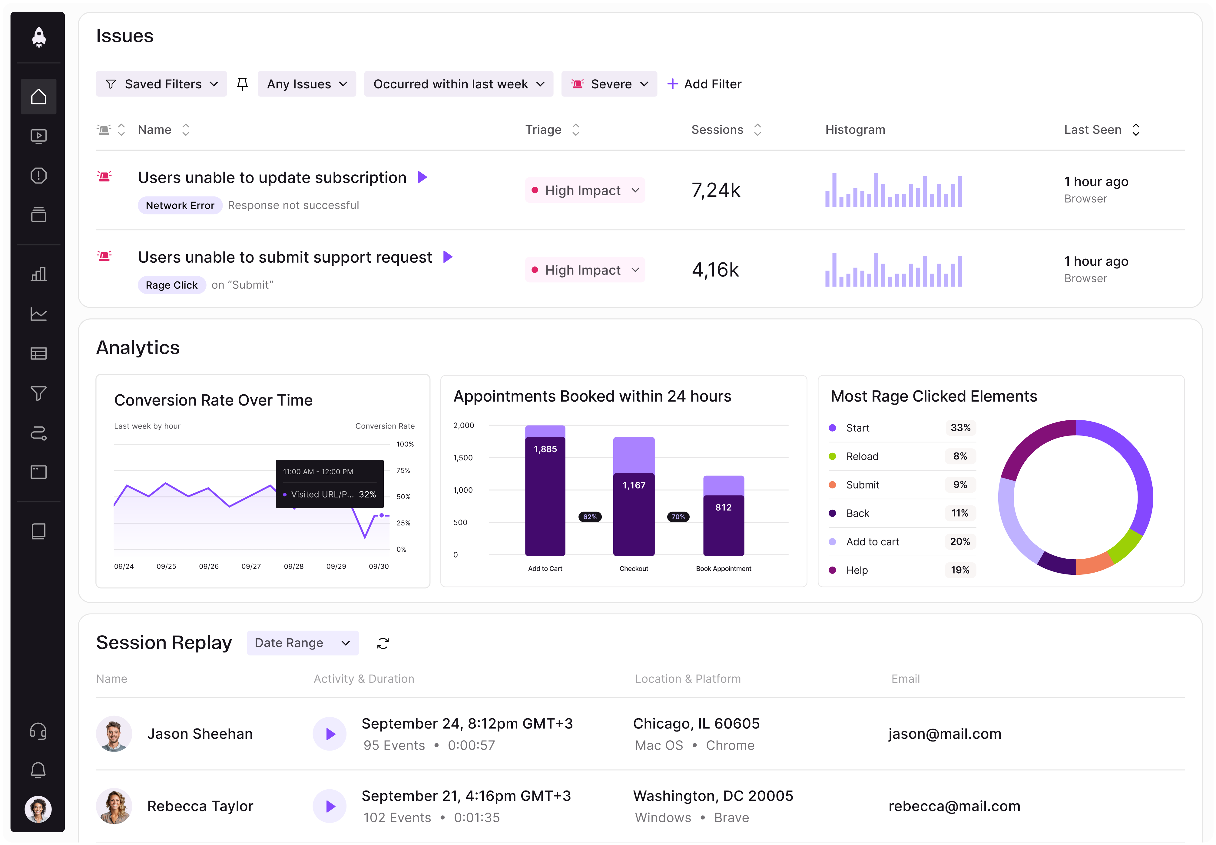
LogRocket identifies friction points in the user experience so you can make informed decisions about product and design changes that must happen to hit your goals.
With LogRocket, you can understand the scope of the issues affecting your product and prioritize the changes that need to be made. LogRocket simplifies workflows by allowing Engineering, Product, UX, and Design teams to work from the same data as you, eliminating any confusion about what needs to be done.
Get your teams on the same page — try LogRocket today.

AI can make PM thinking generic. Learn how to use it without losing judgment, user nuance, or product differentiation.

Learn a 3-lens framework that helps product managers shift stakeholder requests from feature ideas to real problems and outcomes.

CPO and PhD Jen Wang covers “The Zone of Absorption” and why product teams are struggling to build when AI is shifting faster than anyone can keep up.

Explore four product team structures, when each works best, and how to choose the right model for speed, ownership, and clarity.