Natalie Adams Barnes is a product executive with 15+ years of experience building innovative consumer-facing products for household-name companies. When she left CBS Interactive in 2012, Natalie had heard of the dance craze Zumba®, but she had no idea there was an actual business behind it. She took a leap of faith and joined the company as its first product hire, and the rest is history.
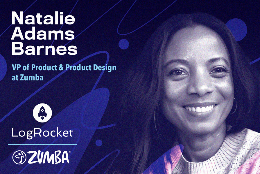
Today, Natalie is VP of Product and Product Design at Zumba, where she works tirelessly with her well-aligned teams to empower instructors around the world through technology. In our conversation, Natalie recalls the challenges she faced when introducing agile into an organization that had grown comfortable with inefficient waterfall processes. She also pulls back the curtain on her approach to prioritization and the user research methods that help her team walk — or, perhaps, dance — in their customers’ shoes.
Zumba was a lot smaller than CBS Interactive. It had around 200 employees, whereas CBS Interactive had thousands. So it was definitely a change because, where I came from, everything was corporate and structured. When I joined Zumba, the product management infrastructure and thought process was not established, so I had the opportunity to start fresh and create a process from scratch.
This was also at a time when the waterfall process was the standard across the board and agile, though very new at the time, was definitely a better process for product development. I seized the opportunity to start creating processes and educating the business and senior leadership on the benefits of moving in this new agile direction.
My role was basically to be the bridge between the business and technology, but the role resided within technology. The rest of the business needed visibility into Jiras and projects on an ongoing basis so key decisions could be made. My first goal was to create a clear, transparent process and build the relationship between the business and technology.
The early stages was a huge learning for the business and for me as well. My role was new to Zumba and the value of the role wasn’t clear yet. There was no blueprint. I just had a list of project requests — didn’t even have the person that requested them, just names of projects.
I started by making sure there was transparency with our process — making sure the rest of the business understood how products get developed, what engineers do, and what their needs are. It was difficult for both the business and technology because the way they worked was so different. It took some time to understand the needs of the different departments and their processes and expectations.
Based on this understanding, I tweaked how we rolled out that agile process to the rest of the business. It took a lot of meetings, a few iterations, and buy-in from the owners and the CTO. In the end, we had a clear, documented, and shared process with automated updates, regular checkings, all the mechanics of an agile development process, as well as a clear product planning and prioritization process.
Zumba has instructors all over the world. We also have consumers, who are the students that our instructors teach classes to. But our main focus, our core audience, is those instructors. That’s who we’ve always built products for.
A lot of the products we build are actually behind the log-in. You have to first take a training, then become a part of the Zumba Instructor Network, which we call ZIN, to get access to a lot of the tools. The tools we build are software products that allow instructors to post their classes,
manage their students, and more.
For example, one app enables ZINs to get their monthly music and choreo delivered to them.
We also have an app very similar to Canva that enables instructors to create marketing assets for their classes and share it on social media to promote their classes.
When COVID happened, we had to shift quickly because a lot of the classes were done in person. Suddenly, instructors weren’t able to teach their classes. In a matter of a few months, after collaborating with Zoom, we had a live streaming feature ready. In addition, we built an on-demand platform to allow them to upload recorded classes.
I have different prioritization methods I use depending on whether it’s a feature, a project, or a bug. Typically, if it’s a feature, I would use the ICE method. I would ask, “How many ZIN members is this particular feature going to affect?”
Of course, critical bugs and blockers would take priority, and then the other Jiras or bugs are prioritized based on impact. We look at data to try to understand the problem and how many people it’s impacting. I would also ask, do we have any qualitative data on this issue or why they need this feature? I try to use data almost always when I’m prioritizing one thing over the other.
For user research, one thing I always try to add to my team’s goals is to do a few monthly interviews with our users. It’s so important as product people to really understand how your users are using your products and what is valuable to them. Without that, it’s hard to understand what to build and know what would have an impact on your end users.
We don’t usually set up a list of questions for these interviews; you’re just talking to the consumer like they’re your friend and you’re just trying to understand their life as a Zumba instructor. We try to understand, what are they loving and what do they need? What are the things they wish they had?
Sometimes, we’ll go to a Zumba class or Zumba training just to understand what that process looks like. My lead product designer and I once went out to a training where people get trained to become an instructor. It’s an eight-hour-long training — it’s a long day. So we wanted to see how the trainers actually train them. What are the questions that they have during the training?
One of the things potential instructors can do at a training is sign up to become a ZIN member, which almost all of them do because they value the support offered if you become a part of ZIN. This was done at the training with physical signup forms at that time, which took time away from them learning the more important skills to become an instructor. So when we get back to building features for them, we understood, for example, that we needed a digital alternative that gives them that time back at the training.
We now have a solution where, as potential instructors are registering for the training, they can also register to become a ZIN member. We also try to address the questions they might have as they’re trying to do so.
In addition to user and field interviews, we do surveys from time to time. We do NPS scores with open-ended questions at the end. And, of course, we watch user sessions. We’ll each pick a section or a segment and look at how they’re going through our site.
In some cases, we do listen to customer service calls because I think that tells us a lot. Let’s say someone doesn’t want to be a ZIN member anymore or wants to put their membership on hold. It’s good to hear why, maybe we are not offering the right benefits or maybe they’re unaware of some of the benefits we’re offering. And, lastly, we review chat logs.
Our A/B test process is fairly standard, but we are adaptable and flexible, so we adjust as needed and are constantly learning and improving. First, we figure out what exactly we want to make better. It could be anything, like increasing conversion or decreasing churn. Then, we pick one thing to change up — let’s say, changing the verbiage on a CTA — and we make a guess (our hypothesis) about how this change might increase conversions by, say, 10 percent.
Next, we create a JIRA to develop our CTA with the new verbiage. That’s our variant. Meanwhile, we keep the original as the control. We segment our audience into two groups randomly; one group sees the old version, and the other gets the new one.
Now, the real fun begins: we let the test run its course until we’ve got enough data to be sure we reached statistical significance. At the end of it all, we dive into the data. Did our new CTA verbiage really make a difference? We figure out if our guess was right or not, share what we learned with the team, and decide if we’re going to stick with the new verbiage.
We also document everything. Every test we do is like a piece of the puzzle, helping us get smarter and make even better guesses in our future tests.
We recently did an A/B test in our training registration process. We have two different signup paths: one for new visitors and another for those we’re retargeting. New visitors first see a page explaining what it means to take training and become an instructor. Retargeted visitors go directly to a page to find a training, which is very different from the find a training page on the new users’ flow.
We noticed that new visitors, after learning about the training on the first page, had a higher conversion rate on the following page (which helps them find suitable training) compared to the retargeted group, which was directly sent to a different version of this page.
Our test involved directing some retargeted visitors to the second page the new users see to choose a training, thinking it might improve their conversion rate. However, the initial results didn’t show the improvement we expected, and we couldn’t run the test long enough to be conclusive. We plan to revisit this test in the future.
We’ve also tested things like placement of modules on pages, two prices versus three prices, different CTA verbiage, etc. For the placement of the modules on pages, at one point, we did a multivariate test where we tested the same modules in different layouts on a page. Because sometimes, with just an A/B test, you don’t get the true story, especially when you’re trying to test a page with different modules, to ensure it is providing information in a layout that resonates with the audience.
It’s so hard to ignore the impact of AI. I think it’s going to evolve to not only change the products that we build, but it’s also going to change the way we work. So the earlier we can understand how to use it — and be careful, of course, and be knowledgeable about how to use it responsibly — the better off we’ll be.
I don’t think it’s something you should shy away from. I use it for so many things. Of course, I don’t enter any personal data. I use it for simple day-to-day things, too, just so I can get familiar with it. And it’s an area that definitely fascinates me.
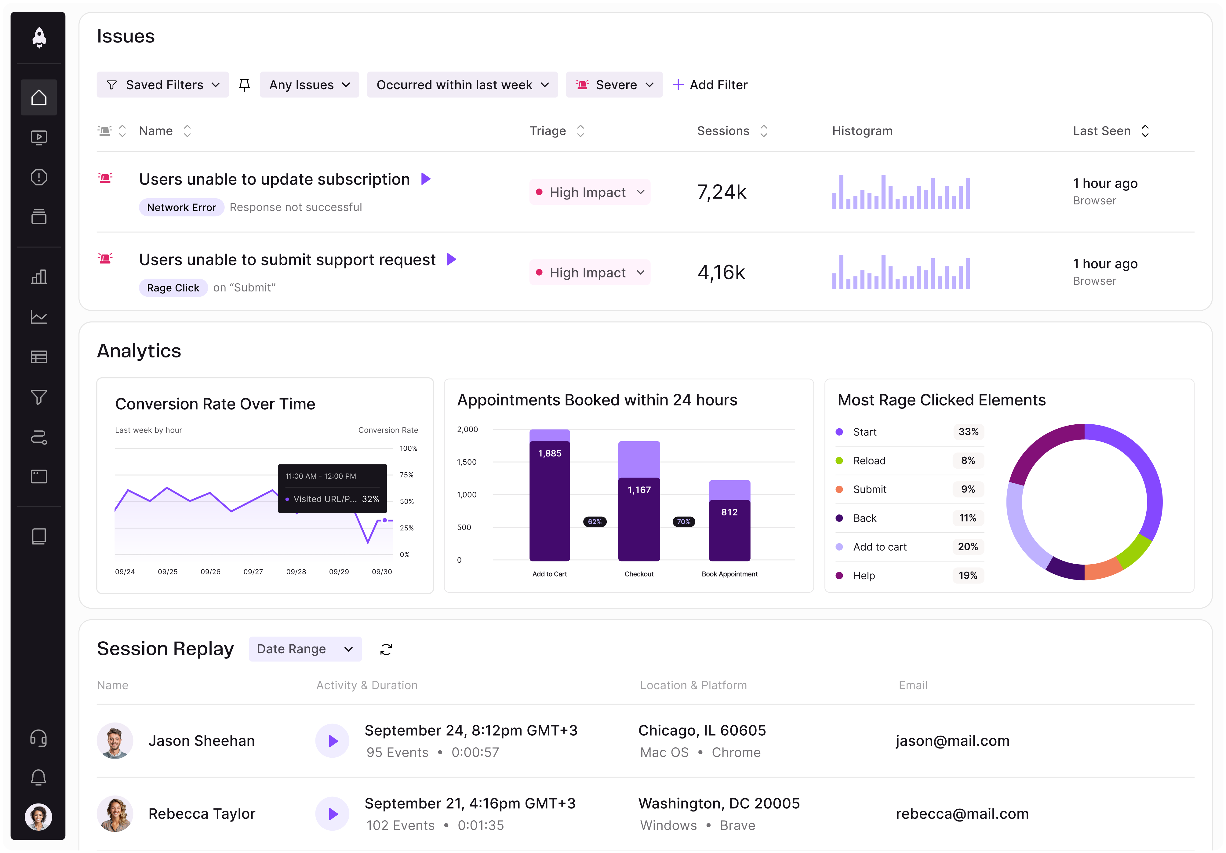
LogRocket identifies friction points in the user experience so you can make informed decisions about product and design changes that must happen to hit your goals.
With LogRocket, you can understand the scope of the issues affecting your product and prioritize the changes that need to be made. LogRocket simplifies workflows by allowing Engineering, Product, UX, and Design teams to work from the same data as you, eliminating any confusion about what needs to be done.
Get your teams on the same page — try LogRocket today.
Controlled scope creep can help PMs use capacity buffers, AI tools, and clear guardrails to turn new ideas into better outcomes.
According to SVP Julia Dalton, managing humans at scale and managing AI agents have a lot more in common than most people realize.

AI can make PM thinking generic. Learn how to use it without losing judgment, user nuance, or product differentiation.
Learn a 3-lens framework that helps product managers shift stakeholder requests from feature ideas to real problems and outcomes.