Marc Singer is Vice President of Product Management and Design at OrthoFi, a software that connects patients with quality orthodontists and general dental practitioners. With a passion for products that interface between technology organizations and external customers, Marc has worked for notable organizations such as NBC News, NBC Sports, The Today Show, CNBC, REI, and Healthgrades.

Marc sat down with us and discussed OrthoFi’s unique position in helping dental providers find the right type of conversions, i.e., patients at the right risk level, to spare them from delinquencies downstream. He talked about the careful balance between removing barriers to patient conversion and the flexibility they need to pay for orthodontic treatment. Marc also shared the benefits of visiting customer offices in person, including experiencing the business that can surround the orthodontic practice, and how that qualitative feedback informs the product.
I broke into the technology space in 2002. msnbc.com was looking for tier-one help desk support for the Salt Lake City Olympics website they were hosting. I started the overnight graveyard shift there and moved my way up through MSNBC and, eventually, the NBC News chain. I went from the operations side to technical account management to program management, eventually becoming the lead program manager to coordinate with the editorial teams for MSNBC. That’s how I got started in the product management space. They didn’t have product managers at MSNBC, so program management was the de facto.
When NBC News took over MSNBC, it was a joint venture through MSNBC, Microsoft, and NBC. NBC bought out the Microsoft share and a lot of the responsibilities shifted over to New York. I’d been there for 12 years, so it was time to explore something new. I wanted to go somewhere scrappy, so I found a small company in Seattle in the dental and ortho software space. I spent a few years there before moving over to REI as a project manager on their mobile apps. I had the opportunity to move to Denver from Seattle, which is when I started a job at Healthgrades. I then found this opportunity at an early startup in its first five years of life, and I wanted to get in early to have an impact there. I’ve been happy at OrthoFi ever since.
What I love most about OrthoFi is solving challenging problems, working with customers to understand what those problems are, and interpreting how we might solve them. I love working with great teams, both on the technical side and also on the non-technical side, to formulate solutions. I grew up playing a lot of sports, so the concept of being on a team and winning as a team means a lot to me. That’s where I find a lot of job satisfaction.
Part of working for a smaller company is that you get opportunities like this — to work in a cross-disciplinary way. The opportunity became available to me to manage the design team, which had been rolling up to the previous vice president of product at OrthoFi. He knew that I was looking to continue to grow my career and expand my ownership areas, so he offered me the opportunity to manage the designers.
I’ve always found myself drawn to the discipline of design and what goes into building great UI/UX. The best relationships I’ve had in my career have typically been with design because product and design work so closely together. There’s a lot of research that goes into it. It didn’t feel like a big leap for me to manage a design team and I was looking forward to the challenge. I’ve been fortunate to have great designers working for me at OrthoFi and that makes the job easier too.
From a high level, the principle is how do I remove friction from the conversion funnel? The more obstacles you put in front of someone who’s trying to get something done within the user experience, the less likely they are to convert, and the more people you’ll see dropping out at different stages.
At OrthoFi, we try to make the process as seamless as possible and very intuitive for a patient or parent of a patient to make decisions on what are usually expensive procedures. The average cost of treatment is anywhere between $5,000 – $6,000. That’s where OrthoFi helps by offering an open-choice model. This model helps parents or patients decide what they’re comfortable putting down for their down payment and what they’re comfortable with as a monthly payment that fits into their budget.
Also, OrthoFi doesn’t only help with conversion, we help with all the downstream activities as well. We collect from the financially responsible party on behalf of the practice once the patient’s treatment starts. For us, being able to convert the right patient at the right risk level so the practice and OrthoFi are not exposed to too many delinquencies downstream is super important to us.
We have proprietary logic in our software that puts financially responsible parties into risk levels. We give the practices the flexibility to configure what their comfort level is with the level of risk of delinquency, which works well for OrthoFi and our customers. We have very low delinquency rates on our patient accounts receivables. Whereas at REI, for example, it’s all about making the sale. You know what you’re getting with a new pair of boots or a new jacket, and you want to limit returns. In OrthoFi’s case, it’s not only the conversion you need to consider but the cost of collecting those monthly payments post-conversion.
It’s certainly a balance. You could set a price really low and have a very high conversion rate, but you’re not going to have a viable business. It’s really about balancing the needs of our customers, the viability of their business, and the cost of doing business with the ability to convert patients. First, as I mentioned before, creating a top-notch user experience so that you’re not putting barriers in place of conversion is very important. Second, we also need to consider the flexibility and how the user might pay for treatment.
If you go to buy a car, for example, many people will say something like, “$400 a month is my budget and I’m going to figure out how to make that happen.” Orthodontics is not much different. A parent might come into the office and say, “I think I can do $300 a month to pay for my child’s treatment.” OrthoFi gives the flexibility to meet that $300 a month threshold, but also receive treatment from a top-notch orthodontic provider. Whereas without OrthoFi, they might have less flexibility and need to make three payments of $1,250 each or something like that.
A/B testing is a great way to test hypotheses. There are lots of assumptions that can be made with the way you’re designing a page, even coming down to where you’re putting a call to action. A lot of it’s about where the user’s eye is drawn to. We use session replay tools to monitor user behavior and how people are actually interacting with the software. Based on what we’re seeing, we can make some small adjustments to the page and potentially drive certain metrics up.
Before OrthoFi, the company I worked at did online scheduling software. Aside from A/B testing, we spent a lot of time watching session replays of how users would schedule the appointment that they were interested in. They did a lot of just moving up and down the page, and it informed us that the design we had for this page wasn’t working very well if they had to shift up and down to select an appointment type. That actually moved us to update the designs to see if we could try to stabilize that behavior and make it easier for users.
First, we track if patients are showing up for scheduled appointments. We think about that whole conversion funnel that starts with the call to the practice to schedule. The office will send the patient forms to fill out and a link. How many of those people are actually filling out all the forms in advance of their exam? How many have we already done an eligibility check for insurance? All of that leads back to that frictionless conversion funnel. Can they walk into the practice and check in at the desk without having to fill anything out?
This process enables our customers, the practices, to know more about their patients and how to structure the best treatment for them. We look into what percentage of people pay in full and how long it takes patients to begin payments. That conversion looks at not only the day of the appointment but also post-appointment if they can’t make these financial decisions on the day of. Those are all important when it comes to evaluating the effectiveness of our software in driving conversion.
We’re very fortunate because our customers love talking with us, and that’s not something I’ve experienced in all industries. When I was at NBC News, the only people contacting us were those who were really ticked off about our news coverage. On the orthodontic side, we are allowed to go into practices, sit in the room with a treatment coordinator who’s talking with a parent or a patient, and watch them interact with the software. There’s a lot of qualitative feedback we can get from that.
Without actually being on-site, we wouldn’t experience the busyness that sometimes surrounds the people in these practices. Qualitatively, it’s interesting to understand that. We also use a call-out in our software that allows feedback to be sent to us. It comes in and we post it to Slack so everyone can see. There are a lot of great ways that we go about gathering that type of feedback. Quantitatively, we use analytics tools and combine that with qualitative feedback to try to tell the full story.
The first time I walked into an orthodontic practice and watched the world they live in, it surprised me. Patients are moving constantly and getting treatment, the front desk person is trying to call people to get them to come in for appointments, etc. They might be dealing with five different tasks at once. It helped us look into how we could build OrthoFi software that integrates with their existing processes without adding to the noise. That was pretty telling for me.
Any product person you talk to is likely going to have examples when their assumptions were incorrect and they needed to change the strategy around it. Sometimes, things shift underneath you, like macroeconomic conditions. Early during COVID, we had this item on our roadmap for a sign-at-home functionality, which allows a parent to decide on payment after the visit and sign the agreement later. Maybe they want to go home, talk with their spouse, and decide on what they can do to pay for treatment.
The pandemic pushed everything to sign-at-home because no one was going into offices, and if they were, they had to limit their time there. We had to quickly pivot the team toward creating that functionality. That feature had been a year out on the roadmap previously, but we had to stop and do it right away. We also had to create it in a way that resonated with our customers and allowed them to continue driving business to their practices even in really adverse conditions. The silver lining that came from the pandemic was just great innovation.

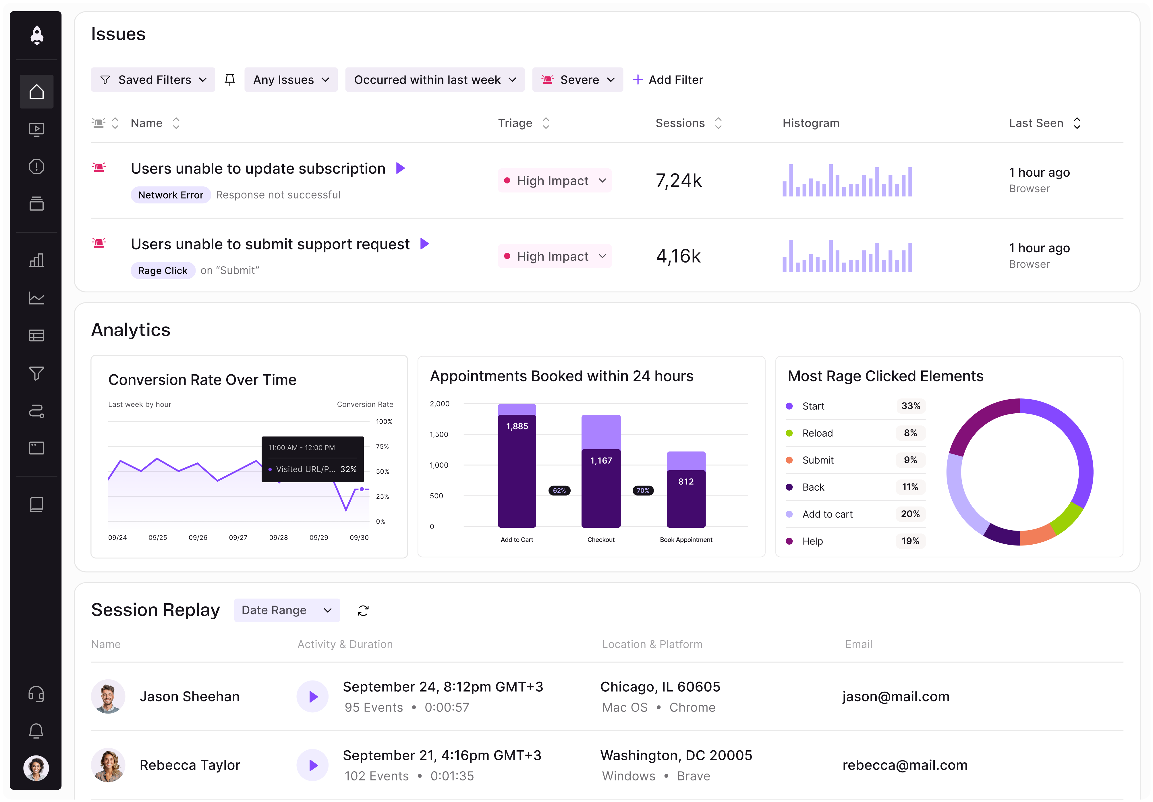
LogRocket identifies friction points in the user experience so you can make informed decisions about product and design changes that must happen to hit your goals.
With LogRocket, you can understand the scope of the issues affecting your product and prioritize the changes that need to be made. LogRocket simplifies workflows by allowing Engineering, Product, UX, and Design teams to work from the same data as you, eliminating any confusion about what needs to be done.
Get your teams on the same page — try LogRocket today.

A practical framework for product leaders to prioritize better, reduce noise, and focus teams on what matters most.

Explore how urban planning helps product managers think in systems, strengthen foundations, and build products that scale well.
Learn how product managers can move from output tracking to outcome-driven product management with metrics tied to user impact.

Learn how to spot PMF erosion early, diagnose the cause, and help your product recover before decline turns into panic.