Ari Saft is VP, Product at Tia, a comprehensive women’s healthcare service. She began her career teaching first grade with Teach for America before transitioning to a product analyst role and, later, venture capital. From there, Ari joined the product team at Yup, an e-learning provider, before transitioning to Tia.

In our conversation, Ari talks about the complexities of building products for multiple end users, such as provider care teams, patients, and businesses. She discusses how she addresses various user needs in the product without making it too complex and describes her role in healthcare products as “building in service of others.”
It’s very intellectually challenging. I started my career in education technology, also building products for multiple end users, so I actually don’t know what it’s like to work on something where you’re focused on just one user. At Tia, we’re building for multiple end users with very different needs, often using the same product. Our challenge is to find common ground so that the product delivers value to all.
I like to use a pizza analogy when meeting with cross-functional stakeholders. Our operations team might want a Hawaiian pizza, and our clinical team might prefer one with onion and sausage, but we’re going to deliver a vegetarian pizza. It might not be exactly what everyone needs, but over time we’ll add more toppings and, hopefully, at some point, give everyone pizzas that are half-and-half.
In this type of work, we have to be able to understand our users deeply. We have to have a pulse on their needs, pain points, and goals — not just quantitatively but qualitatively as well. Sometimes, those interests conflict, and we have to measure the costs and benefits.
We collaborate with teams through the process, ensuring we stay focused on the user. At Tia, we build for the care team as well as for a business that needs to be profitable. Sometimes, these goals are at odds with one another, but keeping an open feedback loop with all of these stakeholders is important. Developing in a silo and focusing on one user won’t work.
One interesting thing about Tia is that our entire care team is set up with computers and Wi-Fi if they’re virtual. If they work in person, our clinics are all set up. From that perspective, we can control the technology people are using and their tech setups. We also maintain strict control over things like which browser they’re using. Our security team manages all of that, which is nice because, at many other companies, the care team is outsourced.
The amazing but sometimes challenging part of this is that all our users are literally on our Slack, so we hear a lot of strong feedback! We are colleagues with all of these people and are also building our tools so they can do their jobs more efficiently. We’re basically enabling care to be delivered in the way that these providers want to deliver it.
It depends on the area of the product. Each one of our products is used by people with different functions. Our RCM (revenue cycle management) is only two or three people. If one of them reports issues with, say, claim reimbursement, that one voice matters a lot because they’re the subject matter experts.
For providers, we have an organizational design that supports upward and downward feedback. Providers can share feedback with their clinical managers who relay it to a clinical product representative. We hold meetings with them and do a lot of shadowing. That way, we can see what’s happening and then prioritize feedback based on the company’s long-term goals. We can validate an issue in different ways in varying situations rather than immediately jumping to fix it.
When designing for Tia’s many user groups, the biggest challenge is balancing their needs without making the product too complex or confusing.
We’re building one EMR (electronic medical record) where everyone lives, but our multiple users may need to access and use that information differently. Providers may need detailed patient information and advanced functionality for charting. Care coordinators need much more streamlined workflows to manage care efficiently. Our clinical operators need quick access to high-level data and tools to support operational tasks.
To address all these needs, we’ve built a core experience that works well for all user groups and then layered in more advanced features for each group, keeping the design consistent and intuitive. This approach prevents users from feeling overwhelmed by too many features and allows them to learn the UX patterns. We provide these prioritized features based on data feedback and the business’s focus. Such open communication with teams ensures we’re aligned with all the user groups, reducing friction and creating a seamless experience for everybody.
It depends on the product. We have a super user group made up of people with different backgrounds at Tia. They provide feedback as we iterate. For smaller changes, we have a testing group that tries the product out in our staging environment before we go live. If it’s a big change, we do a cohorted release.
Sometimes, we get it wrong. We work hard to understand how to interpret provider asks, but then, in the wild, a different experience can arise.
When there’s no clear ROI for a feature, I focus on its potential impact on user experience. We’re very data-driven, but I don’t think “data-driven” needs to mean quantitative. It can be qualitative, too. Sometimes when we think about ROI, we’re like, “What’s the exact percentage point that’s going to drive retention?,” but at other times we just know we need to do this thing.
We evaluate how well the feature aligns with our goals, like improving patient outcomes or streamlining workflows, and we consider qualitative feedback. If it has the potential to solve a pain point or significantly enhance engagement, we’ll prioritize it.
As an example, we recently launched Predictable Payments for our patients. This was a big bet for us. As you know, insurance is complicated — we often never know how much our bill will be when we go to the doctor. We found that one of the top reasons people were leaving Tia was that they received high medical bills, which was actually due to their insurance and had nothing to do with Tia. To help address this, we built a user interface and invoicing program that caps invoices at $100 monthly.
Even if a user receives a bill for $500, they’ll only ever be responsible for $100 a month, which helps them better plan for their healthcare. This program wasn’t about immediate ROI but about addressing a key pain point.
Transparency, collaboration, and data-driven decision-making are key. Everyone needs to understand the bigger picture and see how their goals fit within it — whether it’s providers focusing on patient care or operations looking for efficiency. Bringing teams together early for open discussions and relying on data to explain why we’re prioritizing something enables me to align everyone’s priorities with our company’s broader objectives.
We’ve also started holding many cross-functional meetings that are more about listening and understanding problems before diving into solutions. This has helped us get more perspectives on solving a certain problem.
We have a bunch of different pods at Tia because we have various products. Each pod focuses on one or two success metrics. For example, the team building the EHR relies on provider efficiency — the number of clicks it takes providers to complete a workflow.
A well-known article called “Death by 10,000 Clicks” talks about how healthcare professionals spend much of their entire time clicking through EHRs. Our goal is to avoid that and create something intuitive. If providers can efficiently use their tools, they can spend their time helping patients and thus improve patient outcomes.The short-term metric is reducing clicks, but the long-term goal is healthier patients.
In healthcare, we’re building in service of others. One of the reasons I love my job is that while I come up with innovative strategies and features, the ultimate goal is enabling our providers to deliver care. Say we have a citywide blackout — our providers could still do their job and help people. We are building in service of them, and delivering excellent care is the most important thing we do at Tia.
I’ve heard people say that PMs are the CEOs of the product. But that is not the case when you’re building tools in service of others. On my team, our stakeholders are our most important relationships. While we ultimately make decisions, we would never do so without the input of our stakeholders.
I look for four main qualities: curiosity, the ability to thrive in ambiguity, the ability to see the order of impacts, and ruthless prioritization.
Curiosity is important because when you work with many stakeholders, you must be very open and willing to ask “why” repeatedly. And you shouldn’t be emotionally affected if someone tells you that your idea isn’t working for them. Curiosity drives the desire to dig deeper and keep learning from every interaction.
Thriving in ambiguity is crucial in a startup environment. It’s fast paced and there are many different things going on and you need to be able to navigate that ambiguity.
The third characteristic is being able to see the third, fourth, and fifth-order level impacts of decisions. This is particularly important when building products for multiple end users. Let’s say you change something small in the onboarding flow, like the appointment options a patient can book. If you haven’t checked with the operations team to ensure those appointments are available, you risk creating a major problem for patients, which could increase churn. You need to think through the ripple effects of every decision, even minor ones.
Lastly, I expect my team to be able to prioritize ruthlessly. With limited startup resources, it’s crucial to be thoughtful about how you allocate time and effort. You need to think about the impact and effort of each initiative, which metrics it will move, and how it aligns with the company’s most important objectives. Balancing long-term projects that may not yield results for months with quick wins that show immediate impact is the key for success.

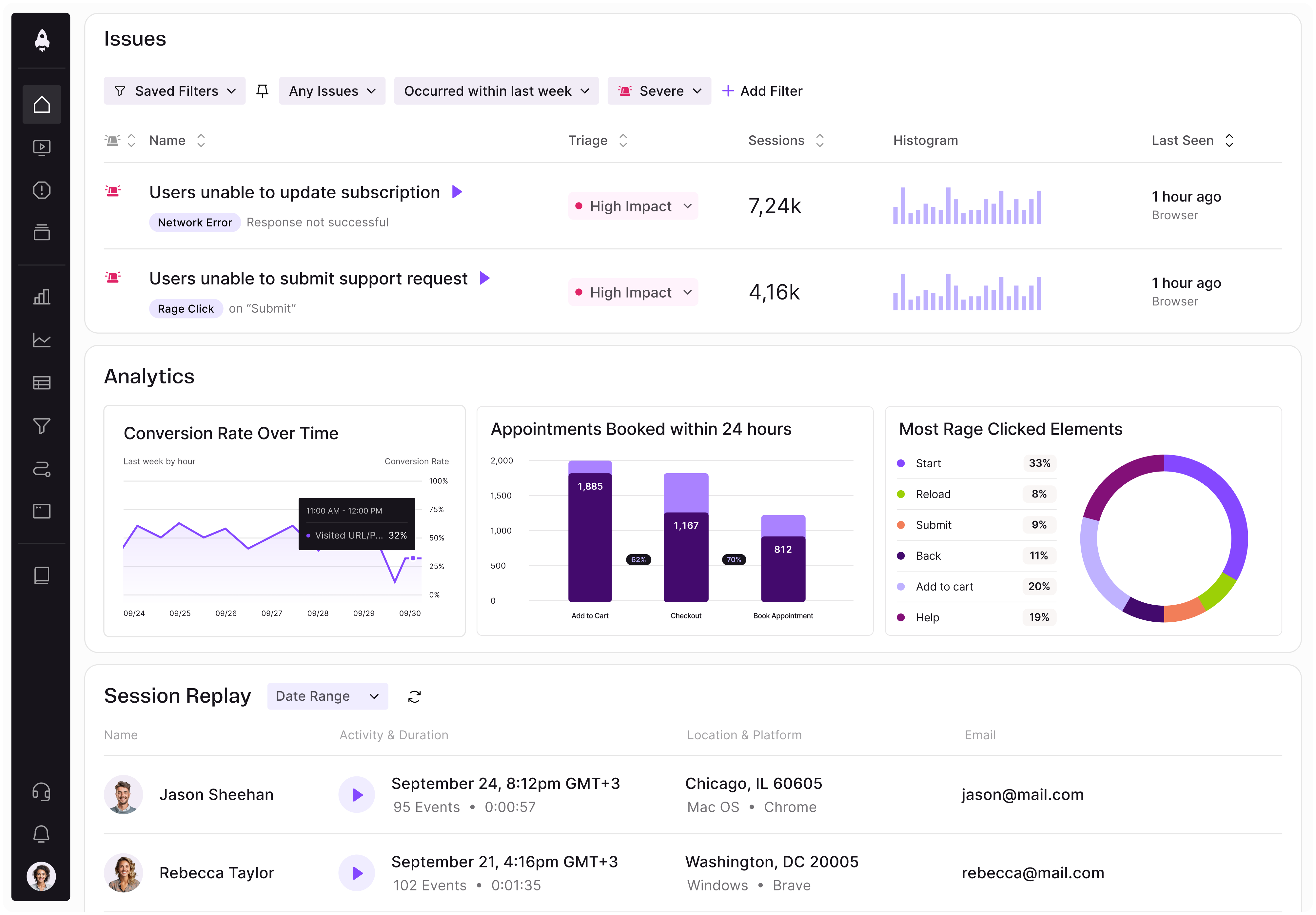
LogRocket identifies friction points in the user experience so you can make informed decisions about product and design changes that must happen to hit your goals.
With LogRocket, you can understand the scope of the issues affecting your product and prioritize the changes that need to be made. LogRocket simplifies workflows by allowing Engineering, Product, UX, and Design teams to work from the same data as you, eliminating any confusion about what needs to be done.
Get your teams on the same page — try LogRocket today.

Controlled scope creep can help PMs use capacity buffers, AI tools, and clear guardrails to turn new ideas into better outcomes.

According to SVP Julia Dalton, managing humans at scale and managing AI agents have a lot more in common than most people realize.

AI can make PM thinking generic. Learn how to use it without losing judgment, user nuance, or product differentiation.

Learn a 3-lens framework that helps product managers shift stakeholder requests from feature ideas to real problems and outcomes.