In this article, we’ll explore MUI’s Grid system in depth. Let’s get started!

The Replay is a weekly newsletter for dev and engineering leaders.
Delivered once a week, it's your curated guide to the most important conversations around frontend dev, emerging AI tools, and the state of modern software.
Grid component?Material Design’s grid system is implemented in MUI using the Grid component. Under the hood, the Grid component uses Flexbox properties for greater flexibility.
There are two types of grid components, container and item. To make the layout fluid and adaptive to different screen sizes, the item widths are set in percentages, and padding creates spacing between each individual item. There are five types of grid breakpoints, including xs, sm, md, lg, and xl.
Grid componentImport the Grid component into the JavaScript file using the following code:
import Grid from '@mui/material/Grid';
The container prop gives the Grid component the CSS properties of a flex container, and the item prop gives the CSS properties of a flex item. Every item must be wrapped in a container, as shown below:
<Grid
  container
  // ...this parent component will be a flex-box container
>
  <Grid
    // ... this child component will be a flex item for the parent Grid
  >
    <Paper></Paper> {/* A simple flex item */}
  </Grid>
</Grid>
Now that you’ve seen the basic structure of the MUI Grid component, let’s dive a little deeper into its background and usage.
Editor’s note: This post was updated by Hussain Arif in April 2025 to reflect the latest updates from MUI v5, explain practical use cases such as nested grids and column spanning, and compare MUI Grid with other layouts, such as CSS Grid and Flexbox.
Material Design is a popular design system developed by Google in 2014. It is a visual language that synthesizes the classic principles of good design with innovations in technology and science.
Google and many other tech companies use Material Design extensively across their brand and products. In 2021, Google revamped its design system, making it more flexible for designers to create custom themes.
MUI is a React library that implements Google’s Material Design and its grid system. Widely used in Android app development, MUI defines a set of principles and guidelines for designing UI components. The creators of this technology shortened the project’s name from Material UI to MUI in September 2021, clarifying that the project was never affiliated with Google.
MUI comes with prebuilt UI components, including buttons, navbars, navigation drawers, and, most importantly, the grid system. MUI v6 offered new features, an updated design, performance optimization, enhanced theming options, and another framework geared towards dashboards.
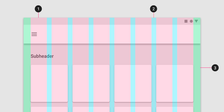
A grid system defines a set of measurements to place elements or components on the page based on successive columns and rows. The grid system in Material Design is visually balanced. It adapts to screen sizes and orientation, ensuring a consistent layout across pages.
The grid system consists of three components:
Here’s a diagram to visualize these components:
Grid vs CSS Grid vs Flexbox: What’s the difference?MUI’s Grid component uses a standard CSS Flexbox to render child items to the browser. According to Stack Overflow, the difference between MUI and Flexbox is that MUI allows developers to use breakpoints to allow for responsive web apps.
Furthermore, it’s important to remember that the Material Grid system does not support auto-placement of children. If you need auto-placement, the team suggests opting for the CSS Grid instead.
The MUI library provides React components that implement Google’s Material Design. Let’s explore implementing Material Design in a React app using MUI.
Run the command below to install the required dependencies in your project:
npm install @mui/material @emotion/react @emotion/styled
Material Design uses Roboto as the default font, so don’t forget to add it as well:
npm install @fontsource/roboto
Alternately, you can omit the snippet above and add the following imports to the entry point of your React app instead, which should normally be the main.tsx file:
import "@fontsource/roboto/300.css";
import "@fontsource/roboto/400.css";
import "@fontsource/roboto/500.css";
import "@fontsource/roboto/700.css";
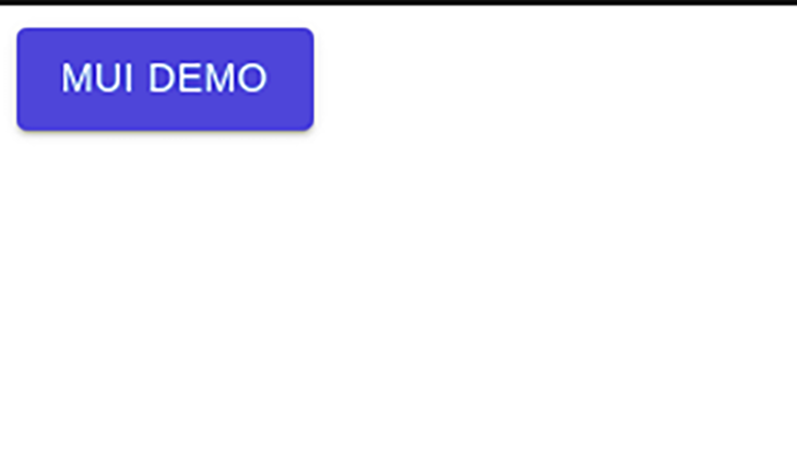
All the components are isolated, self-supporting, and only inject the styles that they need to present. To get things going, let’s use the example below, which creates a simple button component:
import * as React from "react";
//import the Button component from MUI
import Button from "@mui/material/Button";
export default function App() {
  return (
    //Draw a simple button
    <Button variant="contained" color="primary">
      MUI Demo
    </Button>
  );
}
Now that we’ve briefly learnt how to use the MUI library, let’s use the Grid API. This line of code imports the Grid component:
import Grid from "@mui/material/Grid";
#make sure it's not:
import Grid from "@mui/material/GridLegacy"; # this is outdated!
Let’s look at the various props you can provide to the container and item to build a flexible layout.
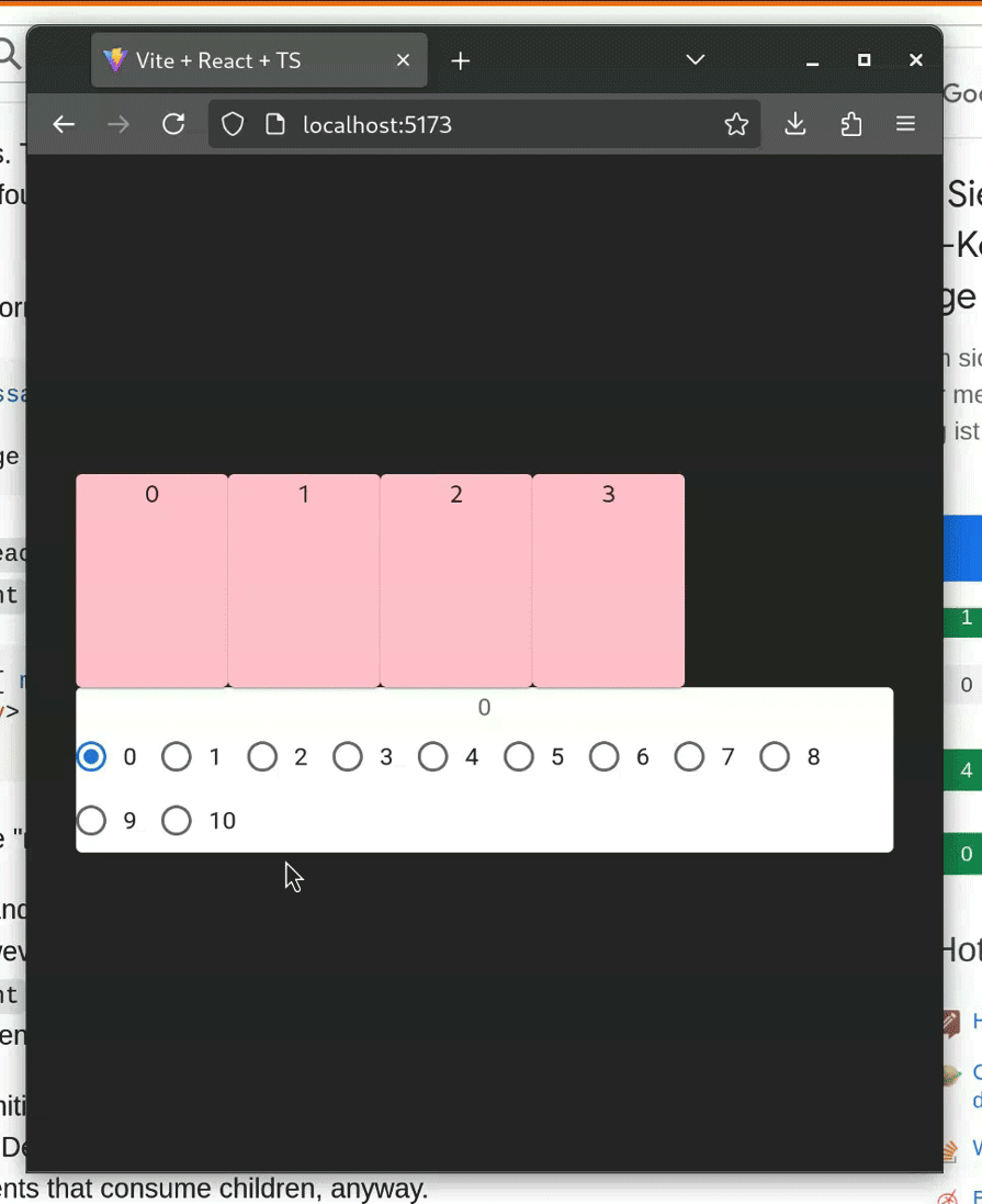
You can apply the spacing prop to the Grid container to create spaces between each individual grid item. In the following example, we interactively change the spacing prop value by passing the value through a set of radio button components:
import Grid from "@mui/material/Grid2";
import FormLabel from "@mui/material/FormLabel";
import FormControlLabel from "@mui/material/FormControlLabel";
import RadioGroup from "@mui/material/RadioGroup";
import Radio from "@mui/material/Radio";
import Paper from "@mui/material/Paper";
import { useState } from "react";
import { FormControl } from "@mui/material";
//create our style
const styles = {
  paper: {
    height: 140,
    width: 100,
    backgroundColor: "pink",
  },
};
const SpacingGridDemo: React.FC = () => {
  //create our spacing variable. Default value will be 2
  const [spacing, setSpacing] = useState(2);
  //when executed, change the value of spacing Hook to chosen value
  const handleChange = (event: React.ChangeEvent<HTMLInputElement>): void => {
    setSpacing(Number(event.target.value));
  };
  return (
    <div>
      <div>
        {/*This container will be aligned in the center */}
        {/* Spacing will vary depending on user choice.*/}
        <Grid container spacing={spacing}>
          {/*Render 4 empty black boxes as items of this container*/}
          {[0, 1, 2, 3].map((value) => (
            <Grid key={value}>
              <Paper style={styles.paper}>{value}</Paper>
            </Grid>
          ))}
        </Grid>
      </div>
      <div>
        <Paper>
          <div>
            {/* Show user's chosen spacing value*/}
            <FormLabel>{spacing}</FormLabel>
            <FormControl>
              <RadioGroup
                name="spacing"
                aria-label="spacing"
                value={spacing.toString()}
                onChange={handleChange}
                row
              >
                {/*Render multiple spacing values in a form */}
                {[0, 1, 2, 3, 4, 5, 6, 7, 8, 9, 10].map((value) => (
                  <FormControlLabel
                    key={value}
                    value={value.toString()}
                    control={<Radio />}
                    label={value.toString()}
                  />
                ))}
              </RadioGroup>
            </FormControl>
          </div>
        </Paper>
      </div>
    </div>
  );
};
export default SpacingGridDemo;
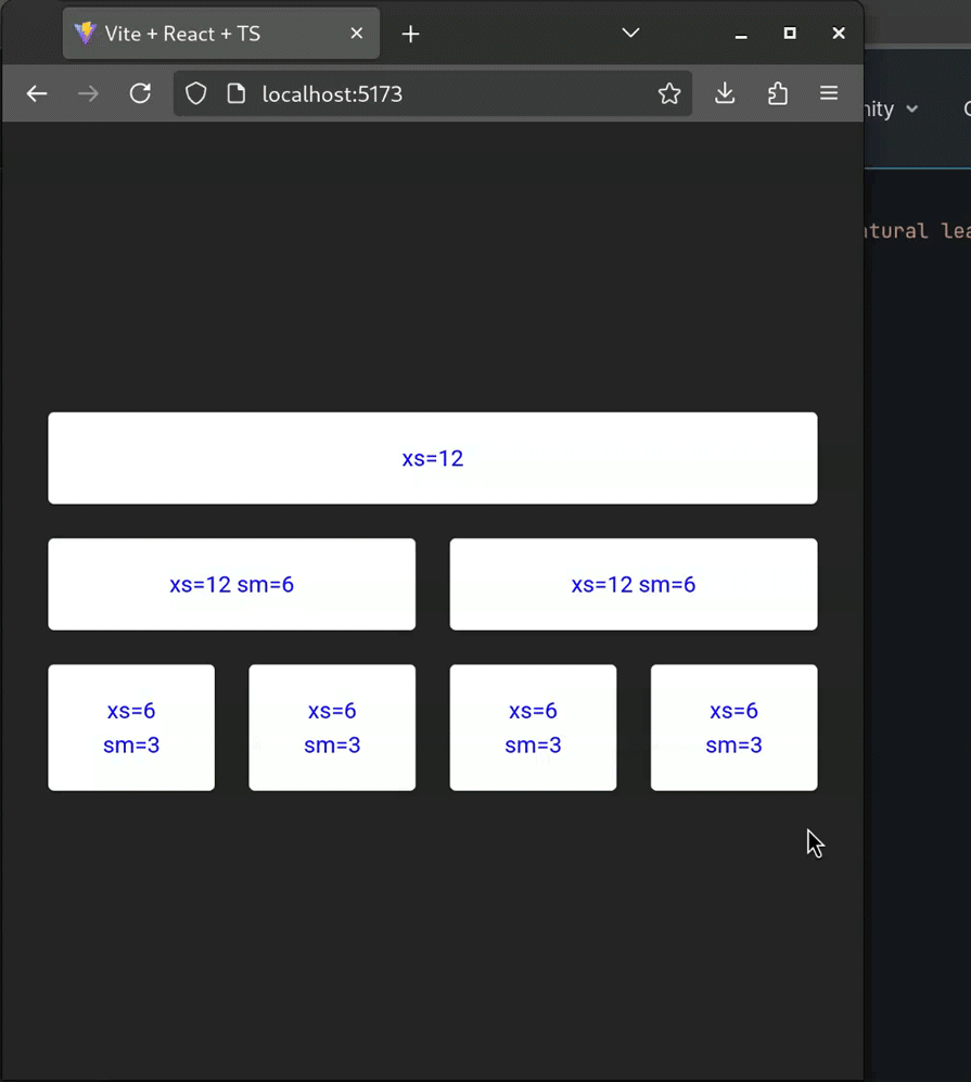
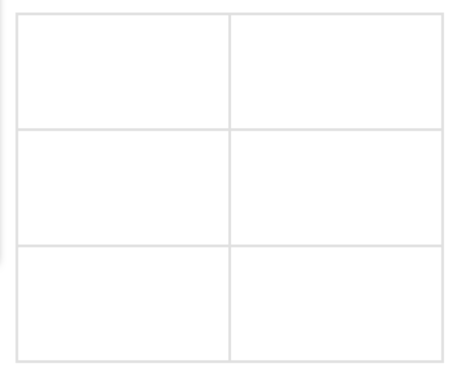
We can create layouts for different screen sizes by using the breakpoint props, xs, sm, md, lg, and xl on the grid items. Fluid grids can scale the grid items and resize content within them:
//create our styles
const classes = {
  root: {
    flexGrow: 1,
  },
  paper: {
    padding: 20,
    color: "blue",
    fontFamily: "Roboto",
  },
};
const BreakpointGridDemo: React.FC = () => {
  return (
    <div style={classes.root}>
      <Grid container spacing={3}>
        {/*Create items with different breakpoints */}
        {/*For example,This item will be 12 units wide on extra small screens */}
        <Grid size={{ xs: 12 }}>
          <Paper style={classes.paper}>xs=12</Paper>
        </Grid>
        {/*This item will be 12 units on extra small screens */}
        {/*But will be 6 units on small screens */}
        <Grid size={{ xs: 12, sm: 6 }}>
          <Paper style={classes.paper}>xs=12 sm=6</Paper>
        </Grid>
        <Grid size={{ xs: 12, sm: 6 }}>
          <Paper style={classes.paper}>xs=12 sm=6</Paper>
        </Grid>
        <Grid size={{ xs: 6, sm: 3 }}>
          <Paper style={classes.paper}>xs=6 sm=3</Paper>
        </Grid>
        <Grid size={{ xs: 6, sm: 3 }}>
          <Paper style={classes.paper}>xs=6 sm=3</Paper>
        </Grid>
        <Grid size={{ xs: 6, sm: 3 }}>
          <Paper style={classes.paper}>xs=6 sm=3</Paper>
        </Grid>
        <Grid size={{ xs: 6, sm: 3 }}>
          <Paper style={classes.paper}>xs=6 sm=3</Paper>
        </Grid>
      </Grid>
    </div>
  );
};
export default BreakpointGridDemo;
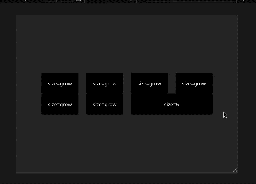
 Auto-layout
The auto-layout feature allows the grid items to auto-resize and occupy the available space without having to specify the width of the item. If you set the width on one of the items, the child items would automatically resize and share the available space.
In the following example, you can see that the items around the xs={6} item auto-resize, resulting in a perfect layout:
const AutoGridDemo: React.FC = () => {
  return (
    <Box sx={{ flexGrow: 1 }}>
      <Grid container spacing={2}>
        {/*They all will have default widths */}
        {[1, 2, 3, 4].map((item) => (
          <Grid key={item} size="grow">
            <Paper style={classes.paper}>size=grow</Paper>
          </Grid>
        ))}
      </Grid>
      <Grid container spacing={2}>
        {[1, 2].map((item) => (
          <Grid size="grow" key={item}>
            <Paper style={classes.paper}>size=grow</Paper>
          </Grid>
        ))}
        {/*However, this component will have 6 units of space */}
        <Grid size={6}>
          <Paper style={classes.paper}>size=6</Paper>
        </Grid>
      </Grid>
    </Box>
  );
};
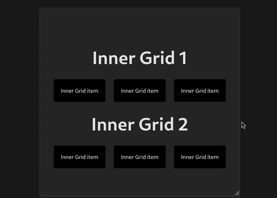
 Nested grids
We can use grids within each other. In the demo below, the container and item props are combined so the Grid component can act like both a container and an item. This allows us to have another set of the grid inside the grid item. In this case, it’s the <InnerGrid /> component:
const InnerGrid: React.FC = () => {
  return (
    <Grid container spacing={3}>
      {[1, 2, 3].map((item) => (
        <Grid key={item}>
          <Paper style={classes.paper}>Inner Grid item</Paper>
        </Grid>
      ))}
    </Grid>
  );
};
const AutoGridDemo: React.FC = () => {
  return (
    <Box sx={{ flexGrow: 1 }}>
      <h1>Inner Grid 1</h1>
      <Grid container>
        <InnerGrid />
      </Grid>
      <h1>Inner Grid 2</h1>
      <Grid container>
        <InnerGrid />
      </Grid>
    </Box>
  );
};
Note: Nested Grid containers should be a direct child of another grid container. If there are any non-grid components in between, the new container will act as a root container:
<Grid container>
  <Grid container> {/*Inherits columns and spacing from the parent item*/}
    <div>
      <Grid container> {/*Root container with its own properties.*/}
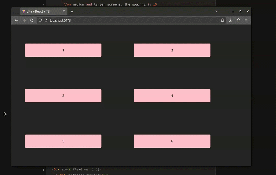
The MUI library also allows for changing the column or spacing depending on the breakpoint. Here’s a code sample that demonstrates breakpoints in action:
const ResponsiveDemo: React.FC = () => {
  return (
    <Box flexGrow={1} padding={2}>
      <Grid
        container
        //on smaller screens, the spacing is 2
        //on medium and larger screens, the spacing is 15
        spacing={{ xs: 2, md: 15 }}
        columns={{ xs: 2, sm: 4, md: 18 }}
      >
        {Array.from(Array(6)).map((_, index) => (
          //similarly, the size of the grid item is different on different screen sizes
          <Grid key={index} size={{ xs: 1, sm: 4, md: 8 }} padding={2}>
            <Paper
              style={{ padding: 19, backgroundColor: "pink", color: "black" }}
            >
              {index + 1}
            </Paper>
          </Grid>
        ))}
      </Grid>
    </Box>
  );
};
According to the documentation, it’s not possible to set the direction property to column or column-reverse. This is because the MUI designed Grids to divide layouts into columns, not rows.
To create a vertical layout, use MUI’s Stack component instead:
return (
  <Box sx={{ flexGrow: 1 }}>
    <Grid container spacing={2}>
      {/*Nested Grid with a stack*/}
      <Grid size={4}>
        {/*Create a vertical stack with 3 Papers*/}
        <Stack spacing={2}>
          <Paper>Column 1 - Row 1</Paper>
          <Paper>Column 1 - Row 2</Paper>
          <Paper>Column 1 - Row 3</Paper>
        </Stack>
      </Grid>
      {/*Create a nested grid*/}
      <Grid size={8}>
        <Paper sx={{ height: "100%", boxSizing: "border-box" }}>Column 2</Paper>
      </Grid>
    </Grid>
  </Box>
);
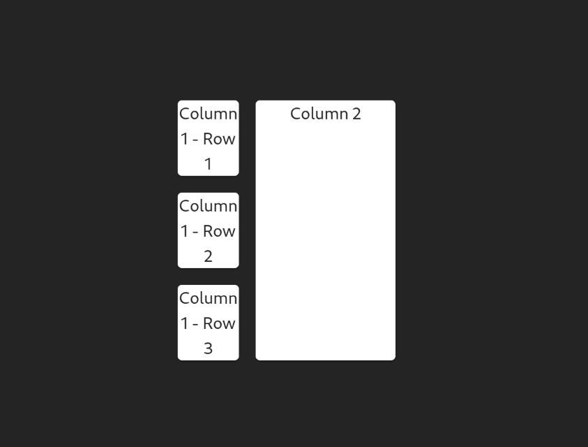
This is useful in cases where you would want to build a dashboard component for your app.
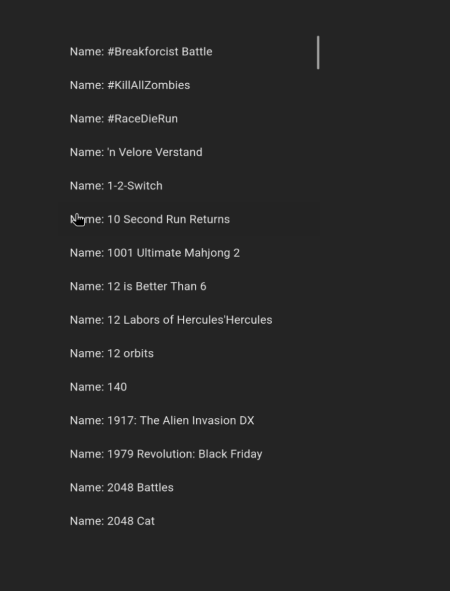
Real-world web applications frequently require displaying extensive datasets from APIs, often numbering in the thousands. Directly rendering such large component lists to the DOM results in significant performance bottlenecks. To address this, developers employ virtualization techniques using libraries like react-window with Material UI’s List component, ensuring smooth rendering and optimal user experience even with massive datasets.
The following example demonstrates how to efficiently display a large list of Nintendo Switch games using this approach:
import Box from "@mui/material/Box";
import ListItem from "@mui/material/ListItem";
import ListItemButton from "@mui/material/ListItemButton";
import ListItemText from "@mui/material/ListItemText";
import { useEffect, useState } from "react";
import { FixedSizeList, ListChildComponentProps } from "react-window";

type ItemData = {
  id: number;
  name: string;
};

const ReactWindowDemo: React.FC = () => {
  const [data, setData] = useState<ItemData[]>([]);
  const getData = async () => {
    const resp = await fetch("https://api.sampleapis.com/switch/games");
    const json = await resp.json();
    setData(json);
  };
  useEffect(() => {
    getData();
  }, []);

  function renderRow(props: ListChildComponentProps) {
    const { index, style } = props;
    return (
      <ListItem
        style={style}
        key={data[index].id}
        component="div"
        disablePadding
      >
        <ListItemButton>
          <ListItemText primary={`Name: ${data[index].name}`} />
        </ListItemButton>
      </ListItem>
    );
  }

  return (
    <Box>
      {data.length && (
        <FixedSizeList
          height={700}
          width={360}
          itemSize={46}
          itemCount={200}
          overscanCount={5}
        >
          {renderRow}
        </FixedSizeList>
      )}
    </Box>
  );
};
 Adding borders
Using a border for a Grid item is simple via the border property:
<Grid
  container
  sx={{
    "--Grid-borderWidth": "4px",
    borderTop: "var(--Grid-borderWidth) solid",
    borderLeft: "var(--Grid-borderWidth) solid",
    borderColor: "divider",
    "& > div": {
      borderRight: "var(--Grid-borderWidth) solid",
      borderBottom: "var(--Grid-borderWidth) solid",
      borderColor: "divider",
    },
  }}
>
  {/*Further code...*/}
</Grid>
In this article, you learned how to build responsive grid layouts via the MUI Grid system. Hopefully, this guide will help you take full advantage of the numerous features we discussed. They’ll come in handy at some point or another when you’re working with the Material Design system.
Install LogRocket via npm or script tag. LogRocket.init() must be called client-side, not
server-side
$ npm i --save logrocket

// Code:

import LogRocket from 'logrocket';
LogRocket.init('app/id');
// Add to your HTML:

<script src="https://cdn.lr-ingest.com/LogRocket.min.js"></script>
<script>window.LogRocket && window.LogRocket.init('app/id');</script>

Learn how to build a full React Native auth system using Better Auth and Expo — with email/password login, Google OAuth, session persistence, and protected routes.

Compare the top AI development tools and models of June 2026. View updated rankings, feature breakdowns, and find the best fit for you.

Learn how Bloom filters reduce database lookups for username availability checks while preserving correctness at scale.

Learn how to test Nuxt apps with Vitest, @nuxt/test-utils, runtime mocks, server route mocks, and Playwright e2e tests.
Hey there, want to help make our blog better?
Join LogRocket’s Content Advisory Board. You’ll help inform the type of content we create and get access to exclusive meetups, social accreditation, and swag.
Sign up now

 Learn more →
