When adding a navigation menu to a mobile website, a common method is for the mobile menu to take up the entire page and hide the original page underneath it.

But, a problem we often face doing this is that the page underneath must still be scrollable when the navigation menu is open and covering it. This problem produces a bad user experience, which we want to avoid at all costs.
One way of getting around this is to add position: fixed to the original page that we opened the menu from. While this will work and the page will no longer be scrollable, by solving this issue, we introduce another.
By adding position: fixed to the page when we open the menu and then change it back to position: relative when we close the menu, we lose the current scroll position of the page, and the user returns to the top of the page, which is again bad UX.
So, to solve both of these issues, we’ll learn how to implement a custom Hook into a React application that allows us to stop the page from scrolling when a full-page mobile menu is open.
But, most importantly, we then maintain the scroll position when we close the full-page mobile menu so the user can continue scrolling from where they left off.
To get started with this tutorial, we need to create a React application using create-react-app (you can find out more about this here if you haven’t used it before).
Once we have our new React application created and all our dependencies installed, we can run npm run start to start up our React application.
With our application started, let’s build out a quick frontend that allows us to show off the custom Hook we’ll build in a moment. Below is the code you need to drop into your ./src/App.js file:
import { useEffect, useState } from 'react';
import Nav from './components/Nav';
import './App.css';

function App() {
  const [scrollValue, setScrollValue] = useState(0);

  useEffect(() => {

    const onScroll = (e) => {
      setScrollValue(e.target.documentElement.scrollTop);
    };

    window.addEventListener('scroll', onScroll);

    return () => window.removeEventListener('scroll', onScroll);
  }, [scrollValue]);

  return (
    <div className="App">
      <p className="filler" />
      <div className="fixed">
        <p>Current Scroll Position:</p>
        <p>{scrollValue}px</p>
      </div>
    </div>
  );
}
export default App;
If you have seen a React application before, this should all be fairly familiar, so we won’t cover the entire file’s code.
However, one piece I want to touch on is the code within theuseEffect() block. This code allows us to put the current scroll position in state and then display it onto the page. While this isn’t required for the custom Hook to work, it shows the custom Hook working within our application.
Here is the styling for our App.js file, which is stored within App.css in the same directory:
.App {
  padding: 0 5rem;
}
.filler {
  height: 300vw;
}
.fixed {
  text-align: center;
  position: fixed;
  left: 50%;
  top: 50%;
  transform: translate(-50%, -50%);
  font-weight: 700;
  font-size: 45px;
}
.fixed > * {
  margin: 0;
}
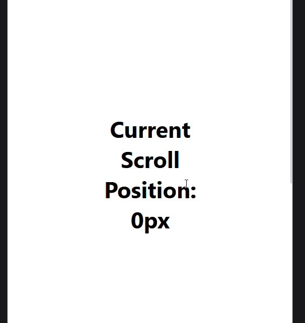
You should now have a page that allows you to scroll up and down and display the current scroll position on the page like so:
With this implemented, we just need to create our mobile navigation menu. Let’s now create this by adding ./src/components/Nav.js to our application. Here is the code for the new component:
import './Nav.css';

export default function Nav() {

  return (
    <nav>
      {/* We will replace this true boolean when we create the hook as this will contain the open/closed state for the nav menu.*/}
      {true ? (
        {/* We will add a onClick handler after we have defined the hook */}
        <button type="button">
          Open Menu
        </button>
      ) : (
        <div>
          <p>Nav Item 1</p>
          <p>Nav Item 2</p>
          <p>Nav Item 3</p>

          {/* We will add a onClick handler after we have defined the hook */}
          <button type="button">
            Close Menu
          </button>
        </div>
      )}
    </nav>
  );
}
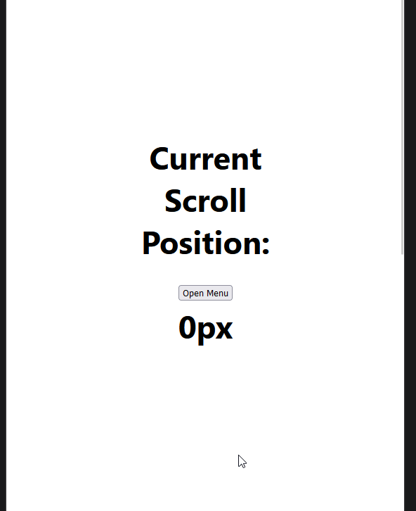
With this code added, we should now have an Open Menu button added onto our page between the title and the current scroll position. At the moment, if we click the button, nothing happens because we haven’t added an onClick handler.
The reason we haven’t added the handler yet is because the state for the menu being open or closed will be contained in the custom Hook we will create in the next section.
Once we create the custom Hook, we will return to this component and add in the relevant pieces of code and styling to allow for the mobile navigation menu to open and close.
useMenuControl custom HookNow we are at the main piece of this article: creating the custom Hook that will control the full-page mobile menu opening and closing as well as maintaining the scroll position on the page underneath it.
Here is the code for the useMenuControl custom Hook; to add this to the application, we must create a new file for the Hook at ./src/hooks/useMenuControl.js:
import { useEffect, useState } from 'react';

export default function useMenuControl() {
  // State to record if the menu is open
  const [isMenuOpen, setMenuOpen] = useState(false);

  // Click handler for opening and closing the menu
  const clickHandler = () => setMenuOpen(!isMenuOpen);

  useEffect(() => {
    // Get original body overflow style so we can revert to it later on
    const originalStyle = window.getComputedStyle(document.body).overflow;

    // If the menu is open then set the overflow to hidden to prevent scrolling the page further
    if (isMenuOpen) {
      document.body.style.overflow = 'hidden';
    }

    // Re-enable scrolling when component unmounts by reverting to the original body overflow style value
    return () => {
      document.body.style.overflow = originalStyle;
    };
  }, [isMenuOpen]);

  // Returning 3 vales :
  // 1. isMenuOpen: boolean - Is the menu open or not.
  // 2. clickHandler: function - Function used to open and close the menu
  return { isMenuOpen, clickHandler };
}
The code is commented with what is happening throughout the Hook, so I won’t cover the entire code but the key pieces to focus on are the state at the top of the file, which we use to control if the menu is open or closed.
This is then followed by our clickHandler function, which we will pass to our onClick properties in our Nav component from before.
But, most important is the code inside of the useEffect() block. This code gets the current overflow style of the document’s body (visible by default) before we open the menu. Then, if the isMenuOpen state is true, we set the overflow of the body to hidden.
This is the important part because by changing the overflow to hidden we prevent scrolling on the page, and when we revert overflow to the original value (visible) the scroll position is still where it was when we opened the page.
By avoiding the use of position: fixed to prevent scrolling when the full-page mobile menu is open, we don’t lose our scroll position.
Now, let’s look at implementing our new useMenuControl hook into our Nav component from before.
useMenuControl custom HookLet’s now revisit our Nav component from earlier and add in the useMenuControl custom Hook from the previous section. Here is the updated code with the Hook added in:
import useMenuControl from '../hooks/useMenuControl';
import './Nav.css';

export default function Nav() {
  const { isMenuOpen, clickHandler } = useMenuControl();

  return (
    <nav className={`${isMenuOpen ? 'menuOpen' : ''}`}>
      {!isMenuOpen ? (
        <button type="button" onClick={clickHandler}>
          Open Menu
        </button>
      ) : (
        <div>
          <p>Nav Item 1</p>
          <p>Nav Item 2</p>
          <p>Nav Item 3</p>
          <button type="button" onClick={clickHandler}>
            Close Menu
          </button>
        </div>
      )}
    </nav>
  );
}
The key pieces of code added here is the isMenuOpen state we use to control if the menu is displayed or not and whether the .menuOpen class is applied to the nav element.
This is important because, in a moment, we will add styles to this class name to make the menu an actual full-page menu.
Secondly, we bring in our clickHandler from the custom Hook and pass it to both onClick handlers on our buttons to control the opening and closing of the menu on the page.
With this sorted, we just need to add some styles for the .menuOpen class by adding in a ./src/components/Nav.css file. Here are the styles we need to add to create the full page menu:
.menuOpen {
  position: fixed;
  left: 50%;
  top: 50%;
  transform: translate(-50%, -50%);
  z-index: 10;
  display: flex;
  flex-direction: column;
  align-items: center;
  justify-content: center;
  gap: 2.5rem;
  background-color: white;
  opacity: 1;
  height: 100vh;
  width: 100vw;
}
With this final piece of code added to our application, we now have a React application that allows us to open a full-page mobile menu that maintains the scroll position on the page underneath the menu while also preventing scrolling the page while the menu is open.
Here is a glimpse at the final version of this application; if you’re interested in checking out the code for this project, you can see it on my GitHub here.
I hope you found this article on creating a custom React Hook for maintaining scroll position with a full-page mobile menu helpful.
If you did, please consider following me over on Twitter, where I post helpful and actionable tips and content on the JavaScript ecosystem and web development as a whole. Or, if Twitter isn’t your thing, visit my blog for more of my content.
Install LogRocket via npm or script tag. LogRocket.init() must be called client-side, not
server-side
$ npm i --save logrocket

// Code:

import LogRocket from 'logrocket';
LogRocket.init('app/id');
// Add to your HTML:

<script src="https://cdn.lr-ingest.com/LogRocket.min.js"></script>
<script>window.LogRocket && window.LogRocket.init('app/id');</script>
Hey there, want to help make our blog better?
Join LogRocket’s Content Advisory Board. You’ll help inform the type of content we create and get access to exclusive meetups, social accreditation, and swag.
Sign up now
Discover how the Interface Segregation Principle (ISP) keeps your code lean, modular, and maintainable using real-world analogies and practical examples.

<selectedcontent> element improves dropdowns

Learn how to implement an advanced caching layer in a Node.js app using Valkey, a high-performance, Redis-compatible in-memory datastore.

Learn how to properly handle rejected promises in TypeScript using Angular, with tips for retry logic, typed results, and avoiding unhandled exceptions.

 Learn more →
