Editor’s note: This post was updated by Isaac Okoro on February 18, 2025, to reflect Framer Motions’ rebranding to Motion, and include information on the latest features and best practices available in Motion.

Motion — the tool formerly known as Framer Motion — can help JavaScript developers quickly and effectively write animations. Motion makes it easy to add intuitive animations to your web applications with minimal code.
Animation in React, and on the web at large, is the process of changing the visual state of the UI elements on a page over time.
What do I mean by visual state? Any property of the element that influences how it looks: height, shape, position relative to other elements, etc. The core idea of animation is that you’re changing some visible property of something on the page over time.
There are a few ways to create animations in React, but all of them fall into two broad categories: CSS animations, which change visual state by applying CSS rules; and, JavaScript animations, which use JavaScript to change the properties of the element.
In either of those categories, you can implement the animation from scratch or use a library. On the CSS side, you can compose your animations with CSS rules, or you can use third-party libraries like Animate.css.
If you choose to use JavaScript, you can either write custom code to create animations or use libraries like GSAP or Framer Motion.
Each library has its advantages, and each has a different approach to writing animations. In this article, we’ll explore Motion (formerly known as Framer Motion), a React animation library created and maintained by the Framer design team.
You’ll learn the core components that underpin all Motion animations, dive into some of the features that make Motion a great tool, discover best practices for getting the most out of the library, and put it all into practice with a step-by-step example: building a task tracker.
The Replay is a weekly newsletter for dev and engineering leaders.
Delivered once a week, it's your curated guide to the most important conversations around frontend dev, emerging AI tools, and the state of modern software.
Motion is a fairly popular and actively maintained library, with over 27k stars on GitHub, and plenty of resources to support it.
But most importantly, Motion is built around allowing you to write complex, production-grade animations with as little code as possible. Using Motion is so convenient that you can implement drag-and-drop by adding a single line of code! Motion also greatly simplifies tasks like SVG animation and animating layout shifts.
Motion has an intuitive approach to animation. It provides a set of components that wrap your markup and accept props to allow you to specify what type of animation you want. The core components of Motion are:
motion componentAnimatePresence componentLazyMotion componentLayoutGroup componentMotionConfig componentReorder componentAnimateNumber component (exclusive to only premium users)Cursor component (exclusive to only premium users)Let’s take a brief look into these components and understand what they do.
motion componentThe motion component provides the foundation of all animation. It wraps the HTML elements in your React components and animates those elements with state passed to its initial and animate props. Below is an example. Take a plain div you might find anywhere on the web:
<div>I have some content here</div>
Let’s assume you wanted this div to fade into the page when it loads. This code is all you need:
<motion.div
  initial={{ opacity:0 }}
  animate={{ opacity:1 }}
>
  I have some content in here
</motion.div>
When the page loads, the div will animate smoothly from transparency to full opacity, gradually fading into the page. In general, when the motion component is mounted, the values specified in the initial prop are applied to the component, and then the component is animated until it reaches the values specified in the animate prop.
AnimatePresence componentAnimatePresence works with motion and is necessary to allow elements you remove from the DOM to show exit animations before they’re removed from the page. AnimatePresence only works on its direct children that fulfill one of two conditions:
motion componentmotion component as one of its childrenThe desired exit animation has to be specified by adding the exit prop to motion. Here’s an example of AnimatePresence at work:
<AnimatePresence>
  <motion.div
    exit={{ x: "-100vh", opacity: 0 }}
  >
    Watch me go woosh!
  </motion.div>
</AnimatePresence>
When the div wrapped by AnimatePresence is removed from the DOM, it will slide 100vh to the left (instead of just disappearing), fading into transparency as it does so. Only after that will the div be removed from the page. Note that when multiple components are direct children of AnimatePresence, they each need to have a key prop with a unique value so AnimatePresence can keep track of them in the DOM.
LazyMotion componentMotion’s motion component comes with all features bundled, resulting in a bundle size of approximately 34kb. However, with LazyMotion and the m component, we can reduce this size to six kb for the initial render and then load specific features either synchronously or asynchronously:
import { LazyMotion, domAnimations } from "motion/react"
import * as m from "motion/react-m"

export const MyComponent = ({ isVisible }) => (
  <LazyMotion features={domAnimations}>
    <m.div animate={{ opacity: 1 }} />
  </LazyMotion>
)
The LazyMotion component provides the features prop that is responsible for loading animation bundles. This component also allows for optimization of the Motion library. When installed, the Motion Library comes with a bundle size of around 34kb. The LazyMotion component allows us to reduce this to six kb for the initial render and then load a subset of features synchronously or asynchronously.
LayoutGroup componentThe LayoutGroup component groups motion components that need to be aware of each other’s state and layout changes, ensuring smooth animations across dynamic UI elements. This can be seen in the example below:
import { LayoutGroup } from "motion/react"

function Accordion() {
  return (
    <LayoutGroup>
      <ToggleContent />
      <ToggleContent />
    </LayoutGroup>
  )
}
MotionConfig componentThe MotionConfig component allows setting default animation configurations for all child motion components, thus improving consistency across animations and simplifying configuration management:
import { motion, MotionConfig } from "motion/react"

export const CustomComponent = () => (
  <MotionConfig transition={{ duration: 2 }}>
    <motion.div initial={{ opacity: 0 }} animate={{ opacity: 1 }} />
  </MotionConfig>
)
The MotionConfig component houses three props:
transition — Define a default transition for all child componentsreducedMotion — Control reduced motion settings ("user", "always", "never")nonce — Apply a CSP nonce for security complianceReorder componentThe Reorder components create smooth drag-to-reorder lists, such as sortable tabs, tasks, and to-dos:
import { Reorder } from "motion"

const [items, setItems] = useState([0, 1, 2, 3])

return (
  <Reorder.Group axis="y" values={items} onReorder={setItems}>
    {items.map((item) => (
      <Reorder.Item key={item} value={item}>
        {item}
      </Reorder.Item>
    ))}
  </Reorder.Group>
)
The Reorder component has two types: the Reorder.Group, which serves as a wrapper component to the Reorder.Item, which takes in a key for unique identification and a value.
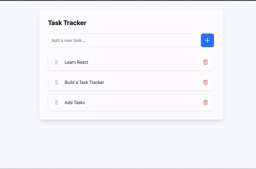
Let’s apply everything we’ve learned to a more complex example. At the end of this article, you’ll have built an animated task tracker that looks like this:
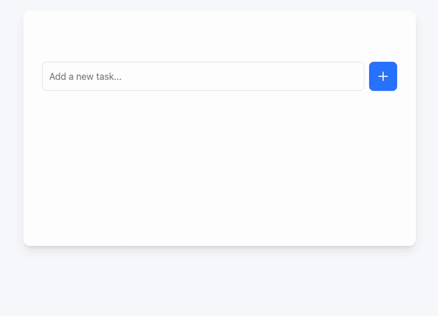
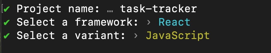
Start by navigating to the directory where you want the example to live. Next, open your terminal and create a starter React app using Vite with this command:
npm create vite@latest
Then, answer the prompts like this:
Next, we’ll add Tailwind CSS and Lucide icon library to our project. To do this, first change the directory into the project directory and add the Tailwind CSS dependencies:
cd task-tracker && yarn add lucide-react tailwindcss @tailwindcss/vite
After running the command above, open the project in your preferred code editor. Your project architecture should now look like this:
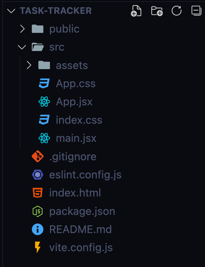
Delete the src/assets folder and App.css. Now, write the code for the task tracker without any animation. Start with the project’s CSS by replacing the contents of index.css with the Tailwind CSS import as shown below:
@import "tailwindcss";
Now go to the vite.config.js file and update it with the code below:
import tailwindcss from "@tailwindcss/vite";
import react from "@vitejs/plugin-react";
import { defineConfig } from "vite";

export default defineConfig({
  plugins: [react(), tailwindcss()],
});
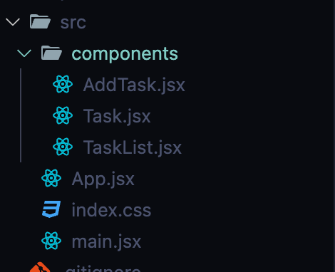
Create a folder called components in the src folder and add the following files to it: AddTask.jsx, Task.jsx, and TaskList.jsx. Your folder should look exactly like the one below:
Next comes the code for the newly created file. In the Task.jsx file, add the code below:
import { GripVertical, Trash2 } from 'lucide-react';

const Task = ({ task, onDelete }) => {
  if (!task) return null;
  const taskText = task.text || 'Untitled Task';

  return (
    <div className="flex items-center gap-4 bg-white rounded-lg p-4 shadow-sm border border-gray-100 w-full">
        <button
        className="p-1 rounded hover:bg-gray-100 text-gray-400 hover:text-gray-600 cursor-grab active:cursor-grabbing"
      >
        <GripVertical size={20} />
      </button>

      <span className="flex-1 text-gray-700">{taskText}</span>

      <button
        onClick={() => onDelete(task.id)}
        className="p-1 rounded hover:bg-red-50 text-red-400 hover:text-red-600 transition-colors"
        disabled={!task.id}
      >
        <Trash2 size={20} />
      </button>
    </div>
  );
};

export default Task;
For brevity, we won’t go over the starter code in detail. Essentially it does a few things:
Next, update the AddTask.jsx file with the code below:
import { Plus } from 'lucide-react';

const AddTask = ({ newTask, setNewTask, onSubmit }) => {
  return (
    <form onSubmit={onSubmit} className="w-full mb-6">
      <div className="flex gap-2">
        <input
          type="text"
          value={newTask}
          onChange={(e) => setNewTask(e.target.value)}
          placeholder="Add a new task..."
          className="flex-1 p-3 rounded-lg border border-gray-200 focus:outline-none focus:ring-2 focus:ring-blue-500 focus:border-transparent"
        />
        <button
          type="submit"
          className="bg-blue-500 text-white p-3 rounded-lg hover:bg-blue-600 transition-colors"
        >
          <Plus size={24} />
        </button>
      </div>
    </form>
  );
};

export default AddTask;
The code above provides a simple and visually appealing form for adding new tasks. It also handles user inputs, updates the newTask state, and triggers the onSubmit function.
Finally, update the TaskList.jsx file with the code block below:
import Task from './Task';

const TaskList = ({ tasks = [], onDelete }) => {
  const taskArray = Array.isArray(tasks) ? tasks : [];

  return (
    <div className="flex flex-col gap-3 w-full">
      {taskArray.map((task) => (
        <Task
          key={task.id || Date.now()}
          task={task}
          onDelete={onDelete}
        />
      ))}
    </div>
  );
};

export default TaskList;
The code block above maps through the tasks array and dynamically renders them in a list of individual tasks. It also handles potential errors and deleting of tasks through the onDelete prop.
Now that we have all our components together, let’s update our App.jsx file and try it out:
import { useState } from 'react';
import AddTask from './components/AddTask';
import TaskList from './components/TaskList';

const App = () => {
  const [tasks, setTasks] = useState([
    { id: Date.now(), text: "Learn React" },
    { id: Date.now() + 1, text: "Build a Task Tracker" },
    { id: Date.now() + 2, text: "Add Tasks" }
  ]);

  const [newTask, setNewTask] = useState("");

  const handleAddTask = (e) => {
    e.preventDefault();
    if (!newTask.trim()) return;

    setTasks([...tasks, { id: Date.now(), text: newTask.trim() }]);
    setNewTask("");
  };

  const handleDelete = (id) => {
    setTasks(tasks.filter(task => task.id !== id));
  };
  return (
    <div className="min-h-screen bg-gray-50 p-4 sm:p-6 md:p-8">
      <div className="max-w-2xl mx-auto bg-white rounded-xl shadow-lg p-6 sm:p-8">
        <h1 className="text-2xl font-bold text-gray-900 mb-6">
          Task Tracker
        </h1>
        <AddTask
          newTask={newTask}
          setNewTask={setNewTask}
          onSubmit={handleAddTask}
        />
        {tasks.length === 0 ? (
          <p className="text-center text-gray-500 py-8">
            No tasks yet. Add one above!
          </p>
        ) : (
          <TaskList
            tasks={tasks}
            setTasks={setTasks}
            onDelete={handleDelete}
          />
        )}
      </div>
    </div>
  );
};
export default App;
The code above manages the overall state and rendering of the imported components. It also provides helper functions for adding and deleting tasks.
Run the code using the command below to see a preview of what we’ve built:
yarn dev
From our preview above, we can observe that we have no animation involved in the user interface.
We’ll start by adding the Motion library to our project. Run the command below to add the Motion animation library:
yarn add motion
Next, let’s update the Task.jsx file by importing some components from Motion and using them:
Then, update the div with the Reorder.Item component:
const Task = ({ task, onDelete }) => {
  const controls = useDragControls();

  if (!task) return null;
  const taskText = task.text || 'Untitled Task';

  return (
    <Reorder.Item
      value={task}
      dragListener={false}
      dragControls={controls}
      className="flex items-center gap-4 bg-white rounded-lg p-4 shadow-sm border border-gray-100 w-full"
      initial={{ opacity: 0, y: -20 }}
      animate={{ opacity: 1, y: 0 }}
      exit={{ opacity: 0, y: 20 }}
      whileHover={{ scale: 1.02 }}
      layout
    >
      <button
        className="p-1 rounded hover:bg-gray-100 text-gray-400 hover:text-gray-600 cursor-grab active:cursor-grabbing"
        onPointerDown={(e) => controls.start(e)}
      >
        <GripVertical size={20} />
      </button>

      ...
    </Reorder.Item>
  );
};
Let’s go through the changes we made to the Task component below:
We wrapped the component in <Reorder.Item>, which is a Motion component for handling drag-to-reorder functionality. The dragListerner prop disables default drag behavior while the dragControls prop links the custom drag controller.
We also specify various props for the <Reorder.Item> component:
initial prop — The starting state for when the component mountsanimate prop — Defines the final state after the component mountexit prop — For defining how the component animates while being unmountedwhileHover prop — Scales the component when hovered onNext, apply the following changes to the TaskList.jsx file. First, import the AnimatePresence, Reorder from the Motion library:
import { AnimatePresence, Reorder } from 'motion/react';
Then, update the div with to the Reorder.Group component:
return (
  <Reorder.Group
    axis="y"
    values={taskArray}
    onReorder={setTasks}
    className="flex flex-col gap-3 w-full"
    layoutScroll
  >
    <AnimatePresence mode="popLayout">
      {taskArray.map((task) => (
        <Task
          key={task.id || Date.now()}
          task={task}
          onDelete={onDelete}
        />
      ))}
    </AnimatePresence>
  </Reorder.Group>
);
In the code block above, The Reorder.Group component serves as a container for all draggable tasks and also permits vertical movement using the axis="y" prop.
When a task is reordered, the onReorder prop receives the new array order and updates the state via setTasks.
The layoutScroll prop ensures sleek animations even when the list is inside a scrollable container.
When set to mode="popLayout", the AnimatePresence component handles the coordinates of the exit animations of removed tasks with the layout adjustments of the remaining tasks.
Next, apply the following changes to the AddTask.jsx file. First, import the lazy m component from the Motion library:
import * as m from "motion/react-m";
Then update the <button> component:
<m.button
whileHover={{
  rotateZ: [0, -20, 20, -20, 20, -20, 20, 0],
  transition: { duration: 0.5 },
}}

  type="submit"
  className="bg-blue-500 text-white p-3 rounded-lg hover:bg-blue-600 transition-colors"
>
  <Plus size={24} />
</m.button>
The code above uses Motion’s m component, which works with the LazyMotion. This component is bundle-friendly because it reduces the bundle size to less than six kb for initial rendering and syncing of subset features.
On mouse hover on the button, Motion uses the whileHover prop to perform a series of rotations based on our specifications to the rotateZ array to create a shaking or wiggling effect. We also ensured the entire animation happens in only half a second (500 milliseconds) by specifying the transition property with duration: 0.5.
Finally, import the following components from the Motion library into your App.jsx:
import { LayoutGroup, LazyMotion, MotionConfig, domAnimation } from 'motion/react';
import * as m from "motion/react-m"
Then update the rest of the code to look like this.
 return (
    <LazyMotion features={domAnimation}>
      <MotionConfig
        transition={{ duration: 0.2 }}
        reducedMotion="user"
      >
        <div className="min-h-screen bg-gray-50 p-4 sm:p-6 md:p-8">
          <div className="max-w-2xl mx-auto bg-white rounded-xl shadow-lg p-6 sm:p-8">
            <LayoutGroup>
              <m.h1
                className="text-2xl font-bold text-gray-900 mb-6"
                initial={{ opacity: 0 }}
                animate={{ opacity: 1 }}
                transition={{ duration: 1 }}
              >
                Task Tracker
              </m.h1>
              <AddTask
                newTask={newTask}
                setNewTask={setNewTask}
                onSubmit={handleAddTask}
              />
              {tasks.length === 0 ? (
                <m.p
                  className="text-center text-gray-500 py-8"
                  initial={{ opacity: 0 }}
                  animate={{ opacity: 1 }}
                >
                  No tasks yet. Add one above!
                </m.p>
              ) : (
                <TaskList
                  tasks={tasks}
                  setTasks={setTasks}
                  onDelete={handleDelete}
                />
              )}
            </LayoutGroup>
          </div>
        </div>
      </MotionConfig>
    </LazyMotion>
  );
In the code block above, we’re utilizing Motion’s LazyMotion component with domAnimation features to optimize loading and MotionConfig with duration: 0.2 and reducedMotion: "user" to establish global animation settings.
Within a LayoutGroup that coordinates animations, two Motion components (m.h1 and m.p) demonstrate fade-in animations, both starting with initial={{ opacity: 0 }} and animating to animate={{ opacity: 1 }}.
The conditional rendering switches between showing a TaskList component or an animated empty state message, both benefiting from the same fade-in animation properties:
Motion also makes animating SVGs a breeze by allowing you to animate the pathLength, pathSpacing, and pathOffset properties of those SVGs. Here’s an example that uses the same bell icon we used in our header bar.
Animate the pathLength of an SVG. In the App.jsx file, wrap the h1 with a span tag and add the svg code as shown below:
<span className='flex'>
  <m.svg
    initial={{ pathLength: 0 }}
    animate={{ pathLength: 1 }}
    xmlns="http://www.w3.org/2000/svg"
    fill="none"
    viewBox="0 0 24 24"
    strokeWidth="1.5"
    stroke="currentColor"
    className="notification__icon max-h-[30px] pr-1.5"
  >
    <m.path
      initial={{ pathLength: 0 }}
      animate={{ pathLength: 1 }}
      transition={{ duration: 2 }}
      height={10}
      strokeLinecap="round"
      strokeLinejoin="round"
      d="M14.857 17.082a23.848 23.848 0 005.454-1.31A8.967 8.967 0 0118 9.75v-.7V9A6 6 0 006 9v.75a8.967 8.967 0 01-2.312 6.022c1.733.64 3.56 1.085 5.455 1.31m5.714 0a24.255 24.255 0 01-5.714 0m5.714 0a3 3 0 11-5.714 0M3.124 7.5A8.969 8.969 0 015.292 3m13.416 0a8.969 8.969 0 012.168 4.5"
    />
  </m.svg>

  <m.h1
    className="text-2xl font-bold text-gray-900 mb-6"
    initial={{ opacity: 0 }}
    animate={{ opacity: 1 }}
    transition={{ duration: 1 }}
  >
    Task Tracker
  </m.h1>
</span>
On page load, the SVG should animate like this:
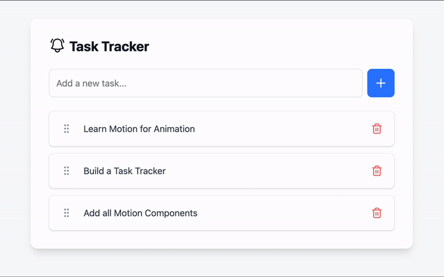
Just like everything else, Motion makes implementing drag-and-drop easy. To make an element draggable, first wrap it with a Motion component, and then add the drag prop. That’s all you need. As an example, you go from this:
<div>Drag me around!</div>
To this:
<motion.div drag>Drag me around</motion.div>
And that’s it! Doing this will let you drag the div anywhere, including off the screen. That’s why Motion provides extra props like dragConstraint to help you limit the range a component can be dragged to, and dragElastic to moderate how elastic the boundary is.
dragConstraint accepts either an object with values for top, left, right, and bottom, or a ref to another DOM object. The value of dragElastic ranges from zero (meaning the boundaries aren’t elastic at all) to one, where the boundaries are as elastic as possible. Here’s an example:
 <motion.div
  drag
  dragConstraints={{
    top: -50,
    left: -50,
    right: 50,
    bottom: 50,
  }}
  dragElastic={0.3}
>
  Drag me around
</motion.div>
Now, the div can only be dragged within a 50px region in any direction, and the region’s boundaries are slightly elastic.
Motion is a great tool, but like any tool, it can be misused. Here are a few rules of thumb to optimize performance when using Motion:
LazyMotion, domAnimations and lazy m for your global settings.layoutGroup component and layoutId prop for shared element animationstransform and opacity properties whenever possibleFollowing these practices will help you optimize performance and create smoother animations with Motion in React
Let’s see how Motion compares to various alternative libraries like React Spring and Anime.js. We will compare using metrics like automatic layout animations, built-in gesture support, and accessibility features:
| Features | Motion | React Spring | Anime.js |
|---|---|---|---|
| Automatic layout animation | Comes with built-in layout animations with a single layout prop that handles everything | Manual calculations needed when creating layout animations | Has no built-in layout system. Better suited for handling keyframe animation |
| Built-in gesture support | Provides native drag, hover, and tap support with seamless animations | Requires additional libraries for gesture support | Has no built-in gesture support |
| Accessibility features | Allows for easy accessibility configurations via MotionConfig, which allows you to set a site-wide policy for respecting the user’s device settings | Requires custom solutions for accessibility | No built-in accessibility features |
| Syntax | Component-based approach with a React-like API | Imperative approach with a Hook-based API | Uses imperative Javascript API |
| SVG animations | Comes with native SVG support and path-drawing animations | Basic SVG support and manual path animation | Excellent SVG support with advanced path animations and morphing |
Motion is a popular, well-supported JavaScript-based animation library for React applications that simplifies the process of implementing complex animations. In this article, we used Motion to build an animated task tracker, animate an SVG, and implement drag-and-drop.
I hope you enjoyed this article. Happy coding!
Install LogRocket via npm or script tag. LogRocket.init() must be called client-side, not
server-side
$ npm i --save logrocket

// Code:

import LogRocket from 'logrocket';
LogRocket.init('app/id');
// Add to your HTML:

<script src="https://cdn.lr-ingest.com/LogRocket.min.js"></script>
<script>window.LogRocket && window.LogRocket.init('app/id');</script>

Why do real-time frontends break at scale? Learn how event-driven patterns reduce drift, race conditions, and inconsistent UI state.

Test out Auth.js, Clerk, WorkOS, and Better Auth in Next.js 16 to see which auth library fits your app in 2026.
When should you move API logic out of Next.js? Learn when Route Handlers stop scaling and how ElysiaJS helps.

Explore how Dokploy streamlines app deployment with Docker, automated builds, and simpler infrastructure compared to traditional CI/CD workflows.
Would you be interested in joining LogRocket's developer community?
Join LogRocket’s Content Advisory Board. You’ll help inform the type of content we create and get access to exclusive meetups, social accreditation, and swag.
Sign up now

 Learn more →
