The hamburger menu icon is a common design element in mobile and responsive websites and applications. It offers a compact way to hide and show navigation links, maintaining a clean and uncluttered user interface. When enhanced with animations, it provides a visually appealing user experience.
In this tutorial, we will:
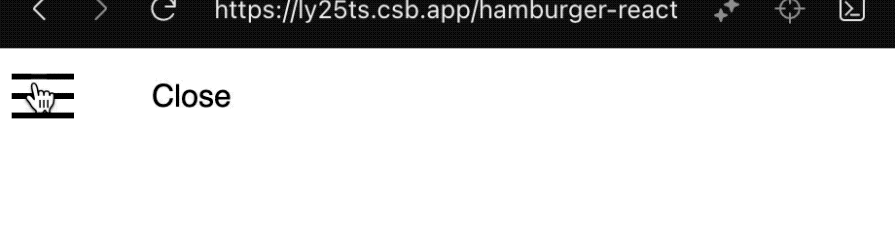
hamburger-react libraryBefore we learn how to create a custom hamburger menu icon in React, one way to add a hamburger button to our React project is by using a library. Among the various options, the hamburger-react library stands out for its simple, elegant, and performant animated hamburger icons with CSS-driven transitions.
Let’s install the library:
npm install hamburger-react
A basic implementation will look like this:
import { useState } from "react";
import Hamburger from "hamburger-react";

export const HamburgerReact = () => {
  const [isOpen, setIsOpen] = useState(false);
  return (
    <div className="hamburger-wrapper">
      <Hamburger toggled={isOpen} toggle={setIsOpen} />
      <div>{isOpen ? "Open" : "Close"}</div>
    </div>
  );
};
We’ve used React’s [useState](https://blog.logrocket.com/guide-usestate-react/) Hook to manage the expanded and collapsed state of the hamburger:
The Hamburger component from the library provides properties like toggled and toggle to control the state of the menu icon. Additionally, the component offers various other properties to customize the appearance and behavior of the animated hamburger menu icon, as shown below:
<Hamburger
  toggled={isOpen}
  toggle={setIsOpen}
  size={40}
  direction="left"
  duration={0.8}
  distance="lg"
  rounded
  label="Show menu"
  color="#ff0000"
  easing="ease-in"
/>
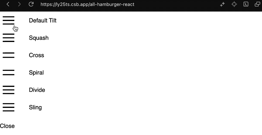
The library also provides additional named exports for various styles of hamburger menu icons:
import { Squash as HamburgerSquash } from 'hamburger-react';
import { Cross as HamburgerCross } from 'hamburger-react';
import { Spiral as HamburgerSpiral } from 'hamburger-react';
import { Divide as HamburgerDivide } from 'hamburger-react';
import { Sling as HamburgerSling } from 'hamburger-react';
Their respective behavior is as follows:
You can interact with the code on CodeSandBox to see it in action and experiment with it in real time.
This library provides several pre-defined styles while also allowing for some customization through the Hamburger props. However, it may not offer as much flexibility as you want. To further enhance the visual appeal and have total customization control, we will create a custom hamburger menu icon component.
To create a reusable hamburger icon component, we’ll utilize TypeScript to ensure that the props provided by users adhere to the expected types.
Note: You don’t, you don’t have to know Typescript to follow along. If you prefer, you can code along with vanilla JavaScript and omit all instances of TypeScript.
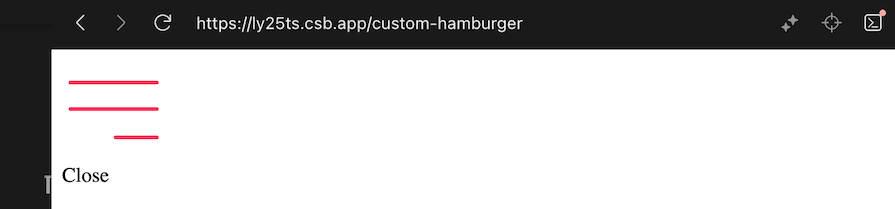
A minimalistic component is as follows:
interface AnimatedHamburgerProps {}

export const AnimatedHamburger = ({}: AnimatedHamburgerProps) => {
  return (
    <div className="hamburger">
      <div className="bar bar1"></div>
      <div className="bar bar2"></div>
      <div className="bar bar3"></div>
    </div>
  );
};
The outer div acts as the container for the entire hamburger icon and will position the three inner div elements representing bars in the hamburger icon.
To ensure consistency and a visually pleasing design, we’ll make the bar width proportional to the overall size of the hamburger icon that the user provides through the prop. Additionally, the color of the bars will be adjustable based on user input.
The code below applies inline styles to the bars to dynamically set the background, width, and height, allowing for a more flexible and customizable design:
interface AnimatedHamburgerProps {
  color?: string;
  size?: number;
}
export const AnimatedHamburger = ({
  color = "black",
  size = 48,
}: AnimatedHamburgerProps) => {
  const barHeight = 3;
  const barWidth = size * 0.875; // 42px out of 48px
  const smallBarWidth = size * 0.4375; // 21px out of 48px
  return (
    <div className="hamburger" style={{ width: size, height: size }}>
      <div
        className="bar bar1"
        style={{
          background: color,
          width: barWidth,
          height: barHeight,
        }}
      ></div>
      <div
        className="bar bar2"
        style={{
          background: color,
          width: barWidth,
          height: barHeight,
        }}
      ></div>
      <div
        className="bar bar3"
        style={{
          background: color,
          width: smallBarWidth,
          height: barHeight,
        }}
      ></div>
    </div>
  );
};
To complete the design, we should also apply the following generic styles in the CSS file:
/* Hamburger Styles */
.hamburger {
  cursor: pointer;
  position: relative;
  user-select: none;
  outline: none;
  z-index: 10;
}
.hamburger .bar {
  position: absolute;
  border-radius: 9em;
}
/* Individual Bars */
.hamburger .bar1 {
  top: 20%;
  left: 6.25%;
}
.hamburger .bar2 {
  top: 45.83%;
  left: 6.25%;
}
.hamburger .bar3 {
  top: 72.92%;
  right: 6.25%;
}
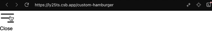
After implementing the above code and styles, we will get the following hamburger menu icon:
Let’s toggle the hamburger menu based on user interaction. In a parent component, we’ll pass the state properties, isOpen, and setIsOpen, to the AnimatedHamburger component similar to the earlier implementation with the hamburger-react library:
import { useState } from "react";
import { AnimatedHamburger } from "./AnimatedHamburger";
export const HamburgerWrapper = () => {
  const [isOpen, setIsOpen] = useState(false);
  return (
    <>
      <AnimatedHamburger isOpen={isOpen} setIsOpen={setIsOpen} />
    </>
  );
};
After receiving the state properties, the AnimatedHamburger component is designed to handle user interactions for toggling the menu and applying dynamic classes to the hamburger div based on the prop:
import { Dispatch, SetStateAction } from "react";

interface AnimatedHamburgerProps {
  color?: string;
  size?: number;
  isOpen: boolean;
  setIsOpen: Dispatch<SetStateAction<boolean>>;
}
export const AnimatedHamburger = ({
  color = "black",
  size = 48,
  isOpen,
  setIsOpen,
}: AnimatedHamburgerProps) => {
  // ...
  const toggleMenu = () => {
    setIsOpen(!isOpen);
  };
  return (
    <div
      className={`hamburger ${isOpen ? "open" : "close"}`}
      style={{ width: size, height: size }}
      onClick={toggleMenu}
    >
      {/* ... */}
    </div>
  );
};
If we inspect the DevTools and interact with the hamburger menu icon, we will see the class names being applied:
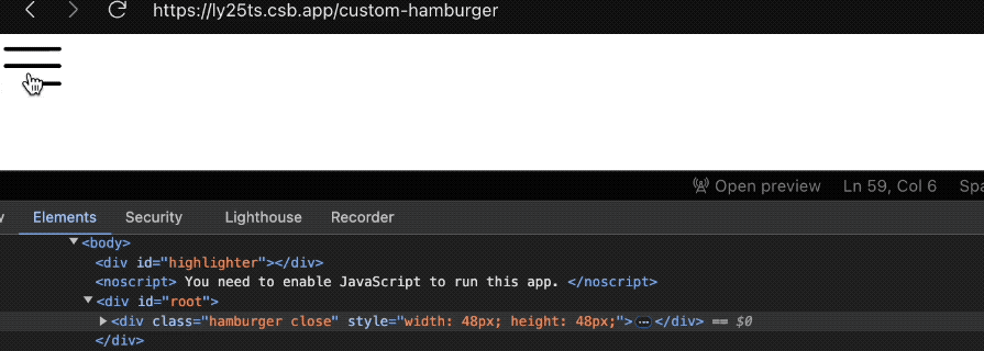
We’ll utilize the conditional class names to trigger CSS animations with keyframes for each bar of the hamburger menu.
Alright, let’s give this hamburger some toppings. We’ll apply specific animations to the three bars of the icon based on the open and closed state. For the open-state animations, we‘ll have the following:
/* Open State Animations */
.hamburger.open .bar1 {
  animation: bar1-open 0.3s forwards;
}
.hamburger.open .bar2 {
  animation: bar2-open 0.3s forwards;
}
.hamburger.open .bar3 {
  animation: bar3-open 0.3s forwards;
}
These rules trigger animations for the bars when the hamburger menu is opened. For the close-state animations, we’ll have this:
/* Close State Animations */
.hamburger.close .bar1 {
  animation: bar1-close 0.3s forwards;
}
.hamburger.close .bar2 {
  animation: bar2-close 0.3s forwards;
}
.hamburger.close .bar3 {
  animation: bar3-close 0.3s forwards;
}
We can now use the CSS keyframes to define the intermediate steps of the animations. The following describes how the first bar should transition from one state to another:
/* Keyframes for Bar Animations */
@keyframes bar1-open {
  0% {
    transform: rotate(0);
    top: 20%;
  }
  50% {
    transform: rotate(0);
    top: 45.83%;
  }
  100% {
    transform: rotate(45deg);
    top: 45.83%;
  }
}
@keyframes bar1-close {
  0% {
    transform: rotate(45deg);
    top: 45.83%;
  }
  50% {
    transform: rotate(0);
    top: 45.83%;
  }
  100% {
    transform: rotate(0);
    top: 20%;
  }
}
These keyframes handle the rotation and vertical position of the first bar during opening and closing.
The following keyframes animate the second bar’s rotation, making it turn into an “X” shape with the first bar when the menu opens and revert when closing:
@keyframes bar2-open {
  0% {
    transform: rotate(0);
  }
  50% {
    transform: rotate(0);
  }
  100% {
    transform: rotate(-45deg);
  }
}
@keyframes bar2-close {
  0% {
    transform: rotate(-45deg);
  }
  50% {
    transform: rotate(0);
  }
  100% {
    transform: rotate(0);
  }
}
The following keyframes animate the third bar’s vertical position and opacity, making it disappear when the menu opens and reappear when it closes:
@keyframes bar3-open {
  0% {
    top: 72.92%;
    opacity: 1;
  }
  50% {
    top: 45.83%;
    opacity: 1;
  }
  100% {
    top: 45.83%;
    opacity: 0;
  }
}
@keyframes bar3-close {
  0% {
    top: 45.83%;
    opacity: 0;
  }
  50% {
    top: 45.83%;
    opacity: 1;
  }
  100% {
    top: 72.92%;
    opacity: 1;
  }
}
In the end, the result looks like so:
We can dynamically change the hamburger size and color via their respective props:
<AnimatedHamburger
  isOpen={isOpen}
  setIsOpen={setIsOpen}
  color="#ff355e" // or "red", "orange", "blue"
  size={80}
/>
The code above will produce the following icon:
When the page loads, the hamburger menu is initially in a closed state. Recall, in the hamburger div wrapper, we conditionally apply the open and close classes like this:
className={`hamburger ${isOpen ? "open" : "close"}`}
This means that on page load, the close class is applied, triggering the keyframe animations defined in our CSS:
.hamburger.close .bar1 {
  animation: bar1-close 0.3s forwards;
}
.hamburger.close .bar2 {
  animation: bar2-close 0.3s forwards;
}
.hamburger.close .bar3 {
  animation: bar3-close 0.3s forwards;
}
To prevent these animations from running automatically when the page loads, we need to ensure they only occur due to user interaction. We can do this by adding a state to track user interaction and only applying the animation when the user interacts with the component:
import {
  // ...
  useEffect,
  useState,
} from "react";
export const AnimatedHamburger = ({}: AnimatedHamburgerProps) => {
  const [canAnimate, setCanAnimate] = useState(false);
  const [interactionOccurred, setInteractionOccurred] = useState(false);
  useEffect(() => {
    if (interactionOccurred) {
      setCanAnimate(true);
    }
  }, [interactionOccurred]);
  // ...
  const toggleMenu = () => {
    // ...
    setInteractionOccurred(true);
  };
  return (
    <div
      className={`hamburger ${isOpen ? "open" : "close"} ${
        canAnimate ? "animate" : ""
      }`}
    >
      {/* ... */}
    </div>
  );
};
In the code above, we apply a custom animate class to the hamburger after user interaction occurs.
We can then update the close-state animations to use this animate class:
/* Close State Animations */
.hamburger.animate.close .bar1 {
  animation: bar1-close 0.3s forwards;
}
.hamburger.animate.close .bar2 {
  animation: bar2-close 0.3s forwards;
}
.hamburger.animate.close .bar3 {
  animation: bar3-close 0.3s forwards;
}
Let’s integrate accessibility features to enhance user experience. The following code adds ARIA attributes and manages focus by including onKeyDown for keyboard interactions, setting aria-expanded and aria-label to provide contextual information, using role="button" to indicate the element’s function, and applying tabIndex={0} to ensure the element is focusable:
export const AnimatedHamburger = ({...}: AnimatedHamburgerProps) => {
  // ...
  const handleKeyDown = (e: React.KeyboardEvent<HTMLDivElement>) => {
    if (e.key === "Enter" || e.key === " ") {
      e.preventDefault(); // Prevent default behavior for space bar
      toggleMenu();
    }
  };
  return (
    <div
      // ...
      onKeyDown={handleKeyDown}
      aria-expanded={isOpen}
      aria-label={isOpen ? "Close menu" : "Open menu"}
      role="button"
      tabIndex={0}
    >
      {/* ... */}
    </div>
  );
};
We now have a component that we can toggle using the Enter and Space keys, enhancing keyboard navigation and ensuring accessibility compliance.
We’ll also apply a focus style using the :focus-visible pseudo-class when the hamburger icon receives focus through keyboard navigation:
.hamburger:focus-visible {
  outline: 2px solid #bfbfbf; /* Adjust color for your design */
}
You can interact with the code on CodeSandBox to see it in action and experiment with it in real time.
Whether using the hamburger-react library or our custom AnimatedHamburger component, we have a menu button design to maintain its state, indicating whether it is expanded or collapsed:
export const HamburgerWrapper = () => {
  const [isOpen, setIsOpen] = useState(false);
  return (
    <>
      <AnimatedHamburger isOpen={isOpen} setIsOpen={setIsOpen} />
    </>
  );
};
Any component within the same file as the AnimatedHamburger can adapt to changes in the hamburger menu’s state. However, to enable external components to monitor and respond to the hamburger menu’s state, we can use state management solutions like React Context to broadcast the state updates.
Let’s put the state in a context store and make it available for components to access. Create a context/hamburger-context.tsx file in the src folder and add the following code:
import {
  createContext,
  Dispatch,
  ReactNode,
  SetStateAction,
  useContext,
  useState,
} from "react";

interface HamburgerContextType {
  isOpen: boolean;
  setIsOpen: Dispatch<SetStateAction<boolean>>;
}

const HamburgerContext = createContext<HamburgerContextType | null>(null);

export const HamburgerProvider = ({ children }: { children: ReactNode }) => {
  const [isOpen, setIsOpen] = useState(false);
  return (
    <HamburgerContext.Provider value={{ isOpen, setIsOpen }}>
      {children}
    </HamburgerContext.Provider>
  );
};

// Custom hook for using the context
export const useHamburgerContext = () => {
  const context = useContext(HamburgerContext);
  if (context === null) {
    throw new Error(
      "useHamburgerContext must be used within a HamburgerProvider"
    );
  }
  return context;
};
This setup manages the current state of the hamburger menu (open or closed) and provides this context to any subscribing components. We can create additional components, like the Sidebar and BackgroundOverlay to subscribe to the context, allowing them to stay in sync and respond dynamically to changes in the menu’s state.
To ensure that these components have access to the context state, we will wrap them with the HamburgerProvider as follows:
import { HamburgerProvider } from "../context/hamburger-context";

export const HamburgerMenuProject = () => {
  return (
    <HamburgerProvider>
      <HamburgerWrapper2 />
      <BackgroundOverlay />
      <Sidebar />
    </HamburgerProvider>
  );
};
The AnimatedHamburger can now control the global context state that other components can consume rather than using the local state:
import { useHamburgerContext } from "../context/hamburger-context";

export const HamburgerWrapper2 = () => {
  //   const [isOpen, setIsOpen] = useState(false);
  const { isOpen, setIsOpen } = useHamburgerContext();
  return <AnimatedHamburger isOpen={isOpen} setIsOpen={setIsOpen} />;
};
Also, the Sidebar and BackgroundOverlay components can subscribe to state updates and react accordingly to the toggle state.
The Sidebar component should look like this:
import { useHamburgerContext } from "../context/hamburger-context";

export const Sidebar = () => {
  const { isOpen } = useHamburgerContext();
  return (
    <div className={`sidebar ${isOpen ? "open" : ""}`}>
      Sidebar content here
    </div>
  );
};
We can add the following CSS to style the sidebar:
/* Sidebar */
.sidebar {
  display: flex;
  justify-content: center;
  align-items: center;
  position: fixed;
  top: 0;
  transform: translateX(-320px); /* Hide the sidebar */
  width: 100%;
  max-width: 280px;
  min-height: 100vh;
  background-color: #cbcbcb;
  transition: transform 0.3s ease;
  z-index: 5;
}
.sidebar.open {
  transform: translateX(0); /* Slide in the sidebar */
}
The styles ensure the sidebar slides in smoothly when the hamburger menu is toggled open.
The BackgroundOverlay component should be implemented as follows:
import { useHamburgerContext } from "../context/hamburger-context";

export const BackgroundOverlay = () => {
  const { isOpen, setIsOpen } = useHamburgerContext();
  return (
    <div
      onClick={() => setIsOpen(false)}
      className={`overlay ${isOpen ? "open" : ""}`}
    ></div>
  );
};
This component subscribes to the context state and updates it accordingly. When the overlay is clicked, it sets the hamburger menu state to close, thereby also closing the sidebar.
We can add the following CSS to style the overlay:
/* Overlay */
.overlay {
  position: fixed;
  top: 0;
  left: 0;
  width: 100%;
  height: 100%;
  background-color: rgba(0, 0, 0, 0.5); /* Semi-transparent black */
  z-index: 2; /* Should be below the sidebar */
  opacity: 0;
  transition: opacity 0.3s ease-in-out;
}
.overlay.open {
  opacity: 1;
}
The GIF below demonstrates the result:

You can interact with the code on CodeSandBox to see it in action and experiment with it in real time.
By following this tutorial, you’ve learned how to create an animated hamburger menu icon for a React application, both using the hamburger-react library and from scratch. We applied CSS animations with keyframes to enhance the visual appeal.
We also provided a solution for how components can subscribe to state updates using React context, allowing other components such as Sidebar and BackgroundOverlay to react to state changes.
If you thought this article was pretty delicious, share it! If you have any questions or recommendations, feel free to share them in the comment section.
As web frontends get increasingly complex, resource-greedy features demand more and more from the browser. If you’re interested in monitoring and tracking client-side CPU usage, memory usage, and more for all of your users in production, try LogRocket.

LogRocket lets you replay user sessions, eliminating guesswork around why bugs happen by showing exactly what users experienced. It captures console logs, errors, network requests, and pixel-perfect DOM recordings — compatible with all frameworks.
LogRocket's Galileo AI watches sessions for you, instantly identifying and explaining user struggles with automated monitoring of your entire product experience.
Modernize how you debug web and mobile apps — start monitoring for free.
Install LogRocket via npm or script tag. LogRocket.init() must be called client-side, not
server-side
$ npm i --save logrocket

// Code:

import LogRocket from 'logrocket';
LogRocket.init('app/id');
// Add to your HTML:

<script src="https://cdn.lr-ingest.com/LogRocket.min.js"></script>
<script>window.LogRocket && window.LogRocket.init('app/id');</script>

Explore why npm dependencies are a major supply chain security risk and how to protect JavaScript apps from compromised packages and transitive threats.

Enabled React Compiler v1.0 on a production Next.js app. Here’s every warning, breakage, and silent opt-out I documented — and what actually worked.

We built the same app in TanStack Start RSC and Next.js RSC. TanStack shipped 40% less JS and built 4x faster — but Next.js is still the safer production bet.

From RSC vulnerabilities and the Vercel breach to TypeScript 7.0 Beta and AI agents — the nine frontend storylines that defined H1 2026, ranked.
Would you be interested in joining LogRocket's developer community?
Join LogRocket’s Content Advisory Board. You’ll help inform the type of content we create and get access to exclusive meetups, social accreditation, and swag.
Sign up now

 Learn more →
