Highlights are used to emphasize or draw attention to something. For example, when reading physical books, you can highlight important text with a highlighter marker. Similarly, you can highlight text online with editing tools like Google Docs.
Online highlights are usually straight, rectangular, and colored strokes that draw attention to certain text. We already know we can do some awesome stuff with CSS, but, in this article, we’ll go over how to create a skewed highlight with CSS. Let’s get started!
Jump ahead:
background-image property
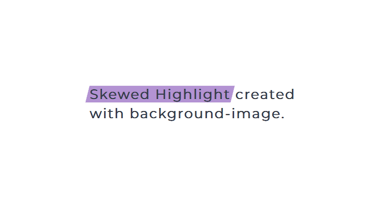
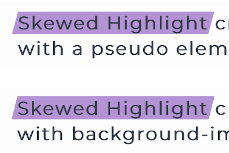
clip-pathbackground-image propertyWe’re going to use the CSS background-image property with linear-gradient to create a skewed highlight. Here’s what we want to achieve:
First, you need some text. Here’s an example:
<body>
<div class="container">
<h1>
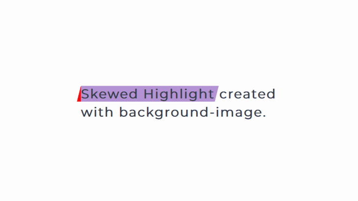
<span>Skewed Highlight</span>
created with background-image.
</h1>
</div>
</body>
The part that’s going to be highlighted is wrapped in the span tag. Now, let’s highlight the text by adding a background-color:
h1 span {
  background-color: #b393d3;
}
The code image above results from the previous code, but as you can see, the highlight is not skewed. To make it skewed, we’re going to divide the text into three parts with gradients, as seen below:
h1 span {
  background-image:
    linear-gradient(to bottom right, transparent 50%, #b393d3 50%),
    linear-gradient(#b393d3, #b393d3),
    linear-gradient(to top left, transparent 50%, #b393d3 50%);
}
The first gradient creates a slope on the left side of the highlight. The second gradient with the same color on two color stops ensures that the color is uniform in the middle. Finally, the last gradient creates the slope at the end. After this, the highlight will remain straight, so we have to size and position it properly.
Here’s the complete CSS syntax:
h1 span {
  background-image: linear-gradient(
      to bottom right,
      transparent 50%,
      #b393d3 50%
    ),
    linear-gradient(#b393d3, #b393d3),
    linear-gradient(to top left, transparent 50%, #b393d3 50%);
  background-repeat: no-repeat;
  background-size: 10px 40px, calc(100% - 20px) 40px, 10px 40px;
  background-position: left center, center, right;
}
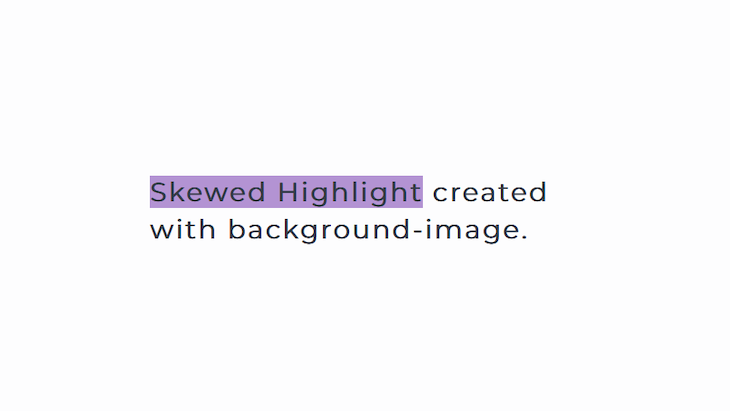
At this point, the highlight doesn’t cover the whole text. To fix this, we’re going to add some padding. This will create a space between the highlighted text and the next word. To remove it, we’ll reduce the margin by the same amount of padding that’s being added, as shown in the code below:
h1 span {
  padding: 10px;
  margin: -10px;
  background-image: linear-gradient(
      to bottom right,
      transparent 50%,
      #b393d3 50%
    ),
    linear-gradient(#b393d3, #b393d3),
    linear-gradient(to top left, transparent 50%, #b393d3 50%);
  background-repeat: no-repeat;
  background-size: 10px 40px, calc(100% - 20px) 40px, 10px 40px;
  background-position: left center, center, right;
}
See the Pen
Skewed Highlight by Oscar-Jite (@oscar-jite)
on CodePen.
Here’s how each gradient affects the text:
linear-gradient(to bottom right, transparent 50%, red 50%),:
linear-gradient(red, red),:
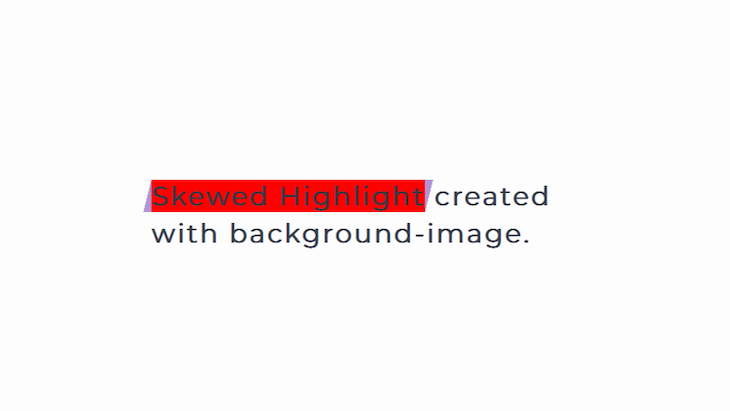
linear-gradient (to top left, transparent 50%, red 50%);:
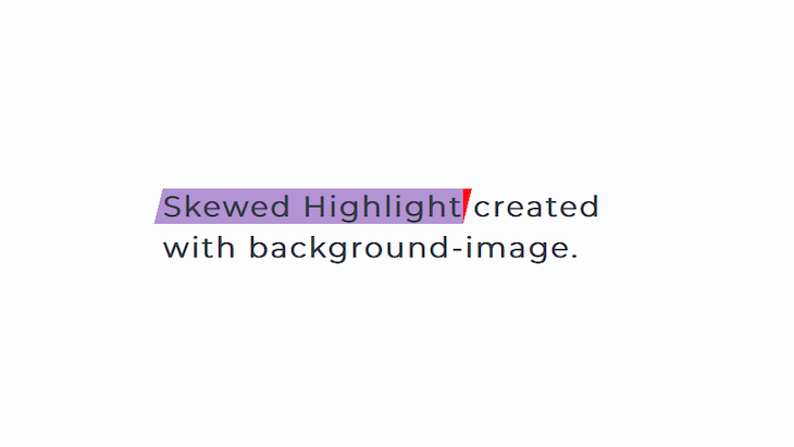
That’s one way to create a skewed highlight with CSS. If you look closely at the angled edges, they’re a little jagged, so we’ll try another method.
For this method, the highlight is going to be a :before pseudo-element. After adding the pseudo-element, you’ll use the transform CSS property to skew the element in a particular direction.
Here’s the CSS:
h1 span {
  position: relative;
  z-index: 1;
}
h1 span::before {
  content: "";
  position: absolute;
  top: 0;
  bottom: 0;
  left: -5px;
  right: -5px;
  background-color: #b393d3;
  transform: skew(-15deg);
  z-index: -1;
}
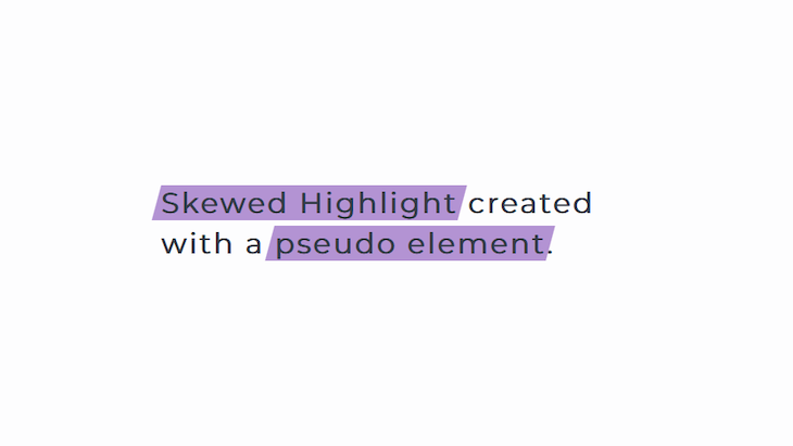
Here’s the result:
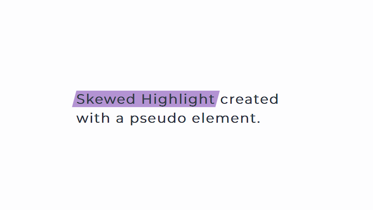
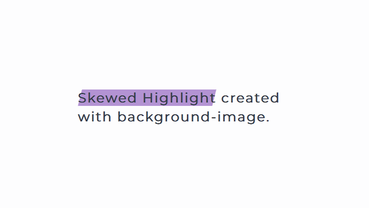
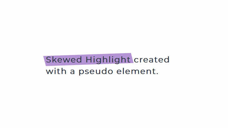
This method produces smooth edges on all sides of the highlight. Here’s a closer look:
It’s also easier to create the skewed highlight because your main concern is the angle of the skew. Check out this example below:
See the Pen
Skewed with a pseudo element by Oscar-Jite (@oscar-jite)
on CodePen.
If you want to add a second highlight, just wrap that part in the same tag and use the same styling as shown below:
<div class="container">
    <h1>
      <span>Skewed Highlight</span>
      created with a <span>pseudo element</span>.
    </h1>
  </div>
Now, you have two highlights:
By default, the direction of the skew is on the x-axis. Normally, you use skewX() and skewY() for the x and y-axes, respectively. You can also include them together by having two values in the brackets separated with a comma:
h1 span::before {
  transform: skew(15deg,-2deg);
}
Now, we have a highlight that’s skewed on both the x and y-axes:
clip-pathSo far, the highlights have both ends skewed. However, what if we want one end skewed or different skew directions?
This can be done with background-image by changing the direction of the linear-gradient. But, as we’ve seen, the gradients produce jagged edges around the highlights. A solution to this is to use the clip-path property to create the shape of the highlight.
We can use this great tool to make clip-path shapes:
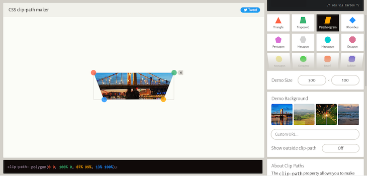
Using the same text, let’s skew one end of the highlight:
h1 span::before {
  content: "";
  position: absolute;
  top: 0;
  bottom: 0;
  left: -5px;
  right: -9px;
  background-color: #b393d3;
  clip-path: polygon(0 0, 100% 0, 97% 100%, 0% 100%);
  z-index: -1;
}
Here’s the result:
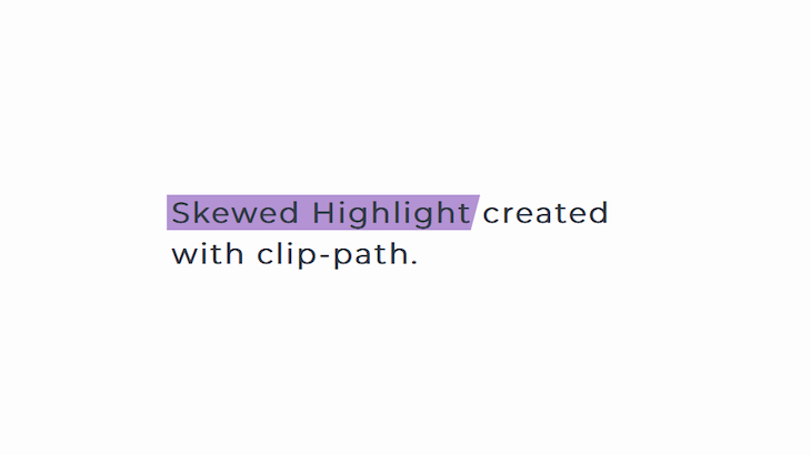
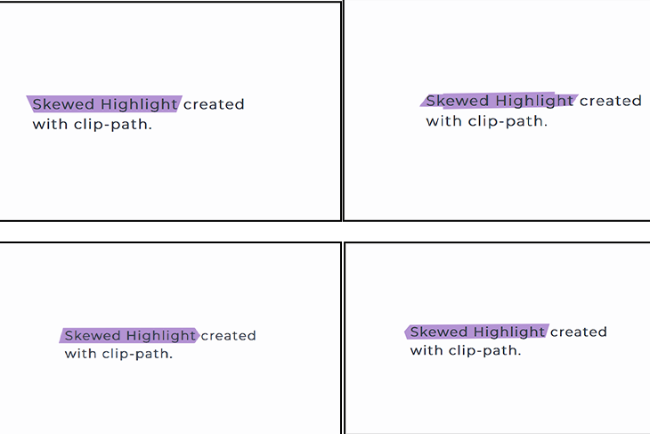
You can create several shapes, but because the text area is small, making the highlight fit properly could come down to trial and error. Here are some examples:
There you go! We’ve covered that’s how to create a skewed highlight with CSS. You can pick the method that works for you and apply it to some text.
As much as highlighting text improves the visual aspect of your website, keep in mind that it shouldn’t affect its accessibility. Web accessibility means that everyone should be able to use your website without issues. Because we’re dealing with text, the major accessibility concerns revolve around readability. Here are some tips to mitigate those concerns.
The color of the highlight should be very distinct from that of the text. The users should have no issues reading the text. It’s also a good idea to find color combinations that are distinguishable by persons who are color blind. For example, you should try to avoid red and green. To pick the right colors, consider using a color palette tool.
Another group of persons you should consider is those with visual impairments who may require reading software. Text-to-speech software should be able to detect the highlighted text. When working with CSS, it’s essential to keep accessibility in mind. You can refer to our guide to improving web accessibility with CSS to learn more.
We used a few different properties, so it’s important to know their compatibility across different browsers. All modern browsers support linear-gradient, and you’ll need the -webkit- prefix for Safari, -moz- for Firefox, and -o- for Opera.
The :before pseudo-element is also supported on every modern browser. It’s not supported on Internet Explorer v7 and below, and you should keep in mind that Internet Explorer v8 doesn’t support content.
The skew function has good support but will need vendor prefixes for Safari, Opera, and Firefox. The clip-path property is not supported on Internet Explorer v10 and below. Lastly, complex shapes have varied support.
Highlights can draw attention to important information, or you could just be looking to add a splash of color to your webpage. You can create a skewed highlight with CSS using gradients with the background-image property or make it easy by using skew on a pseudo-element. If you want to spice up your highlight by changing its shape, the clip-path can help you.
As web frontends get increasingly complex, resource-greedy features demand more and more from the browser. If you’re interested in monitoring and tracking client-side CPU usage, memory usage, and more for all of your users in production, try LogRocket.

LogRocket lets you replay user sessions, eliminating guesswork around why bugs happen by showing exactly what users experienced. It captures console logs, errors, network requests, and pixel-perfect DOM recordings — compatible with all frameworks.
LogRocket's Galileo AI watches sessions for you, instantly identifying and explaining user struggles with automated monitoring of your entire product experience.
Modernize how you debug web and mobile apps — start monitoring for free.
Would you be interested in joining LogRocket's developer community?
Join LogRocket’s Content Advisory Board. You’ll help inform the type of content we create and get access to exclusive meetups, social accreditation, and swag.
Sign up now
Discover how to use Gemini CLI, Google’s new open-source AI agent that brings Gemini directly to your terminal.

This article explores several proven patterns for writing safer, cleaner, and more readable code in React and TypeScript.
A breakdown of the wrapper and container CSS classes, how they’re used in real-world code, and when it makes sense to use one over the other.

This guide walks you through creating a web UI for an AI agent that browses, clicks, and extracts info from websites powered by Stagehand and Gemini.

