Editor’s note: This guide to using CSS ::before and ::after to create custom animations and transitions was updated on 20 November 2022 to include more information about the differences between pseudo-elements and pseudo-classes and add interactive code examples.
Have you ever come across a beautifully animated component on a website and thought to yourself, “Wow! That’s sleek — I wish I could do that,” but quickly gave up on the thought because you assumed it was either beyond your skill or only achievable using an animation library of some sort?
You’d be surprised to learn that most of these complex designs you see daily were created with plain vanilla CSS, using the power of pseudo-elements. In this article, we’ll be looking at how to use these pseudo-elements to create staggering effects.
We’ll learn about pseudo-elements — specifically the ::before and ::after pseudo-elements — and how we can get creative with them to create staggering animated transitions. We’ll start by creating a simple but creatively animated button to get a feel for it. Then, we’ll take it a notch higher by creating an animated profile card that showcases the true power of the ::before and ::after pseudo-elements.
Before we can get to the fun part, we have to cover some basics to familiarize ourselves with all that’s required to make our animations work. You should have a basic understanding of HTML and CSS. You will also need a code editor and browser.
Jump ahead:
relative and absolute properties
z-indexAnimations create micro-interactions between your users and your website. It can be quite difficult to grab a user’s attention, but a well-designed and well-placed animation can pull users in by getting them interested in the content of your website.
Cool animations also give life to simple-looking interface designs and help improve UX when designed around user actions by providing visual feedback.
Pseudo-elements are CSS selectors used to insert artificial or decorative content. For example, content that is not found in the actual HTML markup. Pseudo-elements also style certain parts of an element. There are several pseudo-elements like the ::before, ::after, ::placeholder, ::first-letter, and more. But in this article, we’ll be focusing on ::before and ::after.
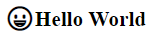
::before pseudo-elementAn element’s ::before pseudo-element inserts some content before the element. The pseudo-element is the first child of the selected element:
h1::before {
  content: "😀";
}
The output of the above would be:
::after pseudo-elementThe ::after pseudo-element is used to insert some content after the content of an element. The pseudo-element is the last child of the selected element:
h1::after{
  content: "😀";
}
Similarly, the output of the above would be:
Pseudo-elements are sometimes confused for pseudo-classes because they look and sound similar, but they are not.
A pseudo-element is a keyword appended to a selector that lets you style a specific part of the selected element(s). For example,::first-letter can be used to style the first letter of a paragraph. Pseudo-elements are keywords that start with a double colon: ::pseudo-class-name:
/* the first letter of every paragraph is colored red and given a bigger font
size */
p::first-letter{
  color:red;
  font-size: 1.25rem;
}
The ::before and ::after pseudo-elements are special because they add content to a specific part of the selected elements(s).
In contrast, a pseudo-class is a keyword appended to a selector that targets an element’s state. For example, it can identify if an element is the first child (location state), if an input element is in a valid state, or if the element is hovered over by a mouse pointer (user action state).
Pseudo-classes are keywords that start with a single colon: :pseudo-class-name.
A typical example is the :hover pseudo-class, which is used to apply CSS rules when the user hovers over an element. This is usually used for interactive elements, such as links and buttons:
/* Any button which the user's pointer is hovering over changes color */
button:hover {
  background-color: lightgrey;
}
There are many more pseudo-classes that target different categories:
:checkedlang():visited:playing:current:first-child:hoverTo return to our previous first letter example, we probably do not want to target every single paragraph with this style. It is more common to style the first letter of the first paragraph in this manner, like the norm is for old manuscripts. We can use the:first-of-type pseudo-class in combination with the::first-letter pseudo-element:
/* the first letter of the first paragraph is colored red and given a bigger font
size */
p:first-of-type::first-letter{
  color:red;
  font-size: 1.25rem;
}
Before we can get right down to the project section of the article, we have to get on the same page. Let’s make sure we have a basic understanding of some of the CSS properties that make animating with CSS a possibility:
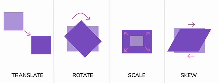
transform: This property lets you rotate, scale, skew, and move an element. This is done through its transformation functions, such as rotate() andscale()transition: Enables the definition of animation through the transitioning of an element from one state to anotherposition: Sets how an element is positioned in a document. It is quite common to position pseudo-elements relative to their parent elementz-index: Sets the z-order of a positioned element. Elements that overlap are stacked according to their z-index. An element with a larger z-index will cover those with a smaller oneI assume you are probably familiar with most of these, if not all of them, but just in case, we’ll take a cursory look at them. If you’re already familiar with them, feel free to skip ahead to the tutorial.
transform and transitionWe’ll be using the CSS transform and transition properties in our project, so it is important that you have a basic understanding of what they are and how they work. The CSS transform property basically allows you to translate (move), rotate, scale, and skew an element:
.box-1 {
 transform: translate(100px, 100px);
}
.box-2 {
 transform: rotate(60deg);
}
.box-3 {
 transform: scale(2);
}
.box-4 {
  transform: skew(-30deg);
}
The transition property allows you to set a time duration for these changes, from one state to another to occur — smoothing the entire animation process. To learn more about animation and transition timing functions in CSS, check out this article.
relative and absolute propertiesThere are several CSS properties that help you easily control the flow and position of an element in an HTML document, but for the sake of this article, we’ll only be looking at the relative and absolute position properties.
relative positionSetting an element’s position to relative lets you control the position of the element in relation to its normal document flow. For example, you can move it around and use the location where it would have been by default as a point of reference.
Here’s an example:
.box-2 {
  position: relative;
  right: -200px;
  top: 0;
}
See the Pen
Relative position by rob2 (@robatronbobby)
on CodePen.
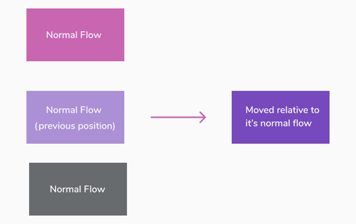
As you can see, the second box gets moved from the right by 200px from its original position, which also doesn’t affect the natural flow of the document as the previous space it occupied is respected by the surrounding elements.
absolute positionWhen setting an element’s position to absolute, the element is pulled from the normal document flow, and no space is created for the element in the page layout (possibly making it overlap with other elements). It is positioned relative to its closest-positioned ancestor (an element with a position other than static). When it fails to find any containing positioned element, it uses the body of the document as a relative point of reference.
Its final position is determined by the values of top, right, bottom, and left:
See the Pen
Absolute positioning by rob2 (@robatronbobby)
on CodePen.
In this example, we create a relative positioned parent with absolute positioned children:
.parent-container {
  position: relative;
}

.box-1 {
  position: absolute;
  left: 20px;
  top: 20px;
}

.box-2 {
  position: absolute;
  right: 50px;
  bottom: 40px;
}
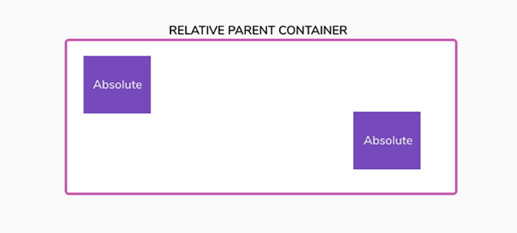
As you’d expect, the parent container becomes a relative point of reference for positioning its absolute children using the provided coordinates. You can try out this interactive article by Ahmad Shadeed to learn more about CSS positioning.
z-indexThe z-index property lets us stack elements on top of each other within the stacking context of the page. If an element has a higher stack order, it will always appear before an element with a lower stack order:
.box-1 {
  z-index: 1;
}
.box-2 {
  z-index: 2;
}
.box-3 {
  z-index: 3;
}
.box-4 {
  z-index: 4;
}
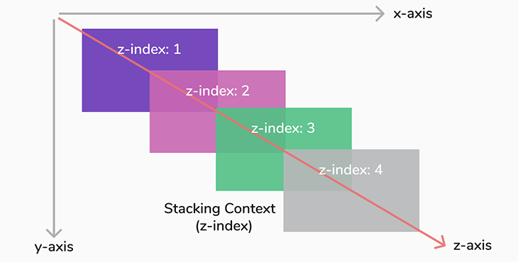
It is also worth noting that the z-index only works on elements that have been positioned using the position property. If two elements have the same z-index, the one that appears last in the HTML markup stays on top.
Now that we’ve covered our basics, let’s move on to our starter project.
For our first project, we’ll start by creating a simple animated button to get a feel for using pseudo-elements to animate. Then, we’ll move on to the more complicated project.
Here is a Codepen of what we will be going through:
See the Pen
animated button by David Herbert (@davehert)
on CodePen.
We’ll start by creating an anchor tag in our HTML mockup that we’ll later style to a button:
<a href="#" class="btn">Hover Me</a>
Here’s our output:

Let’s jump to our CSS file and style this link to look like a typical button:
.btn {
  text-decoration: none;
  border: 2px solid #764abc;
  color: #764abc;
  padding: 10px 20px;
  border-radius: 25px;
    transition: all 1s;
  position: relative;
}
The code should be self-explanatory. We’ve removed the default underline decoration, added a solid border of 2px, and made the color of the button the same as the text. We also added padding to put some space between the text and the border and added a border radius to curve the edges of the button.
Lastly, we added a transition for all properties for a duration of 1 second. For example, any change that occurs to this button should occur smoothly and animate within a second — and set the position to relative because we intend to put a pseudo-element inside this button.
Remember when I mentioned that to position a child element with absolute position, the parent container has to be set to relative? Well, this button will be the parent container. Below is our output:
Now, we are going to create a pseudo-element of this button:
.btn::before {
  content: "";
  position: absolute;
  top: 0;
  left: 0;
  width: 100%;
  height: 100%;
  background-color: #764abc;
  transition: all 1s;
}
You must specify the content property for a :before pseudo-element. Otherwise, it will not be shown. We’ve set content to an empty string to satisfy this; we do not want any text for our pseudo-element. We set its position to absolute, which removes it from its normal flow (making it overlap the button), and then set the coordinates for top and left to 0. This pins the empty pseudo-element to the button at those exact locations.
Afterward, we set the width and height to be exactly 100 percent of the parent, making it the same size as the button itself.
Lastly, we made the pseudo-element’s background the same color as the button and added a transition of 1 second. Below is the output:

As you can see, the pseudo-element overlaps the button because we’ve used an absolute position.
To resolve this, we have to use the z-index property to change their stacking context by pulling the pseudo-element behind the button using a negative value. Then, we use the translateX() transform function to position the pseudo-element along the horizontal axis. Providing a value of -100% positions the pseudo-element adjacent to the element, exactly flush on the left-hand side:
.btn::before {
  /*...previous code */
  z-index: -1;
  transform: translateX(-100%);
}
Et voilà:

Now, we will animate this pseudo-element so that it returns to its original position when we hover over the button, using the :hover pseudo-class:
.btn:hover::before {
  transform: translateX(0);
}
In the code above, we are basically saying that when someone hovers over this button, this pseudo-element should move back to its initial absolute position. Here’s our output:

However, the text is still hidden because the text and the pseudo-element are both the same color. Let’s change the color of the text to display in white when the button is hovered over:
.btn:hover {
  color: #fff;
}

Because we added a translate property to the button itself, this change will occur smoothly.
For the last step, we will apply an overflow: hidden property to the button to hide any element that overflows from the container. When applied to the button, it will hide the translated pseudo-element and only show it when it moves back to position:
.btn {
  /*...previous code. */
  overflow: hidden;
}
Finally, we center the button on the page by making the body a CSS grid container and using the place-items property:
body {
  /* other styles */
  display: grid;
  place-items: center;
}
Final output:

There you have it! We’ve successfully created a beautifully animated button using CSS pseudo-elements.
Now, for the main event, we’ll create a more complex animated profile card using multiple pseudo-elements — four, to be exact — to create a truly stunning hover effect.
Here is a Codepen of what we’ll go through:
See the Pen
Animated Profile Card by David Herbert (@davehert)
on CodePen.
Without further ado, let’s get right into the HTML markup:
<div class="profile-card">
      <div class="info">
        <h2>John Doe</h2>
        <p>Ceo / Founder</p>
      </div>
</div>
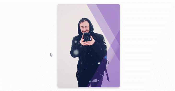
We’ve created a simple card div that holds the user’s bio (consisting of name and position):

Let’s jump to the CSS file and style this card:
.profile-card {
width: 300px;
height: 400px;
border-radius: 8px;
box-shadow: 0 4px 8px rgba(0, 0, 0, 0.2);
display: grid;
place-items: center;
position: relative;
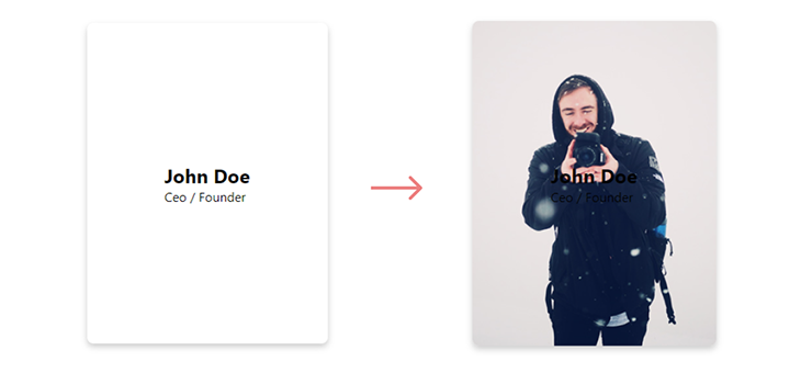
background: url("/image.jpg") no-repeat center center/cover;
}
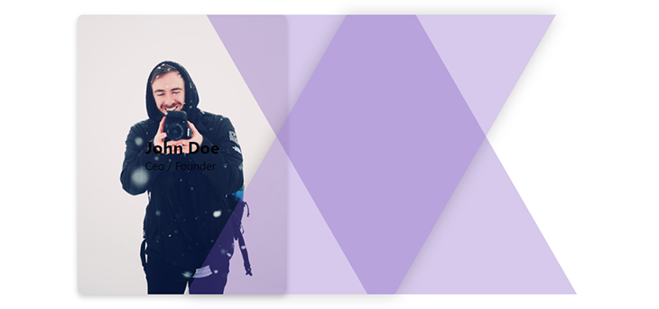
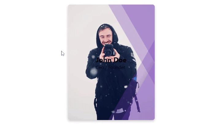
We’ve created a fixed width/height card, placed the content inside at the center using CSS grid, and added a box-shadow to give the edges a bit of shadow, so it looks more realistic. Lastly, we set the card as relative to make it a parent container for the pseudo-elements and added a centered background image. Let’s see our output:
With that out of the way, let’s get on with creating the pseudo-elements.
This is the tricky part. We intend to use four pseudo-elements, but an element can only have one ::before and one ::after pseudo-element, respectively. To get around this, we’ll be using the card itself to create two pseudo-elements. Then, we’ll place another div inside it with the info class that we will use to create another two pseudo-elements, which wrap the content.
Let’s begin with the info div:
.info::before {
  content: "";
  position: absolute;
  top: 0;
  left: 0;
  width: 100%;
  height: 100%;
  background: #764abc;
  transform: skew(30deg) translateX(100%);
  opacity: 0.3;
  z-index: -1;
  transition: all 0.6s ease;
}
Now, because the info div itself has no fixed width or height, the pseudo-element takes the full width and height of the parent card, making it the same size as the card.
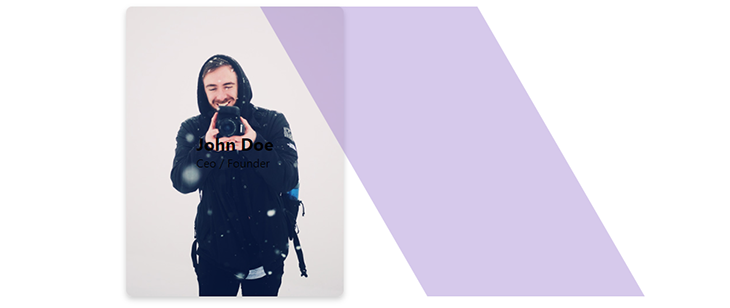
We then create a slanted appearance using the skew(30deg) transformation, and then use translateX(100%) transformation to move it to the right of the card. The negative z-index ensures it stays behind the text while giving opacity a value of 0.3 gives it a partially transparent appearance:
Moving onto the second pseudo-element:
.info::after {
  content: "";
  position: absolute;
  top: 0;
  left: 0;
  width: 100%;
  height: 100%;
  background: #764abc;
  transform: skew(-30deg) translate(90%);
  box-shadow: 0 0 20px rgba(0, 0, 0, 0.7);
  opacity: 0.3;
  z-index: -1;
  transition: all 0.6s ease;
}
Here, we’ve done basically the same thing as the ::before pseudo-element but switched the skew direction to the opposite direction. We also added a box-shadow so shadows are added to the sides. This makes it look more 3D:
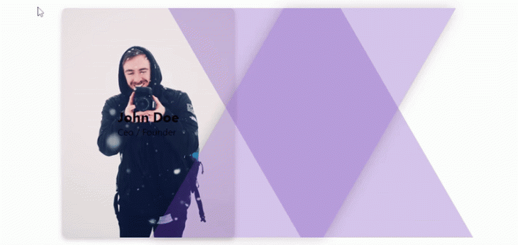
Now, we’ll make it so that whenever this card is hovered over, the pseudo-elements move further into the card. You can rest assured this will happen smoothly because we added a transition to the pseudo-elements:
.profile-card:hover .info::before {
  transform: skew(30deg) translateX(50%);
}
.profile-card:hover .info::after {
  transform: skew(-30deg) translateX(40%);
  opacity: 0.7;
}
Here’s our output:
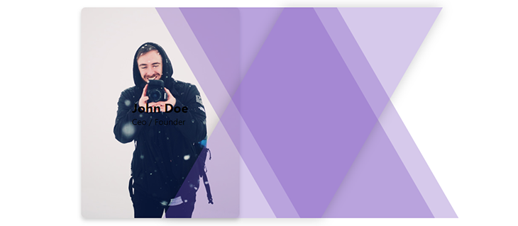
Now, let’s create two more pseudo-elements using the card itself:
.profile-card::before {
  content: "";
  position: absolute;
  top: 0;
  left: 0;
  width: 100%;
  height: 100%;
  background: #764abc;
  opacity: 0.3;
  transform: skew(30deg) translate(100%);
  transition: all 0.6s ease;
  z-index: -1;
}
This code should be self-explanatory by this point. We’ve simply done the same thing as above, but this time we’ve only translated the card’s own ::before pseudo-element to the right by 85 percent. Take a look:
Next, we’ll create the last pseudo-element and skew it in the opposite direction from the ::before:
.profile-card::after {
  content: "";
  position: absolute;
  top: 0;
  left: 0;
  width: 100%;
  height: 100%;
  background: #764abc;
  opacity: 0.3;
  transform: skew(-30deg) translate(85%);
  transition: all 0.6s ease;
  z-index: -1;
}
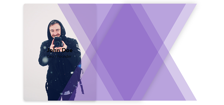
As you would have guessed, we’ll also make it so that when this profile card is hovered, these newly created pseudo-elements move in, like the previous two. But this time around, we’ll move them even further than the previous two:
.profile-card:hover:before {
  transform: skew(30deg) translateX(30%);
}
.profile-card:hover:after {
  transform: skew(-30deg) translateX(20%);
}
Here’s what it will look like:
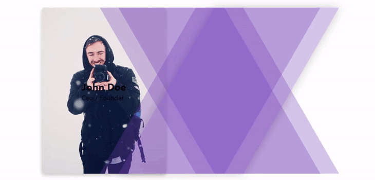
As you can see, our profile card is coming together. Now, for the last piece of the puzzle, we will set the overflow property of this card to hidden to hide the overflowing parts:
.profile-card {
 /*...previous code. */
  overflow: hidden;
}
Here’s the output:
Lastly, we will change the text color to white and make it so the opacity is fully transparent. However, when the card is hovered over, we’ll change the opacity back to normal, making them visible:
.info h2, .info p {
  color: #fff;
  opacity: 0;
  transition: all 0.6s;
}

.profile-card:hover .info h2,
.profile-card:hover .info p {
  opacity: 1;
}
Check out the final result:
Congrats on making it to the end. As you have seen, the ::before and ::after pseudo-elements can be used in several ways to produce interesting animated effects that give life to our designs.
You can explore these further to create even more complex designs and animations, as there’s so much more that can be done using the ::before and ::after CSS pseudo-elements, and we have only just scratched the surface.
As web frontends get increasingly complex, resource-greedy features demand more and more from the browser. If you’re interested in monitoring and tracking client-side CPU usage, memory usage, and more for all of your users in production, try LogRocket.

LogRocket lets you replay user sessions, eliminating guesswork around why bugs happen by showing exactly what users experienced. It captures console logs, errors, network requests, and pixel-perfect DOM recordings — compatible with all frameworks.
LogRocket's Galileo AI watches sessions for you, instantly identifying and explaining user struggles with automated monitoring of your entire product experience.
Modernize how you debug web and mobile apps — start monitoring for free.

Explore why npm dependencies are a major supply chain security risk and how to protect JavaScript apps from compromised packages and transitive threats.

Enabled React Compiler v1.0 on a production Next.js app. Here’s every warning, breakage, and silent opt-out I documented — and what actually worked.

We built the same app in TanStack Start RSC and Next.js RSC. TanStack shipped 40% less JS and built 4x faster — but Next.js is still the safer production bet.

From RSC vulnerabilities and the Vercel breach to TypeScript 7.0 Beta and AI agents — the nine frontend storylines that defined H1 2026, ranked.
Would you be interested in joining LogRocket's developer community?
Join LogRocket’s Content Advisory Board. You’ll help inform the type of content we create and get access to exclusive meetups, social accreditation, and swag.
Sign up now

 Learn more →
