Web accessibility means building web experiences that are usable by all. Just as the web itself has grown, so has the diversity of its users. However, most resources only focus on accessibility for screen readers and keyboard usage, which can be improved with the proper structuring of HTML. What about users with varying auditory, cognitive, neurological, physical, or speech limitations?
To truly create accessible web experiences, concepts that foster usability and inclusion such as responsive design, cross-browser compatibility, web-performance optimization, and progressive enhancement, should all be put into play. The good news is, CSS can help with all that as long as we’re willing to make little changes to the way we write and ship it.
In this article, I’ve put together a few unique conditions that can affect the way some users experience the web and corresponding CSS techniques that will help you build better web experiences.
Some users rely on the keyboard to navigate the web. There should be an indicator that helps identify exactly where users are on a webpage just like a mouse-pointer. So what can you do with CSS?
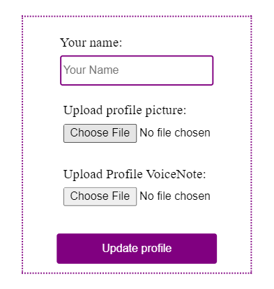
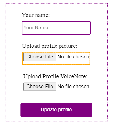
Focus styles help keyboard users be aware of interactions on a webpage. Every browser has its default outline focus style for elements, which may not correspond with your design. It’s okay to want to disable the outline, but whatever you do, do not use outline:none without providing alternate focus styling:
*:focus{
 outline: none;
 border: 3px dotted orange;
}
If you want to dig deeper, here are more best practices for applying focus styles.
Not everyone will be using the latest iPhone 20+ with 5G compatibility. Some people may use phones with 3G or be in a country where internet plans are relatively expensive. Some users may not have much bandwidth to spare for a heavy data-consuming app.
For this category of users, every little performance optimization matters. Here’s what you can do with CSS.
CSS is a render-blocking resource. This means that browsers may delay loading content until stylesheets are loaded, which might increase time to First Contentful Paint. To prevent that, use the preload and preconnect resource hints to load stylesheets.
Preload forces the browser to load a resource without blocking rendering. It is ideal for resources hosted within your project:
<link rel="preload" as=”style” href="mystyle.css”>
On the other hand, preconnect reduces resource load time by securing the connection to an external resource server long before the initial request of such resources is made. It is ideal for resources hosted externally such as Google fonts:
<link rel="preconnect" href="https://fonts.gstatic.com/" crossorigin>
<link href="https://fonts.googleapis.com/css?family=Muli:400" rel="stylesheet">
Unnecessary styles increase the file size of a stylesheet. In turn, this will increase total page size which will increase total page load time. Remember, every additional second of wait time creates an opportunity for users to abandon a web page.
Separate styles according to device type/size or other conditions use media queries to load only the styles needed:
<link rel="preload"as=”style” type="text/css" media="only screen and (max-device-width: 480px)" href="small-device.css" />
<link rel="preload"as=”style” type="text/css" media="only screen and (min-device-width: 1000px)" href="laptop-device.css" />
This approach also offers the flexibility to completely restructure a website’s flow and go with a more minimalist content-first design for mobile devices, considering that latency is higher on mobile.
Not all your users will use the latest Chrome 100.2 beta edition. Different browsers behave differently and have different levels of support for different features.
According to this report, over 20% of Nigerians use the Opera Mini browser as their default browser. With Opera Mini’s almost non-existent support for most web features, it’s necessary to approach web development from a progressive enhancement standpoint if intended users are to fall within such a demographic.
The primary focus should be proper content structuring with HTML. Start with very basic styles and single-column layout, then progress into more complex layouts for better-equipped browsers.
One thing to always test is if stripped of all styles, will that webpage still be presentable in terms of content?
The goal is to ensure that irrespective of the browser version, each user should receive the best possible experience. Here’s how CSS can help.
Browser prefixes are used to make the newest CSS features work in browsers that don’t fully support them yet. This ensures that style rules will still work as expected across browsers:
.example {
  -webkit-transform: rotate(30deg); /* Ch <36, Saf 5.1+, iOS < 9.2, An =<4.4.4 */
      -ms-transform: rotate(30deg); /* IE 9 */
          transform: rotate(30deg); /* IE 10, Fx 16+, Op 12.1+ */
}
Doing this manually across projects is stressful. Luckily, Autoprefixer can automate this process. Autoprefixer is a CSS post-processor that adds or removes vendor prefixes as needed, after cross-checking with caniuse.com. You can use it with different development setups as shown here.
For my simpler projects, I install it via npm with npm i autoprefixer, then add the code below to package.json:
"scripts": {
        "prefix-css": "postcss --use autoprefixer -b \"last 5 versions\" style.css -o style.prefix.css",
     },
The script above uses the postcss cli to run Autoprefixer on style.css, then output the prefixed styles to style.prefix.css.
CSS to an extent is error-proof. Because of how the CSS cascade works, if a browser encounters a style rule that it doesn’t understand, it simply ignores it or uses the last available value for that property. Depending on the browsers you need to support, use this feature to your advantage and always provide fallback styles, whenever you write style rules that are not widely supported across browsers. This way, users with browsers that do not support a particular style value will not be left out. Caniuse.com is the best place to validate browser support.
For example, we want to use rgba to add a little opacity but it is not supported on Internet Explorer(I.E). As a fallback, we’ll simply provide a hex value that is supported:
background-color: #000000;/* Fallback*/
background-color: rgba(0, 0, 0, 0.5);/* RGBa with 0.5 opacity */
Browsers use feature queries for CSS feature detection, to apply a block of style only if the specified conditions are true – just like media queries.
If major browsers do not fully support a shiny new CSS feature but you still want to use it, feature queries are your friend.
Before reaching out for feature queries though, ask yourself if you really need to use that new feature, or will an older method work perfectly?
For example, for simple web layouts of two or three columns, using grids is unnecessary. Float and flexbox can do the job well, and they’re supported across all browsers. But, if you want to try out grids, first layout the page with float or flexbox and then provide a more complicated layout with grids for browsers that support it using feature queries:
<div>
     <div class='box'></div>
     <div class='box'></div>
     <div class='box'></div>
 </div>

 /**/
 box {
     float: left;
     width: 24.25%;
 }

 article:not(:last-child) {
     margin-right: 1%;
 }

 section:after {
     clear: both;
     content: "";
     display: table;
 }

 @supports(display: grid) {
    /*All grid styles go here*/

 }
Feature detection can also be done with libraries like Modernizr and Feature.js.
Adaptability is accessibility. Due to some conditions, users may prefer to have bigger text, smaller text, no animation, dark mode, etc. when using the web.
It is your job as the developer to build adaptable web pages and give users the ability to experience the web the way they want to – as much as possible.
Here’s what you can do with CSS.
Very often, users may need to either increase the size of the content on a webpage due to low vision or decrease it, due to the need to see more content at once. In major browsers, there are two ways to do that, using the zoom option or changing the default font size.
Ideally, if either setting – zoom percentage or default font size – is adjusted, all content on a webpage should scale in proportion to the new size. Unfortunately, they won’t if you use fixed units like px for sizing.
For most browsers, the default font size is set to 16px which can be adjusted from the browser settings:
There’s an argument as old as web design among web developers that using the zoom option handles scaling for both fixed units and relative units and since no user will actually go through the stress of manually changing their browser’s default font size, this rule is pointless. I wish this was true. The fact modern browsers haven’t removed this feature from their settings means that it’s relevant and in this article, Evan Minto shows that the percentage of users who changed their default font size when using his company’s product was 3.08%.
Let’s illustrate what happens to px vs relative sizing when the default font size of the browser is adjusted. I have two boxes one is sized with px and the other with rem.
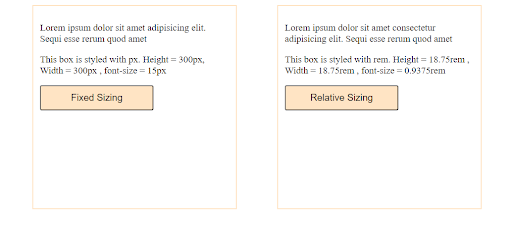
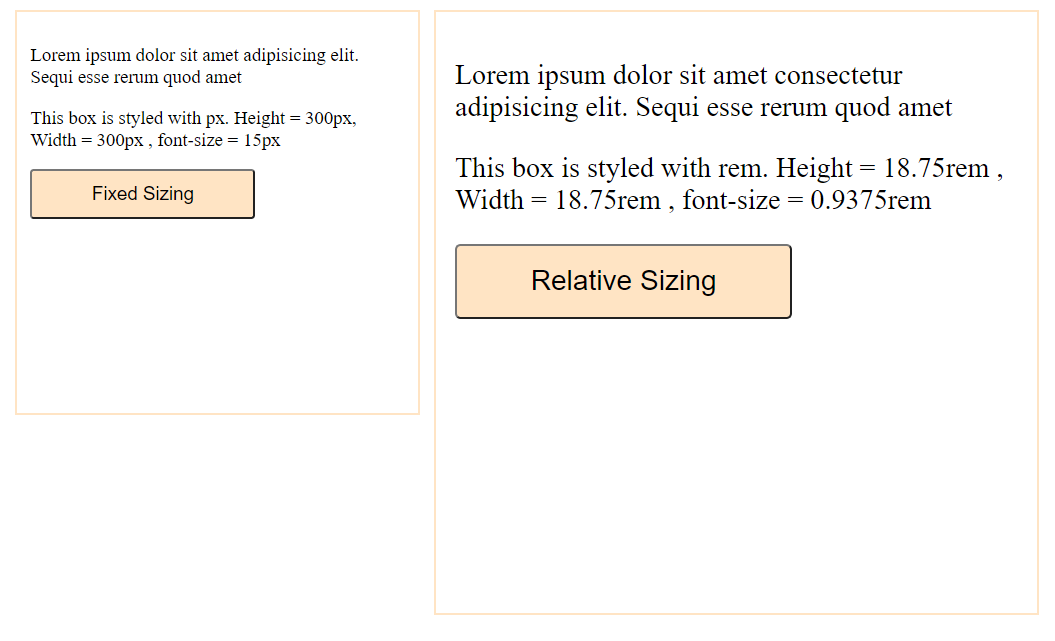
Notice how the px sized box didn’t scale after the default font size was adjusted? That’s bad for accessibility.
Personally, I use px only for media queries. Then, I use vw and vh for layouts that should scale according to device size, rem for fixed layouts and font sizes and % for child layouts that should scale in proportion with their parent layout – all of which are relative units.
The CSS rem unit – which stands for root ephemeral unit – provides a way to specify sizing as a fraction of the current font size of the html element. Unless explicitly defined, the font size of the html element is equal to the set font size of the browser. So, for a default font size of 16px, the font size of the html element is 16px which means 1 rem = 16px. If a browser’s font size is set to 24px, html font size would be 24px, which would make 1rem = 24px.
For ease in working with rem, here’s a tip I’ve been using for a while:
html{
  font-size: 62.5%; /*Default font-size: 16px. 62.5% of 16px = 10px*/
}
p{
  font-size: 1.5rem; /*15px*/
}
I set the font size on html to 62.5% of whatever the font-size of the browser is set to. This means that for the default font size of 16px, html would have a font size of 10px, hence 1.5rem equals 15px. I do this simply for easier calculation of rems in base 10. If a user adjusts the browser font-size to 24px, html font-size becomes 15px and the paragraph element becomes 22.5px. Still scalable.
Many operating systems and browsers have accessibility settings for specifying preferences like theme, text-to-speech, captions, etc. The CSS level 5 media queries introduced the user preference media features which allow developers to create more accessible web experiences tailored to users’ preferences on their device or browser settings.
There are six media preference features but only two are currently supported by all major browsers. For browsers in which they are not supported, CSS just ignores it. So, you can start using them today.
This media query is used to adapt to color theme preference on a user’s device/browser settings (light or dark). Dark mode improves accessibility for users with low vision as it is easier on the eyes:
body{background-color: white; color:black}

@media (prefers-color-scheme: dark){
          body{background-color: black; color:white}
 }
Excessive animations and parallax can trigger users with a vestibular disorder, possibly causing momentary nausea, dizziness, or headaches. This is why in many devices, there is a setting to enable reduced motion. The prefers-reduced-motion media feature should be used to detect if such a setting is enabled and disable excessive movements accordingly:
/*Default for no preference*/
element{
   animation: 3s alternate infinite slide-in;
   transition: width 2s;
}
/*for reduced preference. Disable decorative animations,
parallax scrolling, background videos e.t.c */

@media (prefers-reduced-motion: reduce){
  element{
     animation: unset !important;
     transition: none !important;
  }
}
There’s a catch though, best practice requires that users should have the ability to control as many aspects of the web experience as possible. A user may have a dark theme preference enabled on device settings but may need to view a webpage in light mode due to varying circumstances – like being in a dark place. Always remember to provide buttons to toggle such preferences. If operating systems and browsers let users make their own choices, why wouldn’t you?
Some users have difficulty understanding and remembering content and can easily get confused by inconsistent or non-traditional web page layouts. Clutter and ambiguity should be avoided at all costs. Here are some style tips that can help:
text-align: justify. The uneven-white spaces in justified text can make it difficult to readA popular saying goes, “If what you have is a hammer, everything looks like a nail”. The same thing sometimes happens to frontend developers.
I see a lot of CSS-only solutions now and then. While these are great for experimenting and learning, they are not so optimal for accessibility. CSS is for presentation. Use the right tool for the work at hand.
A common example is using the ::before and :: after pseudo-elements to add text content to HTML:
input[type=password]::after{
  content: “Enter your password”
}
Such implementation is nuts. Pseudo-elements should only be used for decorative styling and not to insert text content that adds meaning to a webpage. This is because screen readers may not be able to correctly interpret content inserted with CSS.
In this article, I put together a number of tips and tiny changes that you, as the developer, can start applying to the way you write CSS, to create better web experiences.
While this is not an exhaustive list, it is a good starting point. Remember that creating accessible web experiences is not a “do it all at once” task. It’s a constant gradual process that starts by incorporating accessibility into development workflows from the onset and then making changes along the way, as you test and find faults.
As web frontends get increasingly complex, resource-greedy features demand more and more from the browser. If you’re interested in monitoring and tracking client-side CPU usage, memory usage, and more for all of your users in production, try LogRocket.

LogRocket lets you replay user sessions, eliminating guesswork around why bugs happen by showing exactly what users experienced. It captures console logs, errors, network requests, and pixel-perfect DOM recordings — compatible with all frameworks.
LogRocket's Galileo AI watches sessions for you, instantly identifying and explaining user struggles with automated monitoring of your entire product experience.
Modernize how you debug web and mobile apps — start monitoring for free.
Hey there, want to help make our blog better?
Join LogRocket’s Content Advisory Board. You’ll help inform the type of content we create and get access to exclusive meetups, social accreditation, and swag.
Sign up now
Discover how the Interface Segregation Principle (ISP) keeps your code lean, modular, and maintainable using real-world analogies and practical examples.

<selectedcontent> element improves dropdowns

Learn how to implement an advanced caching layer in a Node.js app using Valkey, a high-performance, Redis-compatible in-memory datastore.

Learn how to properly handle rejected promises in TypeScript using Angular, with tips for retry logic, typed results, and avoiding unhandled exceptions.

 Learn more →
