Editor’s note: This article was updated on 28 January 2021 to include information on Tailwind CSS v3, which was released in December 2021.

Tailwind CSS, a utility-based CSS framework, makes it possible to create web pages without writing a single line of CSS. It’s packed with utility classes that allow you to build any design directly from your markup.
Current internet consumers who are visiting your webpage will have diverse screen and window sizes, from large desktops to small mobile phones or tablets. As a developer, we need to make the site look good on each of these.
Historically, this has been a challenge with CSS. Creating responsive components involves adding media queries and layout methods (like Flexbox and Grid), checking every part to make sure it looks good, then tweaking the code accordingly.
The good news is that Tailwind can ease your struggle with CSS and even help you build user interfaces faster than ever, just by adding class names inside your HTML code. In this article, I will explain how to build a responsive menu with Tailwind to show you how easy it is to create functional, responsive components without touching a line of CSS.
Tailwind CSS released version 3 in December 2021, and in this article, we’ll use v3 via a CDN link.
We can create responsive designs fairly quickly with Tailwind, but to target a specific breakpoint, we need to take an existing Tailwind utility class and prefix it with the name of the breakpoint, followed by a column. Yes, that’s it!
For example:
<h1 class="text-black md:text-gray-500">Medium breakpoint</h1>
Here, h1 will be the color black for the smallest sizes and up, but when we hit the medium breakpoint (640px and up), its color will change to grey.
You can see the breakpoints and their corresponding screen sizes below. These sizes are based on a mobile-first approach because they are using min-width in CSS:
| Breakpoint prefix | Minimum width | CSS |
|---|---|---|
| sm | 640px | @media (min-width: 640px) { ... } |
| md | 768px | @media (min-width: 768px) { ... } |
| lg | 1024px | @media (min-width: 1024px) { ... } |
| xl | 1280px | @media (min-width: 1280px) { ... } |
| 2xl | 1536px | @media (min-width: 1536px) { ... } |
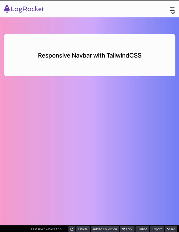
In this tutorial, we will create a responsive navbar. You can follow along with a CodePen.
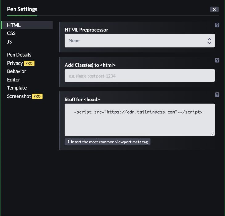
To work with Tailwind 3, go to Settings → HTML → A → Stuff for <head>, and add <script src="https://cdn.tailwindcss.com"></script> CDN link, then save and close. We’ll only be working with HTML, and we will use JavaScript to toggle the button.
You can fork the demo on my CodePen here.
Let’s get started. Go to the HTML tab, then add a body, header and nav tag like so:
<body>
  <header>
    <nav>
      <!--  Code goes here      -->
    </nav>
  </header>
</body>
We will create the navbar inside our nav tag. I added some starter code to make it look better:
<body
    class="
      antialiased
      bg-gradient-to-r
      from-pink-300
      via-purple-300
      to-indigo-400
    "
  >
  <header>
     <nav
        class="
          flex flex-wrap
          items-center
          justify-between
          w-full
          py-4
          md:py-0
          px-4
          text-lg text-gray-700
          bg-white
        "
      >
      <!--  Code goes here      -->
    </nav>
  </header>
</body>
For the body element, we have a gradient background via bg-gradient-to-r from-pink-300 via-purple-300 to-indigo-400 and a font smoothing effect via antialiased.
The nav element has its display property set via flex. This places flex items along the nav’s x-axis and gives them an equal amount of space between each item via justify-between. Then, to wrap the child elements if necessary, we have a flex-wrap utility class.
We are giving a 100 percent width via w-full with 1rem of top and bottom padding (vertically) via py-4. 1rem top and bottom padding will only work from the smallest screen size up to a certain point. We need to make adjustments to the padding on the top and bottom after a medium breakpoint: 768px and up. We remove the padding with the md:py-0 class.
For the right and left padding, we have 1rem horizontal padding with px-4.
For the text size, we added text-lg, which will make the font size 1.125rem and line height 1.75rem.
Last, we added a dark gray text color with text-gray-700.
Inside the nav tag, we will nest a div with a link element, and a svg tag for our logo. You can put whatever logo you want here:
<div>
          <a href="#">
            <svg
              xmlns="<http://www.w3.org/2000/svg>"
              width="150"
              height="32.125"
              viewBox="0 0 150 32.125"
            >
              <g
                id="Group_330"
                data-name="Group 330"
                transform="translate(-251.1 457.654)"
              >
                <g
                  id="Group_329"
                  data-name="Group 329"
                  transform="translate(251.1 -457.654)"
                >
                  <path
                    id="Path_121"
                    data-name="Path 121"
                    d="M257.887-454.034a12.084,12.084,0,0,1,3.505-3.62,11.811,11.811,0,0,1,3.46,3.549,17.887,17.887,0,0,1,3.362,11.216c.73.589,1.482,1.154,2.2,1.754a3.969,3.969,0,0,1,1.266,3.659c-.347,1.672-.679,3.347-1.045,5.015a1.393,1.393,0,0,1-2.12.7c-1.178-.946-2.326-1.925-3.5-2.872a5.373,5.373,0,0,1-3.316,1.44,5.365,5.365,0,0,1-3.882-1.4c-.844.621-1.628,1.367-2.453,2.033a6.315,6.315,0,0,1-1.2.924,1.393,1.393,0,0,1-1.839-.9c-.377-1.631-.771-3.257-1.136-4.89a3.96,3.96,0,0,1,1.335-3.81c.641-.517,1.29-1.025,1.943-1.527.182-.092.091-.3.1-.46a17.915,17.915,0,0,1,3.326-10.806m1.156,5.049a2.748,2.748,0,0,0,.24,3.641,3.024,3.024,0,0,0,4.134.085,2.75,2.75,0,0,0,.729-3.021,2.924,2.924,0,0,0-2.454-1.825,2.984,2.984,0,0,0-2.65,1.119"
                    transform="translate(-251.1 457.654)"
                    fill="#764abc"
                  />
                  <path
                    id="Path_122"
                    data-name="Path 122"
                    d="M260.3-419.746a.693.693,0,0,1,1.027-.557,6.628,6.628,0,0,0,5.77,0,.7.7,0,0,1,1.029.516q.008,1.532,0,3.064a.691.691,0,0,1-1.079.5c-.306-.26-.582-.552-.876-.825-.467.874-.905,1.76-1.375,2.631a.7.7,0,0,1-1.161.007c-.472-.873-.908-1.764-1.384-2.637-.29.275-.566.566-.873.825a.692.692,0,0,1-1.078-.506c-.008-1.007,0-2.015,0-3.022"
                    transform="translate(-253.92 446.225)"
                    fill="#764abc"
                  />
                  <path
                    id="Path_123"
                    data-name="Path 123"
                    d="M265.28-441.9a1.4,1.4,0,0,0,1.432-1.376,1.4,1.4,0,0,0-1.432-1.377,1.4,1.4,0,0,0-1.431,1.377,1.4,1.4,0,0,0,1.431,1.376"
                    transform="translate(-255.01 453.668)"
                    fill="#764abc"
                  />
                  <path
                    id="Path_124"
                    data-name="Path 124"
                    d="M288.561-448.233H290.8v15.127h9.357v2.036h-11.6Zm13.563,11.211a5.99,5.99,0,0,1,.546-2.557,6.4,6.4,0,0,1,1.479-2.037,6.769,6.769,0,0,1,4.751-1.818,6.592,6.592,0,0,1,4.666,1.733,5.891,5.891,0,0,1,1.891,4.521,5.9,5.9,0,0,1-2.024,4.544,6.767,6.767,0,0,1-4.751,1.807A6.582,6.582,0,0,1,304-432.549a5.832,5.832,0,0,1-1.879-4.472m2.3-.133a4.517,4.517,0,0,0,.339,1.757A4.36,4.36,0,0,0,305.7-434a4.381,4.381,0,0,0,3.2,1.235,4.1,4.1,0,0,0,3.03-1.235,4.107,4.107,0,0,0,1.224-3.043,4.325,4.325,0,0,0-1.273-3.188,4.335,4.335,0,0,0-3.2-1.26,4.074,4.074,0,0,0-3.03,1.249,4.213,4.213,0,0,0-1.224,3.091m16.677,1.078a2.077,2.077,0,0,0-.582,1.3.918.918,0,0,0,.413.849,3.845,3.845,0,0,0,1.1.413q.692.157,1.564.266t1.794.218q.909.121,1.782.315a6.957,6.957,0,0,1,1.575.509,2.345,2.345,0,0,1,1.516,2.158,4.306,4.306,0,0,1-1.9,3.563,6.821,6.821,0,0,1-4.157,1.321,7.745,7.745,0,0,1-3.806-.873,3.147,3.147,0,0,1-1.831-2.861,3.762,3.762,0,0,1,.9-2.315,5.143,5.143,0,0,1,.558-.606,2.3,2.3,0,0,1-1.758-2.17,4.315,4.315,0,0,1,1.6-3.321,3.385,3.385,0,0,1-.557-1.878,3.7,3.7,0,0,1,.424-1.806,4.118,4.118,0,0,1,1.152-1.321,5.62,5.62,0,0,1,3.5-1.115,5.436,5.436,0,0,1,3.466,1.115,4.661,4.661,0,0,1,2.5-1.043,6.619,6.619,0,0,1,.945-.072l-.1,1.879a6.307,6.307,0,0,0-2.218.569,3.709,3.709,0,0,1,.412,1.721,3.4,3.4,0,0,1-.436,1.7,4.025,4.025,0,0,1-1.14,1.31,5.554,5.554,0,0,1-3.405,1.091,5.887,5.887,0,0,1-3.309-.91m.582-4.253a2.143,2.143,0,0,0-.231,1.017,2.221,2.221,0,0,0,.231,1.031,2.275,2.275,0,0,0,.654.739,3.493,3.493,0,0,0,2.085.582,2.688,2.688,0,0,0,2.594-1.285,2.074,2.074,0,0,0,.231-1.006,2.135,2.135,0,0,0-.243-1.03,2.124,2.124,0,0,0-.642-.751,3.446,3.446,0,0,0-2.085-.594,2.682,2.682,0,0,0-2.594,1.3m.024,8.944a3.151,3.151,0,0,0-.837,2.194,1.783,1.783,0,0,0,1.2,1.611,4.619,4.619,0,0,0,1.975.473,7.943,7.943,0,0,0,1.6-.134,3.885,3.885,0,0,0,1.139-.4,1.942,1.942,0,0,0,1.176-1.769q0-1.079-2.085-1.443-.9-.157-2.194-.279t-1.975-.254m27.052-11.563a5.27,5.27,0,0,1-3.515,5.273l3.261,6.606H345.9l-2.945-5.976a16.725,16.725,0,0,1-2.509.182h-4.461v5.793h-2.241v-17.163h7.042a12.082,12.082,0,0,1,5.684,1.042,4.451,4.451,0,0,1,2.291,4.242m-8.012,4.048a8.338,8.338,0,0,0,4.024-.752,3.344,3.344,0,0,0,1.612-3.151q0-2.885-3.733-3.273a19.936,19.936,0,0,0-2.218-.121h-4.449v7.3Zm10.7,1.879a5.99,5.99,0,0,1,.546-2.557,6.4,6.4,0,0,1,1.479-2.037,6.77,6.77,0,0,1,4.751-1.818A6.591,6.591,0,0,1,362.9-441.7a5.894,5.894,0,0,1,1.891,4.521,5.9,5.9,0,0,1-2.024,4.544,6.767,6.767,0,0,1-4.751,1.807,6.582,6.582,0,0,1-4.678-1.721,5.831,5.831,0,0,1-1.879-4.472m2.3-.133a4.517,4.517,0,0,0,.34,1.757,4.37,4.37,0,0,0,.933,1.394,4.383,4.383,0,0,0,3.2,1.235,4.1,4.1,0,0,0,3.03-1.235,4.107,4.107,0,0,0,1.224-3.043,4.325,4.325,0,0,0-1.273-3.188,4.336,4.336,0,0,0-3.2-1.26,4.073,4.073,0,0,0-3.03,1.249,4.214,4.214,0,0,0-1.224,3.091m23.344,3.491.424,1.709a7.408,7.408,0,0,1-4.46,1.127,5.729,5.729,0,0,1-4.412-1.721,6.409,6.409,0,0,1-1.563-4.557,6.234,6.234,0,0,1,1.757-4.509,5.974,5.974,0,0,1,4.448-1.818,6.431,6.431,0,0,1,3.9,1.1l-.8,1.805a5.411,5.411,0,0,0-3.321-1.017,3.3,3.3,0,0,0-2.7,1.284,4.622,4.622,0,0,0-.982,3.006,4.82,4.82,0,0,0,1.03,3.175,3.638,3.638,0,0,0,2.969,1.309,8.3,8.3,0,0,0,3.708-.9m3.066-16.326h2.3v12.133l5.442-5.333h2.69l-5.7,5.575,3.394,3.66a3.824,3.824,0,0,0,2.569,1.249l-.352,1.636a3.724,3.724,0,0,1-2.981-.678,6.8,6.8,0,0,1-.691-.667l-4.375-4.728v6.073h-2.3Zm22.108,7.866a4.441,4.441,0,0,1,1.006,1.624,5.626,5.626,0,0,1,.376,2.049,15.688,15.688,0,0,1-.243,2.533h-8.436a4.022,4.022,0,0,0,1.188,2.315,3.741,3.741,0,0,0,2.606.836,10.169,10.169,0,0,0,4.133-.824l.388,1.733a8.96,8.96,0,0,1-3.564.958,15.618,15.618,0,0,1-1.672.073,6.288,6.288,0,0,1-2.158-.412,4.692,4.692,0,0,1-1.866-1.212,6.631,6.631,0,0,1-1.466-4.654,6.234,6.234,0,0,1,1.757-4.509,5.974,5.974,0,0,1,4.448-1.818,4.733,4.733,0,0,1,3.5,1.309m-.812,4.425.049-.655a2.885,2.885,0,0,0-1.66-2.945,3.332,3.332,0,0,0-1.334-.242,3.368,3.368,0,0,0-1.43.3,3.514,3.514,0,0,0-1.114.825,4.376,4.376,0,0,0-1.091,2.715Zm5.358-3.624h-1.3v-1.5l2.982-2.242h.618v1.879h3.466v1.866h-3.466v4.9a5.311,5.311,0,0,0,.521,2.812,2.747,2.747,0,0,0,2.036.91l-.351,1.636q-3.636.46-4.3-2.873a10.568,10.568,0,0,1-.206-2.144Z"
                    transform="translate(-262.589 455.303)"
                    fill="#764abc"
                  />
                </g>
              </g>
            </svg>
          </a>
        </div>
After the logo, let’s add another SVG for a hamburger icon; You can get the SVG from HeroIcons. This will toggle the menu on mobile screens.
Let’s analyze its classes:
<svg class="h-6 w-6 cursor-pointer md:hidden block"> </svg>
This icon will appear by default, so even the smallest screen size will see it. But when we hit the medium breakpoint of 768px, the icon will disappear and show the desktop version of the navigation. This happens because we added the md:hidden block classes.
We’re also increasing the height and width of the icon to 1.5rem with h-6 and w-6.
Finally, we have cursor-pointer. When we hover over it, we see that the mouse cursor changes to a pointing hand.
We have also an id of menu-button, which we will use for the JavaScript toggle:
<!-- Hamburger Icon -->
          <svg
            xmlns="<http://www.w3.org/2000/svg>"
            id="menu-button"
            class="h-6 w-6 cursor-pointer md:hidden block"
            fill="none"
            viewBox="0 0 24 24"
            stroke="currentColor"
          >
            <path
              stroke-linecap="round"
              stroke-linejoin="round"
              stroke-width="2"
              d="M4 6h16M4 12h16M4 18h16"
            />
          </svg>
Now we will add our navigation items inside the nav element:
<div class="hidden w-full md:flex md:items-center md:w-auto " id="menu">
          <ul
            class="
              text-base text-gray-700
              pt-4
              md:flex
              md:justify-between
              md:pt-0"
          >
            <li>
              <a class="md:p-4 py-2 block hover:text-purple-400" href="#"
                >Features</a
              >
            </li>
            <li>
              <a class="md:p-4 py-2 block hover:text-purple-400" href="#"
                >Pricing</a
              >
            </li>
            <li>
              <a class="md:p-4 py-2 block hover:text-purple-400" href="#"
                >Customers</a
              >
            </li>
            <li>
              <a class="md:p-4 py-2 block hover:text-purple-400" href="#"
                >Blog</a
              >
            </li>
            <li>
              <a
                class="md:p-4 py-2 block hover:text-purple-400 text-purple-500"
                href="#"
                >Sign Up</a
              >
            </li>
          </ul>
        </div>
For the parent div, we have an id property of menu. Again, we will use this ID to toggle the hamburger menu items with JavaScript.
Let’s analyze its Tailwind utility classes:
<div class="hidden w-full md:flex md:items-center md:justify-between md:w-auto " id="menu"></div>
By default, our menu items will be hidden via the hidden class and have a full width of the w-full class. We will reveal the menu items only after the user toggles the hamburger icon.
However, after the medium breakpoint of 648px, we will show the menu items as flex items with the md:flex, then align the children along the center of div‘s y-axis with md:items-center. It also sets the width as auto with md:w-auto. This will unset the full width and the browser will calculate the size of the element.
Let’s move on to ul:
<ul class="text-base text-gray-700 pt-4 md:flex md:justify-between md:pt-0"></ul>
Text-base will set the font size to 1rem and line height to 1.5rem. We’re giving the ul‘s child elements a text color of dark gray with text-gray-700, and adding 1rem for top padding with pt-4 class. Don’t forget that these are for small screens; Tailwind uses a mobile-first approach.
For the medium breakpoint and onwards, we will have flex to display the flex items next to each other. Give an equal amount of space to child elements along the container’s x-axis with md:justify-between, and remove the top padding with pt-0.
Let’s move on to the list items now. Li‘s are nested with link tags; let’s examine their classes:
 <li>
    <a class="py-2 block md:p-4 hover:text-purple-400" href="#" >Features</a>
  </li>
Here we have top and bottom padding set to 0.5rem via py-2 and displayed as a block in mobile screens. After the medium breakpoint, we are setting padding to 1rem via md:p-4. There is also a hover effect via hover:text-purple-400, which will turn the list items’ color to light purple.
Now that we’re done with the navigation, let’s add the menu toggle implementation with JavaScript.
Go to the JS tab on CodePen, where we will get our menu (or hamburger) icon and the menu that is holding our list items.
With the click event listener, we are toggling the menu’s hidden class when the user clicks on it:
const button = document.querySelector('#menu-button'); // Hamburger Icon
const menu = document.querySelector('#menu'); // Menu

button.addEventListener('click', () => {
  menu.classList.toggle('hidden');
});
After the navbar, we can display some text. We have two nested divs with a h1 tag:
<div class="px-4">
      <div
        class="
          flex
          justify-center
          items-center
          bg-white
          mx-auto
          max-w-2xl
          rounded-lg
          my-16
          p-16
        "
      >
        <h1 class="text-2xl font-medium">Responsive Navbar with TailwindCSS</h1>
      </div>
    </div>
The first div has a 1rem right and left padding. This will give us some space when the screen is small.
The second div has a flex display and centers the h1 both horizontally and vertically. It has a white background, and the left and right margins have an auto margin via mx-auto.
For the maximum width, it can grow up to 42rem via max-width-2xl. We also have a 0.5rem border radius with rounded-lg.
my-16 sets the top and bottom margins to 4rem, and p-16 sets padding on all sides.
Lastly, h1 has 1.5rem font size and line height of 1.75rem, and a font weight of 500 via font-medium.
I hope this tutorial helped you understand the capabilities of Tailwind CSS when creating responsive navbars. If you want to create the project from scratch without using CodePen, you’ll need to follow some installation guides, which you can find on the official Tailwind CSS website. Plus, if you run into a problem, you can easily search their site for solutions.
As web frontends get increasingly complex, resource-greedy features demand more and more from the browser. If you’re interested in monitoring and tracking client-side CPU usage, memory usage, and more for all of your users in production, try LogRocket.

LogRocket lets you replay user sessions, eliminating guesswork around why bugs happen by showing exactly what users experienced. It captures console logs, errors, network requests, and pixel-perfect DOM recordings — compatible with all frameworks.
LogRocket's Galileo AI watches sessions for you, instantly identifying and explaining user struggles with automated monitoring of your entire product experience.
Modernize how you debug web and mobile apps — start monitoring for free.

Learn how to build smooth staggered animations in CSS using modern features like sibling-index(), complete with practical examples, fallbacks, and accessibility tips.

Compare the top AI development tools and models of July 2026. View updated rankings, feature breakdowns, and find the best fit for you.

Learn how to detect unused and ghost dependencies in JavaScript projects using Knip, a project-level linter that keeps your dependency graph accurate.

Learn how Storybook MCP enables AI agents to understand your component library, generate accurate UI, and validate code using documentation, stories, and automated tests.
Would you be interested in joining LogRocket's developer community?
Join LogRocket’s Content Advisory Board. You’ll help inform the type of content we create and get access to exclusive meetups, social accreditation, and swag.
Sign up now

 Learn more →
