Editor’s note: This article was last updated 19 May 2023 to include a section on adding animations to the pie chart.
Pie charts are a useful tool for analyzing data, breaking down different segments of a larger data set in an aesthetically pleasing and easily understandable manner. There are many ways to display a pie chart on the web, for example, by using Excel sheets, HTML canvases, SVGs, and JavaScript, among other methods.
A popular way to build frontend pie charts is by using one of the many chart libraries available, but if you don’t want to add additional libraries into your project, you can build one from scratch using just HTML and CSS. In this article, we’ll build an interactive pie chart that displays data about food consumption in a city using only HTML and CSS. Our completed project will look like the following:
Jump ahead:
The Replay is a weekly newsletter for dev and engineering leaders.
Delivered once a week, it's your curated guide to the most important conversations around frontend dev, emerging AI tools, and the state of modern software.
First, we’ll create the basic HTML structure with the following code:
<!DOCTYPE html>
<html lang="en">
<head>
<meta charset="UTF-8">
<meta http-equiv="X-UA-Compatible" content="IE=edge">
<meta name="viewport" content="width=device-width, initial-scale=1.0">
<link rel="stylesheet" href="styles.css">
<title>Pie chart</title>
</head>
<body>
</body>
</html>
The code above includes the building blocks for any webpage built with HTML, specifying how we want browsers to read our page.
The following code adds wrappers for the pie chart and its key section. We’ll also add a heading to the page as follows:
<h1 class="heading">Food consumption in a city</h1>
<div class="wrapper">

<div class="pie-wrap"></div>

<div class="key-wrap"></div>

</div>
Let’s add some basic styles to the page. In styles.css, add the following code:
body{
    font-family: Helvetica, sans-serif;
}

.heading{
    text-align: center;
    margin-top: 50px;
}
The style above will center the text and give it some space at the top. Our page should look like the following:
In the pie-wrap div, add the following code to serve as the pie chart’s data:
<div class="pie-wrap">

<div class="light-yellow entry">
    <p>25%</p>
    <p class="entry-value">Rice</p>
</div>

<div class="sky-blue entry">
    <p>25%</p>
    <p class="entry-value">Pasta</p>
</div>

<div class="pink entry">
    <p>12.5%</p>
    <p class="entry-value">Beans </p>
</div>

<div class="purple entry">
    <p> 12.5%</p>
    <p class="entry-value">Plantain</p>
</div>

<div class="green entry">
    <p> 12.5%</p>
    <p class="entry-value">Potato</p>
</div>

<div class="wheat entry">
    <p> 12.5%</p>
    <p class="entry-value">Yam</p>
</div>

</div>
In the code above, we added the various entries and their values. The styles are also named after their respective colors, making it easier to identify each entry.
We haven’t added any styles yet, so we’ll do that now:
.wrapper{
    display: flex;
    align-items: center;
    justify-content: center;
}

.pie-wrap{
    border: 2px solid lightgrey;
    width: 400px;
    height: 400px;
    margin: 10% 50px;
    position: relative;
    border-radius: 50%;
    color: black;
}
With the styles above, we make the pie chart and keys appear next to each other by giving them a flex position. The keys aren’t in our HTML file yet, so let’s focus on the pie chart itself. Our pie chart is now a circle with a bunch of numbers and text. Let’s style it so it looks like the pie chart we’re more familiar with. Add the following styles to your CSS file:
.pie-wrap .entry{
    display: flex;
    flex-direction: column;
    justify-content: center;
    align-items: center;
}

/* *the individual entries* */

.sky-blue{
    background-color: lightskyblue;
    height:50%;
    width: 50%;
    display: block;
}

.light-yellow{
    background-color: lightyellow;
    height:50%;
    width: 50%;
}
In the code block above, we’ve added some general styling for the entry elements. We also styled the sky blue and light yellow entries, which represent the Rice and Pasta entries, respectively. Now, our page should look like the following:
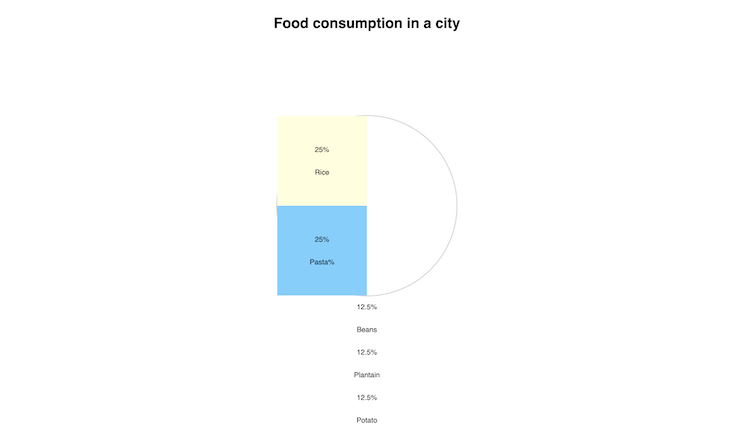
This is our pie chart currently, but we’ll fix the squares soon. Let’s style the other entries before we get to that. Add the following code to your HTML file:
.pink{
    background-color: pink;
    height:50%;
    position: absolute;
    top: 0px;
    right: 0;
    width: 50%;
    clip-path: polygon(0 0, 100% 0%, 0% 100%);
}

.purple{
    background-color: purple;
    height:50%;
    width: 50%;
    right: 0;
    top: 0;
    position: absolute;
    clip-path:polygon(0% 100%, 100% 0%, 100% 100%);
}

.green{
    background-color: limegreen;
    height:50%;
    width: 50%;
    right: 0;
    top: 50%;
    position: absolute;
    clip-path:polygon(0% 0%, 100% 0%, 100% 100%);
}

.wheat{
    background-color: wheat;
    height:50%;
    width: 50%;
    right: 0;
    top: 50%;
    position: absolute;
    clip-path:polygon(0% 0%, 100% 100%, 0% 100%);
}
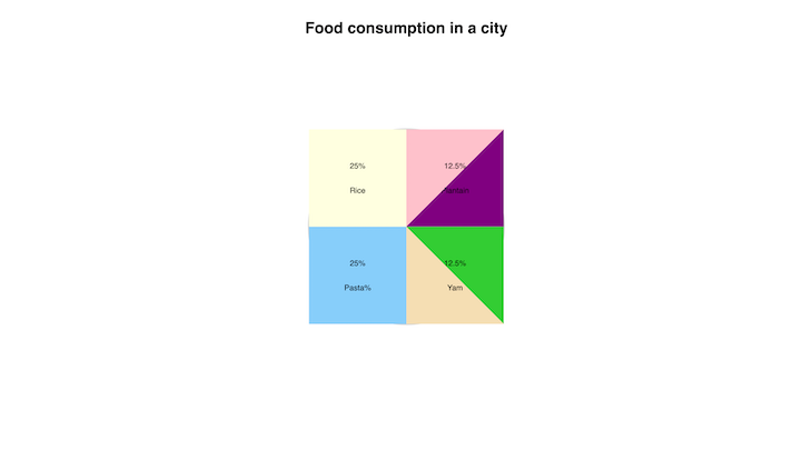
This new code doesn’t look like the first two entries. The Rice and Pasta entries have values of 25 percent each, so they fit perfectly in their wrappers. The others are all 12.5 percent, so we’ll need to create their shapes with an additional style.
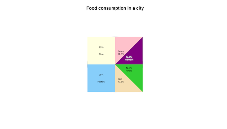
To achieve the ideal shape, we’ll use the CSS clip-path property, which enables us to create different shapes using CSS. Each of the entries has a unique style, and their clip-path properties also vary. You can adjust the clip-path based on your own entry data. We can also adjust their positions in the container to fit in perfectly with the others. Now, our page should look like the following:
You may have noticed that some of the entry values are hidden; this is due to the general entry styles we used earlier. Let’s fix this and make all our entry data visible. Add the following styles to your CSS file:
.pie-wrap .purple p{
    position: absolute;
    top: 140px;
    color: white;
}
.pie-wrap .purple p:first-child{
    top: 120px;
}

.pie-wrap .green p{
    position: absolute;
    top: 20px;
}

.pie-wrap .green p:first-child{
    top: 0px;
}

.pie-wrap .pink p, .pie-wrap .wheat p{
    position: absolute;
    left: 20px;
    top: 80px;
}

.pie-wrap .pink, .pie-wrap .wheat{
    justify-content: flex-start;
}

.pie-wrap .pink p:first-child, .pie-wrap .wheat p:first-child{
    top: 100px;
}
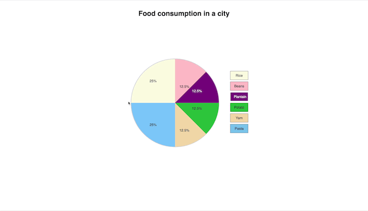
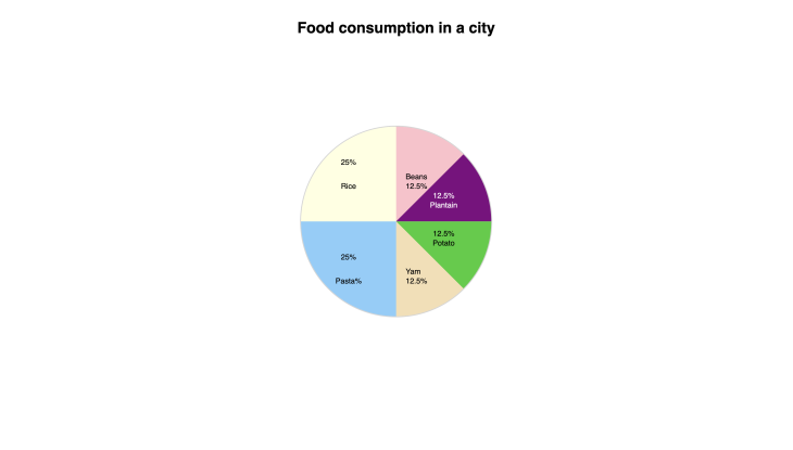
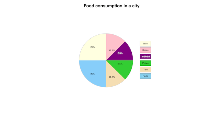
Now, our page should look like the image below, and all of the text should be visible. We also made the text in the purple entry white, so users can easily read it:
Now that we’re done with the entries and data, let’s make our pie chart into an actual round pie chart, as we discussed earlier. Add the following line to your .pie-wrap style:
overflow: hidden;
The overflow:hidden style cuts out everything that overflows from the pie-wrap container. Now, your .pie-wrap style should look like the following:
.pie-wrap{
    border: 2px solid lightgrey;
    width: 400px;
    height: 400px;
    margin: 10% 50px;
    position: relative;
    border-radius: 50%;
    color: black;
    overflow: hidden;
}
We’re done with the basic requirements for our pie chart, but let’s add some more elements to liven it up a little and introduce some interactivity.We’ll hide the name of the food for each entry and show them only when the entry is hovered over by a user:
.entry .entry-value{
    display: none;
    transition: all 500ms linear;
}
.entry:hover .entry-value{
    display: block;
}
The names of the food items are hidden now, but the transition when hiding and revealing them isn’t as smooth as we’d like. Let’s add a transition style and hover effects for the entries:
.entry{
    transition: all 500ms linear ;
}
.entry:hover{
    filter: invert();
}
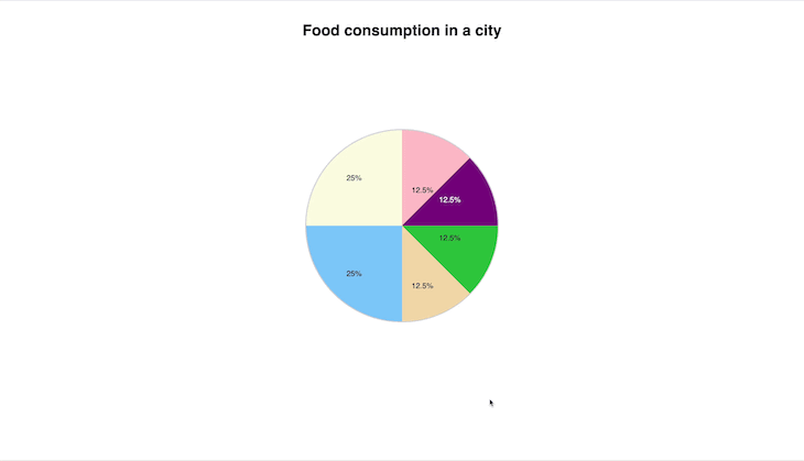
Now, when we hover over each entry, it has a smooth transition to show the name of the food item, while also inverting the color of the entry. It should look like the following:
Our pie chart is almost ready, but we can make it even prettier by adding keys to it. Add the following code to the .key-wrap div that we created earlier:
<!--Pie chart keys  -->
<input type="radio" id="rice" name="values" class="rice-key"/>
<label for="rice" class="rice-label">Rice</label>

<input type="radio" name="values" id="beans" class="beans-key"/>
<label for="beans" class="beans-label"> Beans</label>

<input type="radio" name="values" id="plantain" class="plantain-key"/>
<label for="plantain" class="plantain-label"> Plantain</label>

<input type="radio" name="values" id="potato" class="potato-key"/>
<label for="potato" class="potato-label"> Potato</label>

<input type="radio" name="values" id="yam" class="yam-key"/>
<label for="yam" class="yam-label"> Yam</label>

<input type="radio" name="values" id="pasta" class="pasta-key"/>
<label for="pasta" class="pasta-label"> Pasta</label>
You should now see some radio buttons and labels, which will represent the keys for our pie chart. Let’s style them as follows:
.key-wrap label{
    display: block;
    border: 1px solid;
    width: 50px;
    text-align: center;
    padding: 10px 15px;
    cursor: pointer;
    margin-bottom: 8px;
    }
The styles above add a border to the labels include padding, set the width, and add some space below each label. Clicking the labels also checks the radio buttons, so let’s hide them for a cleaner display. Add the following to your CSS file:
input[type="radio"]{
    display: none;
}
Let’s also add some background colors to the labels:
.rice-label{
    background-color: lightyellow;
}
.beans-label{
    background-color: pink;
}
.plantain-label{
    background-color: purple;
    color: white;
}
.potato-label{
    background-color: limegreen;
}
.yam-label{
    background-color: wheat;
}
.pasta-label{
    background-color: skyblue;
}
Now, our keys should have corresponding colors for their entries, and the page should look like the following:
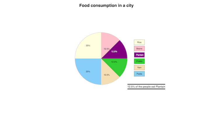
When the keys are clicked, the text should be displayed below with information about the corresponding entry. To do so, add the following code to your HTML file:
<p class="rice-text text">25% of the people eat Rice</p>
<p class="beans-text text">12.5% of the people eat Beans</p>
<p class="plantain-text text">12.5% of the people eat Plantain</p>
<p class="potato-text text">12.5% of the people eat Potato</p>
<p class="yam-text text">12.5% of the people eat Yam</p>
<p class="pasta-text text">25% of the people eat Pasta</p>
The code above should be inside your .key-wrap div, just below the label for Pasta. We’ll hide these texts and only show the relevant ones with the following styles:
.text{
    display: none;
    margin-left: -50px;
    position: absolute;
    margin-top: 50px;
    font-size: 20px;
    padding-bottom: 4px;
    padding-top: 4px;
    border-bottom: 5px solid ;
    border-top: 5px solid ;
}
.key-wrap label:active{
    opacity: .5;
}
.rice-key:checked ~ .rice-text, .beans-key:checked ~ .beans-text, .plantain-key:checked ~ .plantain-text,  .potato-key:checked ~ .potato-text, .yam-key:checked ~ .yam-text, .pasta-key:checked ~ .pasta-text{
    display: block;
}
With the styles above, we hide the text, and, when the key is clicked, the corresponding information is displayed. We also added an active style, so when the keys are clicked, there is a quick animated effect:
It looks good to go, but there is one thing remaining. Let’s make each border a different color based on what information is being displayed:
.rice-text{
    border-color: black;
}
.beans-text{
    border-color:  pink;
}
.plantain-text{
    border-color:  purple;
}
.potato-text{
    border-color:  limegreen;
}
.yam-text{
    border-color:  wheat;
}
.pasta-text{
    border-color:  skyblue;
}
Now, our pie chart should look like the following:

Let’s take it a step further and make our pie chart more interesting by adding some animations. We’ll make the pie chart grow in size after the page loads and also make the pie chart keys appear on the page in sequence. First, we’ll create an animation @keyframe for .pie-wrap by adding the following code to our styles.css file:
@keyframes pie-size {
  from{
    width:0px;
  }
  to{
    width: 400px;
    height: 400px;
  }
}
After adding the keyframe above, let’s add the code below to the .pie-wrap style in our styles.css file:
animation: pie-size 500ms 500ms ease forwards;
Now, the .pie-wrap style should look like the following:
.pie-wrap{
  border: 2px solid lightgrey;
  width: 0px;
  height: 0px;
  margin: 10% 50px;
  position: relative;
  border-radius: 50%;
  overflow: hidden;
  color: black;
  animation: pie-size 750ms 500ms ease forwards;
}
The code above adds a growing animation; the keyframe pie-size makes the pie chart start at a width of 0px and grow to a width and height of 400px. Then, we added the pie-size keyframe to our pie-wrap style using the animation property. Our animation will run for 750ms and have a delay of 500ms before it runs. The pie chart will appear to grow bigger after the page is loaded. It should now look like the following:
Screen Recording 2023 05 21 at 11 36 59
Uploaded by Hafsah Emekoma on 2023-05-31.
Next, let’s add the delayed appearance effect to our pie chart keys. We’ll begin by adding a @keyframe to our styles.css file:
@keyframes display-key {
  from{
    visibility: hidden;
  }
  to{
    visibility: visible;
  }
}
After adding the code block above, we’ll modify the key styles by adding the animation property to each of the keys as follows:
.rice-label{
  background-color: lightyellow;
  visibility: hidden;
  animation: display-key 500ms 1s  ease forwards;
}
.beans-label{
  background-color: pink;
  animation: display-key 500ms 1.5s  ease forwards;
}
.plantain-label{
  background-color: purple;
  color: white;
  animation: display-key 500ms 2s  ease forwards;
}
.potato-label{
  background-color: limegreen;
  animation: display-key 500ms 2.5s  ease forwards;
}
.yam-label{
  background-color: wheat;
  animation: display-key 500ms 3s  ease forwards;
}
.pasta-label{
  background-color: skyblue;
  animation: display-key 500ms 3.5s  ease forwards;
}
You’ll notice that every key has a different animation delay time, making them appear one after another. The display-key animation makes the pie chart keys start with a hidden visibility, and as time progresses, they become visible based on the time stipulated on each of their animation properties. Now, the final pie chart should look like the following:
Screen Recording 2023 05 21 at 11 37 31
Uploaded by Hafsah Emekoma on 2023-05-31.
If you’ve finished this tutorial, you should now be able to build pie charts using only HTML and CSS. Building with just HTML and CSS can come in handy when building light projects where performance is not a primary consideration.
We’ve built a pie chart that displays the percentage of food consumed in a city. When hovered over, it also shows the name of the different food items. There’s also an additional option if you don’t feel like hovering over it; the keys indicate what percentage corresponds with each food. Finally, we have additional information that is displayed when you click on the different keys.
You can build on your newly acquired knowledge by including additional features or using different values in your own pie charts or datasets. You can find the completed code in this repository on GitHub. Thanks for reading, and let me know what you think in the comments below!
As web frontends get increasingly complex, resource-greedy features demand more and more from the browser. If you’re interested in monitoring and tracking client-side CPU usage, memory usage, and more for all of your users in production, try LogRocket.

LogRocket lets you replay user sessions, eliminating guesswork around why bugs happen by showing exactly what users experienced. It captures console logs, errors, network requests, and pixel-perfect DOM recordings — compatible with all frameworks.
LogRocket's Galileo AI watches sessions for you, instantly identifying and explaining user struggles with automated monitoring of your entire product experience.
Modernize how you debug web and mobile apps — start monitoring for free.
When should you move API logic out of Next.js? Learn when Route Handlers stop scaling and how ElysiaJS helps.

Explore how Dokploy streamlines app deployment with Docker, automated builds, and simpler infrastructure compared to traditional CI/CD workflows.
A side-by-side look at Astro and Next.js for content-heavy sites, breaking down performance, JavaScript payload, and when each framework actually makes sense.
AI-generated tests can speed up React testing, but they also create hidden risks. Here’s what broke in a real app.re
Hey there, want to help make our blog better?
Join LogRocket’s Content Advisory Board. You’ll help inform the type of content we create and get access to exclusive meetups, social accreditation, and swag.
Sign up now

