Editor’s note: This article was updated on 23 July 2024 to discuss accessibility considerations, add keyboard navigability, demonstrate playlist shuffling as an example of how to implement a more complex feature in the component, and more.

If you run a podcast or any other sound- or music-related web application, you may want to add an audio player to your project. This guide will teach you how to build an audio player from scratch with React.
The audio player will offer control features like playing or pausing a track, adjusting volume, moving to the next or previous track, moving a progress slider, shuffling, repeating, and so on. We will also customize it to look consistent across browsers.
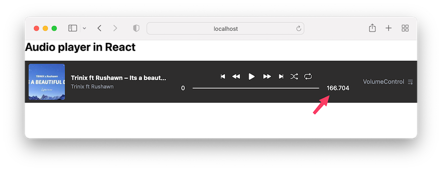
Before beginning the tutorial, ensure you have a basic understanding of React. Below is a preview of the end product we will build together:
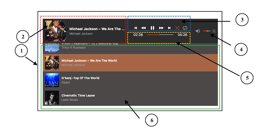
The numbers correspond to the following six components:
AudioPlayer — The parent/root componentTrackInfo — Display information about the current trackControls — Provides playback controlsVolumeControl — Allows the user to adjust the audio volumeProgressBar — Shows the progress of the current trackPlayList — Display a list of available tracksYou can interact with the project here, and after that, get started!
The Replay is a weekly newsletter for dev and engineering leaders.
Delivered once a week, it's your curated guide to the most important conversations around frontend dev, emerging AI tools, and the state of modern software.
Before we dive into building an audio player from scratch in React, one way we can integrate an audio player into our project is by using an existing library. One notable option is the React Modern Audio Player library, which provides a sleek, customizable UI with a range of features.
This library enables developers to add a stylish audio player with extensive customization options. However, one limitation is its accessibility — keyboard users may face challenges navigating the player effectively, which could impact the user experience.
To improve the overall user experience, let’s create a sleek, responsive, and accessible audio player.
We’ll use Vite, TypeScript, and Tailwind CSS to create this project. However, you only need a basic understanding of React to follow along. If you prefer, you can code along with vanilla JavaScript and omit all instances of TypeScript. Start up the project with this command:
npm create vite@latest
You’ll be prompted to select a project template, and then the project will get set up with all needed configurations and dependencies.
As you can see in the preview image above, we can break down the user interface into six components. Remember, the number labels on the image correspond to the following component names:
AudioPlayer — The parent/root componentTrackInfo — Display information about the current trackControls — Provides playback controlsVolumeControl — Allows the user to adjust the audio volumeProgressBar — Shows the progress of the current trackPlayList — Display a list of available tracksWith this in mind, we will create the component files in the src/components folder. Let’s ensure our project directory follows the following structure:
react-audio-player
   ...
    ├── src
    │    ├── components
    │    │      ├── AudioPlayer.tsx
    │    │      ├── Controls.tsx
    │    │      ├── PlayList.tsx
    │    │      ├── ProgressBar.tsx
    │    │      ├── TrackInfo.tsx
    │    │      └── VolumeControl.tsx
    │    ├── data
    │    ├── styles
    │    │      └── index.css
    │    ├── App.tsx
    │    ├── main.tsx
    │   ...
Notice we also added a data folder in the src to hold the audio files.
In each of the components, let’s render some simple contents and styles. See the AudioPlayer component that encapsulates all other components below.
The code contains a drawer menu icon that toggles the playlist. So let’s ensure we install the necessary icon from react-icons:
npm install react-icons
The code also includes a simple state for the toggle functionality:
import { useState } from 'react';
import { RiMenuAddLine } from 'react-icons/ri';
import { TrackInfo } from './TrackInfo';
import { Controls } from './Controls';
import { ProgressBar } from './ProgressBar';
import { VolumeControl } from './VolumeControl';
import { PlayList } from './PlayList';
export const AudioPlayer= () =>{
  const [openDrawer,setOpenDrawer] = useState(false);
  return (
    <div>
      <div className="min-h-8 bg-[#2e2d2d] flex flex-col gap-9 lg:flex-row justify-between items-center text-white p-[0.5rem_10px]">
        <TrackInfo />
        <div className="w-full flex flex-col items-center gap-1 m-auto flex-1">
          <Controls />
          <ProgressBar />
        </div>
        <div className="flex items-center gap-2 text-gray-400">
          <VolumeControl />
          <button onClick={() => setOpenDrawer((prev) => !prev)}>
            <RiMenuAddLine />
          </button>
        </div>
      </div>
      <div
        className={`transition-max-height duration-300 ease-in-out overflow-hidden ${
          openDrawer? 'max-h-72' : 'max-h-0'
        }`}
      >
        <div className="bg-[#4c4848] text-white max-h-72 overflow-y-auto">
          <PlayList />
        </div>
      </div>
    </div>
  );
};
Confirm you can toggle the drawer in the frontend.
We will use the HTML <audio> element to embed audio in our project. This element has a src attribute to specify the audio URL and a controls attribute to display the browser’s specific controls for the audio, such as play, pause, and others:
><audio src=" " controls />
We need audio files to work with to use the <audio> element. So, let’s create a tracks.ts file in the src/data folder and add audio tracks as an array of objects like so:
// audio files
import beautiful from './a_beautiful_day.mp3';

// audio thumbnails
import trinix from './trinix.jpeg';

export const tracks = [
  {
    title: 'Trinix ft Rushawn – Its a beautiful day',
    src: beautiful,
    author: 'Trinix ft Rushawn',
    thumbnail: trinix,
  },
  // ...
];
You can copy the sample audio files from the project repo and use them in the src/data folder.
When working with a real-world project like this, the project’s data is likely to be consumed by multiple components. For instance, the TrackInfo may need information to display track details, ProgressBar may also need information to show playback progress, etc..
This interconnected data flow ensures that all components stay synchronized and provide a seamless user experience. To implement this, we’ll rely on state management solutions. We can use built-in solutions like the useState Hook with prop drilling or the Context API, or state management libraries like Zustand.
In this case, we will use the Context API to ensure these components stay in sync and react to changes in the audio player’s state.
Let’s put the global state in a context store and expose them for components to consume. Create a context/audio-player-context.tsx file in the src folder and add the following starting code:
import {
  createContext,
  useContext,
  useState,
  ReactNode,
  Dispatch,
  SetStateAction,
} from 'react';
import { tracks } from '../data/tracks';
export interface Track {
  title: string;
  src: string;
  author: string;
  thumbnail?: string;
}
interface AudioPlayerContextType {
  currentTrack: Track;
  setCurrentTrack: Dispatch<SetStateAction<Track>>;
}
const AudioPlayerContext = createContext<
  AudioPlayerContextType | undefined
>(undefined);
export const AudioPlayerProvider = ({
  children,
}: {
  children: ReactNode;
}) =>{
  const [currentTrack,setCurrentTrack] = useState<Track>(tracks[0]);
  const contextValue= {
    currentTrack,
    setCurrentTrack,
  };
  return (
    <AudioPlayerContext.Provider value={contextValue}>
      {children}
    </AudioPlayerContext.Provider>
  );
};
export const useAudioPlayerContext = (): AudioPlayerContextType => {
  const context = useContext(AudioPlayerContext);
  if (context === undefined) {
    throw new Error(
      'useAudioPlayerContext must be used within an AudioPlayerProvider'
    );
  }
  return context;
};
This setup holds the current track — i.e., the first track in the array, tracks[0] — and will provide the context value to its children. We will wrap the app’s components with the context provider to enable access to the context data:
import { AudioPlayerProvider } from './context/audio-player-context.tsx';

ReactDOM.createRoot(document.getElementById('root')!).render(
  <React.StrictMode>
    <AudioPlayerProvider>
      <App />
    </AudioPlayerProvider>
  </React.StrictMode>
);
Any component within the provider will have access and can update the current track.
Let’s consume the context data from the components/Control.tsx file and render the audio player:
The file should look like this:
import { useAudioPlayerContext } from '../context/audio-player-context';

export const Controls = () => {
  const { currentTrack } = useAudioPlayerContext();
  return (
    <div>
      <audio src={currentTrack.src} controls />
    </div>
  );
};
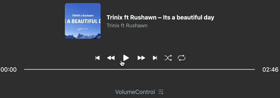
If we save all files, the audio player should render like so:
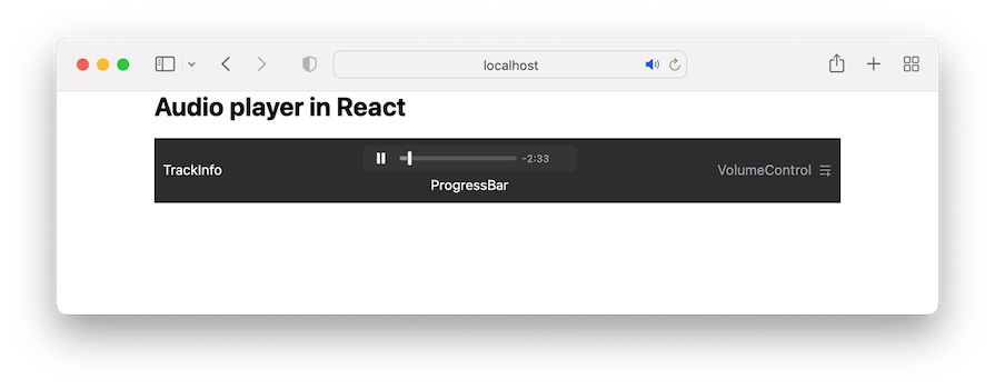
The appearance of the audio control will vary between browsers. Therefore, we will create a custom control to get a consistent look and feel across browsers and add additional features.
Let’s start by removing the controls attribute from the <audio> tag to dismiss the browser’s default control. We should have the following:
<audio src={currentTrack.src} />
Next, we’ll add some custom controls.
In the Controls component, we’ll import and render the control icons from the react-icons. The code also uses the useState() Hook to manage the play, pause, shuffle, and repeat track functionalities:
import { useState } from 'react';
import {
  BsFillFastForwardFill,
  BsFillPauseFill,
  BsFillPlayFill,
  BsFillRewindFill,
  BsSkipEndFill,
  BsSkipStartFill,
  BsShuffle,
  BsRepeat,
} from 'react-icons/bs';
import { useAudioPlayerContext } from '../context/audio-player-context';
export const Controls = () => {
  const { currentTrack } = useAudioPlayerContext();
  const [isShuffle, setIsShuffle] = useState<boolean>(false);
  const [isRepeat, setIsRepeat] = useState<boolean>(false);
  const [isPlaying, setIsPlaying] = useState<boolean>(false);
  return (
    <div className="flex gap-4 items-center">
      <audio src={currentTrack.src} />
      <button onClick={() => {}}>
        <BsSkipStartFill size={20} />
      </button>
      <button onClick={() => {}}>
        <BsFillRewindFill size={20} />
      </button>
      <button onClick={() => setIsPlaying((prev) => !prev)}>
        {isPlaying ? (
          <BsFillPauseFill size={30} />
        ) : (
          <BsFillPlayFill size={30} />
        )}
      </button>
      <button onClick={() => {}}>
        <BsFillFastForwardFill size={20} />
      </button>
      <button onClick={() => {}}>
        <BsSkipEndFill size={20} />
      </button>
      <button onClick={() => setIsShuffle((prev) => !prev)}>
        <BsShuffle
          size={20}
          className={isShuffle ?'text-[#f50]' : ''}
        />
      </button>
      <button onClick={() => setIsRepeat((prev) => !prev)}>
        <BsRepeat
          size={20}
          className={isRepeat ? 'text-[#f50]' : ''}
        />
      </button>
    </div>
  );
};
Notice that we are not placing the state in the global context. If a state can remain local within a component without being needed by other components, it should stay local. We should avoid placing all state data in a global context because every component that consumes the context data will update and re-render unnecessarily.
play() and pause() HTML audio methodsTo play and pause an audio track, the <audio> element exposes the play() and pause() methods. To invoke these methods, we must have access to the <audio> element. In React, we use the useRef Hook for that.
Because we will need this <audio> reference in multiple components in the tree, we will add it in the context store:
export const AudioPlayerProvider = ({
  children,
}: {
  children: ReactNode;
}) =>{
  const [currentTrack,setCurrentTrack] = useState<Track>(tracks[0]);
  const audioRef = useRef<HTMLAudioElement>(null);
  const contextValue= {
    // ...
    audioRef
  };
  return (
    <AudioPlayerContext.Provider value={contextValue}>
      {children}
    </AudioPlayerContext.Provider>
  );
};
In the Controls component file, we’ll consume the reference and assign it to a ref attribute on the <audio> element:
export const Controls = () => {
  const { currentTrack, audioRef } = useAudioPlayerContext();
  // ...
  return (
    <div className="flex gap-4 items-center">
      <audio src={currentTrack.src} ref={audioRef} />
      {/* ... */}
    </div>
  );
};
We now have access to the <audio> element’s methods and properties via the ref object. You can log the audioRef inside a useEffect() Hook to see what it returns in the browser console:
useEffect(() => {
  console.log(audioRef);
}, []);
With this, we can invoke the play() and pause() methods on the current object of the reference variable. This lets us control audio playback programmatically, enabling us to start or stop the audio based on user interactions or other events.
The code below ensures the audio plays or pauses based on the isPlaying state:
export const Controls = () => {
  // ...
  const [isPlaying, setIsPlaying] = useState<boolean>(false);
  useEffect(() =>{
    if (isPlaying) {
      audioRef.current?.play();
    } else {
      audioRef.current?.pause();
    }
  }, [isPlaying, audioRef]);
  return (
    <div className="flex gap-4 items-center">
      <audio src={currentTrack.src} ref={audioRef} />
      {/* <... */}
      <button onClick={() => setIsPlaying((prev) => !prev)}>
        {isPlaying ? (
          <BsFillPauseFill size={30} />
        ) : (
          <BsFillPlayFill size={30} />
        )}
      </button>
      {/* ... */}
    </div>
  );
};
Now, we should be able to play and pause the current audio track in our application.
In the TrackInfo component file, we’ll get the currentTrack state from the context store and display the track’s information:
import { BsMusicNoteBeamed } from 'react-icons/bs';
import { useAudioPlayerContext } from '../context/audio-player-context';
export const TrackInfo = () => {
  const { currentTrack } = useAudioPlayerContext();
  return (
    <div className="flex items-center gap-4">
      <div className="w-24 h-24 flex items-center justify-center bg-gray-200 rounded-md overflow-hidden">
        {currentTrack.thumbnail ? (
          <img
            className="w-full h-full object-cover"
            src={currentTrack.thumbnail}
            alt="audio avatar"
          />
        ) : (
          <div className="flex items-center justify-center w-full h-full bg-gray-300 rounded-md">
            <span className="text-xl text-gray-600">
              <BsMusicNoteBeamed />
            </span>
          </div>
        )}
      </div>
      <div>
        <p className="font-bold lg:truncate lg:max-w-64">
          {currentTrack.title}
        </p>
        <p className="text-sm text-gray-400">{currentTrack.author}</p>
      </div>
    </div>
  );
};
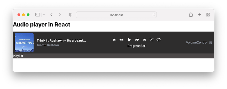
Our application should now look like this:
For accessibility purposes, we’ll leverage the HTML input range element for these functionalities.
In the components/ProgressBar.tsx, let’s add the range slider and markup:
export const ProgressBar= () =>{
  return (
    <div className="flex items-center justify-center gap-5 w-full">
      <span>00:00</span>
      <input className="max-w-[80%] bg-gray-300" type="range" />
      <span>03:34</span>
    </div>
  );
};
If we save the file and view the project, we will see the browser’s default input range. Creating a range element that is consistent across browsers requires a bit more work using CSS rules.
For this, let’s create a styles/customize-progress-bar.css file, copy the range slider CSS rules, and paste them into the newly created CSS file.
Next, import the CSS file inside the src/main.tsx:
import './styles/index.css';
import './styles/customize-progress-bar.css';
Ensure you save all files.
It’s important to note that we have used a CSS variable in the CSS file to assign the progress width dynamically:
input[type="range"] {
  --range-progress: 0;
  /* ... */
}

input[type="range"]::before {
  /* ... */
  background: #f50;
  width: var(--range-progress);
  /* ... */
}
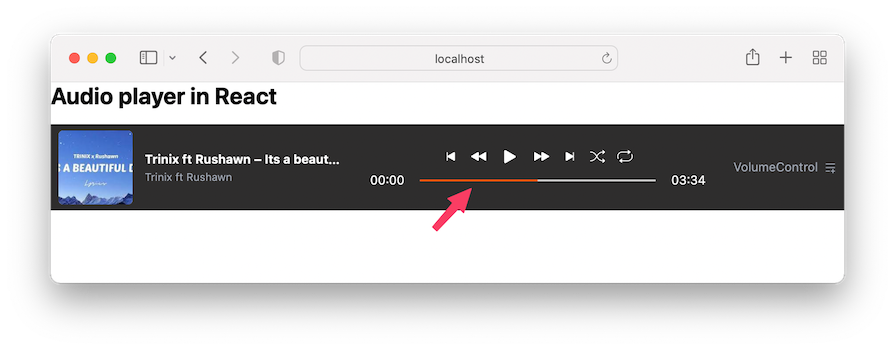
We started with a value of zero. We will dynamically update this value based on the audio progress. For now, let’s temporarily modify the CSS variable value to be 50 percent like so:
input[type="range"] {
  --range-progress: 50%;
  /* ... */
}
We will then have a progress bar that is styled up to 50 percent of the total length:
Let’s return the value assigned to the CSS variable to 0:
input[type="range"] {
  --range-progress: 0;
  /* ... */
}
In React, form inputs like range sliders can be either controlled or uncontrolled. Controlled inputs are managed by the React component state, where we write handlers for every state update. Uncontrolled inputs are managed by the DOM, where we use refs to get the input values directly from the DOM.
We will learn to implement both controlled and uncontrolled inputs. The progress bar will demonstrate the uncontrolled logic, while the volume slider will use controlled logic.
For the progress bar, we will get a reference to the input range element. This reference needs to be put in context because multiple components require access to interact with properties and methods on the DOM element. For instance, the current value of the range element via ref.current.value, the max value via ref.current.max.
Similar to the audioRef, we will add a progressBarRef so the context file looks like this:
export const AudioPlayerProvider = ({
  children,
}: {
  children: ReactNode;
}) =>{
  // ...
  const audioRef = useRef<HTMLAudioElement>(null);
  const progressBarRef= useRef<HTMLInputElement>(null);
  const contextValue= {
    // ...
    audioRef,
    progressBarRef
  };
  return (
    <AudioPlayerContext.Provider value={contextValue}>
      {children}
    </AudioPlayerContext.Provider>
  );
};
In the components/ProgressBar.tsx file, we can consume the context data and assign the reference to a ref attribute on the <input /> element:
import { useAudioPlayerContext } from '../context/audio-player-context';
export const ProgressBar= () =>{
  const { progressBarRef } = useAudioPlayerContext();
  return (
    <div className="flex items-center justify-center gap-5 w-full">
      <span>00:00</span>
      <input
        ref={progressBarRef}
        className="max-w-[80%] bg-gray-300"
        type="range"
      />
      <span>03:34</span>
    </div>
  );
};
Concerning the <input /> element, we will add an onChange event to capture the input values continuously. We will also set the default value to 0, ensuring that the progress bar starts at the beginning. The updated component is as follows:
export const ProgressBar= () =>{
  const { progressBarRef } = useAudioPlayerContext();
  const handleProgressChange = () =>{
    console.log(progressBarRef.current?.value);
  };
  return (
    <div className="flex items-center justify-center gap-5 w-full">
      <span>00:00</span>
      <input
        className="max-w-[80%] bg-gray-300"
        ref={progressBarRef}
        type="range"
        defaultValue="0"
        onChange={handleProgressChange}
      />
      <span>03:34</span>
    </div>
  );
};
When changing the progress bar, we will see the corresponding values in the browser console.
Next, we will synchronize the audio playback position with the progress bar so that the audio jumps to the corresponding point in the track. We’ll take the slider value and assign it to the currentTime property of the audio playback. This property returns the audio playback’s current position using seconds as the unit of measurement.
To get the currentTime property, we need the audio reference. Fortunately, we created it earlier in the context store. So, let’s simply access it from our useAudioPlayerContext Hook, and then assign the progress bar value to the currentTime property:
export const ProgressBar= () =>{
  const { progressBarRef, audioRef } = useAudioPlayerContext();
  const handleProgressChange = () =>{
    if (audioRef.current && progressBarRef.current) {
      const newTime = Number(progressBarRef.current.value);
      audioRef.current.currentTime = newTime;
    }
  };
  return (
    // ...
  );
};
Now, if we change the progress bar, the audio playback jumps to the specified position. Be aware that the time is static for now and the range progress color is not progressing. We will get there!
In the context store, we’ll define their respective states with default values:
export const AudioPlayerProvider = ({
  children,
}: {
  children: ReactNode;
}) =>{
  const [timeProgress,setTimeProgress] = useState<number>(0);
  const [duration, setDuration] = useState<number>(0);
  // ...
  const contextValue= {
    // ...
    timeProgress,
    setTimeProgress,
    duration,
    setDuration,
  };
  return (
    <AudioPlayerContext.Provider value={contextValue}>
      {children}
    </AudioPlayerContext.Provider>
  );
};
We’ll grab the states from the ProgressBar component, and render them in the JSX:
export const ProgressBar = () => {
  const { progressBarRef, audioRef, timeProgress, duration } =
    useAudioPlayerContext();
  // ...
  return (
    <div className="flex items-center justify-center gap-5 w-full">
      <span>{timeProgress}</span>
      {/* ... */}
      <span>{duration}</span>
    </div>
  );
};
Like the current time, as we saw earlier, we also have access to the track duration via the duration audio property.
Starting with the duration, we want to get and display the track duration as soon as the audio metadata loads. We will use the onloadedmetadata event on the <audio />.
Open the components/Controls.tsx file and include this event:
export const Controls = () => {
  // ...
  const onLoadedMetadata = () =>{
    console.log(audioRef.current?.duration);
  };
  return (
    <div className="flex gap-4 items-center">
      <audio
        src={currentTrack.src}
        ref={audioRef}
        onLoadedMetadata={onLoadedMetadata}
      />
      {/* ... */}
    </div>
  );
};
If we save and open the console, we will see the duration time in seconds.
Next, we will update the duration state variable with the audio duration and ensure the <input> progress bar‘s max attribute matches the duration.
In the Controls component, let’s access the setDuration and progressBarRef from the context store and update the onLoadedMetadata handler:
export const Controls = () => {
  const {
    // ...
    setDuration,
    progressBarRef
  } = useAudioPlayerContext();
  // ...
  const onLoadedMetadata = () =>{
    const seconds = audioRef.current?.duration;
    if (seconds !== undefined) {
      setDuration(seconds);
      if (progressBarRef.current) {
        progressBarRef.current.max = seconds.toString();
      }
    }
  };

  return (
    // ...
  );
};
This code ensures the progress bar accurately reflects the total duration of the audio track. Now, we should see the track duration displayed:
The track duration is currently displayed using only seconds as the unit, but it would be easier to read if it displayed both minutes and seconds. Let’s create a function that formats the time to the desired display.
In the ProgressBar component, add the following code above the return statement:
const formatTime = (time: number | undefined): string => {
    if (typeof time === 'number' && !isNaN(time)) {
      const minutes = Math.floor(time / 60);
      const seconds = Math.floor(time % 60);
      // Convert to string and pad with leading zeros if necessary
      const formatMinutes= minutes.toString().padStart(2, '0');
      const formatSeconds= seconds.toString().padStart(2, '0');
      return `${formatMinutes}:${formatSeconds}`;
    }
    return '00:00';
  };
The formatTime function takes a time argument in seconds and reformats it to MM:SS. We will then use the function in the JSX like so:
return (
  <div className="flex items-center justify-center gap-5 w-full">
    <span>{formatTime(timeProgress)}</span>
    {/* ... */}
    <span>{formatTime(duration)}</span>
  </div>
);
Save the file and see the audio time that is formatted the way we want.
requestAnimationFrame APIWe need to manage the playback and progress bar updates for the audio player. To ensure smooth updates for displaying the current time and the progress bar, using requestAnimationFrame is more efficient and smoother compared to setInterval().
The requestAnimationFrame takes a callback function that is called before the next repaint, making it ideal for animations and frequent updates.
Here’s how it works:
requestAnimationFrame again from within the callback to continue the update loopFor the code implementation, we start the animation in the following useEffect block inside the Controls component:
useEffect(() => {
  if (isPlaying) {
    audioRef.current?.play();
  } else {
    audioRef.current?.pause();
  }
}, [isPlaying,audioRef]);
We update it to look like this:
const playAnimationRef = useRef<number | null>(null);
useEffect(() => {
  if (isPlaying) {
    audioRef.current?.play();
    startAnimation();
  } else {
    audioRef.current?.pause();
    if (playAnimationRef.current !== null) {
      cancelAnimationFrame(playAnimationRef.current);
      playAnimationRef.current = null;
    }
    updateProgress(); // Ensure progress is updated immediately when paused
  }
  return () =>{
    if (playAnimationRef.current !== null) {
      cancelAnimationFrame(playAnimationRef.current);
    }
  };
}, [isPlaying,startAnimation, updateProgress,audioRef]);
With this code, once the audio starts playing, we immediately start the animation by calling startAnimation, which looks like this:
const startAnimation = useCallback(() =>{
  if (audioRef.current && progressBarRef.current && duration) {
    const animate = () => {
      updateProgress();
      playAnimationRef.current = requestAnimationFrame(animate);
    };
    playAnimationRef.current = requestAnimationFrame(animate);
  }
}, [updateProgress, duration, audioRef, progressBarRef]);
This function initiates the animation by calling requestAnimationFrame and setting up a loop with the animate function. The animate function also calls another function called updateProgress with the code below to update the progress of the audio playback and progress bar:
const updateProgress = useCallback(() =>{
  if (audioRef.current && progressBarRef.current && duration) {
    const currentTime= audioRef.current.currentTime;
    setTimeProgress(currentTime);
    progressBarRef.current.value = currentTime.toString();
    progressBarRef.current.style.setProperty(
      '--range-progress',
      `${(currentTime / duration) * 100}%`
    );
  }
}, [duration,setTimeProgress, audioRef, progressBarRef]);
We declared a custom CSS property called --range-progress in our CSS file to provide the visual style for the progress bar. It takes a percentage value representing the amount of audio that has been played.
Overall, the code manages the playback while smoothly updating the progress bar using requestAnimationFrame. It also includes cleanup logic to efficiently manage resources.
Ensure you import the useCallback Hook and get the duration state and setTimeProgress from the context:
const { currentTrack, audioRef, setDuration, duration, setTimeProgress, progressBarRef} =
    useAudioPlayerContext();
When testing our application, you’ll observe that changes to the progress bar do not animate while the audio is paused. This happens because cancelAnimationFrame is called during the pause state, stopping the animation:
In that case, we will visit the ProgressBar component file and update the handleProgressChange from this:
const handleProgressChange = () => {
  if (audioRef.current && progressBarRef.current) {
    const newTime = Number(progressBarRef.current.value);
    audioRef.current.currentTime = newTime;
  }
};
To this:
const handleProgressChange = () => {
  if (audioRef.current && progressBarRef.current) {
    const newTime = Number(progressBarRef.current.value);
    audioRef.current.currentTime = newTime;
    setTimeProgress(newTime);
    // if progress bar changes while audio is on pause
    progressBarRef.current.style.setProperty(
      '--range-progress',
      `${(newTime / duration) * 100}%`
    );
  }
};
The improvements ensure that the progress bar visually reflects the new playback time and maintains synchronization with the audio, even when the audio is paused.
Make sure you get the setTimeProgress from the context.
Let’s work on the control buttons logic. This includes the next, previous, skip forward, and skip backward buttons. We‘ll start by attaching onClick events to them. In the components/Controls.tsx file, update the buttons in the JSX to include onClick event handlers:
export const Controls = () => {
  // ...
  const skipForward= () =>{};
  const skipBackward= () =>{};
  const handlePrevious= () =>{};
  const handleNext = () => {};
  return (
    <div className="flex gap-4 items-center">
      {/* ... */}
      <button onClick={handlePrevious}>
        <BsSkipStartFill size={20} />
      </button>
      <button onClick={skipBackward}>
        <BsFillRewindFill size={20} />
      </button>
      {/* ... */}
      <button onClick={skipForward}>
        <BsFillFastForwardFill size={20} />
      </button>
      <button onClick={handleNext}>
        <BsSkipEndFill size={20} />
      </button>
      {/* ... */}
    </div>
  );
};
To handle the next and previous tracks, we need to know the index of the current playing track and have access to the playlist. In the context store, let’s initialize a state for the track index. Then ensure the currentTrack uses the index rather than tracks[0]:
export const AudioPlayerProvider = ({
  children,
}: {
  children: ReactNode;
}) =>{
  const [trackIndex,setTrackIndex] = useState<number>(0);
  const [currentTrack,setCurrentTrack] = useState<Track>(
    tracks[trackIndex]
  );
  // ...
  const contextValue= {
    // ...
    setTrackIndex,
  };
  return (
    <AudioPlayerContext.Provider value={contextValue}>
      {children}
    </AudioPlayerContext.Provider>
  );
};
Back to the Controls component file, let’s access the setTrackIndex along with setCurrentTrack from the useAudioPlayerContext Hook:
const {
  // ...
  setTrackIndex,
  setCurrentTrack,
} = useAudioPlayerContext();
Then, we will update the handleNext handler, so we have the following:
const handleNext = () => {
  setTrackIndex((prev) => {
    const newIndex = isShuffle
      ? Math.floor(Math.random() * tracks.length)
      : prev >= tracks.length - 1
      ? 0
      : prev + 1;
    setCurrentTrack(tracks[newIndex]);
    return newIndex;
  });
};
Ensure you import the tracks data array.
The handleNext function updates the track index and current track of the audio player by either selecting a random track (if shuffle mode is enabled) or moving to the next track in the list, looping back to the first track if at the end.
For performance considerations, we should memoize the function so that it only recreates when its dependencies change. This ensures that it does not trigger unnecessary executions of other hooks when used as a dependency.
Now, update the handleNext handler to use the useCallback Hook:
const handleNext = useCallback(() => {
setTrackIndex((prev) => {
const newIndex = isShuffle
? Math.floor(Math.random() * tracks.length)
: prev >= tracks.length - 1
? 0
: prev + 1;
setCurrentTrack(tracks[newIndex]);
return newIndex;
});
}, [isShuffle, setCurrentTrack, setTrackIndex]);
Similar to the “next track” handler, let’s update the handlePrevious handler so we have the following:
const handlePrevious = useCallback(() => {
setTrackIndex((prev) => {
const newIndex = isShuffle
? Math.floor(Math.random() * tracks.length)
: prev === 0
? tracks.length - 1
: prev - 1;
setCurrentTrack(tracks[newIndex]);
return newIndex;
});
}, [isShuffle, setCurrentTrack, setTrackIndex]);
The handlePrevious function updates the track index and current track by either selecting a random track (if shuffle mode is enabled) or moving to the previous track in the list, looping to the last track if at the beginning.
The skipForward function advances the audio playback by 15 seconds and updates the progress, while the skipBackward function rewinds the audio playback by 15 seconds and also updates the progress:
const skipForward = () => {
  if (audioRef.current) {
    audioRef.current.currentTime += 15;
    updateProgress();
  }
};
const skipBackward = () => {
  if (audioRef.current) {
    audioRef.current.currentTime -= 15;
    updateProgress();
  }
};
Save and ensure the control buttons work as expected.
onEnded eventWhen the audio playback reaches the end, we will trigger the onended event on the <audio> element to either repeat the audio or proceed to the next track on the playlist. In the Controls component file, let’s add the following code below the handleNext function:
useEffect(() => {
    const currentAudioRef= audioRef.current;
    if (currentAudioRef) {
      currentAudioRef.onended = () => {
        if (isRepeat) {
          currentAudioRef.play();
        } else {
          handleNext();// This function should handle both shuffle and non-shuffle scenarios
        }
      };
    }
    return () =>{
      if (currentAudioRef) {
        currentAudioRef.onended = null;
      }
    };
  }, [isRepeat, handleNext,audioRef]);
With the above block, if the isRepeat flag is true, the audio will automatically start playing again when it ends. Otherwise, it calls the handleNext function, which manages moving to the next track (considering both shuffle and non-shuffle modes).
We also returned the useEffect cleanup function to ensure that when the component unmounts or dependencies change, the onended event handler is removed (set to null).
As we mentioned earlier, we will use the HTML input range element to let us control the volume via a slider. In the VolumeControl component file, let’s add the UI code and basic logic:
import { ChangeEvent, useState } from 'react';
import {
  IoMdVolumeHigh,
  IoMdVolumeOff,
  IoMdVolumeLow,
} from 'react-icons/io';
export const VolumeControl= () =>{
  const [volume, setVolume] = useState<number>(60);
  const [muteVolume,setMuteVolume] = useState(false);
  const handleVolumeChange = (e: ChangeEvent<HTMLInputElement>) =>{
    setVolume(Number(e.target.value));
  };
  return (
    <div>
      <div className="flex items-center gap-3">
        <button onClick={() => setMuteVolume((prev) => !prev)}>
          {muteVolume || volume< 5 ? (
            <IoMdVolumeOff size={25} />
          ) : volume< 40 ? (
            <IoMdVolumeLow size={25} />
          ) : (
            <IoMdVolumeHigh size={25} />
          )}
        </button>
        <input
          type="range"
          min={0}
          max={100}
          value={volume}
          className="volumn"
          onChange={handleVolumeChange}
        />
      </div>
    </div>
  );
};
In the code, we define two component states: one for managing the volume level and another for the mute status. Based on these states, the component displays different volume icons. Then, in the JSX, we render a slider input to allow users to adjust the volume.
Let’s capitalize on the volume state variable to style the volume progress dynamically. On the volume input element, let’s add a style attribute to style the progress:
<input
  // ...
  style={{
    background: `linear-gradient(to right, #f50 ${volume}%, #ccc ${volume}%)`,
  }}
/>
The code above styles the volume progress bar using the CSS linear gradient. As the volume state increases, the progress bar’s orange background color will also match until it takes up the rest of the progress bar’s length. Remember to save the file and ensure it works!
For the volume to be in sync with audio playback, we will need access to the audioRef. We can update the code to include the following:
export const VolumeControl= () =>{
  // ...
  const { audioRef} = useAudioPlayerContext();
  useEffect(() =>{
    if (audioRef.current) {
      audioRef.current.volume = volume / 100;
      audioRef.current.muted = muteVolume;
    }
  }, [volume, audioRef, muteVolume]);
  return (
    // ...
  );
};
The code now adjusts the audioRef.current.volume and audioRef.current.muted properties based on the component’s state.
Save the file and ensure you can increase and reduce the audio volume.
We will render a list of audio tracks in the UI by opening the PlayList component file and mapping over the tracks array to create UI elements for each track:
import { BsMusicNoteBeamed } from 'react-icons/bs';
import { useAudioPlayerContext } from '../context/audio-player-context';
import { tracks } from '../data/tracks';
export const PlayList = () => {
  const { currentTrack } = useAudioPlayerContext();
  return (
    <ul className="bg-[#4c4848] text-white max-h-72 overflow-y-auto">
      {tracks.map((track, index) => (
        <li
          key={index}
          className={`flex items-center gap-3 p-[0.5rem_10px] cursor-pointer ${
            currentTrack.title === track.title ? 'bg-[#a66646]' : ''
          }`}
        >
          <div className="w-16 h-16 flex items-center justify-center bg-gray-200 rounded-sm overflow-hidden">
            {track.thumbnail ? (
              <img
                className="w-full h-full object-cover"
                src={track.thumbnail}
                alt="audio avatar"
              />
            ) : (
              <div className="flex items-center justify-center w-full h-full bg-gray-300 rounded-md">
                <span className="text-xl text-gray-600">
                  <BsMusicNoteBeamed />
                </span>
              </div>
            )}
          </div>
          <div>
            <p className="font-bold text-sm">{track.title}</p>
            <p className="text-sm text-gray-400">{track.author}</p>
          </div>
        </li>
      ))}
    </ul>
  );
};
This implementation displays the playlist, listing each track with its title, author, and thumbnail. Next, we’ll make the playlist interactive so that selecting a track initiates playback.
To enable this, we’ll need to update the isPlaying state from the PlayList component. This change will allow the Controls component to trigger playback and animation as follows:
useEffect(() => {
  if (isPlaying) {
    audioRef.current?.play();
    startAnimation();
  } else {
  //   ...
}, [isPlaying,startAnimation, updateProgress]);
Since the isPlaying state is currently local to the Controls component, we’ll move it to the context store. This will allow the PlayList component to update the state and control playback across components:
export const AudioPlayerProvider = ({
  children,
}: {
  children: ReactNode;
}) =>{
  // ...
  const [isPlaying, setIsPlaying] = useState<boolean>(false);
  const contextValue= {
    //  ...
    isPlaying,
    setIsPlaying,
  };
  return (
    <AudioPlayerContext.Provider value={contextValue}>
      {children}
    </AudioPlayerContext.Provider>
  );
};
We can now consume the state in the Controls component file rather than using the local state:
export const Controls = () => {
  // const [isPlaying, setIsPlaying] = useState(false);
  const {
    // ...
    isPlaying,
    setIsPlaying,
  } = useAudioPlayerContext();
  // ...
  return (
    // ...
  );
};
Next, we will access the setIsPlaying updater from the PlayList component to update the isPlaying status when a playlist item is clicked:
export const PlayList = () => {
  const { currentTrack, setIsPlaying, setCurrentTrack} =
    useAudioPlayerContext();
  const handleClick= (track: Track) => {
    setCurrentTrack(track);
    setIsPlaying(true);
  };
  return (
    <ul className="bg-[#4c4848] text-white max-h-72 overflow-y-auto">
      {tracks.map((track, index) => (
        <li
          key={index}
          className={`flex items-center gap-3 p-[0.5rem_10px] cursor-pointer ${
            currentTrack.title === track.title ? 'bg-[#a66646]' : ''
          }`}
          tabIndex={0}
          onKeyDown={(e) => {
            if (e.key === 'Enter'|| e.key === ' ') {
              handleClick(track);
            }
          }}
          onClick={() => handleClick(track)}
        >
          {/* ... */}
        </li>
      ))}
    </ul>
  );
};
For accessibility concerns, we also added the tabIndex={0} which makes the element focusable via keyboard navigation. The onKeyDown event listener helps capture keyboard events when the element is focused.
So, pressing either the Enter or Space key will call the handleClick(track) function, effectively simulating a click action. This is particularly useful for making interactive elements accessible to users who rely on keyboard navigation.
I’m glad you are here! Creating audio players can be a tedious task, especially if we aim to include major features.
In this guide, we learned how to create a React audio player that offers necessary features, including the play, pause, volume, next, previous, and progress controls. We also ensured the audio player looks consistent across browsers.
I hope you enjoyed reading this guide. Let me know your thoughts in the comment section, and remember to share the guide around the web if you found it useful.
See the final source code and the live project for reference.
Install LogRocket via npm or script tag. LogRocket.init() must be called client-side, not
server-side
$ npm i --save logrocket

// Code:

import LogRocket from 'logrocket';
LogRocket.init('app/id');
// Add to your HTML:

<script src="https://cdn.lr-ingest.com/LogRocket.min.js"></script>
<script>window.LogRocket && window.LogRocket.init('app/id');</script>

Learn about TypeScript v6’s breaking changes, new ES2025 features, and deprecated options. A complete migration guide from v5 to prepare for v7.

Learn how Vite+ unifies Vite, Vitest, Oxlint, Oxfmt, Rolldown, and Node.js management in one CLI.

AI companies are buying developer tools as coding agents turn runtimes, package managers, and linters into strategic infrastructure.
Learn how AI-assisted development governance uses rules, agents, hooks, and protocols to help AI coding tools produce safer, more consistent code.
Would you be interested in joining LogRocket's developer community?
Join LogRocket’s Content Advisory Board. You’ll help inform the type of content we create and get access to exclusive meetups, social accreditation, and swag.
Sign up now

 Learn more →
