The initial release of Flutter in 2017 spelled the beginning of a new era in the hybrid development of cross-platform apps. Flutter took the world by storm and, within a few years, countless companies and developers adopted Flutter as their platform and framework of choice for developing cross-platform applications.

Flutter enables you to develop mobile (Android and iOS), desktop, and, as of the release of Flutter 2.0, even web apps without changing their codebase or rewriting the apps from scratch.
The latest release of this rapidly evolving framework, Flutter 2.5, packs a whole new, even more powerful punch. In this guide, we’ll help you get familiar with the most noteworthy new features and improvements introduced with Flutter 2.5, including:
MaterialState.scrolledUnder and support in AppBar.backgroundColorYou can upgrade your Flutter version to v2.5 by running the following command:
flutter upgrade
The Flutter CLI tool will do its work to upgrade your Flutter SDK to the latest version 2.5.
To verify that the upgrade is successful, run the following command:
flutter --version

Flutter 2.5.0 • channel stable • https://github.com/flutter/flutter.git
Framework • revision 4cc385b4b8 (5 days ago) • 2021-09-07 23:01:49 -0700
Engine • revision f0826da7ef
Tools • Dart 2.14.0
Make sure the Flutter version is 2.5.0. The above output is the result from my system.
Flutter made quite a few changes to its full screen modes in Android. Full screen modes affect the visibility of system UI overlays such as the status and bottom navigation bars.
This change introduced new mode configurations for both Android and iOS called lean back, immersive, immersive sticky, and edge to edge.
Material You is the new Google version of Material Design. With it comes a lot of support, and Flutter 2.5 has support for the FloatingActionButton sizes and themes.
FloatingActionButton sizes can be configured to have four sizes: small, regular, large, and extended.
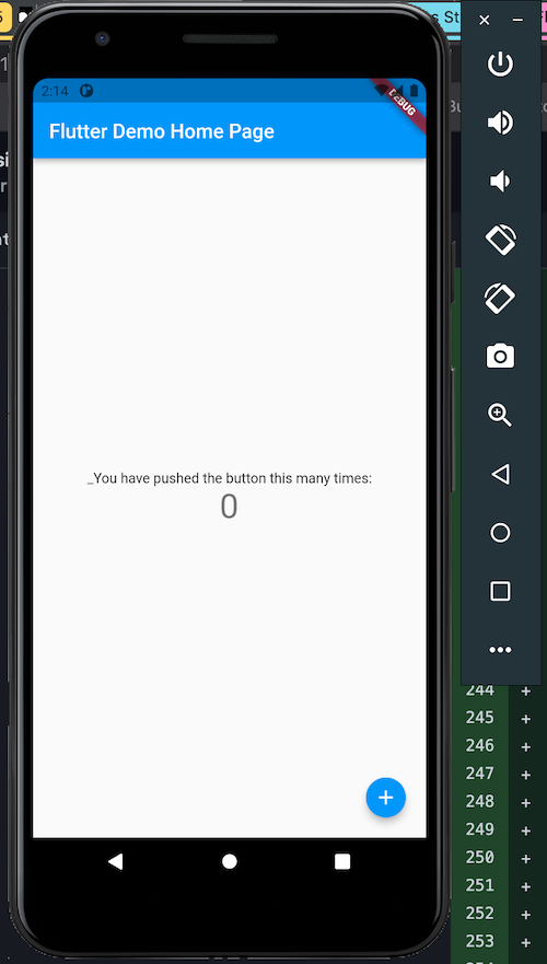
smallThe FAB appears very small. See the code below:
floatingActionButton: FloatingActionButton.small(
onPressed: _incrementCounter,
tooltip: 'Increment',
child: const Icon(Icons.add),
),
The above code will create and render a small FAB widget:
Methods with the names small, large, extended were added to the FloatingActionButton class, so we can easily call them to create the various FAB sizes.
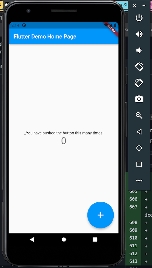
regularThe regular size is the normal size of the FAB. We can use it how we use the FloatingActionButton normally:
      floatingActionButton: FloatingActionButton(
        onPressed: _incrementCounter,
        tooltip: 'Increment',
        child: const Icon(Icons.add),
      ), // This trailing comma makes auto-formatting nicer for build methods.
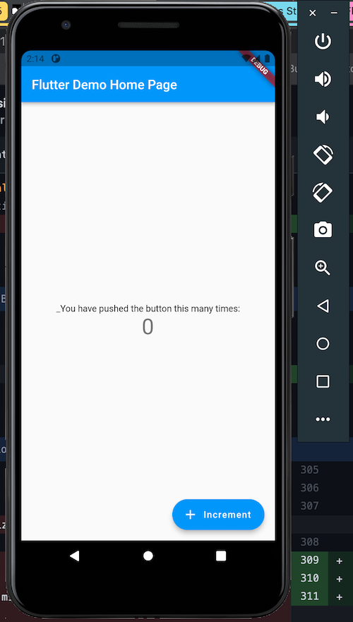
largelarge renders a very large size of the FAB.
To use this size, call the large method in the FloatingActionButton class:
      floatingActionButton: FloatingActionButton.large(
        onPressed: _incrementCounter,
        tooltip: 'Increment',
        child: const Icon(Icons.add),
      ), // This trailing comma makes auto-formatting nicer for build methods.
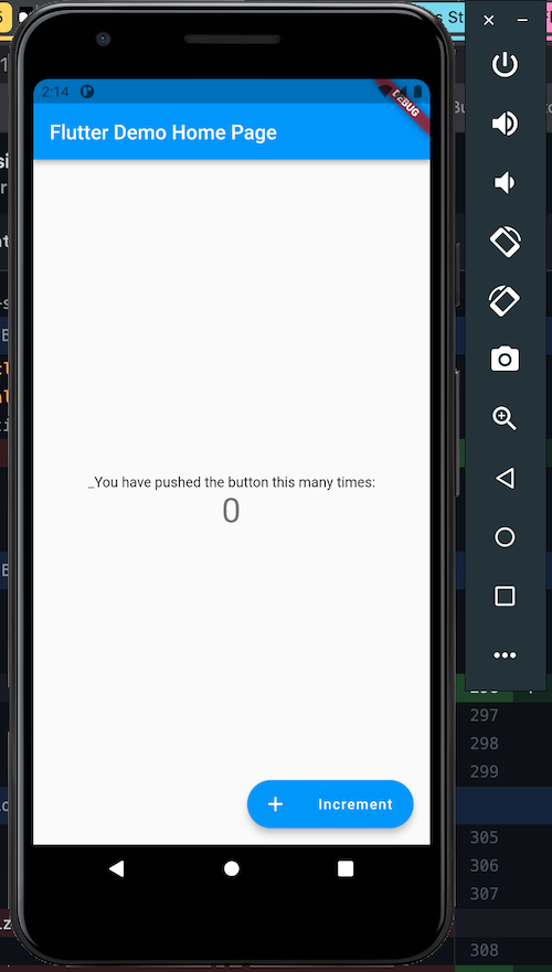
extendedextended combines text and icon on the FAB.
The extended method is called on the FloatingActionButton class. A label argument is passed to the extended method. This argument will be the text the FAB will display. Then, an icon argument is also passed to the method, this icon argument is the icon that will be displayed alongside the label on the FAB.
      floatingActionButton: FloatingActionButton.extended(
        onPressed: _incrementCounter,
        tooltip: 'Increment',
        label: Text("Increment"),
        icon: const Icon(Icons.add),
      )
We can customize the spacing between the label and icon in this extended FAB. To do that, pass an extendedIconLabelSpacing argument to the extended method:
      floatingActionButton: FloatingActionButton.extended(
        onPressed: _incrementCounter,
        tooltip: 'Increment',
        label: Text("Increment"),
        icon: const Icon(Icons.add),
        extendedIconLabelSpacing: 30
      )
We set the extendedIconLabelSpacing to have the value of 30.
We can theme FABs of all sizes in our application. This is done through the FloatingActionButtonThemeData class.
First, create an instance of FloatingActionButtonThemeData and pass settings to it:
const BoxConstraints constraints = BoxConstraints.tightFor(width: 100.0, height: 100.0);

const FloatingActionButtonThemeData(
    largeSizeConstraints: constraints,
    backgroundColor: Colors.green,
),
In the example above, we set the box model of the FAB to be 100.0 units in both height and width and the background color to green.
Let’s set this instance of FloatingActionButtonThemeData to the ThemeData call in our MaterialApp widget:
  @override
  Widget build(BuildContext context) {
    const BoxConstraints constraints = BoxConstraints.tightFor(width: 100.0, height: 100.0);
    return MaterialApp(
      title: 'Flutter Demo',
      theme: ThemeData(
        floatingActionButtonTheme: const FloatingActionButtonThemeData(
          largeSizeConstraints: constraints,
          backgroundColor: Colors.green,
        ),
        primarySwatch: Colors.blue,
      ),
      home: const MyHomePage(title: 'Flutter Demo Home Page'),
    );
  }
This theming will affect the FABs we’ll create in our application. All the FABs in our app will be 100.0 units in width and height and the background color will be green.
Let’s add two FABs:
floatingActionButton: Container(
    padding: const EdgeInsets.all(50.0),
    child:Row(
    children: [
        FloatingActionButton.extended(
            onPressed: _incrementCounter,
            tooltip: 'Increment',
            label: Text("Increment"),
            icon: const Icon(Icons.add),
        ),
        FloatingActionButton.extended(
            onPressed: ()=>{},
            tooltip: 'Decrement',
            label: Text("Decrement"),
            icon: const Icon(Icons.cancel_sharp),
        ),
     ],
    ),
)
Our two FABs have no color set on them, but the theming we set in the ThemeData will affect them. They will have a box constraint of 100.0 units and green background.
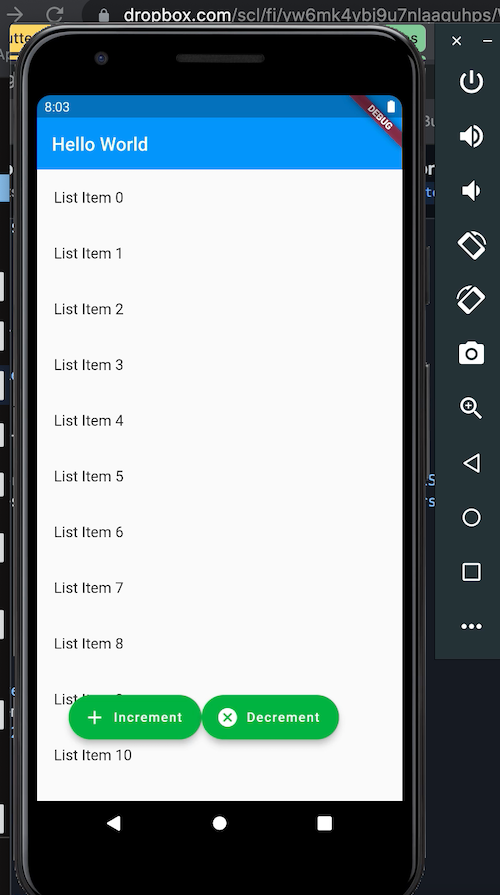
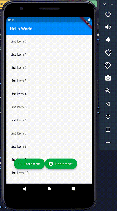
MaterialState.scrolledUnder and support in AppBar.backgroundColorThis feature is an effect that applies to an AppBar or SliverAppBar’s background color.
The Flutter team added a MaterialState.scrolledUnder state to the MaterialState. This scrollUnder state is set when the widget overlaps the content of a scrollable below. The AppBar sets this state to indicate that a piece of scrollable content has scrolled up behind it.
By setting a listener in the AppBar or SliverAppBar’s background color property, you can change the color when the scrollUnder event is fired:
class _MyHomePageState extends State<MyHomePage> {

static Widget buildListItem(BuildContext context, int index) {
    final Color color = Colors.primaries[index % Colors.primaries.length];
    return Padding(
      padding: EdgeInsets.all(2),
      child: ListTile(
        title: Text('List Item $index'),
      ),
    );
  }

  @override
  Widget build(BuildContext context) {
    return Scaffold(
      appBar: AppBar(
        backwardsCompatibility: false,
        elevation: 0,
        backgroundColor: MaterialStateColor.resolveWith((Set<MaterialState> states) {
          return states.contains(MaterialState.scrolledUnder) ? Colors.red : Colors.blue;
        }),
        title: Text('Hello World'),
      ),
      body: ListView.builder(
        itemCount: 200,
        itemBuilder: buildListItem,
      ),
    );
  }
}
We set the AppBar’s backgroundColor to resolve colors from its current states. We called the MaterialStateColor.resolveWith(...) and set a callback function in it. This callback function receives all the states in the AppBa.
Then we checked whether the states contain MaterialState.scrolledUnder. This tells us that that the AppBar has been scrolled under, so we return the indigo color. If not, the blue color is returned.
ScrollMetricsNotificationThe ScrollMetricsNotification feature enables you to listen in on a scrollable to detect when the scrollable’s content is altered. The scrollable is also notified if the size of the widow or the scrollable’s parent is altered.
Here’s an example:
class _MyHomePageState extends State<MyHomePage> {
  double windowSize = 200.0;

  @override
  Widget build(BuildContext context) {
    return Scaffold(
        appBar: AppBar(
          backwardsCompatibility: false,
          elevation: 0,
          title: Text('Hello World'),
        ),
        body: NotificationListener<ScrollMetricsNotification>(
          onNotification: (ScrollMetricsNotification notification) {
            ScaffoldMessenger.of(notification.context).showSnackBar(
              const SnackBar(
                content: Text('Scroll metrics changed!'),
              ),
            );
            return false;
          },
          child: Scrollbar(
            isAlwaysShown: true,
            child: SizedBox(
              height: windowSize,
              width: double.infinity,
              child: const SingleChildScrollView(
                child: FlutterLogo(
                  size: 300.0,
                ),
              ),
            ),
          ),
        ),
        floatingActionButton: Container(
          padding: const EdgeInsets.all(50.0),
          child: Row(
            children: [
              FloatingActionButton.extended(
                onPressed: () => {
                  setState(() {
                    windowSize += 10.0;
                  })
                },
                tooltip: 'Adjust WindowSize',
                label: Text("Adjust WindowS"),
                icon: const Icon(Icons.cancel_sharp),
              ),
            ],
          ),
        )
    );
  }
}
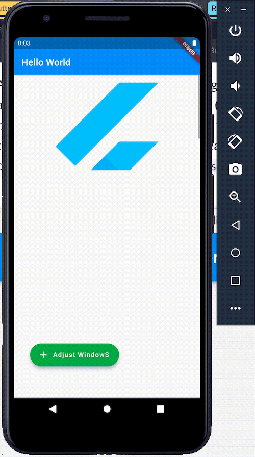
We have a Scrollbar encased in a NotificationListener widget. The ScrollBar has a SizedBox; the SizedBox‘s height is attached to the windowSize state.
We have an onNotification callback set in the NotificationListener widget. This callback is called when the SizedBox content is altered. Notice that the callback receives an argument that is an instance of ScrollMetricsNotification.
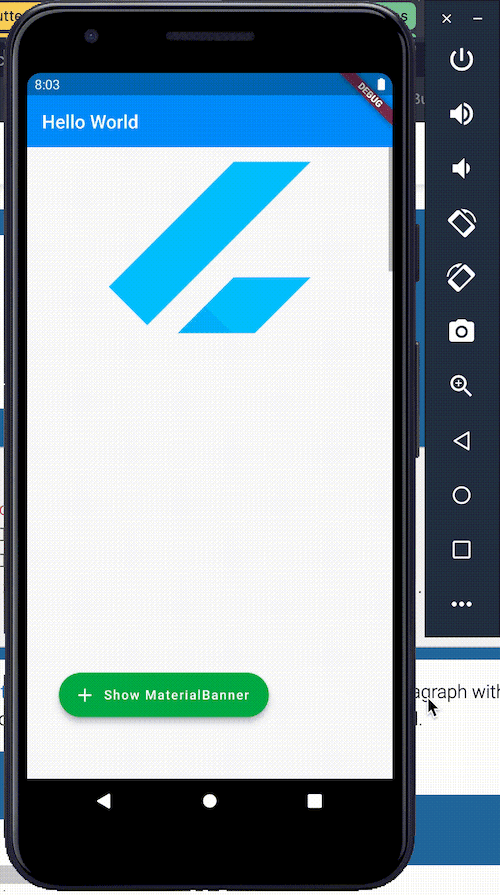
Finally, the MaterialBanner class is here. This feature enables you to add a banner to the top of your Flutter app. This banner stays there until it is dismissed.
This Material Design banner is handled by the ScaffoldMessenger class. This ScaffoldMessenger class has methods that we can use to create and remove MaterialBanners.
ScaffoldMessenger.of(context).showMaterialBannerThis method creates and displays a Material Banner. ScaffoldMessenger.of(context).showMaterialBanner is passed a MaterialBanner widget; this is the MaterialBanner that the method displays on top of our application.
ScaffoldMessenger.of(context).showMaterialBanner(
    MaterialBanner(
        content: const Text('Yay!! Do you like me!!'),
        leading: const Icon(Icons.warning),
        backgroundColor: Colors.purple,
        actions: [
            TextButton(
            child: const Text('Dismiss', style: const TextStyle(color: Colors.white)),
            onPressed: () => ScaffoldMessenger.of(context)
                .hideCurrentMaterialBanner(),
            ),
        ],
    ),
)
The above code will show a MaterialBanner. See that a MaterialBanner widget is passed to the showMaterialBanner method.
In the MaterialBanner widget, we passed the following props:
content: This prop sets the body of the banner.leading: This sets the icon that will be at the start of the banner.backgroundColor: This sets the background color of the banner widget.actions: This sets the buttons that will be at the end of the banner widget.ScaffoldMessenger.of(context).hideCurrentMaterialBannerThis method removes an existing MaterialBanner.
actions: [
    TextButton(
    child: const Text('Dismiss', style: const TextStyle(color: Colors.white)),
    onPressed: () => ScaffoldMessenger.of(context)
        .hideCurrentMaterialBanner(),
    ),
],
The full code:
class _MyHomePageState extends State<MyHomePage> {

  @override
  Widget build(BuildContext context) {
    return Scaffold(
        appBar: AppBar(
          backwardsCompatibility: false,
          elevation: 0,
          title: Text('Hello World'),
        ),
        body: NotificationListener<ScrollMetricsNotification>(
          onNotification: (ScrollMetricsNotification notification) {
            ScaffoldMessenger.of(notification.context).showSnackBar(
              const SnackBar(
                content: Text('Scroll metrics changed!'),
              ),
            );
            return false;
          },
          child: Scrollbar(
            isAlwaysShown: true,
            child: SizedBox(
              height: 100.0,
              width: double.infinity,
              child: const SingleChildScrollView(
                child: FlutterLogo(
                  size: 300.0,
                ),
              ),
            ),
          ),
        ),
        floatingActionButton: Container(
          padding: const EdgeInsets.all(50.0),
          child: Row(
            children: [
              FloatingActionButton.extended(
                onPressed: () => {
                  ScaffoldMessenger.of(context).showMaterialBanner(
                      MaterialBanner(
                        content: const Text('Yay!! Do you like me!!'),
                        leading: const Icon(Icons.warning),
                        backgroundColor: Colors.purple,
                        actions: [
                          TextButton(
                            child: const Text('Dismiss', style: const TextStyle(color: Colors.white)),
                            onPressed: () => ScaffoldMessenger.of(context)
                                .hideCurrentMaterialBanner(),
                          ),
                        ],
                      ),
                    )
                },
                tooltip: 'Show MaterialBanner',
                label: Text("Show MaterialBanner"),
                icon: const Icon(Icons.add),
              ),
            ],
          ),
        )
    );
  }
}
In addition to the new UI features described above, Flutter 2.5 introduced support for switchable keyboard shortcuts, an improved widget inspector tool, support for adding dependencies in VS Code projects, and a new app template.
Let’s take a closer look.
Version 2.5 introduced some updates to Flutter’s text editing keyboard shortcuts. The most noteworthy change is that shortcuts are now overridable. The new overridable keyboard shortcuts in Flutter 2.5 enable you to set shortcut combinations to perform custom actions.
The Flutter widget inspector got a major facelift with the release of Flutter 2.5. The new and improved widget inspector now offers a more detailed look into your widgets, including deep insight into why specific frames might be performing jankily.
Picking up a frame in the inspector reveals information about the frame, including the frame’s Frame Time (UI), Frame Time(Raster), Jank, and Shader Compilation.
The Flutter plugin’s support for Visual Studio Code and IntelliJ has also been updated with Flutter. It’s now possible to add new dependencies to a project from the Flutter plugin.
This is done via the following commands:
Dart: Add Dependency adds a Flutter package in the main dependencies of the projectDart: Add Dev Dependency adds a dependency that the project uses during the development of the projectInitially, Flutter generated a counter example app when you created a Flutter project using flutter create app. The problem with the counter template is that it doesn’t provide a good starting point for building a real-world app.
Flutter 2.5 introduced a new template complete with production-level quality features, including:
To use this new template when scaffolding a new Flutter project, run the following command:
flutter create -t skeleton app
Install LogRocket via npm or script tag. LogRocket.init() must be called client-side, not
server-side
$ npm i --save logrocket

// Code:

import LogRocket from 'logrocket';
LogRocket.init('app/id');
// Add to your HTML:

<script src="https://cdn.lr-ingest.com/LogRocket.min.js"></script>
<script>window.LogRocket && window.LogRocket.init('app/id');</script>

Learn how to use Fallow to analyze AI-generated code, detect dead code, duplicate logic, and complexity issues, and integrate automated code quality checks into your AI-assisted development workflow.

Learn how to protect full-stack projects from NPM supply chain attacks with a practical security checklist.

Explore 15 essential MCP servers for web developers to enhance AI workflows with tools, data, and automation.

Learn how contrast-color() automatically picks accessible text colors using native CSS, without JavaScript.
Would you be interested in joining LogRocket's developer community?
Join LogRocket’s Content Advisory Board. You’ll help inform the type of content we create and get access to exclusive meetups, social accreditation, and swag.
Sign up now

 Learn more →
