The AppBar widget is essential for any mobile app. It is used to show important information such as the page title, tabs, images, and actions that can be taken on the page.

We’ve covered how to customize the AppBar in a Flutter app. But what if you want to animate the AppBar when a user scrolls up and down?
For example, the AppBar might show a full profile picture when the user scrolls up and slowly transition to show only the user name when the user scrolls down. This effect is called a floating app bar. In Flutter this can be achieved using the widget called SliverAppBar.
In this tutorial, we’ll show you how to implement the SliverAppBar widget in a Flutter app by walking through some practical examples.
Here’s what we’ll cover:
In Flutter, SliverAppBar is a successor to the AppBar widget, which allows you to create the floating app bar effect. The SliverAppBar expands the AppBar when the screen is scrolled up and collapsed on scroll down.
You can also completely remove or hide the AppBar when the user is scrolling down a long list. SliverAppBar has got a lot of customization options so you can tailor it to your needs.
If you’re a visual learner, check out this quick video tutorial:
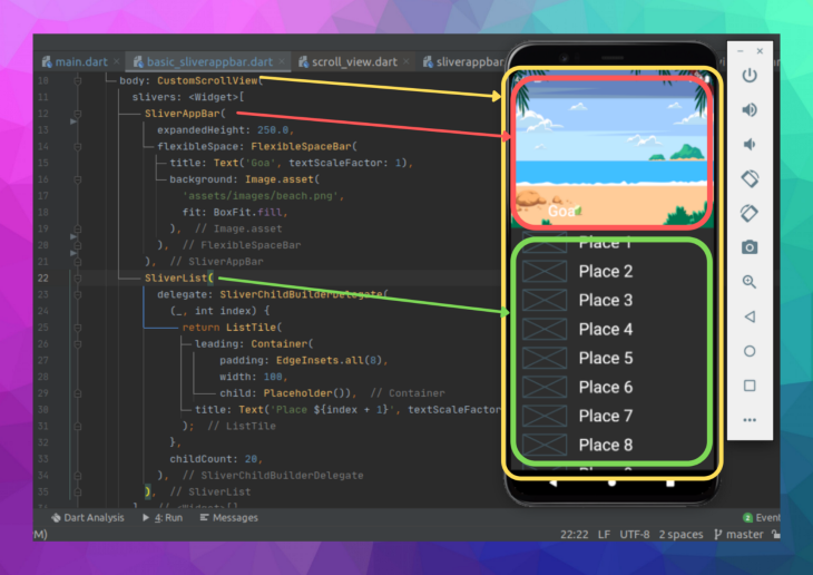
Here is the minimal code to get SliverAppBar up and running:
return Scaffold(
  //1
  body: CustomScrollView(
    slivers: <Widget>[
      //2
      SliverAppBar(
        expandedHeight: 250.0,
        flexibleSpace: FlexibleSpaceBar(
          title: Text('Goa', textScaleFactor: 1),
          background: Image.asset(
            'assets/images/beach.png',
            fit: BoxFit.fill,
          ),
        ),
      ),
      //3
      SliverList(
        delegate: SliverChildBuilderDelegate(
          (_, int index) {
            return ListTile(
              leading: Container(
                  padding: EdgeInsets.all(8),
                  width: 100,
                  child: Placeholder()),
              title: Text('Place ${index + 1}', textScaleFactor: 2),
            );
          },
          childCount: 20,
        ),
      ),
    ],
  ),
);
To add CustomScrollView, place CustomScrollView in the body section of the Scaffold widget. This is used to synchronize the scroll position of the AppBar and the list.
There are several widgets that can be added to CustomScrollView, and SliverAppBar is one of them.
SliverAppBar provides all the features of the normal AppBar widget with the addition of animating it. flexibleSpace is used to show any widget when the AppBar is expanded. expandedHeight is used to set the height of FlexibleSpaceBar the widget.
SliverList shows the list of items. We can’t use the normal ListView class because CustomScrollView accepts the widget of type sliver.
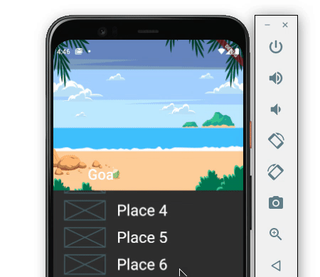
Here is the output:
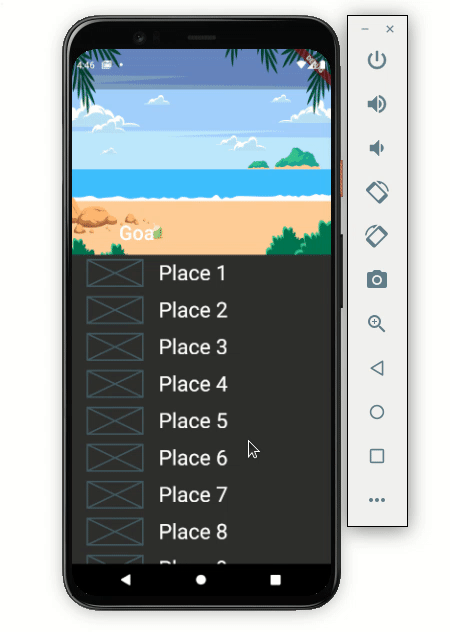
Here’s how the code translates into the design:
The default behavior will hide the SliverAppBar when scrolling down and expand when the first item in the list is reached upon scrolling up. However, SliverAppBar has options to customize this behavior.
SliverAppBar has three important properties known as pinned, snap and floating. Setting the combination of these three parameters allows the SliverAppBar to work as you need it to.
Let’s demonstrate how these properties work by looking at a practical example.
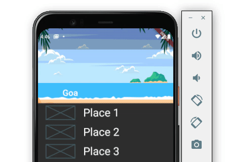
pinned: true,snap: false,floating: false:
Setting only a pinned value to true sticks the SliverAppBar at the top when scrolling down. SliverAppBar expands only when the first item in the list is reached when scrolling up.
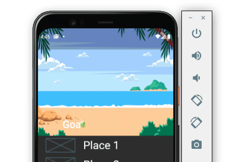
pinned: true,snap: true,floating: true:
When all the parameters are set to true, SliverAppBar sticks at the top on scrolling down and expands fully on scrolling up a bit, even though the first item in the list is not reached.
pinned: true,snap: false,floating: true:
When only the snap value is set to false, the SliverAppBar stays on top while scrolling down. The background image starts expanding as we scroll up and stops with our scroll.
pinned: false,snap: false,floating: true:
Setting only the floating value to true hides the SliverAppBar on scrolling down and starts showing the background image as we scroll in an upward direction.

pinned: false,snap: true,floating: true:
If you want to keep SliverAppBar hidden when scrolling down and show to the full background image when scrolling up a bit, even when the first item in the list is not shown. you can set only the snap and floating to true.

It’s important to note that SliverAppBar is not a complete replacement for the normal AppBar. The beauty of writing apps in Flutter is that you can mix and match widgets to create something new.
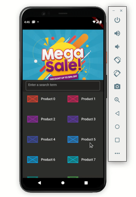
For example, you may run into a situation where you need to show an AppBar containing a search box inside the SliverAppBar.
Let’s look at an example. Below is an e-commerce app where the banner image is hidden when scrolling down and the search box remains stuck at the top.
Here’s how to do that:
Scaffold(
  body: CustomScrollView(
    slivers: <Widget>[
      SliverAppBar(
        ...
        bottom: AppBar(
          title: Container(
            height: 45,
            child: TextField(
              decoration: InputDecoration(
                  border: OutlineInputBorder(),
                  hintText: 'Enter a search term'),
            ),
          ),
        ),
      ),
      SliverGrid(
        gridDelegate: SliverGridDelegateWithFixedCrossAxisCount(
          crossAxisCount: 2,
          childAspectRatio: 2,
        ),
        delegate: SliverChildBuilderDelegate(
          (BuildContext context, int index) {
            return ItemTile(index);
          },
        ),
      ),
    ],
  ),
)
Let’s break down the code. First, just write a normal AppBar in the bottom property of the SliverAppBar. The AppBar will contain the TextField widget as an input box for searching the items.
The list of items is shown in the SliverGrid. As we have used CutomScrollView, we can’t use the normal GridView here.
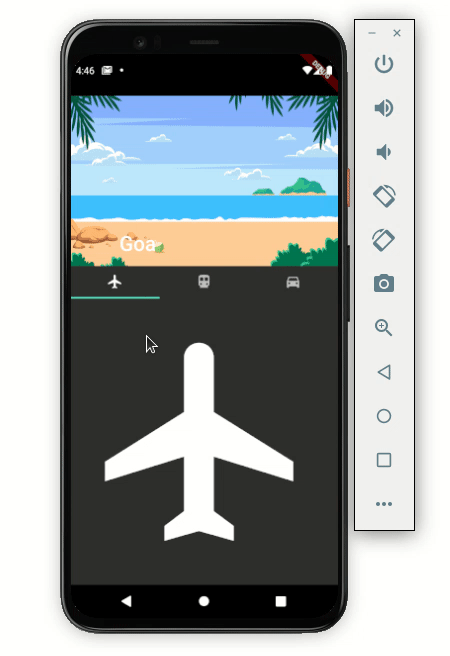
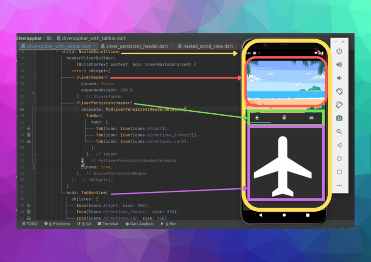
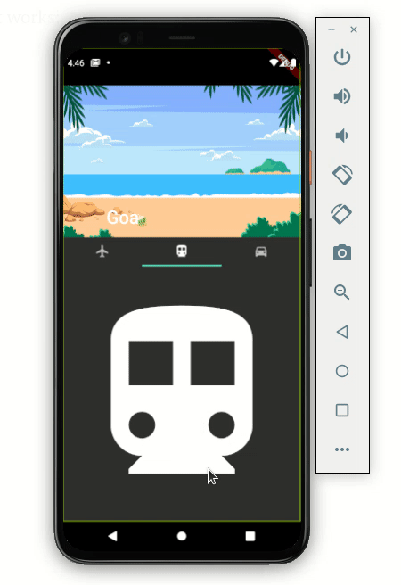
The TabBar widget is used to show different categories of content or features available to users. In some cases, you may want to show the TabBar with SliverAppBar.
Let’s walk through how to add the TabBar and make it behave like in the following example:
Scaffold(
  body: DefaultTabController(
    length: 3,
    child: NestedScrollView(
      headerSliverBuilder:
          (BuildContext context, bool innerBoxIsScrolled) {
        return <Widget>[
          SliverAppBar(
            pinned: false,
            expandedHeight: 250.0,
            flexibleSpace: FlexibleSpaceBar(
              title: Text('Goa', textScaleFactor: 1),
              background: Image.asset(
                'assets/images/beach.png',
                fit: BoxFit.fill,
              ),
              stretchModes: [StretchMode.zoomBackground],
            ),
            //collapsedHeight: 100,
          ),
          SliverPersistentHeader(
            delegate: MySliverPersistentHeaderDelegate(
              TabBar(
                tabs: [
                  Tab(icon: Icon(Icons.flight)),
                  Tab(icon: Icon(Icons.directions_transit)),
                  Tab(icon: Icon(Icons.directions_car)),
                ],
              ),
            ),
            pinned: false,
          ),
        ];
      },
      body: TabBarView(
        children: [
          Icon(Icons.flight, size: 350),
          Icon(Icons.directions_transit, size: 350),
          Icon(Icons.directions_car, size: 350),
        ],
      ),
    ),
  ),
)
The NestedScrollView widget is used to return the header as a combination of the SliverAppBar and SliverPersistentHeader widgets. SliverAppBar internally uses SliverPersistentHeader for the shrinking and growing effect. You can use this widget to show the tabs below the SliverAppBar.
TabBarView is given in the body parameter of the NestedScrollView widget.
Here’s how the above code translates into the design:
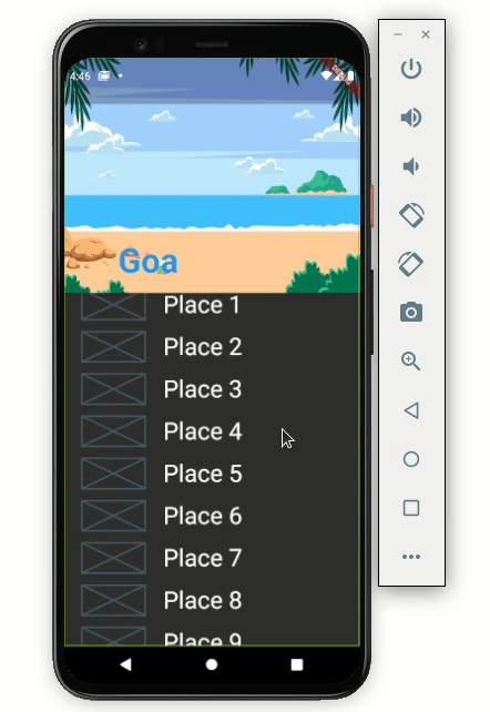
If you look carefully, the TabBar is hidden when scrolling down. To improve the user experience, you should always keep the TabBar visible on top when scrolling down.
Setting the pinned value to true in SliverPersistentHeader will solve this problem.
SliverPersistentHeader(
  delegate: MySliverPersistentHeaderDelegate(
    TabBar(
      tabs: [
        ...
      ],
    ),
  ),
  pinned: true,
)
Here’s how it works:
If want to listen to the SliverAppBar’s status to determine whether it’s expanded or collapsed, you can use the returned value to change the SliverAppBar settings. For example, you might change the text color of the title when it is expanded.
late ScrollController _scrollController;
//----------
@override
void initState() {
  // TODO: implement initState
  super.initState();

  _scrollController = ScrollController()
    ..addListener(() {
      setState(() {
        _textColor = _isSliverAppBarExpanded ? Colors.white : Colors.blue;
      });
    });
}
//----------
bool get _isSliverAppBarExpanded {
  return _scrollController.hasClients &&
      _scrollController.offset > (200 - kToolbarHeight);
}
//----------
Scaffold(
  body: CustomScrollView(
    controller: _scrollController,
    slivers: ...,
  ),
);
Here’s is the output that changes the color of the title “Goa” when SliverAppBar is expanded:
We’re already watching the SliverAppBar’s status to see if it’s expanded or collapsed. You can use it to display and hide the titles of the SliverAppBar and FlexibleSpaceBar.
When expanded, the FlexibleSpaceBar title is displayed, and when collapsed, the SliverAppBar title is displayed. Otherwise, if both titles are added, they will be visible when the AppBar is expanded and will overlap when it is collapsed.
Please examine the distinction between the two, followed by the code to display and hide the title.
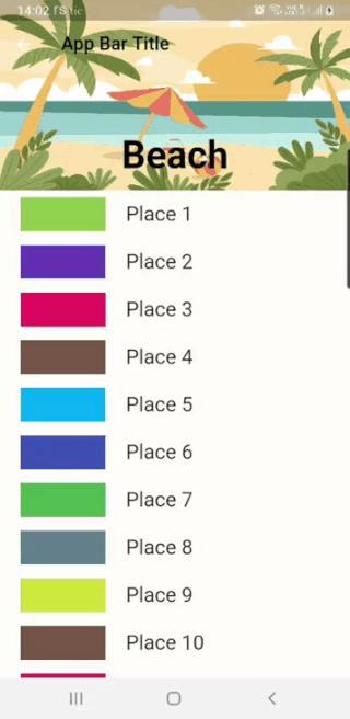
SliverAppBar(
 // show and hide SliverAppBar Title
 title: _isSliverAppBarExpanded ? const Text('App Bar Title') : null,
 pinned: true,
 snap: false,
 floating: false,
 expandedHeight: kExpandedHeight,
 // show and hide FlexibleSpaceBar title
 flexibleSpace: _isSliverAppBarExpanded
     ? null
     : FlexibleSpaceBar(
         title: Text(
           'Beach',
           textScaleFactor: 1,
           style: TextStyle(
               color: _textColor,
               fontWeight: FontWeight.bold,
               fontSize: 30),
         ),
         background: Image.asset(
           'assets/images/newBeach.jpg',
           fit: BoxFit.fill,
         ),
       ),
),
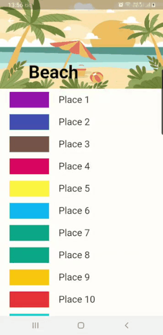
Similar to the Scaffold AppBar, we can also customize the look of SliverAppBar and FlexibleSpaceBar. We already know how to add an image to the FlexibleSpaceBar. Now let’s see how to add rounded corners at the bottom of the FlexibleSpaceBar and SliverAppBar and change the position of the titles.
Typically, we would use a Container widget to style other widgets wrapped inside it. For example, if we had added color or gradient instead of an image inside our FlexibleSpaceBar, the Container widget would be an ideal choice. But using an image wrapped with Container will not change the properties of the image.
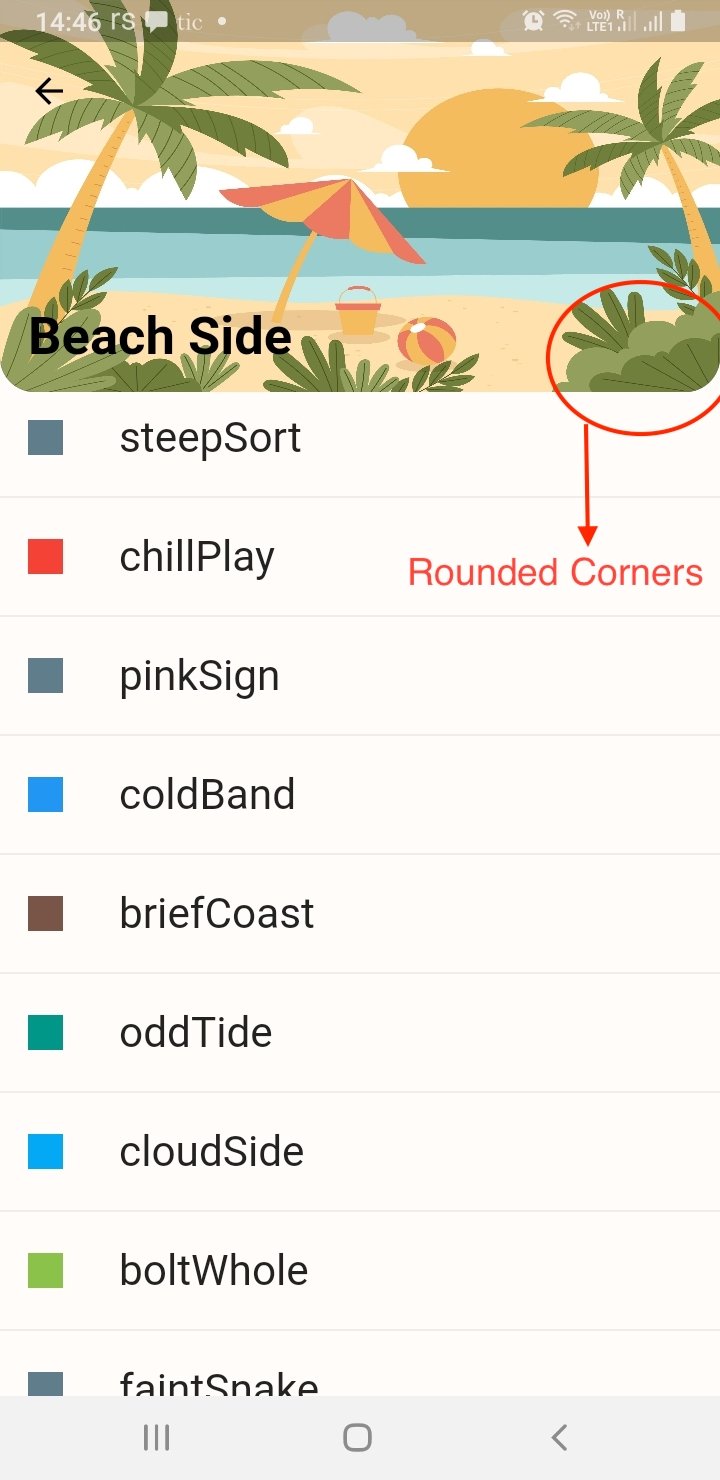
So, the solution is to use the ClipRRect widget and wrap the Image.asset with it. ClipRRect has borderRadius property similar to the Container decoration property. Please look at the code here and the image below for reference.
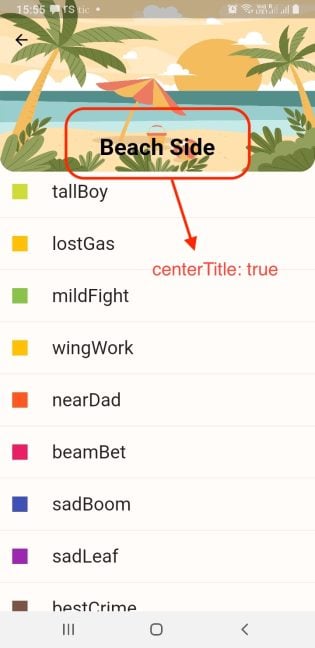
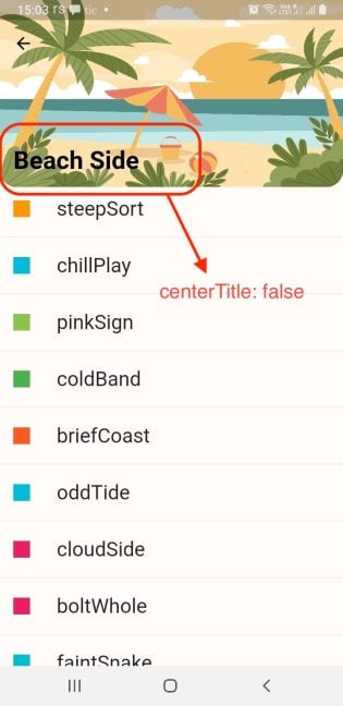
Secondly, if we want to change the position of the title, we have to set the centerTitle property to either true or false.
But, setting the property to false will not move the title completely toward the start of the FlexibleSpaceBar because there is default title padding that needs to be adjusted according to the UI design.
By default, the title padding if the centerTitle is set to false is set to EdgeInsetsDirectional.only(start: 72.0, bottom: 16.0). Otherwise, if the centerTitle is set to true, the padding is set to EdgeInsetsDirectional.only(start: 0, bottom: 16.0).
I have set the centerTitle to false and changed the padding values. Now the output will look like this:
// title is not centered with custom padding.
FlexibleSpaceBar(
   titlePadding: const EdgeInsetsDirectional.only(
       start: 16.0, bottom: 16.0),
   centerTitle: false,
   title: const Text(
     'Beach Side',
     textScaleFactor: 1.0,
     style: TextStyle(
         color: Colors.black, fontWeight: FontWeight.bold),
   ),
   // ClipRRect added here for rounded corners
   background: ClipRRect(
     borderRadius: const BorderRadius.only(
       bottomLeft: Radius.circular(20.0),
       bottomRight: Radius.circular(20.0),
     ),
     child: Image.asset(
       'assets/images/newBeach.jpg',
       fit: BoxFit.fill,
     ),   ), ),
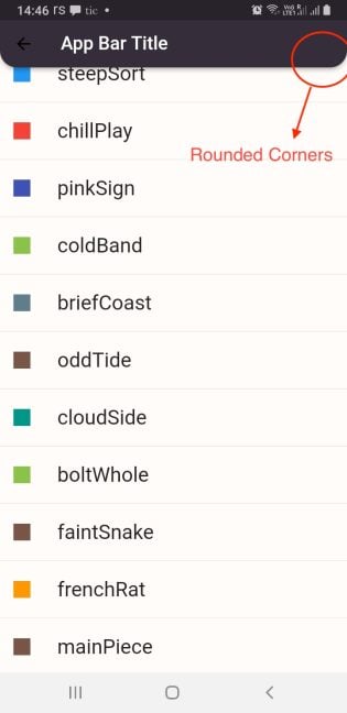
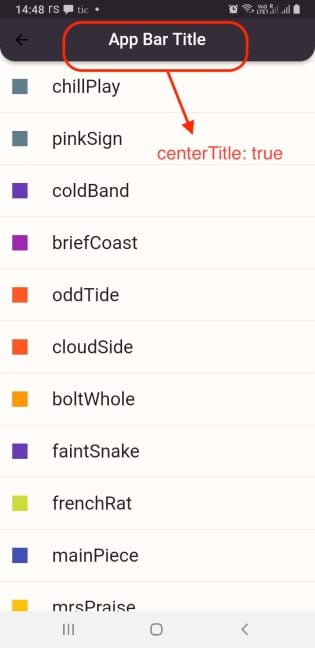
If you want similar styling for the SliverAppBar, it already has a property called shape, where we can use the RoundedRectangleBorder widget. We also change the position of the title by setting the centerTitle property to true. Please have a look at the image and code below:
SliverAppBar(
 centerTitle: true,
 iconTheme: const IconThemeData(color: Colors.black),
 title: _showAppBarTitle ? const Text('App Bar Title') : null,
// shape property takes in RoundedRectangleBorder widget
 shape: const RoundedRectangleBorder(
   borderRadius: BorderRadius.only(
     bottomLeft: Radius.circular(20.0),
     bottomRight: Radius.circular(20.0), ), ),
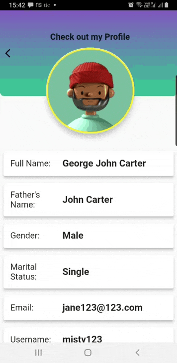
This next bit of code is inspired by Diego Velasquez. He has used SliverPersistentHeader to create a similar effect as SliverAppBar and FlexibleSpaceBar.
I have created a profile page with the user’s information and a circular avatar at the center. When we scroll up, the Circular Avatar disappears, and a normal AppBar appears. The background is a Container with a gradient color. When the AppBar collapses, the gradient also collapses with it, and the AppBar also has the same gradient effect.
The code block is pretty long, so I am leaving a link here to the example instead of posting the whole code. Please look at the image below for reference.
If you’ve made it this far, you should have all the requisite knowledge to add the SliverAppBar in your Flutter app.
The full code used for this example is available on GitHub.
Install LogRocket via npm or script tag. LogRocket.init() must be called client-side, not
server-side
$ npm i --save logrocket

// Code:

import LogRocket from 'logrocket';
LogRocket.init('app/id');
// Add to your HTML:

<script src="https://cdn.lr-ingest.com/LogRocket.min.js"></script>
<script>window.LogRocket && window.LogRocket.init('app/id');</script>
Would you be interested in joining LogRocket's developer community?
Join LogRocket’s Content Advisory Board. You’ll help inform the type of content we create and get access to exclusive meetups, social accreditation, and swag.
Sign up now
Get to know RxJS features, benefits, and more to help you understand what it is, how it works, and why you should use it.

Explore how to effectively break down a monolithic application into microservices using feature flags and Flagsmith.

Native dialog and popover elements have their own well-defined roles in modern-day frontend web development. Dialog elements are known to […]
LlamaIndex provides tools for ingesting, processing, and implementing complex query workflows that combine data access with LLM prompting.

 Learn more →

2 Replies to "How to add SliverAppBar to your Flutter app"
Thank you! Very helpful!
I am so thankful to you for providing such a good explanation with a detailed description and images. It gives a clear understanding of the points and saves time.