Web brutalism is a term used to describe a design trend characterized by “rawness.”

The term started to gain traction around 2016 and is credited to Pascal Deville. At that time, Deville felt a new kind of aesthetic trend could be seen in website design. To substantiate his theory, he set up “brutalistwebsites.com” (where Deville curated a catalog of websites that he believed shared elements of a new design philosophy).
Rawness is a vague term — what does it mean in design?
In this blog, I discuss web brutalism — where it comes from, what it means, what challenges it faces, and what opportunities it offers UX designers. Read on!
To understand web brutalism, it is important to appreciate the history of the word brutalism and the context in which Deville adapted it.
Deville repurposed the term “brutalism” (borrowed from a modernist architectural style that significantly featured exposed concrete) for a web development context. In architecture, the term was derived from “béton brut” — French for raw or rough concrete. He believed there was an aesthetic commonality between the design philosophy of building architecture and website architecture.
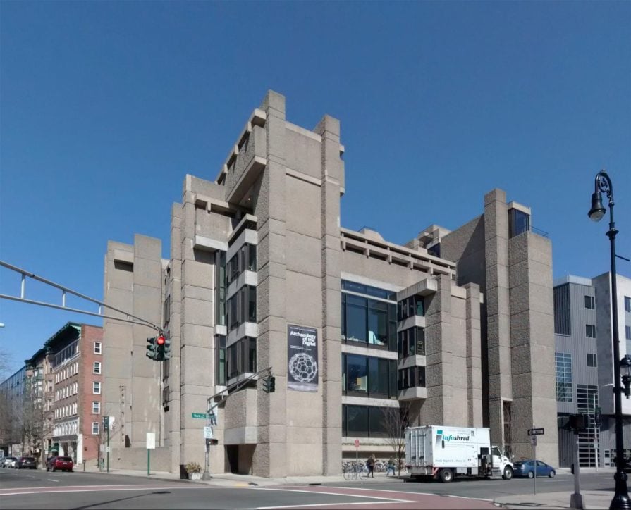
In 1955, critic Rayner Barnam published an essay titled ‘On the New Brutalism.’ This essay is credited with popularizing and codifying the core philosophy of the brutalist architectural style. He wrote, “In the last resort what characterizes the New Brutalism in architecture as in painting is precisely its brutality, its je-m’ en-foutisme, its bloody-mindedness.”
Roughly translated, ‘Je-m’ en-foutisme’ is an attitude that says — I don’t give a damn.
Pascal Deville’s opinion is that an analogy could be drawn between web brutalism and its analogous, older architectural cousin. According to Deville, web brutalism was marked by a “ruggedness and lack of concern to look comfortable or easy.” The designer believed this was a younger generation’s reaction to the enforced lightness, optimism, and frivolity of contemporary mainstream web design.
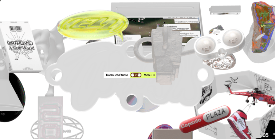
So, like brutalist buildings, brutalist websites are unconcerned about conventional design beauty. This has caused much division and debate. While some praise their novel character, others decry their ugliness, and, well, brutality.
According to Frederick O’Brien, web brutalism is a broad term that actually encompasses two distinct types of website design styles:
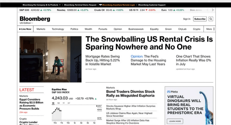
The functional type of web brutalism leans into its architectural cousin’s core feature — the exposure of “raw materials.” In web development terms, this translates to displaying the website as a basic HTML structure (like the exposed concrete in brutalist buildings). The emphasis is on bare functionality and core purpose.
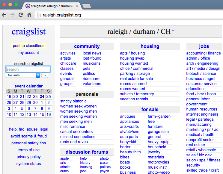
Moreover, this style is also a kind of nostalgia that celebrates the simpler days of the early web. The backgrounds are white or black, the text is a selection of system fonts, and the hyperlinks are blue. These designs have a boxy, raw HTML-like appearance with little decoration and no drop-down menus. The typography is rudimentary, and the animations are simple (with some embellished with the goofy rainbow effects and animations of the early web).
This can be seen as a response by some creators that web development has become far too complex and time-consuming.
Bloomberg.com is an often-cited example of clean and functional brutalist design:
Another great example is the design agency 56 Digital:
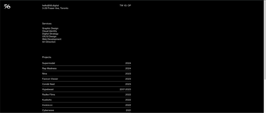
The second type of web brutalism leans towards deliberately ignoring design conventions and guiding design principles to create something jarringly different. There is a deliberate lack of symmetry or visual grid.
Layouts can appear unstructured or haphazard, lacking information hierarchy and unclear user journey. The color palettes are irregular. The typography is oversized, large, and imposing, with typefaces that clash. Elements are intentionally made to appear unrefined so as to look raw and unpolished.
The Twomuch Studio website I referred to above is a good example of this over-the-top design.
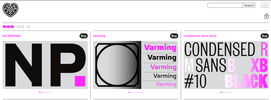
Type design agency A2-Type has a deliberately jarring website with asymmetric text and the tactical use of a single shade of garish pink/purple to pop against the black-and-white:
What’s common between the two sorts?
Both styles of web brutalism — functional and the jarring variety — have a commonality. They reject mainstream design trends and signal rebellion against sleek, corporate web aesthetics.
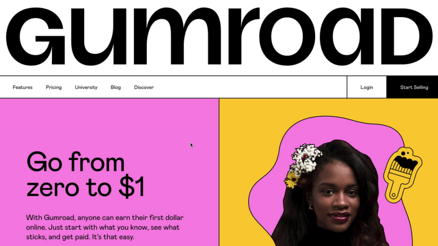
In some styles, like “neu Brutalism,” elements of both types of web brutalism can be seen.
A good example of this cartoony and friendly version of brutalism is the Gumroad website:
By prioritizing aesthetics ahead of usability, web brutalism has been accused of inverting the concept of design on its head.
Generally, the focus of UX design is the user. The ultimate goal of experience design is usability and balancing the user’s needs with the goals of a business. An example of the user-centric nature of UX design is the importance of user research and collecting data about user journeys. This information is crucial to understanding the needs, goals, or decision pain points in a user journey.
Web brutalism is the opposite approach, where a coder can deliberately disregard a user’s convenience. From this perspective, the division between front-end and back-end development is unnecessary, and the discipline of UX design creates more problems than it solves.
It could be argued that this is an overly negative way of looking at the development environment. What is perceived as complexity is an evolving response to the limitations of technology and options available to previous generations of developers.
Yet, there is a criticism about the discipline of UX design that should be paid attention to.
Consistency has emerged as an important UX design principle for enabling smooth design journeys. This is achieved by using familiar design patterns and interactions, internal consistency throughout the product, utilizing other design principles such as visual hierarchy and color, and avoiding unnecessary complexity. This consistency can be very helpful and time-saving for users when there is a certain uniformity, such as where the shopping cart icon is.
However, consistency across a genre of industry can result in established conventions. To some, this means boring and staid design, which actually detracts from user engagement. Web brutalism can be thought of as a response to ossified and vestigial design that may have outlived its utility through rote and repetition.
While there can be different choices in terms of specific details (such as typeface choices or organization of information), broadly, all websites of newspapers, such as the Washington Post, New York Times, or Financial Times, look and feel the same way. It can be argued that this results in easy user journeys across the platform.
A good example of breaking industry conventions is The Drudge Report‘s brutalist website. Here, the aesthetics of the website matter much more than established conventions. In fact, the point of the design is to emphasize that this is not an ordinary news website:

Prioritizing aesthetics over usability can be an issue when it comes to accessibility and designing for all users, especially those with disabilities.
According to a critic of web brutalism, Professor Bruno Ribiero, “Twenty-plus years into its development, the web is still fairly inaccessible to people who have physical disabilities, or who must access the internet through slow connections and underpowered devices, or who have limited access to internet connectivity or electricity.”
Incorporating accessibility guidelines (such as the WCAG) may be a good practice, especially when attempting unconventional design. Other ways could be explored to enhance accessibility. For instance, the British Dyslexia Association recommends the use of Comic Sans, which is frowned upon by typographic purists, as helpful for dyslexic readers.
Web brutalism presents an exciting opportunity and method to question formal conventions of design theory.
Given how design grows and advances, it is possible that some rules have inadvertently become dogma and outlived their utility.
Furthermore, a brutalist approach can help innovate solutions tailored to contemporary user requirements by challenging norms and experimenting with unconventional design layouts and interactions. This approach can be particularly helpful for UX designers interested in visual differentiation, memorable/simplified user experience, and other allied technical benefits.
As web brutalism is premised on breaking away from conventional design trends, it naturally lends itself towards a brand aesthetic that stands out from competitors. This can help leave a lasting impression on visitors. The simplicity and rawness of brutalism can convey a sense of authenticity and honesty about a brand.
Furthermore, the style can resonate strongly with certain demographics, particularly those who appreciate non-conformity and raw aesthetics.
For artistic or design-focused brands, brutalism can be a powerful demonstration of innovative thinking.
Thus, the raw, unpolished aesthetic of web brutalism lends itself particularly well to youth-oriented digital brands, art, fashion, or any other brand that wants to signal its position as “alt” in the marketplace.
By stripping away unnecessary visual elements, brutalism can direct users’ attention to the most essential information (this applies more to the bare, functional type of web brutalist website rather than the over-the-top ones). Additionally, minimal graphics and simplified design often result in quicker page loads, benefiting user experience and SEO.
Bold typography and high-contrast color schemes can improve readability for users with visual impairments or other forms of neurodiversity. The advantage of a radically different user experience, even a difficult one, can be memorability.
Designers can prioritize resource efficiency by stepping back from implementing the entire package of conventional UX principles.
Brutalist designs often require less development time and fewer resources, potentially reducing costs. With fewer complex elements, brutalist websites can be easier to update and maintain over time. Additionally, a minimalist approach can result in a faster-loading website, positively impacting search engine rankings and user engagement.
Finally, a pared-back design approach can help simplify the enormous complexity surrounding how a website is displayed across platforms and screen sizes.
By leveraging these opportunities, designers and brands can use web brutalism to create impactful, efficient, and memorable online experiences that challenge conventional web design norms.
Rayner Barnam’s classic essay on Brutalism opens with a quote from brutalist master architect and painter Le Corbusier — “Architecture is the establishing of moving relationships with raw materials.”
Websites, like physical spaces, can be understood as a form of moving relationships where the raw material is HTML, font choices, or more subtle elements like information hierarchy. Therefore, by exposing the elements that go into constructing a website’s architecture, web brutalism is a good analogy to brutalism as an architectural movement.
Web brutalism, like architectural brutalism, is also characterized by a rebellious disregard for the rules of conventional aesthetics.
Some developers argue that web design has become too complex and have nostalgia for the simpler early days of the internet. To them, the division between front-end and back-end development is unnecessary, and UX design is too complicated.
Accepting this criticism of UX design and incorporating elements of web brutalism techniques provides interesting opportunities for designers. For instance, the functional variety of web brutalism offers a visually different and neater user experience with technical benefits. Web brutalism is also a great method to create a unique “alt” brand image that is well-suited to youth-oriented, new technology, fashion, or art-related businesses.
Web brutalist websites can be divided into two broad varieties — a minimalist, functional type and an over-the-top jarring variety. Both reject mainstream design trends and signal rebellion against sleek, corporate web aesthetics. This is a spectrum, and some types of web brutalist websites borrow from both sides of the trend.
Unconventional design doesn’t need to be automatically less accessible. A desire to break the mold can lead to more open and accessible information. By leveraging these opportunities, designers and brands use web brutalism to create impactful, efficient, and memorable online experiences that challenge conventional web design norms.
Whether one agrees or disagrees with web brutalism, engaging with this unconventional approach provides an opportunity to discover unexpected benefits by questioning orthodox ideas and experimenting with breaking the rules.
LogRocket's Galileo AI watches sessions and understands user feedback for you, automating the most time-intensive parts of your job and giving you more time to focus on great design.
See how design choices, interactions, and issues affect your users — get a demo of LogRocket today.
A three-week mobile banking project taught me that the “proper” UX process is not always realistic. Sometimes, the better approach is to work with what you know, identify what you still need to learn, and make the strongest decision possible under real constraints.
A/B testing compares two versions of a design to see which performs better with real users. Here’s how UX teams can use it to test hypotheses, measure outcomes, and make smarter product decisions.
This case study shows how one ad experience redesign increased total ad exposure while lowering perceived friction, proving that timing and context can matter more than raw interruption.

As products evolve into ecosystems, navigation becomes a system-level challenge. This article explores how to align structure, context, and user journeys to create seamless movement across tools without confusion.