It’s hard to pinpoint a more essential metric in subscription products than subscription churn (or, alternatively, its counterpart, subscription retention).
The lower the churn, the longer subscribers stay with you. The longer subscribers stay with you, the more they contribute to your monetization and growth loops, and the more successful your product becomes.
SaaS products that nail the churn problem become unicorns, and others struggle and often go off the market.
Let’s touch upon how you, as a UX designer, can help solve the churn problem. Based on an actual story.
Let me start with establishing some context.
A few years back, I worked on a B2C edtech subscription product that helped African students prepare for their university entrance exams.
Over the months, we managed to greatly improve our acquisition channels and conversion funnel from unlog to log to trial to subscriber. However, we still had a problem achieving the desired growth.
The problem? Subscribers didn’t stick with us long enough. The average retention rate of ~2.2 months was far from ideal.
The churn problem was our most impactful lever to pull, so we decided to dig deeper into understanding what are the reasons behind our product’s low stickiness.
As with any problem-solving activity, the first step is to get a better understanding of the problem and collect as many insights as possible.
Customers who are already churned are the best source of insights. It’s also one of the hardest to get.
Ideally, you’d invite users for a post-churn interview; however, that works mostly for B2B companies, and it was hard to execute in our case. People rarely want to talk with developers after they delete an app from their phone.
What worked for us, though, was a quick post-churn survey that popped up after user canceled their plan. Initially, it had only one question: “Can you tell us in a few words why you canceled and what would need to happen for you to subscribe again?”
Don’t neglect to talk to your current subscribers; they’re a goldmine of insights about your subscription value proposition, its problems, and potential reasons to churn.
Hopefully, you already have some sort of continuous interviewing mechanic in place, and if not, it’s high time to start. All you need to do next is to adjust your interview script to include some churn-related questions, such as:
Treat this list just as a starting point. The exact list of questions heavily depends on your product’s context.
In our case, we decided to invite a sample of six subscribers, including:
for a subscription churn-focused interview to get some insights.
If you have proper product analytics in place (such as LogRocket), you can look through churn-related dashboards and dig for potential insights.
Although for advanced analytical topics, such as building churn prediction models and pattern recognition, you might need the help of a data analyst or a product manager, there are some things you can easily check yourself as a UX designer. For example:
If you have an in-product cancellation flow, take a look at which steps of the journey are the most effective at discouraging users from cancellations and which ones need improvement. You can also review how much time users spend on each step and what they interact with to further understand points of improvement.
In our case, we didn’t even have a proper cancellation flow (just a confirmation modal), so sadly, there was nothing to analyze.
Another interesting data insight is where users begin the cancellation journey:
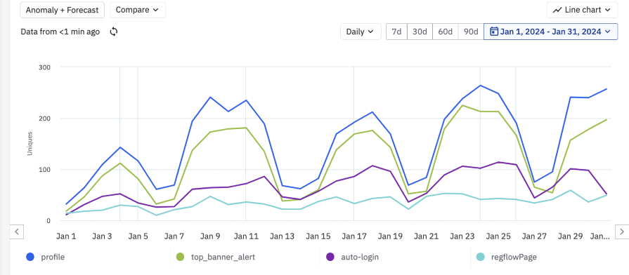
One of the things we learned when analyzing our cancelation sources is that our top banner was the second main source of cancellations. The banner appeared a week before the planned renewal, and its goal was to remind users of the pending charge.
This insight made us think whether we should even keep the banner. Although it was a very user friendly mechanic, it cost us a lot of revenue.
After interviews, post-churn surveys, and some data analysis, we found three primary insights as to why people cancel their subscriptions:
That was a good input for further prioritization and decision-making.
Although we could proceed further with developing a robust UX problem statement with a defined persona, list of assumptions, and intended outcomes, we believed we already had enough clarity about the problem. Plus, we were a small startup in execution mode and decided we’d rather start putting things in front of users ASAP.
With a list of problems to address, it was time to work on solutions.
Although I wish I could tell you a fantastic story about how we used ideation and prioritization frameworks to list out solutions and how we pre-validated them with MVPs, the truth is, we spent an hour having a whiteboarding exercise and just switched to execution.
Well, that’s the nature of working in an early-stage, pre-PMF startup. Sometimes, it’s cheaper and more effective to just ship and see what happens.
Without further ado, here’s what ended up working for us.
Problem: Users are not fully aware of our non-exam-related use cases
One of the first things we did was reviewing our existing onboarding flow. The truth is that what happens on day one of the user experience (even before they become subscribers) tremendously impacts how users interact with the product over the long run.
The whole onboarding flow focused on the exam preparation, and we neglected to update it whenever we developed new core functionalities. Moreover, our users often knew about the exam prep part even before downloading our app — we had quite a solid word of mouth for that one.
We adjusted our onboarding journey to focus more on the non-seasonal use cases. As simple move as updating the copy and visuals on welcome screens boosted our non-exam features discovery and engagement by roughly 30 percent, which helped us strengthen our other non-seasonal use cases.
Although it’s hard to directly measure the impact of onboarding on the churn — those two events are often separated by months — catering for higher engagement, thus better user experience always helps with retention.
Problem: A significant part of our cancellations came from alerts reminding users about pending renewal
We knew we were losing too much money with our renewal reminders to afford to keep them. But we also wanted to be fair with our users.
After some thoughtful consideration (and many arguments), we decided to adopt the following strategy:
This way, we catered to both business (by reducing cancellation rate) and our users (by solving unintended renewal problems). The mere act of removing the banner reduced our churn rate by 15 percent. That’s a big win for an hour of work.
Problem: There’s no incentive to stay subscribed over holiday and non-exam periods
The trickiest problem to address was the long-term stay incentive. The nature of our market segment was heavy seasonality closely tied to the school year, and it was a smart move to simply cancel the subscription during off-peak school periods.
Inspired by Duolingo, we thought about implementing some sort of streak system available only for our premium users:
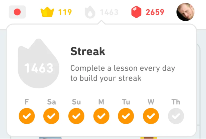
However, in this case, seasonality was also a problem. We couldn’t find a habit action that would be valuable for users all year round, so we parked this topic.
Then, a random idea popped up. What if we discount the subscription price for every month a user stays with us? Every month, we’d discount the price by 1 percent, with the discount loss upon cancellation:
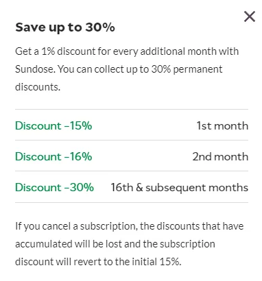
We did some math to figure out what type of discount we could afford, and we actually decided that we could let the discount accumulate indefinitely up to 100 percent. If someone would stay with us for eight years, they would give us enough revenue to justify offering them a service for free.
The cancellation screen that informed about the potential discount loss helped us reduce the churn by 18 percent. However, the number is probably deflated, as some people wouldn’t even enter the cancellation flow knowing about the potential discount loss.
Problem: There’s no incentive to stay subscribed over holiday and non-exam periods.
The accumulating discount mechanic wasn’t enough to stop people from canceling during the summer holiday break. With more than two months of holidays and the majority of our users not wanting to study during this period, keeping the subscription still didn’t make sense.
So, we decided to encourage users to pause instead. We allowed up to three months per year of pause while maintaining the accumulated discount, and it worked. We managed to encourage roughly 30 percent of canceling users in the pre-holiday season to pause instead:
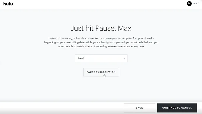
Although it might seem like a cosmetic improvement at first — after all, you’re still not getting revenue — it’s actually quite a big difference.
When users pause, you keep their CC details and agree with them to start renewing payments from a particular date. It dramatically reduces the friction of coming back. If they canceled instead, they’d have to consciously decide to repurchase the subscription and go through the checkout process.
Problem: There’s no incentive to stay subscribed over holiday and non-exam periods and users are not fully aware of our non-exam-related use cases.
Even if a user has already decided to leave you, you can still win them back. That’s where cancellation flow comes into play. Not only does it give you the last chance to prevent churn, but it’s often where your other tactics come together.
Our old cancellation flow was just a confirmation modal, whereas the new one consists of the following steps, with rough conversion rates in brackets (the less, the better):
Overall, the whole funnel had roughly a 67 percent conversion rate from start to cancellation/pause, which means we prevented 33 percent of subscribers from churning thanks to our cancellation flow:
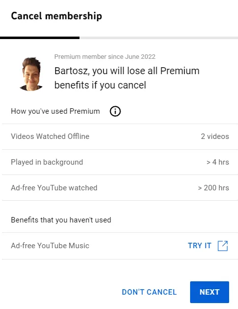
Cancellation flow is one of the most important funnels you have, so revisit it often and keep optimizing it over time.
The subscription churn rate is what makes or breaks SaaS businesses.
Although ambiguous at first, it’s a problem that can be solved with a modern design thinking approach as any other challenge.
Start by gathering insights and understanding where exactly the problem is coming from. Ideally, reach out to customers who have already churned, but talking to current ones and looking through qualitative data can also bring you valuable insights.
Use these insights to name your key churn drivers. In our case, it was:
All that’s left next is to work on solving these churn drivers just like any other user problem. I shared a few strategies that worked for our users, but that doesn’t necessarily mean they’ll work for you. You need to do your research (or, as we did, launch and see what happens) to see what works and what doesn’t.
Lastly, keep in mind that no churn prevention tactic can compensate for the inadequate value proposition. The process I described in this article is, in reality, churn optimization. It can help you reduce churn here and there, but if you are looking for truly 10x improvements, the only way is to become better at solving problems your users have.
No matter how great your cancellation flow is, if your product doesn’t add any value, users will churn.
Header image source: IconScout
LogRocket's Galileo AI watches sessions and understands user feedback for you, automating the most time-intensive parts of your job and giving you more time to focus on great design.
See how design choices, interactions, and issues affect your users — get a demo of LogRocket today.
A three-week mobile banking project taught me that the “proper” UX process is not always realistic. Sometimes, the better approach is to work with what you know, identify what you still need to learn, and make the strongest decision possible under real constraints.
A/B testing compares two versions of a design to see which performs better with real users. Here’s how UX teams can use it to test hypotheses, measure outcomes, and make smarter product decisions.
This case study shows how one ad experience redesign increased total ad exposure while lowering perceived friction, proving that timing and context can matter more than raw interruption.

As products evolve into ecosystems, navigation becomes a system-level challenge. This article explores how to align structure, context, and user journeys to create seamless movement across tools without confusion.