For my last birthday, I took a city trip to Berlin with a group of friends. As we walked through the train station, we got lost trying to find the right exit. Two station agents pointed us in the right direction, and everything seemed straightforward — until we reached an escalator going the wrong way.
I remembered a TikTok video showing that escalators can change direction on demand in Germany. Confidently, I approached, ready to switch it… and then, nothing. No button, no instructions. I waved my hand near a glowing red light, tapped the column, but the escalator remained stubbornly still.
With no other choice, we took the elevator instead. Just as the doors closed, I saw the same agents we asked for directions before, effortlessly activating the escalator’s hidden feature.

I wasn’t missing the feature — I just couldn’t figure out how to use it. I didn’t know if I was making a mistake if I lacked permission, or if the system was simply unresponsive. This confusion — this disconnect between my intent, the available actions, and the system’s feedback — is a perfect example of the Gulf of Execution and the Gulf of Evaluation.
These gaps between user expectations and system behavior are everywhere, from everyday interactions to digital interfaces. In this article, we’ll explore how they shape user experience, why they create frustration, and, most importantly, how designers can bridge them to create more intuitive interactions.
When humans interact with a machine, system, or service, they mentally construct a representation of how it functions. This cognitive simplification of how something works is a way for us to interact with our environment in the most efficient way possible. For example, understanding every component of a car’s engine isn’t necessary to drive — it’s enough to know which controls influence its behavior.
And that’s the purpose of designing interfaces. Designers create interfaces to connect the user’s intent with the system’s backend through a set of buttons, menus, and visual cues.
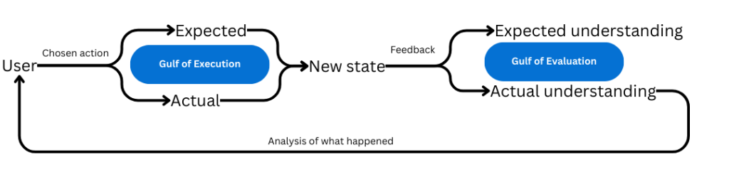
But this lack of understanding of the black box (the internal workings) of a machine (the system) will inadvertently lead to misunderstandings and errors. People will want to achieve a certain goal, act based on what they understand of the machine they are interacting with, and fail because their mental representation isn’t perfectly matched with reality. This is what we call the Gulf of Execution — a gap between what users do and the expected results.
This gap can occur for several reasons but is strongly related to the concept of affordance (the spontaneous, intuitive understanding of possible interaction with an object) and the concept of discoverability (how easy it is to find and learn a feature).
The Gulf of Execution can be summarized in one question — “How do I know what I can (or cannot) do?”
Consider a driver on a frosty morning. Seeing their car covered in ice, they manually scrape it off, unaware that the vehicle has an automatic defrost function that could be activated with the press of a button. Here, the Gulf of Execution arises from not knowing the feature exists. The user finds a longer, more uncomfortable solution, leading to unnecessary frustration.
But the Gulf can also stem from the misplaced expectations. A driver used to modern vehicles might expect their car to lock automatically as they walk away. If it doesn’t, frustration ensues when they realize they must return to lock the doors manually.
Once users take an action, they immediately seek an evaluation of the consequences of their actions. Did it work? Did it give the expected results or something else?
Some actions provide obvious feedback — hitting a nail with a hammer clearly shows success or failure. But in digital interfaces, feedback must be thoughtfully designed.
Generally speaking, after each change of state in a system and after each validation or failure of an action, users must get a signal. If feedback is delayed, missing, or unclear, it creates uncertainty and a disconnect between expectation and reality. This disconnect is the Gulf of Evaluation.
The Gulf of Evaluation can be summarized in one question — “How do I know what happened?”
Let’s go back to the car example. If the driver presses the defrost button, they need a clear signal indicating that the system has been activated. If there is no sound, light change, or dashboard message confirming the action, the driver may doubt whether it was successful. This absence of immediate feedback creates uncertainty, illustrating the Gulf of Evaluation.
The user will choose how to act based on their evaluation of previous actions. A bad evaluation may lead to a bad choice of actions, deepening the frustration and risk of abandoning their task.
This also highlights the importance of designing systems that effectively and visually communicate their status. Poor interpretation of system signals can lead to inappropriate or repetitive behaviors, increasing user frustration.
Clear and immediate feedback is a cornerstone of user experience. It not only reduces uncertainty but also builds trust in the system. Without this trust, users are more likely to feel a lack of control and have a bad user experience.
These two concepts were introduced by Don Norman, a pioneer in user experience. They represent two sides of the same coin — one affects the other in a continuous loop until the user either achieves their goal or gives up.
The two key questions — “How do I know what I can do?” and “How do I know what happened?” — form the foundation of intuitive interface design.
Understanding how our users think and what they understand about our design is fundamental. We, designers, are not the end users, and what seems clear to us may not be clear to others. Think of how, in older video games, developers, having spent countless hours testing, assumed mechanics were obvious. Players, however, struggled due to missing hints and unclear objectives.
If the gulfs are too wide, they negatively impact user experience. The challenge lies in identifying these gaps and designing to minimize them.
If there is too much gap between what people think they can do, what they think they did, and the reality, bad emotions will flow. Imagine how frustrating it would be for users to experience the Gulf of Execution in a flow like this:
A large Gulf of Evaluation, on the other hand, will be a source of uncertainty. Users unsure of an action’s outcome may hesitate, repeat actions unnecessarily, or misinterpret system responses. Over time, they lose confidence in the product, leading to decreased engagement or abandonment.
Both gulfs can result in a poor user experience — the product would just be too difficult to use. And, of course, the gulf can be assessed in relationship to a whole product or just one feature. If something happens to have both a large Gulf of Execution and a Gulf of Evaluation, it is virtually unbearable to the users.
The Gulf of Execution emphasizes the need for clear, intuitive actions so users can achieve their goals without confusion. And the Gulf of Evaluation highlights the importance of providing immediate and clear feedback, ensuring users understand the outcome of their actions.
Together, these gulfs shape the interaction loop between users and systems — when poorly designed, they lead to frustration and task abandonment.
By refining affordances, reducing complexity, and prioritizing user feedback, designers can bridge these gaps and create seamless, trust-building experiences.
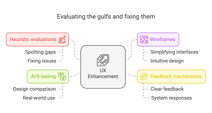
The best way to spot and fix these gaps is through heuristic evaluations and smart testing. For execution, wireframes help simplify interfaces and make sure everything feels intuitive. It’s important to check if key actions are obvious and offer multiple ways to complete tasks so users don’t feel stuck. Card sorting can also help confirm whether users’ mental models align with what designers intended.
For evaluation, feedback needs to be clear — especially for actions that might make users second-guess themselves.
Take LinkedIn, for example. When you apply for a job, a big pop-up confirms your application, leaving no doubt that it went through. But when you save a job, the notification lingers on the screen instead of disappearing on its own, making it feel more significant than necessary.
Small details like this can affect how users interpret system responses. A/B testing is another great way to refine feedback and interaction flows, letting teams compare different design choices and see what works best in real-world use.
The Gulf of Execution and the Gulf of Evaluation highlight the gaps between what users want to do, how they attempt to do it, and how well they understand the system’s response. When these gaps are too wide, users get lost, frustrated, and might even give up altogether.
One thing my teacher always said applies here — machines should adapt to people, not the other way around. If users struggle to understand a design or its feedback, that’s not their fault — it just means the design needs to do a better job of guiding them.
Closing these gaps starts with intuitive design that aligns with how people naturally think. Clear signposts, easy-to-find actions, and multiple ways to get things done help users navigate the Gulf of Execution. Meanwhile, instant and well-structured feedback ensures they aren’t left wondering if their actions worked. Techniques like heuristic evaluations, usability testing, and A/B testing help fine-tune interfaces to keep interactions smooth and frustration-free.
But this idea isn’t just about UX — it’s crucial in accessibility, persuasive design, and even AI-driven interactions. As technology evolves with voice interfaces, AR, and AI-powered personalization, the real challenge isn’t just fixing these gaps — it’s staying ahead of them.

LogRocket's Galileo AI watches sessions and understands user feedback for you, automating the most time-intensive parts of your job and giving you more time to focus on great design.
See how design choices, interactions, and issues affect your users — get a demo of LogRocket today.

Explore the core principles of GUI design and learn how consistency, simplicity, feedback, accessibility, and user testing contribute to better digital experiences.

After five years in UX, I revisited the Daily UI challenge to reconnect with hands-on design. Along the way, I learned that great interfaces come from thoughtful briefs, sound judgment, and user feedback, not just better AI tools.

Learn what makes a great login screen through real-world examples and UX best practices for creating secure, accessible, and low-friction authentication flows.

Skeuomorphism helped define early digital interfaces by mimicking real-world objects to make technology more intuitive. Learn how it compares with flat design and neumorphism, why it declined, and where it still has a place in modern UX.


