UX writing might be one of the most important aspects of user experience design. Dare I say it, UX copywriting might be the most important.
Why?
Because without persuasive copywriting, including UX labels, our design simply just doesn’t work.
In product design, a label is a descriptive piece of text we use to inform our users about the purpose of an interface element on the webpage and web app. Labels can be associated with various UI elements, like buttons, form fields, icons, or checkboxes.
For example:
We use labels in interface design to explain the purpose and functionality of an interactive website element, such as buttons, icons, forms, and menus. Labels in UX have the following goals:
Labels tell users the purpose or function of an interactive element. For example, a button labeled Download clearly shows its function, so users know they’ll download an item when they click it.
For inclusive design, adding labels to interactive elements should be mandatory. Imagine visually impaired users who rely on screen readers applying for health card renewal; labels provide the much-needed context for UI elements. They ensure even people who can’t see the interface can still interact with it and complete the task they come to the website for.
To ensure we provide users with a unified experience, consistent labeling is a must across different parts of an application and website. Consistent labeling reduces confusion, and users don’t need to relearn how to interact with different sections of the app or website.
For example, we need to decide on the label name upfront. Instead of using different versions for the same element (e.g., email, email address, email ID), pick one (I’d recommend email address for clarity) and stick to it throughout your webpages.
When we provide clear labeling in UX, users are less likely to make mistakes. For instance, if you have a form, it’s super important to label the input fields. Imagine we present the following credit card form to users:
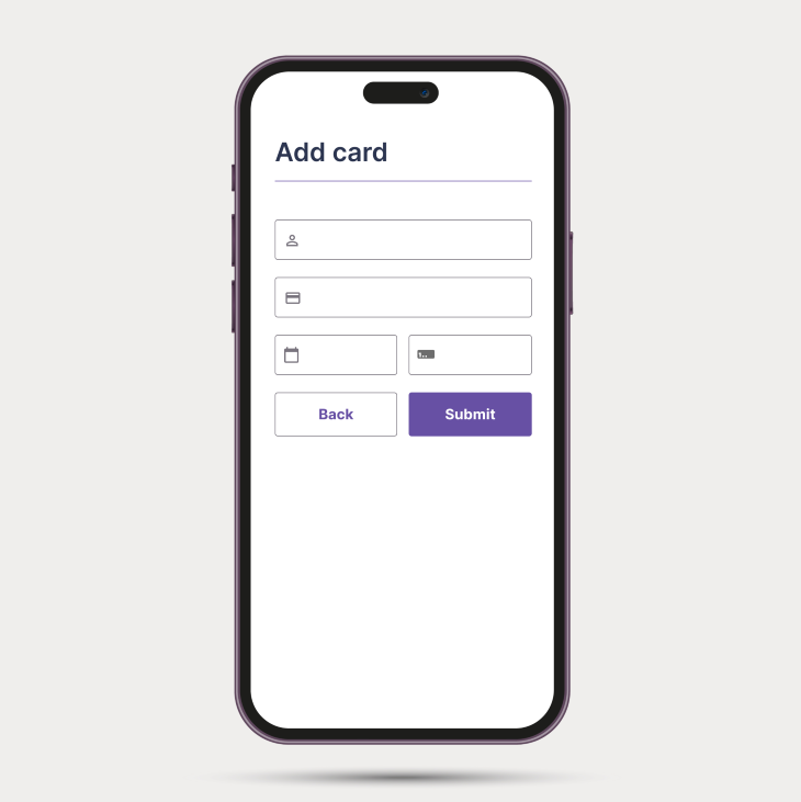
What’s the result? Confusion.
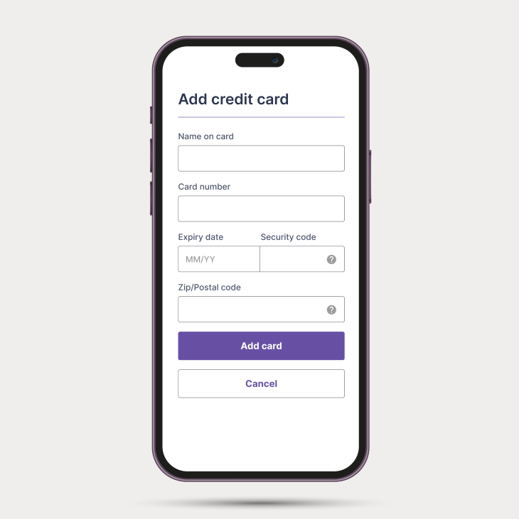
Instead of only displaying the input fields and icons, you should provide labels to help users understand what information goes where; e.g., in the following credit card details form, labels such as Name on card, Card number, Expiry date, etc., clarify what users need to input in each field:
The Single Most Important Thing You Need To Know About Required & Optional Input Fields Form UX
The Single Most Important Thing You Need To Know About Required & Optional Input Fields. How to design accessible form REQUIRED vs OPTIONAL input fields | FORM UX DESIGN for beginners A11Y? How to design accessible input fields in forms? This video shows the best practice of when to use required vs optional input fields (and labels) in a form.
When we clearly label interactive elements, users simply don’t need to spend time deciphering the interface. So if you’re measuring task completion rate in an analytics tool, you can see how a well-labeled interface speeds up the task completion time and provides a more efficient interface.
To sum it up, the significance of labels in UX and interface design at their core is to provide clarity. We live in a world where every minute, every click and tap matters, so it’s our responsibility to guide and help our users so they know what they’re about to activate and what’s expected from them when interacting with websites and apps.
I hope it’s easy to see how effective labels play a crucial role in UX design. Labels improve usability, guide user actions, and simplify navigation.
When we write labels for buttons and link items, we should use verbs that indicate what will happen when users interact with them. For example, when you want users to submit a form, use action verbs such as Submit instead of button labels like I’m done.
Labels in UX should be straightforward and short. Try to avoid using jargon and ambiguity. Jargon should be only allowed when users know the terminology, e.g., in a specialized application for lawyers, where they expect specific terms such as affidavit (which is a written statement confirmed to be true by oath or affirmation).
When we write UX labels, we need to ensure the label captures the essence of the interactive element (or content), so users can easily navigate the web pages. For example, let’s say you want to buy a T-shirt on an e-commerce website. You see a button labeled ‘Add to cart.’ It is important to us (and to users, too) to feel confident when we click the ‘Add to cart’ button; we don’t purchase the item; we just add it to the cart for review before completing the purchase.
Feedback-oriented simply means when a label changes based on user action (e.g., toggle on and off), the labels should provide clear feedback to users on the current state.
Whenever you design the following elements, always think about feedback-oriented labels too:
If you design your product for the international market, the UX labels in your product should be culturally sensitive. Don’t just use Google Translate because it doesn’t do a 100 percent accurate job. Just make sure to translate labels as appropriately and accurately as possible because users from different cultures might interpret words differently.
When we choose the text size for our application, we can’t rely on users to use the browser’s inbuilt font size feature, so we need to make sure labels are properly sized, and the default font size is relatively large (not smaller than 10pt).
Font size guideline
Treat these as what they are: guidelines. You can always adjust the size based on other factors such as font type, line height, and text length. The goal for the text is to be easily readable across all devices.
Labels should make sense to users and be placed close to the related content.
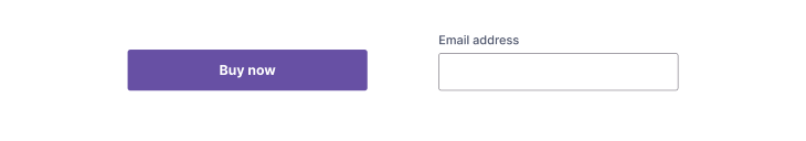
For example, imagine a user browsing for books. Next to the picture of the book, you see a button labeled Buy now. It’s contextual because it’s placed close to the image and relates to the action of buying the displayed book. If the button said something like Watch video, it’d just confuse users.
Contextual labeling is important because it ensures users can quickly understand the purpose of an interactive element. For instance, a Start button can mean different things depending on the context, e.g., starting a game or starting an application process.
Consistency is not only a role but also a characteristic of effective labels. We must use consistent labeling across websites and applications to avoid confusing users.
How can we make sure we use consistent labels?
Here are a couple of tips:
Pro tip: keep a record of the UX label. Use a style guide or design system to document decisions so that when you work with other designers and developers, they can follow the same standards and conventions.
We talked briefly about this in the section on the characteristics of labels. To craft user friendly labels, there are three main strategies to keep in mind.
The simpler the phrase, the better the interface because an overly verbose label can easily make our UI cluttered. Which one is more concise?:
I guarantee 99.9% of users would vote for the latter.
However, sometimes, it’s better to be specific and use more than a single word. If you want users to learn about the different pricing tiers, stop using vague labels such as Learn more. Instead, use more descriptive wording such as View pricing. Always think about what makes sense and what makes the interface easy to use.
UX labels, especially for buttons and links, should indicate actions. Do your best to explain to users what will happen when they click or tap a button. Short action verbs are the best, such as Save, Download, Buy, Upload, Sign in, Delete, or Cancel.
We talked about this before, so I want to emphasize its importance. Keeping industry-specific terms out of our vocabulary is a good idea.
We don’t even need to go as far as a legal application. Let’s think about a simple login flow. Even though the proper technical term would be Authenticate, it would confuse most users, so instead, Sign in and Log in are more universally understood.
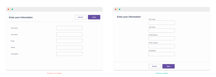
When we talk about label placements, we need to talk about one of the UX laws, proximity. What’s proximity? Objects that are near each other tend to be grouped together.
This is 100 percent true for label placement. When we look at a form with multiple input fields, the labels should be placed in close proximity to their respective input fields so that users can easily scan the form and reduce the cognitive load on them.
If a label is placed too far from its interactive element, it creates confusion and slows down users. Play with whitespace and make sure you add proper spacing between elements to provide users with the best user experience.
For form input fields, labels are usually placed directly above the input field or to the left of it (well, at least in Western cultures). Users also might have device-specific expectations. For example, they might always want easy access to the home page or might always want to see the collapsable hamburger menu. Consider cultural context, too, because people read text from right to left in some cultures and languages, so label placement should adapt to that.
The fact is, larger labels naturally draw more attention because they simply indicate their importance. Of course, smaller labels indicate less significance. Be careful when using these rules so you spotlight the most important information you want in the product.
Because we can emphasize important labels just by playing with font size, we can also employ different font weights (bold, regular, or bold-italic) to draw attention to certain labels. In a nutshell, section headings (H1, H2, H3) are larger and bolder than subheadings (H4, H5, H6) or body text.
Another way to draw attention to certain elements is by applying different colors. You shouldn’t rely solely on colors to indicate importance, but you can use them to highlight specific details.
Today, we switch between devices frequently. We might read the news on an iPad with our morning coffee, text friends on our phones during our commute, and watch shows on TV at night. Given this, labels must fit every device. Whether smartphones, tablets, or desktops, a huge variety of screen sizes and resolutions exist.
It’s 2023, so it’s essential for designs to be responsive. Users expect a smooth experience on any device they use to view content.
In UX design, we know testing and iterating on our findings are crucial to success. Conducting usability tests to gather feedback from users is essential because testing can highlight areas of inconsistency and confusion that we can easily overlook during the design phase.
If you have a complex user interface, it’s worth running a short (10 min long) usability testing targeted to test labels to see if users associate labels with their respective elements; otherwise, best practices could help.
There are many methods you can apply to test your design; here are the five most common:
Besides testing with users, I’d recommend using emulators (in your browser) or actual devices (it’s fairly common in a startup environment) to see how labels function and appear on the screen. Test each new release on different devices & screen sizes, orientations, and resolutions.
Never release a product without testing it first! Even small issues with labels can impact usability.
When you find valuable insight during testing, make sure you iterate on the design.
Accessible design is a team sport. Even though we designers provide the most accessible design, without engineers and their expertise, we won’t be able to deliver an inclusive product.
This section could be another article on its own! For now, remember to collaborate with the development team to make sure the correct HTML elements (e.g. <label>) are used so that screen readers can identify and read labels aloud.
From a visual design point of view, keep the contrast high so that labels can stand out against their background. There are 3 levels of conformance when it comes to web content accessibility. Familiarize yourself with the standard your company and product require and design accordingly. Also, some countries set standards for digital inclusivity; be aware of the legal aspect.
Here are our quick tips on what to check for with accessible and inclusive labels:
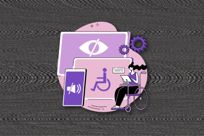
Accessibility and inclusivity go hand in hand. We need to remember that users come in all shapes and forms, aka users have a range of abilities, including visual, auditory, cognitive, and motor challenges. Make sure the design, including labels, is inclusive, and everyone can enjoy the same great user experience regardless of their ability.
An inclusive online space ensures everyone can interact with and grasp digital content regardless of ability. Labels are pivotal to guide user actions on digital platforms. To be truly inclusive, these pointers must be clear and universally understandable.
Accessible design benefits all users, not only those with different needs!
Localization and creating multilingual labels can be tricky. It’s not just about translating words but about adapting content for different cultural and linguistic nuances. For example, a thumbs-up might be a friendly gesture in one country but rude in another. Also, direct translations might sound weird or change the intended meaning. There are also technical challenges, like designing for right-to-left languages like Arabic. Colors, too, can have different meanings across cultures.
In the digital age where apps and sites are used globally, getting these labels right is super important. This means going beyond machine translations and getting real people who understand the local context to translate. Testing these translations with local users is also a smart move.
Some practical tips? Use professional translators, and make sure images and symbols fit the local culture. Remember, a phrase in English (Settings) might be way longer in German (Einstellungen). So, designs need to be flexible!
Labels in UX are more than simple texts — they’re the cornerstone of user-friendly design. They need to be correctly crafted to define functions for buttons, icons, and more elements to boost user interactions. Effective labels merge clarity, brevity, and user-focused design.
In our digital world, they must be adaptable across devices and sensitive to diverse global audiences. So, designers! Keep perfecting those labels because they’re essential to continuously improving our products.
Header image source: IconScout

LogRocket's Galileo AI watches sessions and understands user feedback for you, automating the most time-intensive parts of your job and giving you more time to focus on great design.
See how design choices, interactions, and issues affect your users — get a demo of LogRocket today.
I’ve spent enough time designing with WCAG 2.2 to know it’s not enough. Here’s why I’m skeptical and cautiously hopeful about WCAG 3.0.

I learned this lesson the hard way. Good UX doesn’t survive endless approval loops. Here’s what went wrong — and how to protect your vision.
I’ve reviewed “final” designs more times than I can count — and the copy almost always gives users a reason to hesitate.
The checkbox is one of the most common elements in UX design. Learn all about the feature, its states, and the types of selection.

 Learn more →
