Check out ten Figma accessibility plugins that make creating accessible designs easy — and learn why accessibility matters so much.

Working on user experience can be difficult, even in a team — this is doubly true when you have to work through UX challenges alone.

Let’s journey back to Adobe Spectrum’s pioneering days and delve into the enhancements that Spectrum 2 brings to the table.

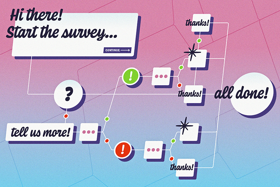
Conditional logic empowers you, the surveyor, with the ability to create dynamic surveys that respond intelligently to respondents’ answers.

Let’s talk about why user onboarding matters and some best practices to follow when designing a mobile app onboarding flow.

The best way to address design cohesiveness and consistency is to create, maintain, and share ongoing UX documentation.

What if you could wave a magic wand and effortlessly streamline your design workflow? Enter, Figma’s Magician AI tool.

Here are some real-life examples of AI-generated image descriptions and some tips and tricks for generating effective descriptions with AI.

In the realm of UX, information architecture is instrumental in shaping users’ digital interactions. Stay current with the latest trends here.

The Figma Mirror app lets you view your Figma designs on mobile or tablet so you can see what your design will look like.

Learn what survey fatigue is, what causes it, and what you can do to prevent it, netting you more survey responses and quality insights.

Explore the importance of age-inclusive design, the best principles to follow, and some tips for testing interfaces for age-inclusivity.