
The right fonts can make your website user-friendly and enjoyable, while poor readability and contrast can ruin your design.
The Zeigarnik effect explains why people tend to remember incomplete tasks first and complete work that’s already started.
The hamburger menu is a design classic that keeps things tidy and functional. In this blog, I will share how you can implement it effectively in your next project.
Oftentimes when looking at something, you can tell what looks good or bad, however struggle to verbalize why.
To think outside the box means to come up with atypical ideas, usually by ideating in an non-traditional way.
It’s time to ditch those sneaky UX traps and actually connect with your users. In this blog, I talk all about transparency, informed consent, and why trust isn’t something you can fake as a UX designer.
The first interaction sets the tone for the entire experience — get it right, and you’ve hooked your users from the start. So as a UX designer, you need to know how to put the primacy effect of UX design to good use.
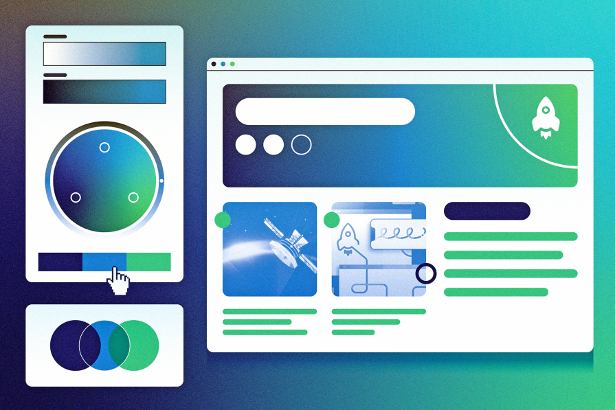
Analogous color schemes offer a powerful way to guide user emotions and behavior. This guide shows you how to make colors do the good work of improving UX.
Knowing about trie data structures can help UX designers create quicker and more intuitive search experiences and improve overall usability.
The need for human centered design will only grow as technology evolves. Embracing these principles now will set you up to not meet but exceed the expectations of your users.

By starting with content, you ensure that your core message is clear, engaging, and aligned with user needs.
Signifiers are not just fancy signs in UIs. They are crucial communication tools for UX designers that hint users about specific actions by enhancing usability factors.