Have you ever been to a party where you easily remember the first few people you met but struggled to recall those you encountered later? As socially awkward as this phenomenon is, it’s totally common and a perfect illustration of the primacy effect in action.

The primacy effect refers to our tendency to remember better and be more influenced by information presented first in a sequence. It’s a psychological phenomenon that plays a significant role in how we process and retain information.
Understanding and leveraging the primacy effect is not just a psychological quirk, but a powerful tool in the context of UX. It empowers designers to influence how users interact with and remember elements of their design, from navigation menus to content structure.
I’ve established that the primacy effect is a psychological phenomenon where individuals tend to remember and place more importance on information presented first in a sequence.
More technically, however, the primacy effect is part of the broader serial position effect, which describes how the position of information in a series affects recall.
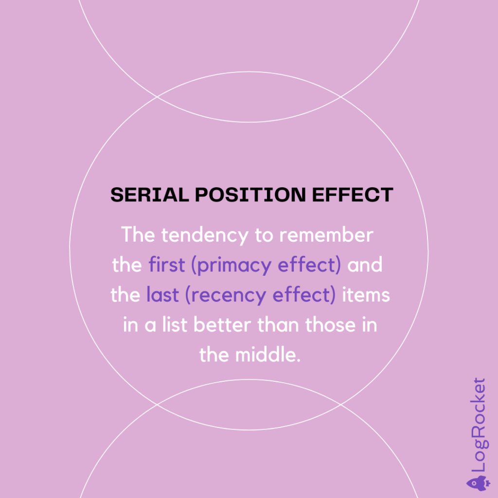
The psychological basis of the primacy effect lies in how our brains process and store information.
When we encounter new information, our minds are initially more attentive and have more cognitive resources available. This allows us to process early information more deeply, leading to stronger encoding in our memory. Additionally, we have more time to rehearse and reflect on this initial information, further strengthening its place in our memory.
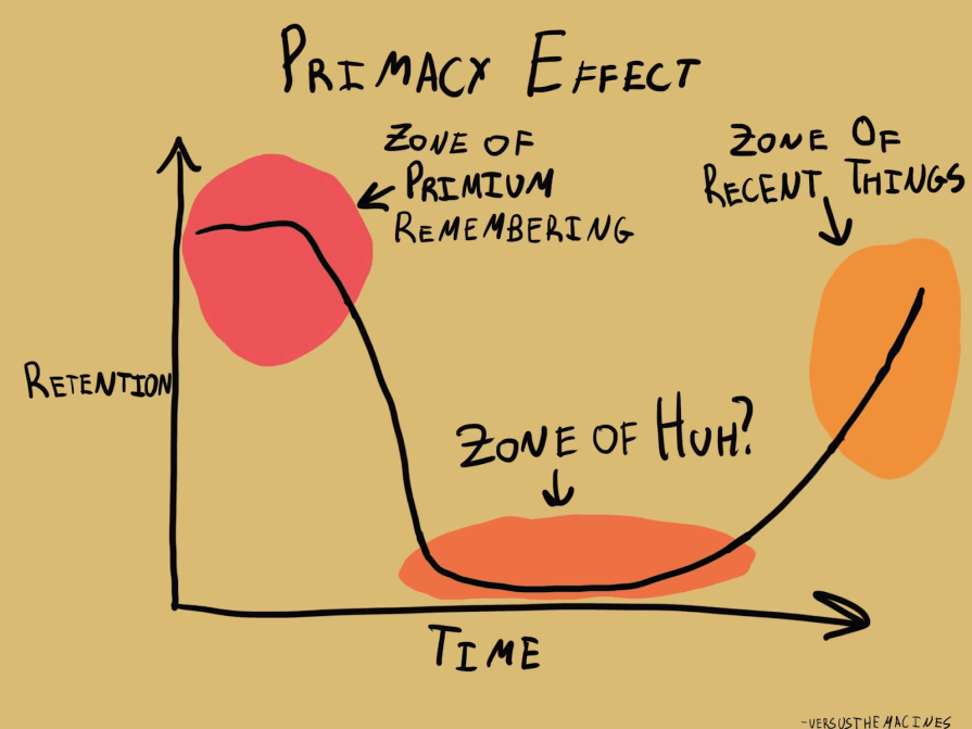
The primacy effect significantly impacts memory and attention in several ways.
Information presented first is more likely to be transferred from short-term to long-term memory, making it easier to recall later. This effect is particularly strong when the total amount of information is large, or there’s a delay between presentation and recall. The primacy effect also influences what we focus on and how we interpret subsequent information. This can lead to confirmation bias, a cognitive bias in which we interpret later information in a way that confirms our initial impressions, potentially leading to a skewed user experience.
It’s worth noting that the primacy effect isn’t absolute — it can be influenced by factors such as the total amount of information, the time given for processing, and individual differences in cognitive processing. Understanding these nuances of psychology in UX design is crucial for effectively applying the primacy effect in fields like UX design and communication, making us more informed and competent in our design decisions.
By understanding and applying the primacy effect, UX designers can guide user attention, improve information retention, and potentially influence user behavior and decision-making. These early interactions can have a lasting impact on users’ overall opinions and satisfaction.
Something to consider is how the primacy effect extends to brand perception. The first elements of a user interface that a person encounters can strongly color their view of the entire brand or product. This underscores the importance of carefully crafting the initial stages of user interaction to create a positive and lasting impression.
This makes understanding and applying the primacy effect a valuable tool for creating effective and engaging user interfaces. In the context of UX design, the primacy effect can be leveraged in several ways:
Placing important menu items or links at the beginning of a list makes them more noticeable and memorable, as users tend to scan and navigate content from top to bottom.
This prime positioning ensures that key information catches their attention first, increasing the likelihood of interaction and engagement. It also enhances user experience by reducing the effort needed to navigate to essential options.
Presenting key information or main points at the start of a page or article can significantly improve retention and comprehension. This strategy leverages the primacy effect, where users are likelier to remember the first items they encounter.
By front-loading essential details, readers can quickly grasp the core message, making the content more impactful and ensuring they understand the most important aspects from the outset.
Focusing on creating a strong first impression during user onboarding can positively influence the overall user perception of the product. A well-designed onboarding experience can make users feel welcomed, valued, and confident in navigating the product.
By clearly demonstrating the product’s benefits and ease of use from the beginning, users are more likely to have a favorable view, leading to higher satisfaction, increased engagement, and better long-term retention.
Placing simpler, less intimidating fields at the beginning of a form can encourage users to start filling it out by lowering the initial barrier to entry.
This form design strategy makes the form feel more approachable, reducing any anxiety or hesitation users might have. By easing them into the process with straightforward questions, users are likelier to continue and complete the form, resulting in higher completion rates and a more positive user experience.
Featuring top-selling or strategically important items at the beginning of a product list can increase their visibility and potential sales by immediately catching the customer’s attention. This prime placement capitalizes on the tendency of users to notice and interact with items listed first, enhancing the chances of conversion.
Highlighting popular or key products early on also guides customers’ buying decisions, steering them toward high-value or priority items that align with the business’s goals.
By strategically placing certain elements at the beginning, designers can shape user perception and decision-making, ultimately increasing conversions and driving desired actions.
Another strategy is to break long processes into smaller chunks, ensuring the most crucial or engaging steps come first. This approach is often used in multi-step forms or tutorials, helping to maintain user engagement throughout the process.
Additionally, designers can use progressive disclosure, gradually revealing information to avoid overwhelming users while leveraging the primacy effect for key elements.
The primacy effect has been successfully implemented in various real-world design scenarios, demonstrating its effectiveness in enhancing user experience and achieving desired outcomes.
One notable case study is the redesign of Airbnb’s search results page. Airbnb recognized that the first few listings users see significantly influence their perception and decision-making.
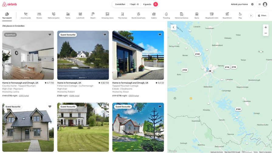
They restructured their search results to showcase a mix of highly-rated and diverse options at the top of the page. This change led to increased user engagement, with more users exploring a variety of listings rather than focusing solely on the cheapest options.
The primacy effect helped Airbnb guide users towards higher-quality experiences, improving overall customer satisfaction and retention.
Another example is LinkedIn’s profile page design. LinkedIn strategically places the most important professional information at the top of a user’s profile, including name, headline, and summary.
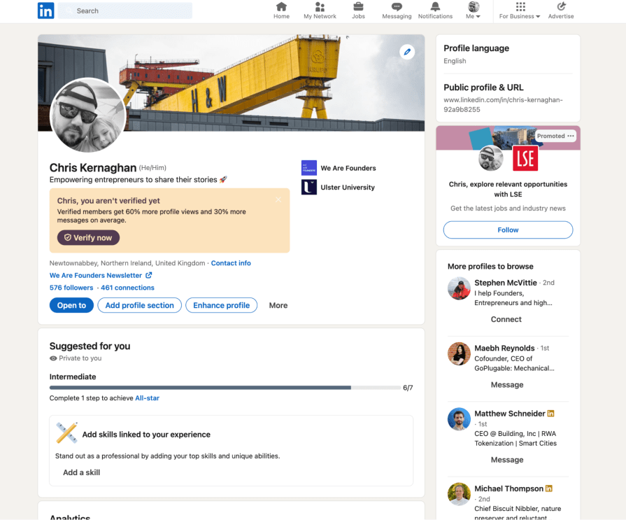
This leverages the primacy effect to ensure visitors quickly grasp the most crucial details about a person’s professional identity.
LinkedIn reported increased profile views and connection requests, as users could more easily determine the relevance and value of potential connections.
Within e-commerce, Amazon’s product pages demonstrate effective use of the primacy effect. The top of each product page features the item’s name, main image, price, and buy button. This prioritization of key information and call-to-action leverages the primacy effect to drive purchasing decisions.

Amazon’s continued dominance in e-commerce partly stems from its user-friendly design, which guides users toward making informed and quick purchase decisions.
The New York Times website redesign also showcases the primacy effect in action:

They revamped their homepage to feature their most important or breaking news stories at the top — often with larger images and headlines. This design choice not only caters to users’ tendency to focus on initial information but also helps the Times guide readers to what they deem most newsworthy.
The redesign increased engagement with top stories and longer average session durations.
Spotify’s onboarding process for new users is another effective application of the primacy effect:

Upon signing up, users are immediately prompted to select their favorite music genres and artists.
This initial interaction not only engages users quickly but also allows Spotify to provide personalized recommendations right from the start. By prioritizing personalization in onboarding, Spotify reported higher user retention rates and more engaged listeners.
The primacy effect is everywhere, and these case studies demonstrate its effectiveness in various design contexts. The outcomes generally include improved user engagement, increased conversion rates, better information retention, and enhanced overall user satisfaction.
However, it’s important to note that the success of these implementations often relies on thorough user research and ongoing testing to ensure the prioritized elements truly align with user needs and expectations.
While the primacy effect is powerful, its application should be balanced with other design principles and user needs. Overreliance on the primacy effect could lead to overlooking important secondary information or creating an unbalanced user experience.
Therefore, designers must continually evaluate and refine their use of the primacy effect to create truly effective and user-centered designs.
When implementing the primacy effect in UX design, several best practices can enhance its effectiveness while avoiding common pitfalls.
Identify the most crucial information or actions for your users and ensure these elements appear first in their journey. This might involve conducting user research or analyzing user behavior data to determine what matters most.
Remember — not everything can be first, so be selective in what you emphasize.
An effective practice is to use visual hierarchy to reinforce the primacy effect, a technique that has been integral to information presentation since the inception of newspapers. Elements that appear first should also be visually prominent through size, color, or positioning.
This combination of sequence and visual emphasis enhances the impact of important elements, reflecting a deep-seated approach to information consumption.
The primacy effect can vary in strength depending on factors like user motivation, time constraints, or the complexity of information. Tailor your approach based on your specific user scenarios.
For instance, in a high-pressure situation like booking a flight, users might benefit from seeing the most critical options upfront.
Another important tip is consistency across different parts of your interface. While leveraging the primacy effect, ensure the overall structure remains logical and intuitive. Users should be able to predict where to find information, even if key elements are prioritized.
One often overlooked best practice is periodically reassessing and updating what’s given primacy. User needs and business priorities can change over time, so what’s most important may shift.
Regular user testing and data analysis can help keep your primacy-based design decisions relevant. A/B testing and user feedback are crucial for refining your approach and ensuring that using the primacy effect truly enhances the user experience.
One frequent error I see UXers making is overloading the initial experience.
Some designers make the mistake of assuming that what’s important to the business should always come first — a UX design bias. However, this may not align with user needs or expectations. While it’s tempting to front-load with information, overwhelming users can negate the benefits of the primacy effect.
Strike a balance between prioritization and simplicity. Always validate your assumptions about what should be prioritized through user research.
The primacy effect, a psychological principle where the information presented first is better remembered and has a greater impact, is a crucial tool in UX design. Thousands of designers are likely implementing it, even if they’re not entirely sure what the effect is called.
Designers can significantly influence user engagement, memory retention, and decision-making by strategically placing key information, actions, or features at the beginning of a user’s interaction. Whether in navigation design, content structure, onboarding processes, or form layouts — leveraging the primacy effect can improve user experiences, higher conversion rates, and enhance brand perception.
Balance the primacy effect with other design considerations to ensure the user journey is seamless and coherent.
LogRocket's Galileo AI watches sessions and understands user feedback for you, automating the most time-intensive parts of your job and giving you more time to focus on great design.
See how design choices, interactions, and issues affect your users — get a demo of LogRocket today.

A three-week mobile banking project taught me that the “proper” UX process is not always realistic. Sometimes, the better approach is to work with what you know, identify what you still need to learn, and make the strongest decision possible under real constraints.

A/B testing compares two versions of a design to see which performs better with real users. Here’s how UX teams can use it to test hypotheses, measure outcomes, and make smarter product decisions.
This case study shows how one ad experience redesign increased total ad exposure while lowering perceived friction, proving that timing and context can matter more than raw interruption.

As products evolve into ecosystems, navigation becomes a system-level challenge. This article explores how to align structure, context, and user journeys to create seamless movement across tools without confusion.