The law of conservation of complexity (Tesler’s Law) reminds us that every system has a certain amount of complexity that cannot be removed — only shifted. Strip away too much, and you risk oversimplifying the user experience. This typically happens when we prioritize aesthetics over usability or misapply so-called “UX best practices” as one-size-fits-all solutions.
Take hamburger menus. How often does it ‘simplify’ (read: hide) navigation on websites that have more than enough space for visible links?
Classic overdesign.
And while many poor UX designs made for the sake of aesthetics (or habit) aren’t inherently malicious, they often stem from good intentions without careful thinking.
So — when does thoughtful UX become overdesign? And how do you know whether a UX best practice is truly best for your context?
In this article you’ll learn about the dangers of overdesign, how to be mindful of common overdesign banana skins, how to add finishing touches to user experiences without breaking the law of conservation of complexity (Tesler’s Law for short), and how UX research fits into all of this.
These aren’t the only types of overdesign, but they are fairly common — and the advice is very transferrable to other UX situations:
The hamburger menu seems like a clean, minimal solution. And it can be — especially in mobile UIs or space-constrained layouts.
But if navigation items (especially important ones) are hidden behind a hamburger menu (especially unnecessarily), this is an extra layer of friction for those who know that they’re there and a source of frustration for those who don’t. Uncommon navigation items are almost undiscoverable.
I noticed this on Airbnb recently. Even though I’m just one user, I’d say that “Trips” and “Messages” are fairly important, but they’re hidden behind a hamburger menu instead of being right there in the header, which seems nonsensical considering the amount of space that’s available there.
That being said, Airbnb does a lot of experimentation (they have the money to do so, so why not?). There’s no such thing as a bad UX experiment:
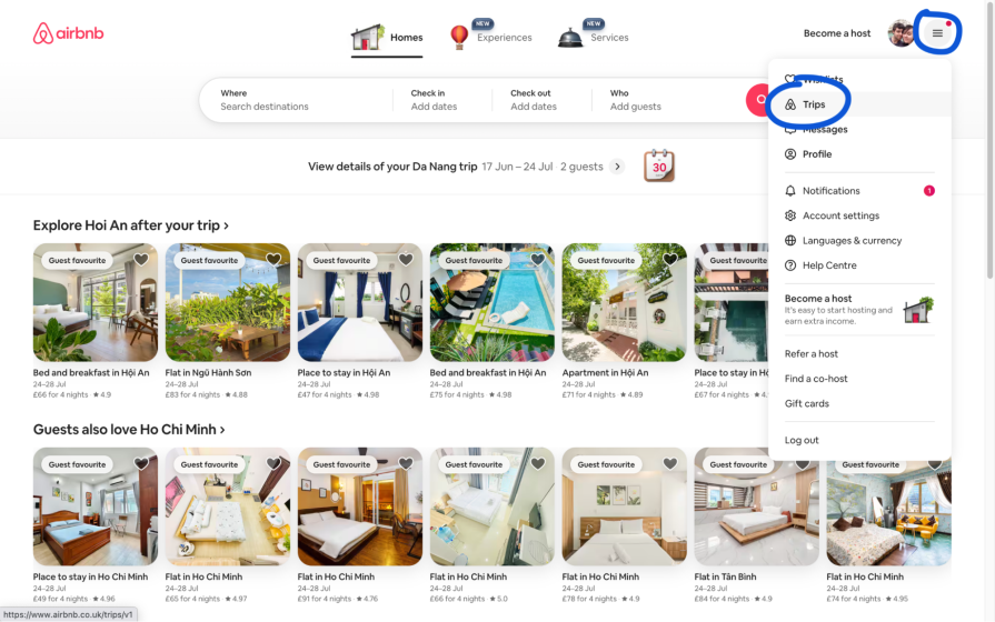
The takeaway — Clutter is bad. But hiding things can be worse. Therefore, we must consider both the benefits and drawbacks of a UX decision before making it, and then validate it through UX testing. Remember, we’re basically masters of our own designs. At the same time, users are much less familiar with them, so what might feel like less clutter to us because we know what’s behind our hamburger menus, might feel like confusion to users because they don’t. At the very least, what’s out of sight is out of mind.
Overall, I’d say that clutter is better than hiding things in this context, and for sure ,many other contexts too (we can tidy up UIs in other ways, anyway). Don’t rush to conclusions when it comes to UX best practices because there’s nearly always another UX best practice that contradicts it. Consider every side of the coin, or just run a UX experiment, because you never know (if you have a specific question, such as “Would a hamburger menu be better?”, A/B/multivariate testing is what you’re looking for).
Generally, though, all kinds of UX research should be leading you through your UX decisions, helping you to avoid overdesigning, which is honestly just a symptom of not knowing what to do/relying too much on UX instincts.
Let’s take a look at some more examples.
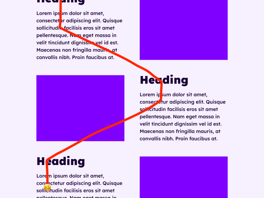
‘Whiplash’ layouts are layouts whose content aggressively opposes the user’s reading direction (e.g., left-to-right). No doubt you’ve seen this on marketing pages, where there’s a heading on the left and a paired image on the right, but then an image on the left and a paired heading on the right, and then…well, you get the idea. You could also just call them insane layouts for no reason.
Marketing pages in general tend to get pretty chaotic with these whiplash layouts, decorative elements, and whatever design trends are popular at the time, where the only goal is to get a reaction — any reaction — out of the user:
Really, the goal should be to get a good reaction out of users. To compel them, help them understand, or make them feel something, not to bounce them around the page like a pinball, or capture their attention with smoke and mirrors only to let them go without them taking anything of value away. This doesn’t mean that art in UX design is a fad, just that art for art’s sake is like rattling a toy in front of a baby — it’ll capture their attention, but that’s all, and our users certainly aren’t babies.
So, how do we engage (adult) users in a scenario like this?
Start with what I like to call the reverse empathy map:
If you can answer these questions (the message-mining technique is one of the best ways to help you do that), your content will look/sound compelling, and you won’t feel tempted to overdesign in other ways.
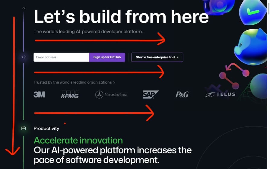
Next, presentation. This part is super easy — simply present the content in the user’s reading direction. In English, for example, stack sections from top to bottom and information within those sections from left to right. Try to maintain left alignment too, so that scanning the content ultimately feels natural, as if reading a book (totally not whiplashy at all).
This is a key feature of the linear design trend, by the way (below: GitHub’s Linear-inspired page with perfect reading direction):
Now you can start to think about the visuals, and again, you won’t feel tempted to overdesign because your design (or rather, the product) will already feel pretty compelling at this point.
(tl;dr, fundamentals first).
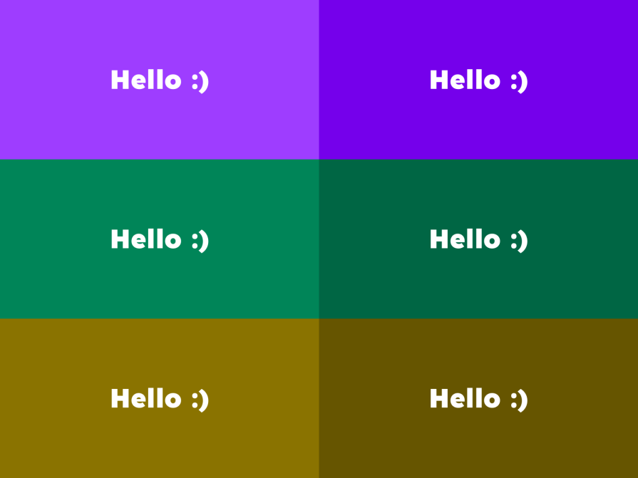
We’ve already seen how a fundamental UX principle, such as reading direction, can have a tremendous impact, to the point that it can prevent us from overdesigning. Well, color contrast works the exact same way, and isn’t just a progressive enhancement that makes content accessible to those with low vision.
Great color contrast makes content clearer, bolder, and more exciting to all users.
In the demonstrations below:
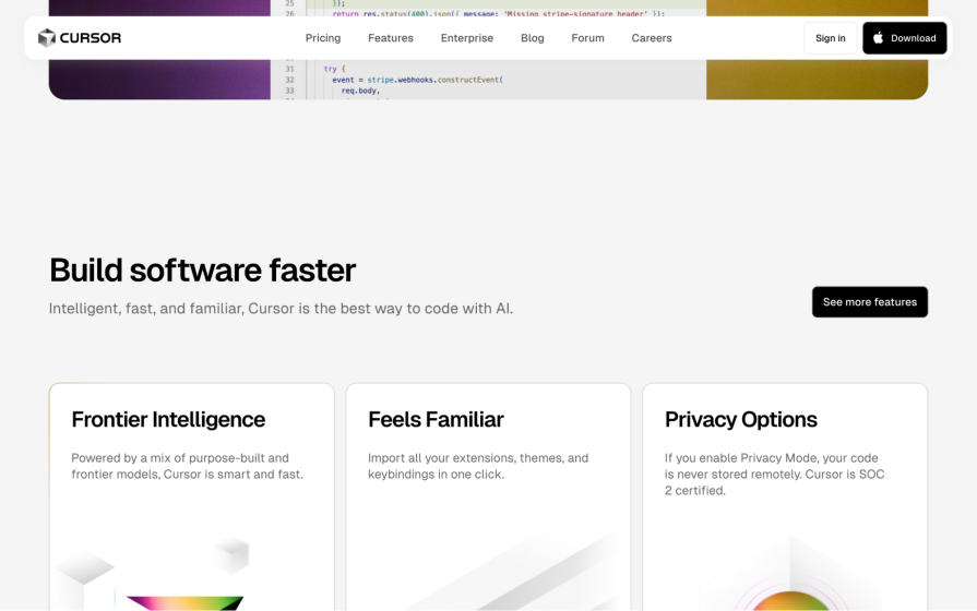
Cursor’s website does exactly this, and look how incredible it is. It’s a rather basic website that, because of great color contrast and great use of UX fundamentals in general (notice the perfect reading direction?), hasn’t been overdesigned in the slightest. This is what happens when we focus on UX fundamentals and accessibility:
And color contrast is so easy to ensure, too. Assuming that you’re using Figma (as almost all UX designers are these days), you can either use the color contrast checker that’s built right into the color picker UI or use the Stark plugin, which provides a whole bunch of accessibility tools. But don’t aim for the minimum color contrast as required by law — aim higher, create even more contrast, and make your text exceptionally crisp.
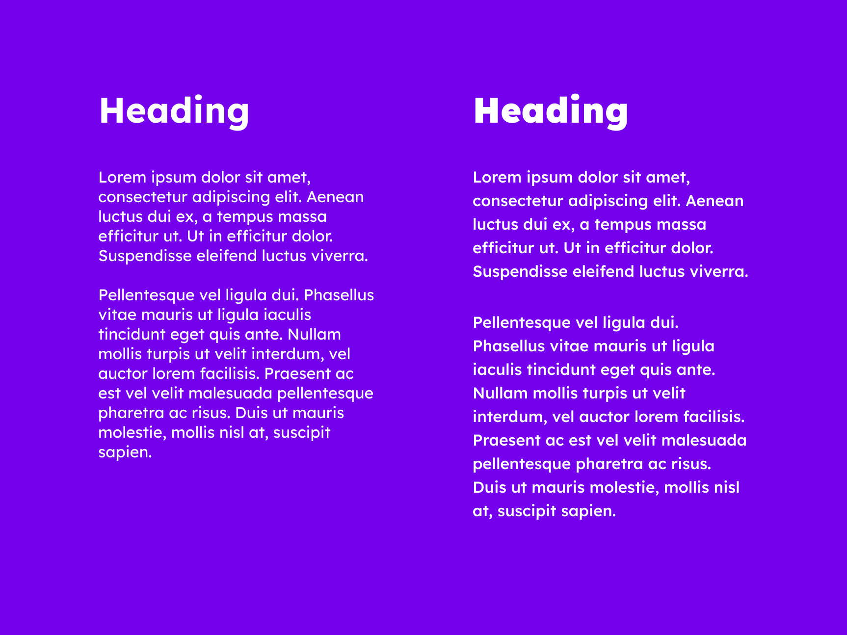
The same applies to inaccessible typography, which certainly doesn’t look nice but could be better described as just… off.
As outlined by the WCAG, accessible typography follows these rules:
Technically, the WCAG specifies that there should be no loss of content or functionality when users make these text adjustments themselves; however, ensuring them by default is both inclusive and aesthetically pleasing.
I also recommend:
In practice, here’s what that looks like (right) compared to unoptimized typography (left):
Additionally, just like with color contrast, creating accessible typography enhances the design without adding to it, which is what truly makes these two improvements great. Some of the biggest contributors to overdesign are those that occupy physical space and clutter the UI. This leads us to uncluttering the design, for example, creating hamburger menus.
Which brings us full circle, I think!
As a UX designer, thinking that your design is boring is surprisingly common. After all, you’ve been staring at it for days/weeks/months! Your users, however, aren’t feeling the same way. While you’ve invested a lot of time in your design, they’re investing considerably less (perhaps just a few minutes). Our goal is just to help them get what they want in fewer minutes, and that’s all, really.
Simply put, UX designers have the highest standards for UX design work, so much so that we can become, frankly, a little obsessive, and that can lead to overdesigning.
Overdesigning is a tricky thing to navigate. Obsessive, attention-to-detail personalities aside, there are also these little things called UX best practices, like ‘reduce clutter’ and ‘be clear’, that are often conflicting, and can lead to bad UX decisions if we fail to consider them from every point of view.
Obviously, thorough UX research is in order, including A/B testing for making very specific UX decisions, such as hamburger menu or no hamburger menu, but we also need to keep our minds sharp and not lose our critical thinking abilities, nor our gut instincts for UX design and everything that we know about UX fundamentals.
Some things to consider:
Here’s what we can do instead:
And when thinking about adding a UX detail, some general questions to ask yourself:
When in doubt, less is more.
Got a question or another overdesign pitfall that we need to avoid? If so, drop it in the comment section below, and thanks for reading!

LogRocket's Galileo AI watches sessions and understands user feedback for you, automating the most time-intensive parts of your job and giving you more time to focus on great design.
See how design choices, interactions, and issues affect your users — get a demo of LogRocket today.

Research is becoming more democratized, product cycles are accelerating, and AI is transforming synthesis and ResearchOps. Here are the three trends shaping UX research in 2026.
AI tools can generate beautiful UI concepts in minutes, but most teams struggle to integrate those outputs into real design systems. This guide explores why AI drifts toward generic patterns and how to build governed workflows that keep speed without sacrificing brand consistency.
Adaptive interfaces personalize experiences using behavioral signals and machine learning. But when personalization becomes autonomous, systems can reinforce patterns, limit discovery, and shape user behavior in ways designers didn’t intend.
Security requirements shouldn’t come at the cost of usability. This guide outlines 10 practical heuristics to design 2FA flows that protect users while minimizing friction, confusion, and recovery failures.

 Learn more →
