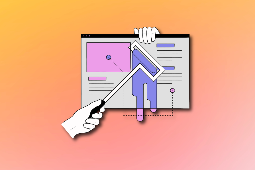
While designing user experiences, we tend to focus on the big stuff — major redesigns, “aha” moments, flashy features. It makes sense. But by prioritizing those big wins, we often overlook the small stuff. And over time, those little things stack up into UX debt.
Micro-disappointment — those tiny, frustrating moments in a user journey — might seem insignificant on their own. But they tend to add up, and when they do, they can chip away at your product’s credibility.
Micro-disappointments are situations in the user journey that cause small discomfort or dissatisfaction. On their own, they are too small to make users immediately quit or get angry at us. Still, they leave a dent in our experience.
Imagine going to McDonald’s and the kiosk crashes mid-order, or your table’s sticky, or you wait longer than usual, or you’re missing your sauce.
Nothing catastrophic. But after a few of those? You might want to pick KFC the next time.
Technically, any situation that makes users experience confusion or anxiety is a form of disappointment. The most common micro-disappointments in digital products are:
When using digital products, our patience and attention span are usually low. We hate waiting. Any wait times — including long page load, or overly slow transitions or animations, or a process just taking a long time — tend to annoy us.
In UX, time feels amplified. If your app drags, your users will, too.
If I have to zoom in just to tap a button, we’ve got a problem. The minimum tap target size:
If users keep missing the target, they’ll start missing your product entirely.
CTAs set expectations, and if you misdeliver, you break trust.
For example, if the content is cut off and there is a “see more” CTA, the typical expectation is that clicking on it will expand the content, as most websites do. If you instead redirect users to a new page, it’s unexpected and somewhat annoying behavior.
Not understanding if the action we just did succeeded or not can be nerve-wrecking.
A great example is the “Save” button. Imagine you click on it, you even get the click animation, but then nothing happens. No green checkmark. No “Saved” copy. Nothing.
In this case, I would click the second and third time, and if I still didn’t get any visual feedback, I would copy-paste whatever I am working on just to be sure I won’t lose it.
Same goes for:
Even a two-pixel animation can make a world of difference.
This one’s personal. I hate browsing a store, finding something perfect, and seeing it’s out of stock only after I try to add it to my cart.
I get it, there are a lot of benefits of doing so, such as
So I don’t blame businesses for doing that. But from a user standpoint? It’s disheartening.
ZIP code or phone number input fields always give me anxiety. Should I use “-” or not? Should my number contain “-” and dial code or not? I never guess correctly!
These errors are needless and a result of sloppy design. However you store ZIP codes, you could easily manipulate different types of inputs on your backend to maintain consistency.
Validation rules are important, but instead of pushing users to use only the correct format you accept, do some work on your end.
If you already have my ZIP code, why do I need to fill in my city? Or why would you ask me for my second name, even if it’s optional?
Most forms out there tend to ask for more information than’s truly needed. Stop collecting data that “might maybe become somehow useful in some feature”. They never do.
I get it that the password I put in is wrong. But it doesn’t mean you need to clear the email or account ID that I already put in.
Not to mention, I cleared out 10+ field forms just because I didn’t click on the recaptcha before clicking submit. (Yes, that happened.)
Modals are great at communicating critical information or converting users to specific actions. Just don’t overdo it.
It’s surprisingly easy to do so. I always thought I was conscious whenever adding a banner, and only added “high-value” ones. It wasn’t until I played with our app that I noticed I got three modals in a row. Wow.
Longer flows should have progress indicators. Otherwise, users will doubt how much more work is ahead of them.
Long onboarding, multi-step checkout design, or layered forms should have clear progress indicators, and ideally, a “Save” button allowing users to come back after a break.
Micro-disappointments are easily neglected. Their impact is hard to quantify, and making a case for fixing them is difficult.
I would like to use the Psych framework to depict the impact of micro-disappointments on users and businesses.
Imagine you have a ten-step user journey that ends with users getting to the checkout:
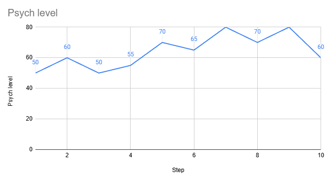
The chart above shows the Psych level, user satisfaction, and motivation at each step. When something exciting happens, it goes up. When users need to go to work or are confused/tired, it goes down.
With each step having a significant impact on Psych, sometimes doing as heavy changes as 20 pts, micro-disappointments that could be quantified as “-1” or “-3” seem irrelevant.
But imagine a small micro-disappointment of “-2” on each step. Then this chart would look more like that:
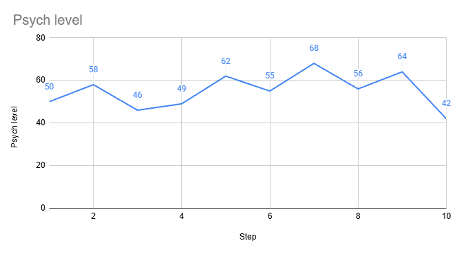
The difference between 60 Psych and 42 Psych on such an important step as checkout can be the difference between making a sale or not.
Different actions require different Psych levels, and our goal is to maintain the Psych at a high enough level that the user goes through all needed steps:
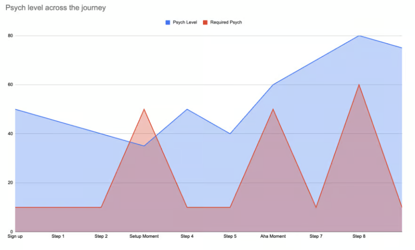
Each micro-disappointment lowers the Psych slightly, which might not matter much right now, but the series of micro-disappointments can heavily impact a user’s decision-making down the road.
Small UX issues are often hard to explain and pitch to key stakeholders. The solution? Don’t bother getting buy-in. Just do it.
Micro-disappointments are a form of UX debt. A healthy tactic is to fix them as you do other work on the related screen.
For example, a too small a tap area on the onboarding screen might not be relevant enough to report a dedicated bug to the dev team, But if you are already redesigning the animation on the onboarding, you can throw a comment to your Figma spec to devs to also adjust the tap area if they are working on the screen regardless.
Pitch spending just a few percent of the team’s capacity every week on “ad hoc UX improvements”. One small fix per sprint = 50 improvements a year. It adds up.
If you have a good relationship with developers, just ask them every now and then to make a quick UX fix in between tasks. Micro-disappointments often come from really small issues, which are, in turn, really easy to fix.
Not getting a formal buy-in and instead smuggling an improvement here and there is a bit of a shady tactic, and in some heavily processed organizations, it might be a no-go. Still, I’ve never really gotten into any real trouble by doing so.
You could spend some time preparing a great pitch, but explaining why fixing one small form or adding a small checkmark next to the save icon will generate revenue is a painful and often ineffective journey.
If you really want to get it done the proper way, though, I recommend you go gather a batch of 10 or so fixes under one “UX improvements” ticket. It’s easier to pitch and explain a batch of UX changes as a “UX debt reduction” task than to pitch each improvement separately.

LogRocket's Galileo AI watches sessions and understands user feedback for you, automating the most time-intensive parts of your job and giving you more time to focus on great design.
See how design choices, interactions, and issues affect your users — get a demo of LogRocket today.

AI has made polished, confident content easy to generate, but that does not make it trustworthy. This article explains how UX teams can design stronger quality signals using source transparency, validation, confidence communication, and reputation.
Inclusive design is evolving beyond accessibility alone. This guide explains how UX designers can create more inclusive products through usability, accessibility, neurodiverse UX, adaptive personalization, multimodal design, and culturally aware product experiences.

I was working with an intern on a UX research project, and before we even started, we both had private […]

AI has accelerated design execution, but speed can come at the expense of intentionality. Learn how UX teams can preserve product thinking and judgment.


