It’s hard to find a more sensitive design element than a checkout or a payment form. Small tweaks in the designs of these pages can lead to millions in revenue being won or lost.
Think about it.
If every customer goes through the checkout flow during the sales journey, a 1% conversion improvement often translates directly to a 1% total revenue increase. That’s real impact, right?
So, how does one craft an exceptional, highly converting checkout experience?
Although there’s no silver bullet answer, there are some best practices you could use for a checkout design. Practicing these will, more often than not, help you boost your checkout conversion rates significantly.
Let’s dive right in.
First things first — think of the overall layout and approach to the checkout.
Should you aim for fast and intuitive?
Or should you put your best sales pitch there?
How much content should be there?
In practice, the answers to these depend on the price point itself.
The higher the price, the more you have to justify it. And the lower the price, the more frictionless the checkout experience should be.
Let’s take a look at some examples.
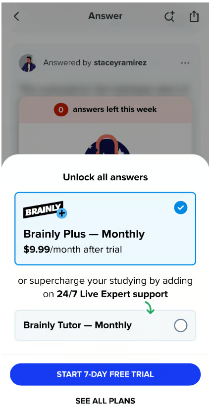
Brainly is an AI Learning Companiontm that equips students with study tools to help them nail their homework and prepare for exams. Its $9.99 price point is relatively accessible compared to similar products, and the value proposition itself is easy to grasp.
So, Brainly optimizes the speed and efficiency of the checkout design:
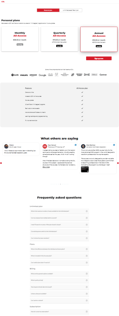
The opposite example is CXL, a platform for digital marketing courses. Their price points are relatively high compared to other providers ($200 for monthly access), so they need to focus more on showcasing their value proposition, testimonials, FAQs, etc.:
Key takeaway — if you charge a premium amount for your offering compared to other solutions on the market, go for a robust and detailed checkout design. If you are cheaper than your competitors, make the purchase seamless and avoid needless fireworks.
Many payment forms reiterate the benefits of the product or service. That’s not the best foot forward.
If a customer is already at the end of the sales funnel, they are already bought in. You have already explained all the benefits in the sales flow or imposed clear limitations on free offerings.
So now, it’s time to address your customer’s concerns and anxieties. These might include concerns like:
Understand the objections your potential customers have and focus on addressing these in your checkout design.
A good way to understand your customers’ objections and concerns is to ask them right after the purchase.
For example, I often ask new buyers: “Is there anything that almost stopped you from buying today?” right after the purchase. This question can be highly relieving
Prices are formatted bigger in size and bolder in font than the rest of the page. Here’s a quick example from Tally:
Making the price the most prominent element of the checkout design might not be a good practice.
Here’s why.
There is a psychological bias involved. According to Clark University’s research, we perceive big, bold prices as more expensive than the same price point showcased more subtly. It comes down to the primitive system 1 thinking taking over and associating “big font” as a visual cue with the concept of “big price.”
Sometimes, an experiment as simple as lowering the font size can boost your conversion noticeably.
There is an exception, though.
If your offering is significantly cheaper than alternatives and the price is part of your value proposition, then highlighting it might actually be a good tactic. I still encourage you to experiment with that one, though.
If you have discount codes or coupons, make them very subtle.
Of course, I’m not asking you to hide them from coupon holders. These should still be easily discoverable.
But if your payment form shouts, “Put your discount code here!” you risk losing customers who don’t have one.
A massive FOMO tends to kick in, and potential customers start wondering if there’s some discount code they should be aware of. Some will even go to Google and try to search for one but never return.
Here’s why I’m not a fan of Shopify checkouts:
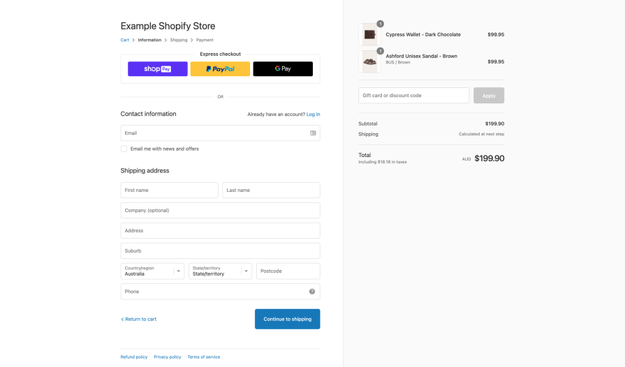
Whether I want to check my cart or ensure the total price is right, the discount code field screams for attention. Should I feel bad that I don’t have one?
Although call-to-actions such as Upgrade Now are OK, they are not enticing. If anything, they shout, “If you click me, you’ll have to pay!” Here’s an example:

A better way is to focus on the value the purchase will give your customers.
Two battle-tested approaches include “Get <value>” and “Start <doing something valuable to you>” calls to action:
Although what happens after clicking the CTA remains the same, the first approach focuses on the process (upgrading and often paying), while the latter focuses on the value a potential customer gets.
A little disclaimer here, though.
If you’re working on the checkout design for the CTA at the very last step of the funnel, that is, the actual payment, make sure it’s crystal clear that you will charge the customer after they click the button. You don’t want to deal with chargebacks later on.
The rules for good CTA buttons apply to the headers, too.
As someone who has been working in CRO for quite a while, I’m still baffled by checkout headers like “Pick your plan” or “Choose your subscription.”
These headers are naught but wasted opportunities.
I strongly suggest combining your core value proposition into one sentence and using it as a header.
Even a simple header like “Unlock all features” works better than “Pick your plan”. So if you don’t mess with the usability aspects, your users will know they need to choose a plan, even if you don’t tell them explicitly.
Price anchoring and decoy pricing are the holy grain of checkout optimization.
I’m thinking of Jason Shepherd’s reference to this sketch from Sketchplanation:
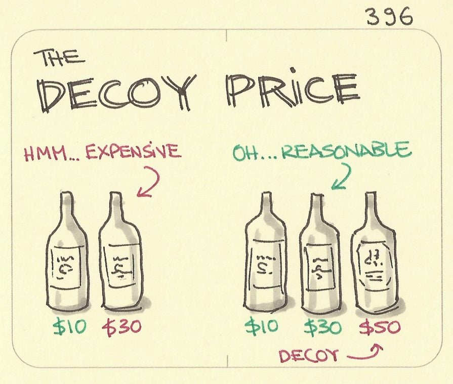
You’d want to offer a premium plan a bit above your users’ willingness to pay — that’s your decoy. The main goal of a decoy is to make other price points seem more reasonable.
Odd as it might sound, having a $30 and $50 plan will most likely yield more total conversion than just having a $30 plan — there are hundreds of A/B tests to prove that.
The order of plans on your checkout design is also important.
Always put the plan you want to optimize for on the left or top, depending on your layout. People read from left to right and from top to bottom, and we tend to compare everything to the first option.
If you want to optimize for CVR, anchor your cheapest plan. If you want to optimize for average revenue per customer, anchor your most expensive plan.
An important thing to remember about best practices is that they are merely guidelines. Although they work in most cases, it doesn’t mean they must work in your context.
Following the best practices is a sound way to develop the first iteration of your checkout funnel. However, you still need to research the needs of your particular audience and experiment constantly to figure out the most efficient approach for you.
Best practices are a great starting point but won’t replace research and experimentation.

LogRocket's Galileo AI watches sessions and understands user feedback for you, automating the most time-intensive parts of your job and giving you more time to focus on great design.
See how design choices, interactions, and issues affect your users — get a demo of LogRocket today.

Explore the core principles of GUI design and learn how consistency, simplicity, feedback, accessibility, and user testing contribute to better digital experiences.

After five years in UX, I revisited the Daily UI challenge to reconnect with hands-on design. Along the way, I learned that great interfaces come from thoughtful briefs, sound judgment, and user feedback, not just better AI tools.

Learn what makes a great login screen through real-world examples and UX best practices for creating secure, accessible, and low-friction authentication flows.

Skeuomorphism helped define early digital interfaces by mimicking real-world objects to make technology more intuitive. Learn how it compares with flat design and neumorphism, why it declined, and where it still has a place in modern UX.


