Editor’s note: This article was updated on 19 November 2024 to offer in-depth insights, actionable design tips, and technical implementation guidance for accordion UIs. Changes include additional best practices for designing accordion UIs, accessibility concerns to address, when to use accordions vs. other collapsible patterns, answers to common questions, and more.

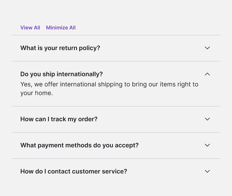
An accordion UI, or accordion menu, is a series of adjacent sections that a user can expand or collapse to reveal or hide content by clicking on the section headers. The general purpose and key benefit of an accordion UI is to reduce cognitive load and ease navigation.
A user is most likely to come across an accordion in a sidebar menu that has child items or on FAQ pages. The primary purpose of accordions in these scenarios is to better organize large amounts of content, making information easier to find.
Users have to click on section headers to reveal content; hence, the primary collapsed state of accordions is less overwhelming and results in a better user experience for users. It also enables users to prioritize which content they want to access, thus allowing them to find their desired relevant information faster.
We can broadly generalize the use of accordions to these two use cases:
That said, they can provide some challenges for your users, which in turn can make them a problem for UX designers. Let’s discuss why.
Accordion UIs can enrich UX for three main reasons:
However, despite these advantages, accordions have several usability issues:
Nielsen Norman Group found that users do scroll long pages, as long as they have relevant content and are organized and formatted properly for easy scanning. The scroll interaction on mouse and trackpads is much easier than performing clicks on targets. The content simply needs to be structured and presented better.
From this, we can gather that the correct usage of accordions to ensure a smooth user experience can be generalized as follows:
Note that on mobile screens, a long scroll can be a negative experience, so an accordion UI may ultimately be more suitable.
Even though accordions are quite common, they can still be hard for users to identify and navigate because their styling can vary widely from one application to another. Therefore, to make accordions intuitive for users, we must follow certain best practices and keep the accordion UI relatively recognizable:

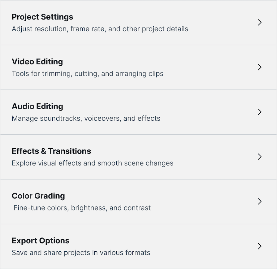
If you’re looking for a step-by-step guide to implementing an accordion component in your app, we have tutorials on building a React accordion menu from scratch and building collapsible accordions in React Native over on our developer blog.
As mentioned in the best practices listed above, each section of the accordion needs a clear, concise header:
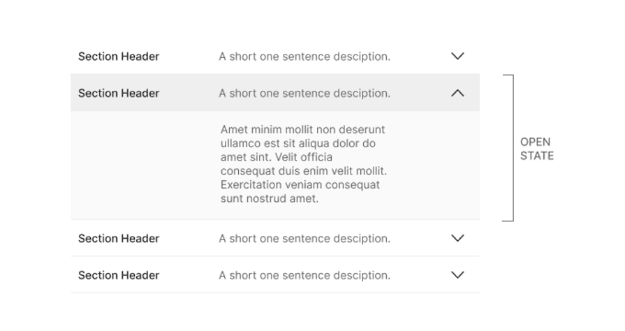
Even though the image above demonstrates section headers with both titles and descriptions, it is completely optional. Section headers can simply be one singular body of text, which is usually a short descriptive sentence or phrase.
You also need a way to show that an accordion section is expandable. The image below demonstrates the various different icons that could be used to signify that it is a clickable section header:
![]()
Nielsen Norman Group conducted an elaborate study to identify which icon is the best, and their finding suggests that the caret icon is the most effective in matching user expectations. Although it’s not possible to match every user’s mental model, including the caret symbol communicates to users that the accordion section is expandable and unlikely to direct them to a new page.
The study also included some recommendations for what not to do:
As with every UX design component added to the interface, it is important to ensure it is accessible so all users can use it easily. Here are some tips to make accordion elements more accessible:

aria-expanded, which tells the system if the accordion is open or closed: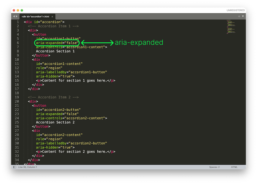
Other ARIA attributes you might need to know are:
role="region" — Defines the accordion section as a landmark or logical grouping.aria-hidden="true/false" — Explains if the content is visible or hiddentabindex="0" — Makes sure that accordion controls can be selected and navigated using the keyboardaria-controls="ID" — Connects the button to the content it controlsPlease note that applying this attribute is more work for developers. However, as a product designer, it is your responsibility to make sure the developers use it.
Here is a short accessibility checklist for your reference:
In our article so far, we’ve discussed accordions in the context of menus and collapsible on-page content. There are far more varied uses of accordions, such as in forms and filters.
When designing for the various use cases, something important to consider is whether to enable single-active or multiple-active accordion sections. The image below demonstrates the two different accordion states:
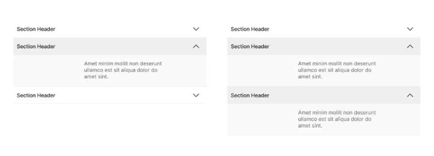
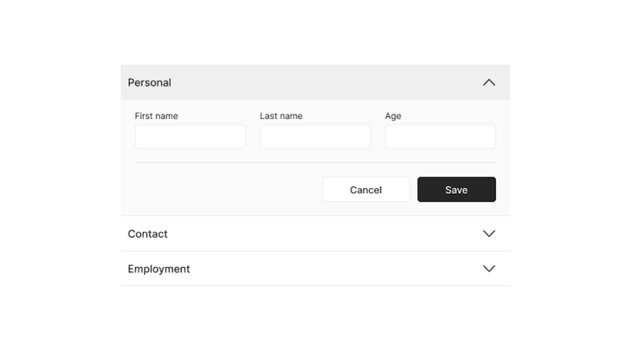
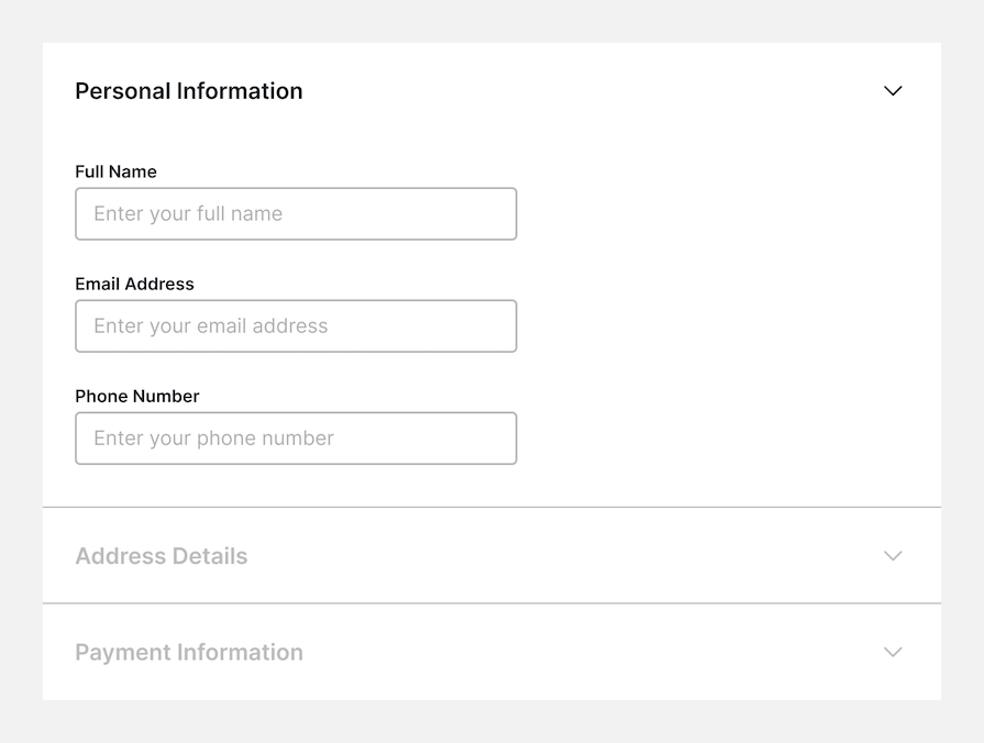
For instance, when using accordions in multistep form design, it might be desirable to use single-active accordions so that user focus and attention remains on the task at hand (i.e., the section of the form that the user is filling out). This reduces error and information overload.
The final confirmation screen can summarize all the data at a glance before submission:
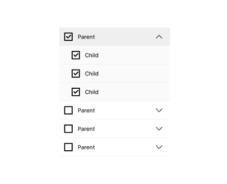
However, when designing accordions for filter UIs, it may be desirable to have multiple active sections so that the user can mix and match choices. Putting child items inside parent filter options does reduce the number of options at first glance for the user, as opposed to having a long list of filter items:
The variation in accordion styling can be summarized by the image below. The accordion design can be simple, more obvious and contained in a box, or with some separation to further convey a clickable button style interaction:
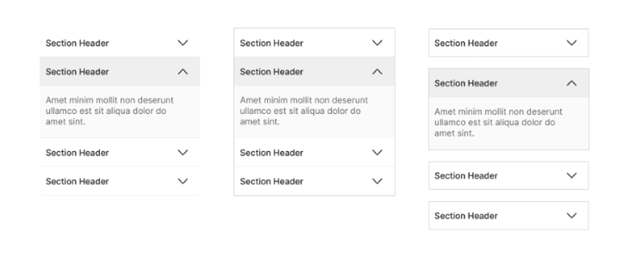
We see the separated interaction particularly in single-active accordions to convey that toggling one open will collapse the other because they’re not directly related.
Some designers debate whether to have an accordion open or closed by default. The argument for open by default is to convey to users that it is an accordion and to surface important information.
Keep in mind that important information often does not belong inside an accordion to begin with. Since users are more likely to miss content hiding inside accordions, we should only use accordions where we can afford less discoverability for that content.
Accordion menus can be found in different places in interfaces, such as FAQs on websites or support centers, navigation menus (especially on mobile devices), and forms. They help organize a lot of information in a simple way to help users find what they need quickly.
However, it is important to know that they are not fit for every need, and there are alternatives you may want to consider. Let’s take a look at them.
In general, websites with a lot of information, such as large ecommerce websites, use a mega menu instead of an accordion for better organizational purposes. Mega menus make it easier for users to scan information quickly, since it’s all presented in one large menu:
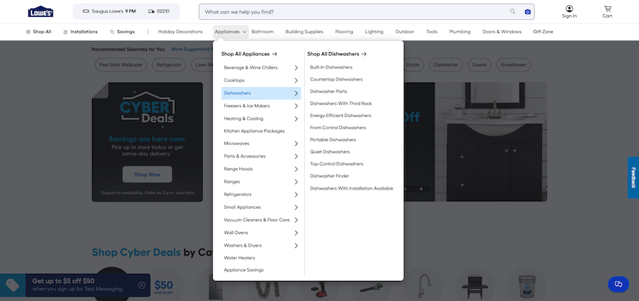
In a mega menu, each of the top categories opens a menu on hover or click. This menu contains categories and sometimes subcategories, organized so the user can navigate the information more easily.
One downside of mega menus is that they don’t work well on mobile, so adaptations are necessary.
Tab-segmented menus can also replace accordions. This type of menu works well when all the information fits into a small number of tabs. A good example is the Apple sound menu on macOS:
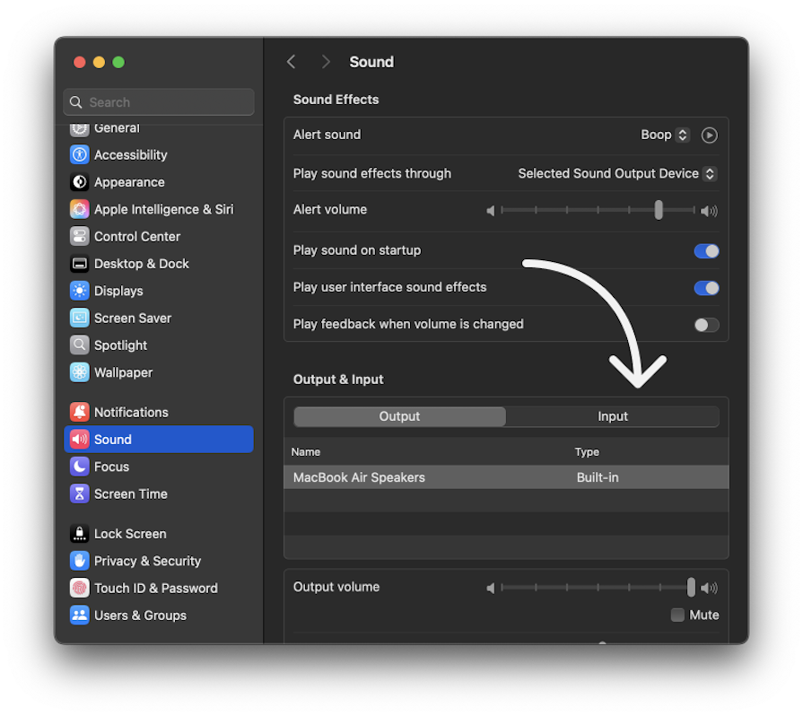
Tabs reduce clicks and make information easier to find. But if there are too many tabs, an accordion is better.
If you want to show or hide information for the user in a simple way, you can also consider using a toggle button. For example, you could use a toggle button to show or hide advanced settings options in a general settings menu. Keep in mind that it is only useful for small amounts of information.
Another option is to use a carousel component, which works well for presenting small amounts of information visually. For example, a carousel can be effective in the hero section of a website to quickly communicate key points to the user. However, it is not suitable for detailed or long content.
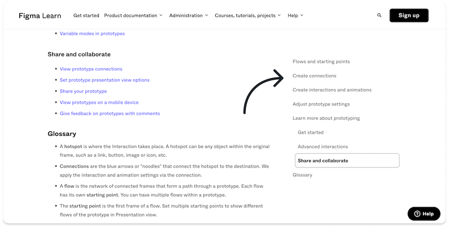
You can avoid using an accordion at all and add the information as it is on the page. But remember that this option forces the user to scroll through the page to find the information.
If you select this option, consider adding side menus so the user can navigate easily. You should also include a search option on the page to make it easier for the user to find the information. You can see an example of it in the Figma help center:
To help you decide what component to select, ask yourself these questions to help you choose:
Apart from these questions, I suggest you add the information in two ways and make a quick prototype to see which solution fits better.
Here is a simple table with all the information you need in one place:
| Component | Strengths | Weaknesses | Best used for… |
|---|---|---|---|
| Accordion | Compact, reduces clutter, interactive | Not ideal for quick scans | FAQs, forms, lots of mobile content |
| Mega menu | Everything visible at once, easy scanning | Not fit for mobile | Large websites with lots of categories |
| Tabs | Easy navigation | Doesn’t scale well with many items | Small amounts of unrelated content |
| Carousel | Visual, small chunks of featured content | Content is hidden | Featured items, image galleries |
The visual design of a basic accordion component is quite simple. It includes a title, icon, and text once it opens.
Besides these basics, it may be possible to add other visual elements to the accordion if needed, like notification information or status information. For example, you could add a status indicator to communicate that the user completed or did not complete the information inside.
Let’s break down visual and interaction design for accordion UIs.
You can use different icons to clearly show users whether the accordion is open or closed. Here are some examples you can use:
![]()
It’s also possible to make the component without an icon, but this will not communicate effectively to the user that they can open or close it.
You can position the icon before or after the text, but it’s most commonly placed at the end of the section. Positioning the icon before the text can create confusion if another icon is added nearby.
However, placing the icon after the text also has its challenges. Variations in text length can cause the open/close icon to appear misaligned or out of place across different sections. For these reasons, placing the icon at the end is the best choice:
![]()
Like any component, you can show different states for the accordion to communicate with users. Since this component can open and close, these states apply to both:
An advanced accordion status you can enable is Complete/Incomplete — for example, when the user is filling out a form and you want to indicate that a section has been completed (and doesn’t need to be opened again) or still needs to be completed.
Accordion components can be made without any animations. However, adding a small animation to the component may add another layer of good UX to the interface.
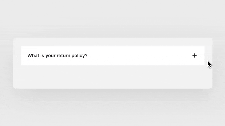
You can add animation when the component opens or closes, but also for the icon. For example, if you use the plus icon, you can turn it 45 degrees with micro interaction to convert it into a close icon:
There are some advanced interactions you can select for this component to make it more precise for the user’s needs. Here are some examples:
We’ve covered a lot of information about designing accordion UIs, but you may have some general questions still. Here are answers to some common questions about accordion components:
Have any questions you don’t see answered here? Ask me in the comments section below!
In this article, we looked at the accordion UI component and covered advanced UX/UI principles to help you implement better accordion UI designs for complex content.
First, we reviewed the accordion component and understood its usage in organizing information.
Our next step was to look at the best practices for using it. For example, adding an icon to communicate better that it is an accordion is a good idea. In addition, each section of the accordion needs a clear and concise heading.
Then we looked at the problems of the accordion and discussed how information hidden in collapsed accordion sections make it less easily accessible to the users. We also reviewed the accessibility guidelines for this component. Apart from basic design tips like sizing on mobile, we explored various ARIA attributes that help convey accordion content more effectively to people with disabilities.
Next, we looked at the different types of accordion UIs and compared accordions to other collapsible patterns. For example, we learned to use a mega menu instead of an accordion component for extensive content. However, if we have a lot of data to organize, an accordion is better than tabs.
In the end, we focused on the interaction of this component, like the enabled and disabled states. We understood that adding the icon at the end of the section is better because it avoids visual issues. In addition, we looked at the option to add animation to the component and some advanced cases like step-by-step expansion for forms.
Featured image source: IconScout
LogRocket's Galileo AI watches sessions and understands user feedback for you, automating the most time-intensive parts of your job and giving you more time to focus on great design.
See how design choices, interactions, and issues affect your users — get a demo of LogRocket today.

Learn how context-aware mode prioritization and seamless transitions improve multimodal UX and reduce mode confusion.

Research is becoming more democratized, product cycles are accelerating, and AI is transforming synthesis and ResearchOps. Here are the three trends shaping UX research in 2026.

Voice support is not the same as multimodal UX. Here’s how to design systems with true mode continuity and context-aware interactions.
AI tools can generate beautiful UI concepts in minutes, but most teams struggle to integrate those outputs into real design systems. This guide explores why AI drifts toward generic patterns and how to build governed workflows that keep speed without sacrificing brand consistency.