React Native developers typically use UI component libraries to build apps. Even though modern mobile devices come with higher screen resolutions, a generic smartphone screen is still relatively small compared to computer screens, so app developers often need to reduce app UI content. There are various strategies to achieve this, such as using a collapsible segment that only shows its content with a screen tap to reduce the visible content in a user-friendly manner.

In some apps, we can toggle collapsible panel lists (a.k.a., accordion elements) with screen touch events. An accordion element typically lists multiple panel headers with summarized titles. Users can expand and collapse a collapsible panel to see more content by clicking or tapping the related header.
Every software development requirement typically has multiple possible solutions. Similarly, in this tutorial, I’ll explain the available options for building collapsible accordions in React Native with practical examples. We can use the following approaches for implementing accordions in React Native:
View, TouchableOpacity), vector icons, and inbuilt Animation APIsLet’s start with a practical session and develop accordions based on the above options!
Jump ahead:
react-native-collapsibleaccordion-collapse-react-nativeMost accordions play expanding/collapsing animations by default, but in this section, we’ll build one without animations. Create a new React Native project to get started:
npx react-native init AccordionFromScratch
cd AccordionFromScratch
Starting from v0.71, React Native generates the initial project template with TypeScript by default. The above command will scaffold a project with the App.tsx source file; we’ll also use TypeScript in this tutorial.
Run the app with npx react-native run-android or npx react-native run-ios to make sure the project creation was successful.
We’ll use two vector icons from the react-native-vector-icons package. You can install it according to the official installation guide.
Next, erase everything in your App.tsx and add the following imports and the type definition:
import React, { useState } from 'react';
import type { PropsWithChildren } from 'react';
import {
  SafeAreaView,
  ScrollView,
  StyleSheet,
  Text,
  TouchableOpacity,
  View,
  Button,
} from 'react-native';
import Icon from 'react-native-vector-icons/FontAwesome';

type AccordionItemPros = PropsWithChildren<{
  title: string;
}>;
Accordions usually have several collapsible elements. We can start implementing the accordion component with a single collapsible component. Create AccordionItem with the following code:
function AccordionItem({ children, title }: AccordionItemPros): JSX.Element {
  const [ expanded, setExpanded ] = useState(false);

  function toggleItem() {
    setExpanded(!expanded);
  }

  const body = <View style={styles.accordBody}>{ children }</View>;

  return (
    <View style={styles.accordContainer}>
      <TouchableOpacity style={styles.accordHeader} onPress={ toggleItem }>
        <Text style={styles.accordTitle}>{ title }</Text>
        <Icon name={ expanded ? 'chevron-up' : 'chevron-down' }
              size={20} color="#bbb" />
      </TouchableOpacity>
      { expanded && body }
    </View>
  );
}
The above collapsible component toggles the expanded/collapsed state when the user presses the panel header by using the expanded state field. Here, we change the arrow vector icon and accordion body section based on the expanded state field. This component accepts the accordion item title via a prop and accordion body elements via the component children prop.
Now, we can use the AccordionItem component and create an accordion within the App component as follows:
function App(): JSX.Element {
  return (
    <SafeAreaView style={styles.container}>
      <ScrollView
        contentInsetAdjustmentBehavior="automatic"
        style={styles.container}>
        <AccordionItem title="Native development">
            <Text style={styles.textSmall}>React Native lets you create truly native apps and
            doesn't compromise your users' experiences. It provides a core set of platform
            agnostic native components </Text>
        </AccordionItem>
        <AccordionItem title="Fast refresh">
            <Text style={styles.textSmall}>See your changes as soon as you save.
            With the power of JavaScript, React Native lets you iterate at
            lightning speed.</Text>
        </AccordionItem>
        <AccordionItem title="Cross-platform">
            <Text style={styles.textSmall}>React components wrap existing native code
            and interact with native APIs via React’s declarative UI paradigm
            and JavaScript. This enables native app development for whole new teams
            of developers</Text>
            <View style={styles.seperator}></View>
            <Button title="See more..."/>
        </AccordionItem>
      </ScrollView>
    </SafeAreaView>
  );
}
Look at the above code snippet and check how we added body content to our accordion body — we can use any component inside the accordion body. We’ve added a Button component instance in the third collapsible panel body for demonstration purposes.
Finally, we can add styling definitions and export the App component:
const styles = StyleSheet.create({
  container: {
    flex: 1
  },
  accordContainer: {
    paddingBottom: 4
  },
  accordHeader: {
    padding: 12,
    backgroundColor: '#666',
    color: '#eee',
    flex: 1,
    flexDirection: 'row',
    justifyContent:'space-between'
  },
  accordTitle: {
    fontSize: 20,
  },
  accordBody: {
    padding: 12
  },
  textSmall: {
    fontSize: 16
  },
  seperator: {
    height: 12
  }
});

export default App;
Here is the complete source code for building an accordion without expanding/collapsing animations:
import React, { useState } from 'react';
import type { PropsWithChildren } from 'react';
import {
  SafeAreaView,
  ScrollView,
  StyleSheet,
  Text,
  TouchableOpacity,
  View,
  Button,
} from 'react-native';
import Icon from 'react-native-vector-icons/FontAwesome';

type AccordionItemPros = PropsWithChildren<{
  title: string;
}>;

function AccordionItem({ children, title }: AccordionItemPros): JSX.Element {
  const [ expanded, setExpanded ] = useState(false);

  function toggleItem() {
    setExpanded(!expanded);
  }

  const body = <View style={styles.accordBody}>{ children }</View>;

  return (
    <View style={styles.accordContainer}>
      <TouchableOpacity style={styles.accordHeader} onPress={ toggleItem }>
        <Text style={styles.accordTitle}>{ title }</Text>
        <Icon name={ expanded ? 'chevron-up' : 'chevron-down' }
              size={20} color="#bbb" />
      </TouchableOpacity>
      { expanded && body }
    </View>
  );
}

function App(): JSX.Element {
  return (
    <SafeAreaView style={styles.container}>
      <ScrollView
        contentInsetAdjustmentBehavior="automatic"
        style={styles.container}>
        <AccordionItem title="Native development">
            <Text style={styles.textSmall}>React Native lets you create truly native apps and
            doesn't compromise your users' experiences. It provides a core set of platform
            agnostic native components </Text>
        </AccordionItem>
        <AccordionItem title="Fast refresh">
            <Text style={styles.textSmall}>See your changes as soon as you save.
            With the power of JavaScript, React Native lets you iterate at
            lightning speed.</Text>
        </AccordionItem>
        <AccordionItem title="Cross-platform">
            <Text style={styles.textSmall}>React components wrap existing native code
            and interact with native APIs via React’s declarative UI paradigm
            and JavaScript. This enables native app development for whole new teams
            of developers</Text>
            <View style={styles.seperator}></View>
            <Button title="See more..."/>
        </AccordionItem>
      </ScrollView>
    </SafeAreaView>
  );
}

const styles = StyleSheet.create({
  container: {
    flex: 1
  },
  accordContainer: {
    paddingBottom: 4
  },
  accordHeader: {
    padding: 12,
    backgroundColor: '#666',
    color: '#eee',
    flex: 1,
    flexDirection: 'row',
    justifyContent:'space-between'
  },
  accordTitle: {
    fontSize: 20,
  },
  accordBody: {
    padding: 12
  },
  textSmall: {
    fontSize: 16
  },
  seperator: {
    height: 12
  }
});

export default App;
Run the above code. You’ll see a sample accordion, as shown in the following preview:
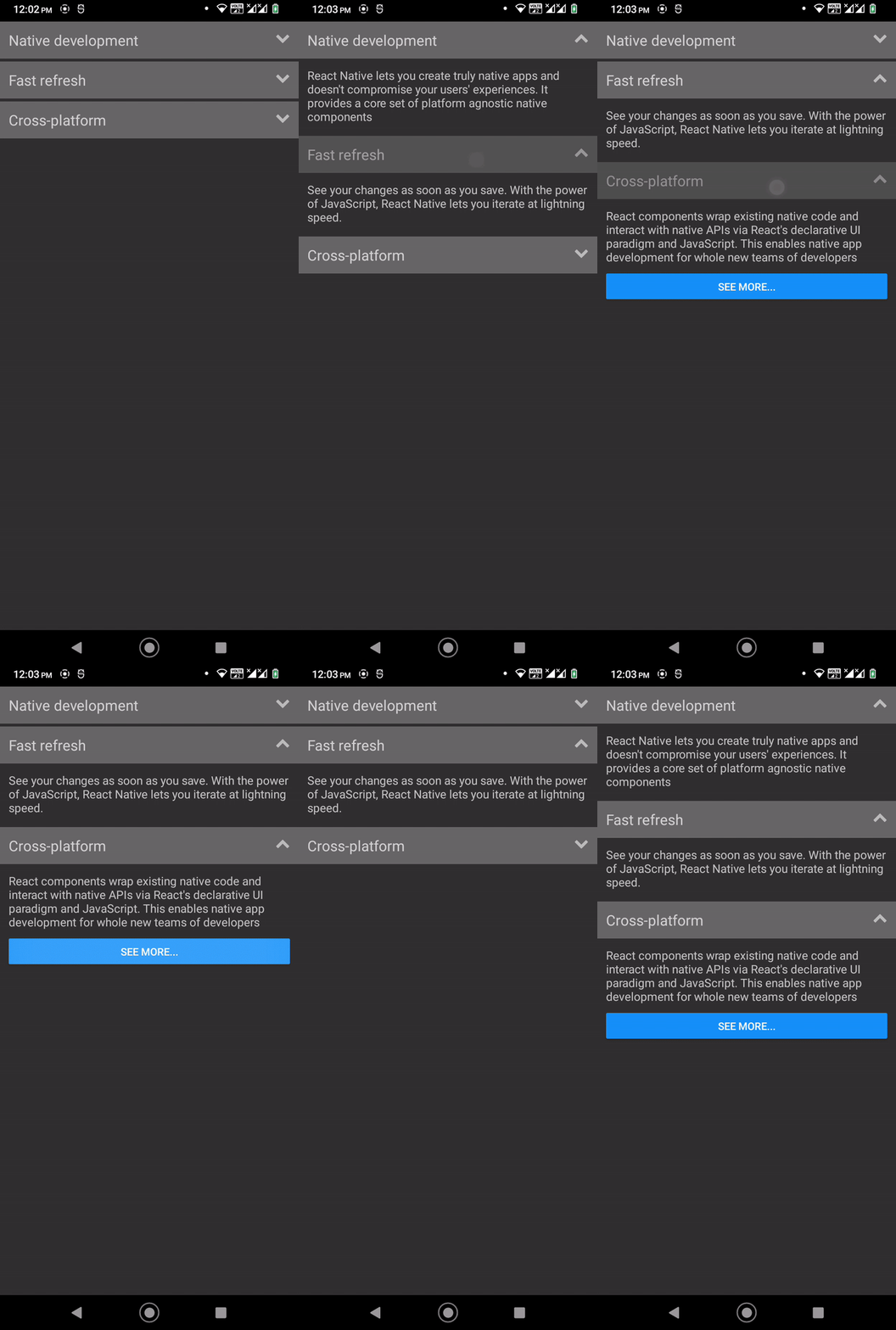
The sample accordion plays a flashing animation when we press each header because of the TouchableOpacity component, but we don’t have any user-friendly expanding/collapsing animation for the accordion panel — the accordion body appears and disappears instantly.
Try to add more styles and dynamically change them based on the expanded state field. We’ll add expanding/collapsing animations soon!
React Native offers two inbuilt APIs for handling animations: Animated and LayoutAnimation. We’ll use LayoutAnimation here because we need to animate the accordion body in the render cycle based on the expanded state field’s boolean value.
Turning on animations for the accordion is so easy with LayoutAnimation. First, update your react-native imports as follows:
import {
  SafeAreaView,
  ScrollView,
  StyleSheet,
  Text,
  TouchableOpacity,
  View,
  Button,
  Platform,
  UIManager,
  LayoutAnimation
} from 'react-native';
Next, add the following code snippet right after all the import statements to enable LayoutAnimation on Android:
if(Platform.OS === 'android') {
  UIManager.setLayoutAnimationEnabledExperimental(true);
}
Finally, let React Native animate the accordion body when it renders by using the following toggleItem implementation:
function toggleItem() {
  LayoutAnimation.configureNext(LayoutAnimation.Presets.easeInEaseOut);
  setExpanded(!expanded);
}
Look at the live app and press the accordion headers. You will see expanding/collapsing animations for the accordion:
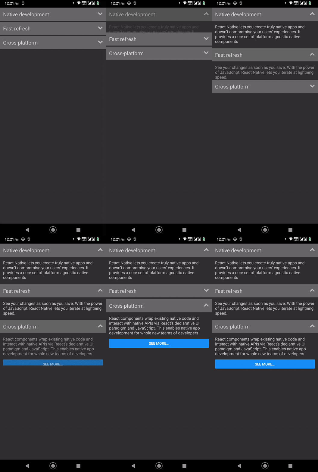
You can change this animation by using a different preset or creating a custom animation with the LayoutAnimation.create method. Look at the following example:
LayoutAnimation.configureNext(LayoutAnimation.create(500, 'linear', 'scaleY'));
The above configuration plays the following animations:

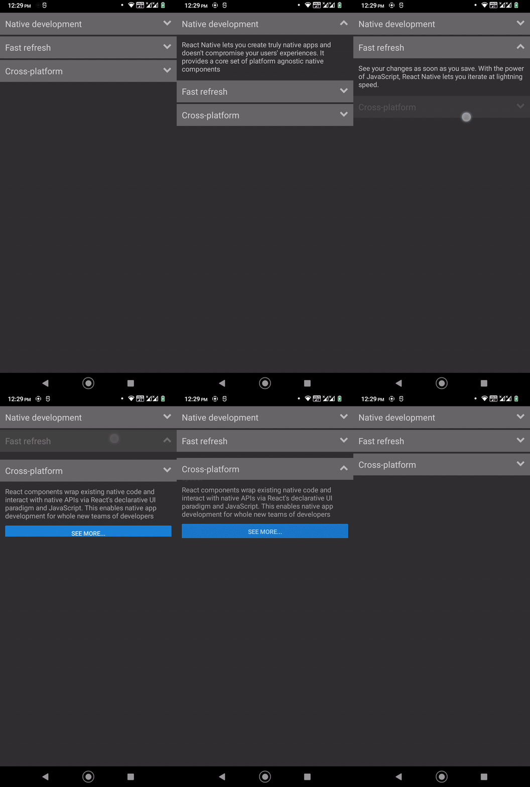
You can choose any development strategy to build accordions from scratch based on your design requirements. For example, assume that you want to activate only one collapsible section at a time in a dynamic accordion. Then, you can make AccordionItem stateless and create a new stateful Accordion component to handle dynamic accordion items.
Use the following code segment in your App.tsx file:
type AccordionItemPros = PropsWithChildren<{
  title: string;
}>;

type AccordionData = {
  title: string;
  content: JSX.Element;
  expanded: boolean;
  onHeaderPress: (index: number) => void;
};

type AccordionProps = PropsWithChildren<{
  data: AccordionData;
}>;

function AccordionItem({ children, title, expanded, onHeaderPress }: AccordionItemPros): JSX.Element {
  const body = <View style={styles.accordBody}>{ children }</View>;

  return (
    <View style={styles.accordContainer}>
      <TouchableOpacity style={styles.accordHeader} onPress={ onHeaderPress }>
        <Text style={styles.accordTitle}>{ title }</Text>
        <Icon name={ expanded ? 'chevron-up' : 'chevron-down' }
              size={20} color="#bbb" />
      </TouchableOpacity>
      { expanded && body }
    </View>
  );
}

function Accordion({ data }: AccordionProps): JSX.Element {

  const [ expandedIndex, setExpandedIndex ] = useState(null);

  function handleHeaderPress(index) {
    LayoutAnimation.configureNext(LayoutAnimation.Presets.easeInEaseOut);
    setExpandedIndex(expandedIndex === index ? null : index);
  }

  return(
    <>
      { data.map((item, index) => (
      <AccordionItem
        key={index}
        title={item.title}
        expanded={expandedIndex === index}
        onHeaderPress={ () => handleHeaderPress(index) }>
          {item.content}
      </AccordionItem>
      )) }
    </>
  );
}

function App(): JSX.Element {
  return (
    <SafeAreaView style={styles.container}>
      <ScrollView
        contentInsetAdjustmentBehavior="automatic"
        style={styles.container}>
          <Accordion data={[
            {
              title: 'Native development',
              content: <Text style={styles.textSmall}>
                React Native lets you create truly native apps and
          doesn't compromise your users' experiences. It provides a core set of platform
          agnostic native components
              </Text>
            },
            {
              title: 'Fast refresh',
              content: <Text style={styles.textSmall}>
                See your changes as soon as you save.
                With the power of JavaScript, React Native lets you iterate at
                lightning speed.
              </Text>
            },
            {
              title: 'Cross-platform',
              content:  <><Text style={styles.textSmall}>React components wrap existing native code
                and interact with native APIs via React’s declarative UI paradigm
                and JavaScript. This enables native app development for whole new teams
                of developers</Text>
                <View style={styles.seperator}></View>
                <Button title="See more..."/>
              </>
            }
            ]
          }/>
      </ScrollView>
    </SafeAreaView>
  );
}
Here, the Accordion component accepts a data prop and lets you define accordion items dynamically, so it’s possible to use this accordion easily with RESTful API data. The handleHeaderPress function enables layout animations and sets the currently active collapsible section based on the collapsible panel’s indices.
Once you run the updated app, you will see the following result:
You can auto-open the first collapsible section as follows:
const [ expandedIndex, setExpandedIndex ] = useState(0);
react-native-collapsibleEarlier, we built an accordion from scratch with React Native’s inbuilt components, Font Awesome vector icons, and the inbuilt animation APIs. Even though we implemented the accordion from scratch, it didn’t take much time since our design requirements weren’t complex.
If we need to implement more features for the accordion or have very limited development time, using a third-party accordion library is a good idea.
The react-native-collapsible library offers a pre-developed, customizable accordion component. Let’s make an accordion with react-native-collapsible!
Create a new React Native project with the following command:
npx react-native init AccordionFromLibrary
cd AccordionFromLibrary
Install the required dependencies as follows:
npm install react-native-collapsible react-native-vector-icons
# --- or ---
yarn add react-native-collapsible react-native-vector-icons
Make sure to configure the project for the react-native-vector-icons package according to the official installation guide.
Now, add the following code to your App.tsx file:
import React, { useState } from 'react';
import type { PropsWithChildren } from 'react';
import {
  SafeAreaView,
  ScrollView,
  StyleSheet,
  Text,
  View,
  Button,
} from 'react-native';
import Icon from 'react-native-vector-icons/FontAwesome';
import Accordion from 'react-native-collapsible/Accordion';

function App(): JSX.Element {
  const [ activeSections, setActiveSections ] = useState([]);
  const sections = [
    {
      title: 'Native development',
      content: <Text style={styles.textSmall}>
        React Native lets you create truly native apps and
        doesn't compromise your users' experiences. It provides a core set of platform
        agnostic native components
      </Text>
    },
    {
      title: 'Fast refresh',
      content: <Text style={styles.textSmall}>
        See your changes as soon as you save.
        With the power of JavaScript, React Native lets you iterate at
        lightning speed.
      </Text>
    },
    {
      title: 'Cross-platform',
      content:  <><Text style={styles.textSmall}>React components wrap existing native code
        and interact with native APIs via React's declarative UI paradigm
        and JavaScript. This enables native app development for whole new teams
        of developers</Text>
        <View style={styles.seperator}></View>
        <Button title="See more..."/>
      </>
    }
  ];

  function renderHeader(section, _, isActive) {
    return (
      <View style={styles.accordHeader}>
        <Text style={styles.accordTitle}>{ section.title }</Text>
        <Icon name={ isActive ? 'chevron-up' : 'chevron-down' }
              size={20} color="#bbb" />
      </View>
    );
  };

  function renderContent(section, _, isActive) {
    return (
      <View style={styles.accordBody}>
        {section.content}
      </View>
    );
  }
  return (
    <SafeAreaView style={styles.container}>
      <ScrollView
        contentInsetAdjustmentBehavior="automatic"
        style={styles.container}>
          <Accordion
            align="bottom"
            sections={sections}
            activeSections={activeSections}
            renderHeader={renderHeader}
            renderContent={renderContent}
            onChange={(sections) => setActiveSections(sections)}
            sectionContainerStyle={styles.accordContainer}
          />
      </ScrollView>
    </SafeAreaView>
  );
}

const styles = StyleSheet.create({
  container: {
    flex: 1
  },
  accordContainer: {
    paddingBottom: 4
  },
  accordHeader: {
    padding: 12,
    backgroundColor: '#666',
    color: '#eee',
    flex: 1,
    flexDirection: 'row',
    justifyContent:'space-between'
  },
  accordTitle: {
    fontSize: 20,
  },
  accordBody: {
    padding: 12
  },
  textSmall: {
    fontSize: 16
  },
  seperator: {
    height: 12
  }
});

export default App;
The above source file renders an accordion by importing the Accordion component from the react-native-collapsible library. The above source code produces the following result:
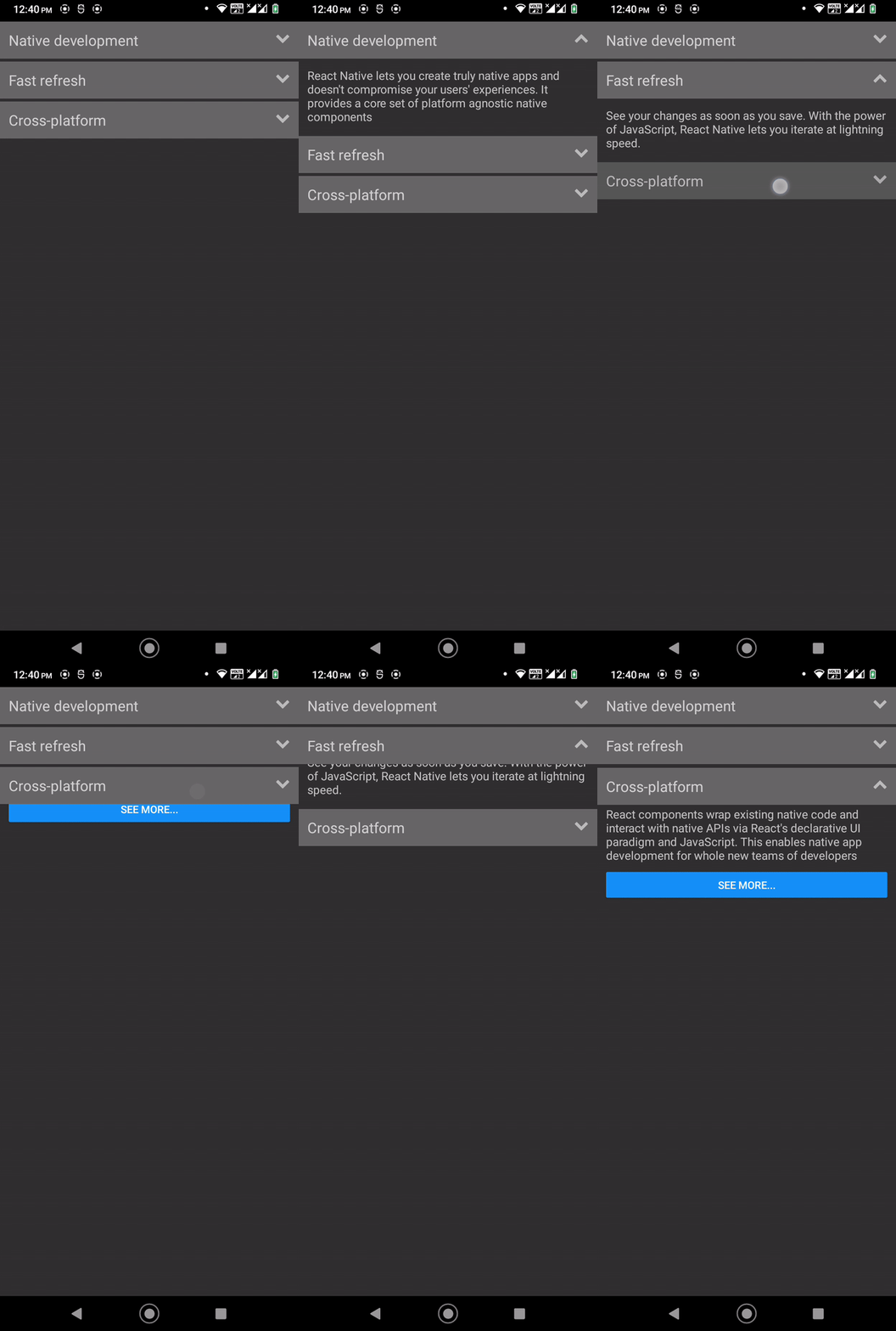
The pre-developed Accordion component is so flexible — see how it lets developers build accordions with custom styles and content? For example, we added an icon for the accordion header with the renderHeader function:
function renderHeader(section, _, isActive) {
    return (
      <View style={styles.accordHeader}>
        <Text style={styles.accordTitle}>{ section.title }</Text>
        <Icon name={ isActive ? 'chevron-up' : 'chevron-down' }
              size={20} color="#bbb" />
      </View>
    );
  };
This library lets you customize the accordion’s behavior with several props, just as it offers you custom styles and flexible accordion content support. For example, you can customize the expanding/collapsing animation as follows:
<Accordion
  easing="easeInBounce"
  duration={600}
  ....
  ....
/>
The above setup renders a slow bouncing animation as follows:
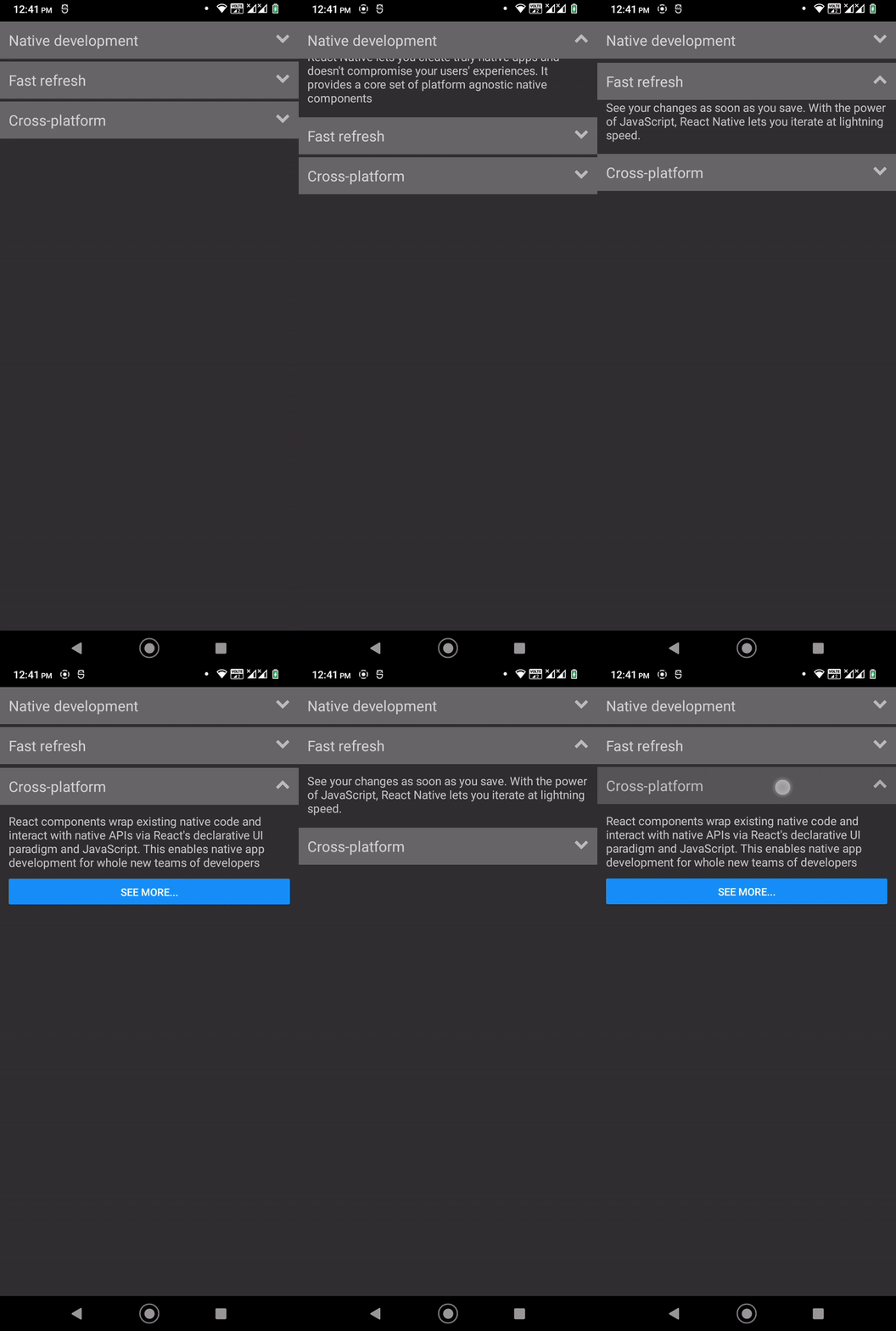
By default, the library opens one collapsible section at a time, but you can override it as follows:
<Accordion
  expandMultiple={true}
  ....
  ....
/>
Now, you can expand multiple collapsible sections, as shown in the following preview:

See all supported accordion props from the official documentation.
accordion-collapse-react-nativeThe React Native library ecosystem is so competitive — we can find alternatives for almost all React Native packages. The accordion-collapse-react-native library is an alternative to react-native-collapsible. This library offers you a pre-developed, customizable AccordionList component for creating accordions. Let’s use this library too!
We can use the previous project to check out this library. Install the library with the following command:
npm install accordion-collapse-react-native
#--- or ---
yarn add accordion-collapse-react-native
Add the following code to your App.tsx file:
import React from 'react';
import {
  SafeAreaView,
  ScrollView,
  StyleSheet,
  Text,
  View,
  Button,
  Platform,
  UIManager,
  LayoutAnimation
} from 'react-native';
import Icon from 'react-native-vector-icons/FontAwesome';
import { AccordionList } from 'accordion-collapse-react-native';

if(Platform.OS === 'android') {
  UIManager.setLayoutAnimationEnabledExperimental(true);
}

function App(): JSX.Element {
  const sections = [
    {
      title: 'Native development',
      content: <Text style={styles.textSmall}>
        React Native lets you create truly native apps and
        doesn't compromise your users' experiences. It provides a core set of platform
        agnostic native components
      </Text>
    },
    {
      title: 'Fast refresh',
      content: <Text style={styles.textSmall}>
        See your changes as soon as you save.
        With the power of JavaScript, React Native lets you iterate at
        lightning speed.
      </Text>
    },
    {
      title: 'Cross-platform',
      content:  <><Text style={styles.textSmall}>React components wrap existing native code
        and interact with native APIs via React's declarative UI paradigm
        and JavaScript. This enables native app development for whole new teams
        of developers</Text>
        <View style={styles.seperator}></View>
        <Button title="See more..."/>
      </>
    }
  ];

  function renderHeader(section, _, isActive) {
    return (
      <View style={styles.accordHeader}>
        <Text style={styles.accordTitle}>{ section.title }</Text>
        <Icon name={ isActive ? 'chevron-up' : 'chevron-down' }
              size={20} color="#bbb" />
      </View>
    );
  };

  function renderContent(section, _, isActive) {
    return (
      <View style={styles.accordBody}>
        {section.content}
      </View>
    );
  }

  function handleOnToggle() {
    LayoutAnimation.configureNext(LayoutAnimation.Presets.easeInEaseOut);
  }

  return (
    <SafeAreaView style={styles.container}>
      <AccordionList
        list={sections}
        header={renderHeader}
        body={renderContent}
        onToggle={handleOnToggle}
      />
    </SafeAreaView>
  );
}

const styles = StyleSheet.create({
  container: {
    flex: 1
  },
  accordHeader: {
    padding: 12,
    backgroundColor: '#666',
    color: '#eee',
    flex: 1,
    flexDirection: 'row',
    justifyContent:'space-between',
    marginBottom: 4
  },
  accordTitle: {
    fontSize: 20,
  },
  accordBody: {
    padding: 12
  },
  textSmall: {
    fontSize: 16
  },
  seperator: {
    height: 12
  }
});

export default App;
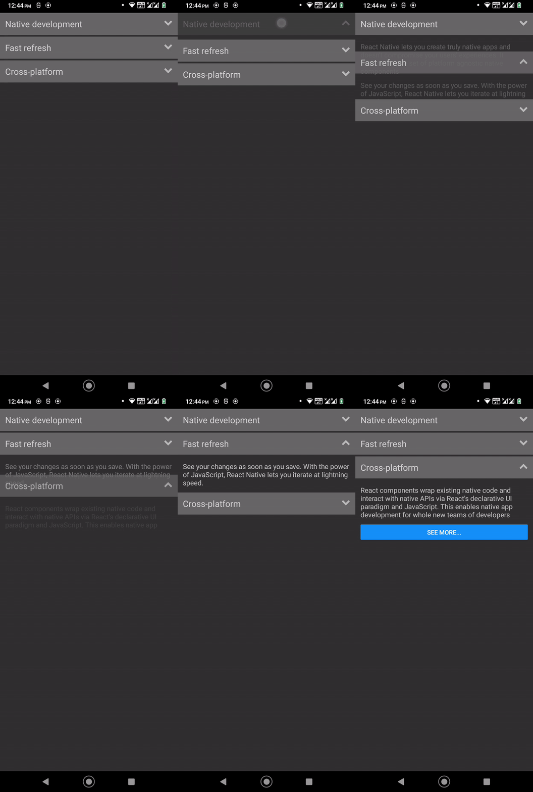
Here, we created an accordion with the pre-developed AccordionList component from the accordion-collapse-react-native library. AccordionList offers a flexible way to use content and header, just like react-native-collapsible‘s Accordion, but it comes with fewer customizability options compared to Accordion. Also, AccordionList doesn’t come with inbuilt animations, so we’ve used LayoutAnimation in the above code.
Run the above code. You will see the same accordion we built earlier, but with an alternative library:
See all supported props from the official documentation.
Some developers use inbuilt React Native framework components and third-party components from various npm packages. For example, earlier, we used react-native-collapsible with its inbuilt components, such as Button, View, etc. Other developers stick to one UI kit, rather than using various components from various npm packages. This second approach brings you the following benefits:
If you use a UI kit that offers a pre-included accordion component, you don’t need to implement an accordion yourself or import one from a third-party package.
Look at the following accordion components that we can import from popular UI kits.
Accordion from MUI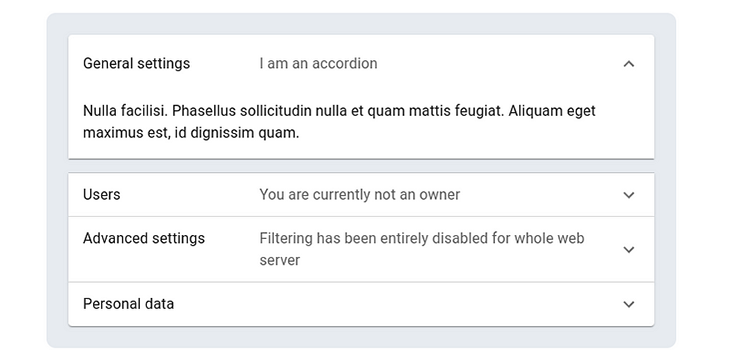
accordion previewReact Native MUI offers the pre-developed Accordion component to add Material Design-based accordions into your apps.
List.Accordion from React Native Paper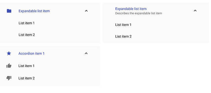
list.accordion previewReact Native Paper offers the List.Accordion component for creating list-based accordions with inbuilt expand/collapse icons.
Accordion from Ant Design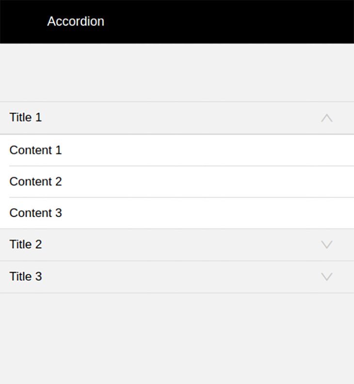
accordion previewAccording to Ant Design’s UX rules, it offers the Accordion component to group, show, and hide complex app areas.
ListItem.Accordion from React Native Elements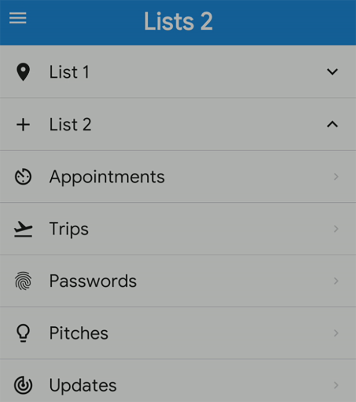
ListItem.Accordion previewReact Native Elements also offer a customizable, pre-developed accordion via the ListItem.Accordion component.
In this tutorial, we’ve discussed the available options for creating accordions in React Native apps. We’ve built accordions from scratch, and used pre-developed accordions from two popular libraries. Also, we’ve discussed available accordion components in popular React Native UI kits.
Like any other development approach, the best accordion development method depends on your design requirements, delivery timeline, and development team’s skills. However, you should always adhere to generally-accepted UI/UX principles while developing accordions, such as using suitable expand/collapse icons, playing smooth minimal animations, and grouping content accordingly.

LogRocket's Galileo AI watches sessions for you and and surfaces the technical and usability issues holding back your React Native apps.
LogRocket also helps you increase conversion rates and product usage by showing you exactly how users are interacting with your app. LogRocket's product analytics features surface the reasons why users don't complete a particular flow or don't adopt a new feature.
Start proactively monitoring your React Native apps — try LogRocket for free.
Hey there, want to help make our blog better?
Join LogRocket’s Content Advisory Board. You’ll help inform the type of content we create and get access to exclusive meetups, social accreditation, and swag.
Sign up now
Not sure if low-code is right for your next project? This guide breaks down when to use it, when to avoid it, and how to make the right call.

Compare Firebase Studio, Lovable, and Replit for AI-powered app building. Find the best tool for your project needs.

Discover how to use Gemini CLI, Google’s new open-source AI agent that brings Gemini directly to your terminal.

This article explores several proven patterns for writing safer, cleaner, and more readable code in React and TypeScript.