The accordion menu, also called an expansion panel, is a feature that allows users to toggle between hiding and displaying content in a UI.

Vertically stacked panels contain the most important information, and when clicking a panel, it expands to reveal more related content, a concept called progressive disclosure.
The accordion menu, which embodies progressive disclosure, provides a clean UI and minimizes scrolling, especially on smaller screens, which is beneficial for mobile devices.
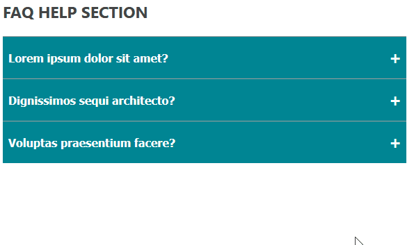
In this tutorial, we will cover how to build an accordion menu in React from scratch by creating a FAQ application. We will create two different accordion types. To start, the option that allows one expansion at a time as seen in the GIF below:
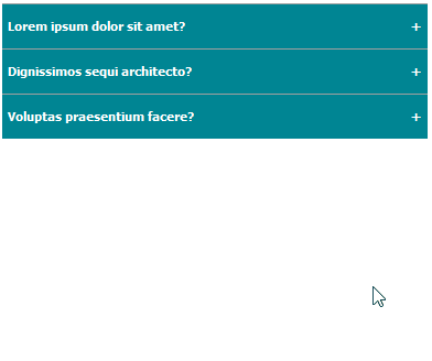
And another that allows multiple expansions as seen below:
Before beginning the tutorial, ensure you have a basic understanding of React and Node.js installed. You can see the final project here.
Now, let’s get started.
Run the following command from the directory you want to save your project to (for instance, cd Desktop):
npx create-react-app react-accordion-menu
Once the project generates, open it with a code editor and run npm start to start the development server.
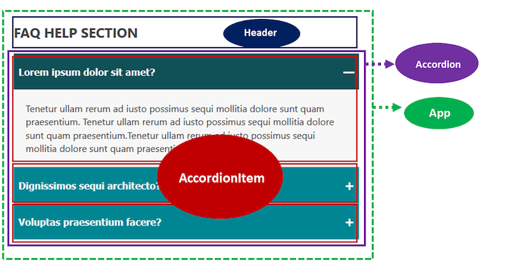
To organize our project, we’ll split the project layout into four independent units called components.
The parent component, App, holds two immediate children components, Header and Accordion. Accordion holds the individual AccordionItem.
Let’s create a file for each component. First, delete all the files in the src folder and create a new index.js file to prevent a page break.
Next, create a folder called components in src and add the following files: App.js, Accordion.js, AccordionItem.js, and Header.js.
Inside App.js, add the following starting code:
const App = () => {
  return (
    <div className="container">
      Header and Accordion here
    </div>
  )
}

export default App
Notice that we included className in the div container to apply CSS styles to elements. So, let’s create an app.css file in the src folder to hold our app CSS styles, copy the CSS styles from here, and add them to the app.css file.
Now, go inside the src/index.js file and render the App component like so:
import React from "react";
import ReactDOM from "react-dom";

import App from "./components/App";
// styles
import "./app.css";

ReactDOM.render(
  <React.StrictMode>
    <App />
  </React.StrictMode>,
  document.getElementById("root")
);
Save all the files and see the App content rendered in the frontend.
The Header component only renders the heading content. So, let’s simply add the following code in the components/Header.js file:
const Header = () => {
  return (
    <h1 className="heading">
      FAQ help section
    </h1>
  )
};

export default Header;
Save the file. Then, import the component in the components/App.js file:
import Header from "./Header";

const App = () => {
  return (
    <div className="container">
      <Header />
    </div>
  );
};

export default App;
Save the file to see the heading text rendered in the frontend.
The Accordion component in the design holds the individual AccordionItem. AccordionItem is a component that holds the heading and the dropdown content.
To create the heading and dropdown content, create a data.js file in the src folder and add the following:
export const faqs = [
  {
    question: "Lorem ipsum dolor sit amet?",
    answer:
      "Tenetur ullam rerum ad iusto possimus sequi mollitia dolore sunt quam praesentium. Tenetur ullam rerum ad iusto possimus sequi mollitia dolore sunt quam praesentium.Tenetur ullam rerum ad iusto possimus sequi mollitia dolore sunt quam praesentium.",
  },
  {
    question: "Dignissimos sequi architecto?",
    answer:
      "Aperiam ab atque incidunt dolores ullam est, earum ipsa recusandae velit cumque. Aperiam ab atque incidunt dolores ullam est, earum ipsa recusandae velit cumque.",
  },
  {
    question: "Voluptas praesentium facere?",
    answer:
      "Blanditiis aliquid adipisci quisquam reiciendis voluptates itaque.",
  },
];
Here, we created an array of objects called faqs. We must loop through this data to display the individual faqs item. Then, save the file.
In React, data flows from the parent component down to the children through props. In this case, we import the data in the Accordion parent component, loop through it, and pass it down to the AccordionItem component.
Open the components/Accordion.js file and add the following code to import the data:
import { faqs } from "../data";
import AccordionItem from "./AccordionItem";

const Accordion = () => {
  return (
    <ul className="accordion">
      {faqs.map((faq, index) => (
        <AccordionItem key={index} faq={faq} />
      ))}
    </ul>
  );
};

export default Accordion;
Now we can access the data in the AccordionItem component via the faq prop.
Next, we must save the file and import the Accordion into the App.js file:
// ...
import Accordion from "./Accordion";

const App = () => {
  return (
    <div className="container">
      {/* ... */}
      <Accordion />
    </div>
  );
};

// ...
In the components/AccordionItem.js file, add the following code to access the question and answer props’ data to use them in our JSX markup:
const AccordionItem = ({ faq }) => {
  const { question, answer } = faq;
  return (
    <li className="accordion_item">
      <button className="button">
        {question}
        <span className="control">—</span>
      </button>
      <div className="answer_wrapper">
        <div className="answer">{answer}</div>
      </div>
    </li>
  );
};

export default AccordionItem;
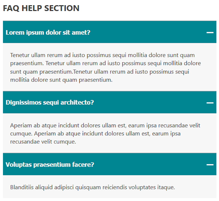
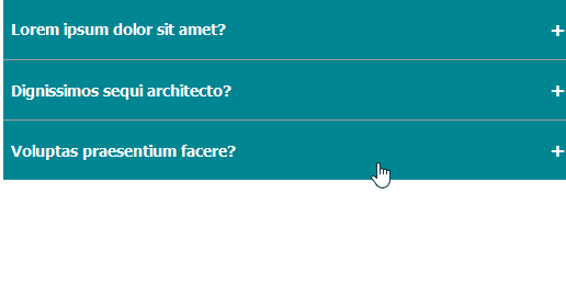
After saving the files again, the app’s FAQ section now looks like this:
Let’s start by implementing the logic that opens one panel at a time.
We can achieve this feature using the AccordionItem‘s index. By grabbing the index of the clicked AccordionItem component, we can define a logic that returns a Boolean value to dynamically toggle the panel. We will also use the value to style the active panel.
In our setup, the Accordion component holds the index values and for that, it can hold the state to manage and handle the click event.
In the components/Accordion.js file, let’s add the useState():
import { useState } from "react";
// ...

const Accordion = () => {

  const [clicked, setClicked] = useState("0");

  return (
    // ...
  );
};

export default Accordion;
In the AccordionItem component, we will add an on-click event to the panel to trigger the toggle. When a user clicks the accordion panel, we must reach out to the component holding the state to update the state value, which then update the logic that dynamically display or hide the accordion panel.
To do this, we must understand how to raise and handle an event in React. We will raise an event from the AccordionItem child component and handles it in the Accordion parent component.
So let’s update the components/AccordionItem.js file to include an onClick and onToggle props:
const AccordionItem = ({ faq, onToggle }) => {
 const { question, answer } = faq;
 return (
  <li className="accordion_item">
   <button className="button" onClick={onToggle}>
    {question}
    <span className="control">—</span>
   </button>
   <div className="answer_wrapper">
    <div className="answer">{answer}</div>
   </div>
  </li>
 );
};

export default AccordionItem;
In the component/Accordion.js file, let’s ensure we pass onToggle prop to <AccordionItem /> and add the handleToggle handler so we have:
// ...
const Accordion = () => {
 const [clicked, setClicked] = useState("0");

 const handleToggle = (index) => {
  if (clicked === index) {
   return setClicked("0");
  }
  setClicked(index);
 };

 return (
  <ul className="accordion">
   {faqs.map((faq, index) => (
    <AccordionItem
     onToggle={() => handleToggle(index)}
     // ...
    />
   ))}
  </ul>
 );
};

export default Accordion;
The handleToggle handler receives the clicked panel’s index and updates the state value. With this, we can detect which panel is active or not by adding an active prop to the AccordionItem instance like so:
<AccordionItem
 onToggle={() => handleToggle(index)}
 active={clicked === index}
 // ...
/>
Save the file. In the components/AccordionItem.js, let’s use the active prop which returns a Boolean value to dynamically add a class name to the active panel and style it.
const AccordionItem = ({ faq, onToggle, active }) => {
 const { question, answer } = faq;
 return (
  <li className={`accordion_item ${active ? "active" : ""}`}>
   <button className="button" onClick={onToggle}>
    {question}
    <span className="control">{active ? "—" : "+"} </span>
   </button>
   <div className={`answer_wrapper ${active ? "open" : ""}`}>
    <div className="answer">{answer}</div>
   </div>
  </li>
 );
};

export default AccordionItem;
If active returns true, we add active class to style the panel and also add open class to reveal the dropdown content.
Now we can update the CSS file to accommodate the dynamic class names. Open the src/app.css file and add the following styles at the bottom:
/* activate toggle */
.accordion_item.active .button {
  background-color: #105057;
}
.answer_wrapper {
  height: 0;
  overflow: hidden;
}
.answer_wrapper.open {
  height: auto;
}
Save all the files, test the application, and it should work.
To make the accordion panel toggle smoothly, we will add a CSS transition property to add a smooth transition effect over a given duration.
Let’s update the .answer_wrapper to include the transition CSS property:
.answer_wrapper {
  /* ... */
  transition: height ease 0.2s;
}
If we save the file and test our project, it will not work unless we change the content height from auto to an explicit value, such as 100px:
.answer_wrapper.open {
  height: 100px;
}
However, this is not practical for dynamic content since using a fixed height may be too big or too small for the content. To rectify this issue, we can use scrollHeight to dynamically set the dropdown content height.
scrollHeightThe DOM scrollHeight property allows us to measure an element’s height based on the amount of content.
In React, we can access the DOM element via the useRef Hook to get its content height.
Open the AccordionItem.js file and import the useRef Hook, like so:
import { useRef } from "react";

const AccordionItem = ({ faq, active, onToggle }) => {
  // ...

  const contentEl = useRef();

  return (
    <li className={`accordion_item ${active ? "active" : ""}`}>
      {/* ... */}
      <div ref={contentEl} className="answer_wrapper">
        <div className="answer">{answer}</div>
      </div>
    </li>
  );
};

// ...
Notice how we pass a ref prop to the target element containing the dropdown content. We’ve also removed the open class name from the dropdown content element. We can now dynamically add the explicit content height using the scrollHeight in the style attribute:
<div
  ref={contentEl}
  className="answer_wrapper"
  style={
    active
      ? { height: contentEl.current.scrollHeight }
      : { height: "0px" }
  }
>
  <div className="answer">{answer}</div>
</div>
After saving the file again, remove this style from the app.css file, since it is now redundant:
.answer_wrapper.open {
  height: auto;
}
Now test the app and see the smooth transition effect when toggling the accordion panel.
For this accordion type, we will simply use the result of toggling a Boolean state value. Here, we don’t have to define any logic using the accordion index as we’ve done with the single expansion.
The components/Accordion.js file will look like so:
import { faqs } from "../data";
import AccordionItem from "./AccordionItem";

const Accordion = () => {
  return (
    <ul className="accordion">
      {faqs.map((faq, index) => (
        <AccordionItem key={index} faq={faq} />
      ))}
    </ul>
  );
};

export default Accordion;
And the components/AccordionItem.js will look like so:
import { useState } from "react";
import { useRef } from "react";

const AccordionItem = ({ faq }) => {

  const [clicked, setClicked] = useState(false);
  const contentEl = useRef();

  const { question, answer } = faq;

  const handleToggle = () => {
    setClicked((prev) => !prev);
  };

  return (
    <li className={`accordion_item ${clicked ? "active" : ""}`}>
      <button className="button" onClick={handleToggle}>
        {question}
        <span className="control">{clicked ? "—" : "+"} </span>
      </button>

      <div
        ref={contentEl}
        className="answer_wrapper"
        style={
          clicked
            ? { height: contentEl.current.scrollHeight }
            : { height: "0px" }
        }
      >
        <div className="answer">{answer}</div>
      </div>
    </li>
  );
};

export default AccordionItem;
Save the files and test your project. You can try it yourself on CodeSandbox.
By learning how to create a smooth transitioning accordion menu, you can now implement it into your own React projects.
If you have any questions or contributions, share them in the comment section. You can find the project source code from this GitHub repository.
Install LogRocket via npm or script tag. LogRocket.init() must be called client-side, not
server-side
$ npm i --save logrocket

// Code:

import LogRocket from 'logrocket';
LogRocket.init('app/id');
// Add to your HTML:

<script src="https://cdn.lr-ingest.com/LogRocket.min.js"></script>
<script>window.LogRocket && window.LogRocket.init('app/id');</script>

Learn how to build smooth staggered animations in CSS using modern features like sibling-index(), complete with practical examples, fallbacks, and accessibility tips.

Compare the top AI development tools and models of July 2026. View updated rankings, feature breakdowns, and find the best fit for you.

Learn how to detect unused and ghost dependencies in JavaScript projects using Knip, a project-level linter that keeps your dependency graph accurate.

Learn how Storybook MCP enables AI agents to understand your component library, generate accurate UI, and validate code using documentation, stories, and automated tests.
Hey there, want to help make our blog better?
Join LogRocket’s Content Advisory Board. You’ll help inform the type of content we create and get access to exclusive meetups, social accreditation, and swag.
Sign up now

 Learn more →
