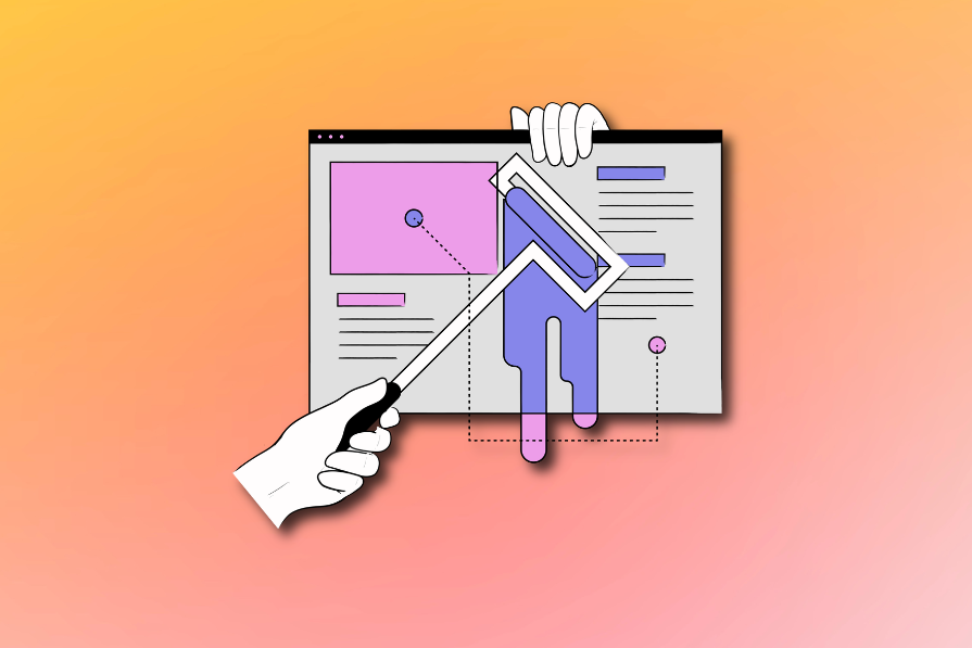
There have been many famous battles and rivalries, both real and fictional, but none have been as longstanding as designers vs. developers — frontend developers in particular.
The designer creates designs using image-based tools like Figma, while the developer turns those designs into functional digital products using code. But problems are bound to arise if the developer’s final product doesn’t quite match the designer’s design. It’s a “what I ordered versus what I got” scenario, and determining who’s to blame for the inconsistencies will be an uphill battle.
The major issue is that designers and developers use different tools, creating a communication gap. We can’t change this, but what if we turned things around and literally started from code instead of design?
This post will explore how a code-to-design workflow can improve collaboration between designers and developers, bridge the gap, and create digital products more aligned with the designer’s specifications.
Before we proceed, let’s remind ourselves how a design-to-code system works to understand its challenges.
The websites you visit and the apps you use start from an idea. Ideation is the first step in creating a new website or application, updating the UI of an existing product, or introducing a new feature. During this phase, ideas are generated, and the key benefits are identified.
At this point, further research is needed to determine and validate the idea’s relevance. Then, the designers create mockups and prototypes of the final digital product.
Developers receive the designs and are tasked with creating real digital products. This process, called the design handoff, is not always straightforward. It can be stressful and frustrating — for both UX designers and developers.
Designers and developers are supposed to collaborate during handoffs, but the major drawback of a design-to-code UX workflow is the “language” barrier.
As we’ve established, designers use image-based tools while developers use code. Developers may misinterpret details in the designs, leading to inconsistencies.
Translating a Figma design can be challenging due to technical constraints. While it’s easy to let the creative juices flow, designers need to understand the abilities of the developers who will bring the product to life. Some of their design choices may not be feasible.
Design handoffs often require extensive back-and-forth between designers and developers to ensure the final product is error-free. This can be a time-consuming process, slowing down the workflow and negatively impacting the time to market.
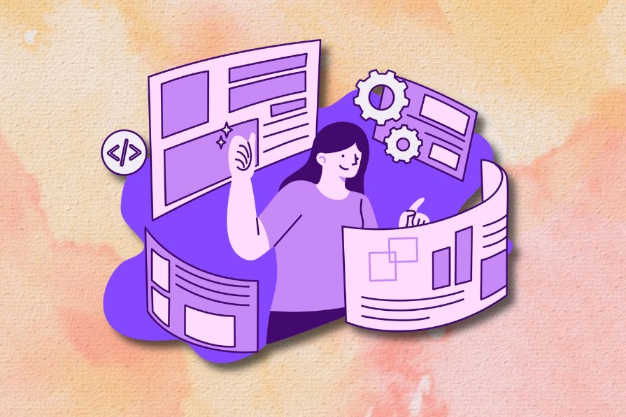
The code-to-design UX workflow reverses the traditional process. Developers build the UI components with frontend technologies/frameworks. The designers then use the coded components to create the mockup of the digital product instead of manually drawing each UI element.
Designers can build prototypes with the same functionality as the final product. This means the prototypes will have animations, responsive elements, states, and interactions like the real product.
This workflow works well for teams using a component-based design system, where websites and applications are built by assembling reusable UI components.
Developers can use the same components across multiple pages without repeating code when working within a component-based architecture. React, Vue, and Angular are frontend frameworks supporting this design system. Having a well-defined design system makes it easy to build and maintain UI components, which speeds up production.
Like creating different items with Lego bricks, developers don’t need to style each page on the website or application independently. Instead, each page consists of UI building blocks that can be disassembled and reassembled to create entirely new pages.
In a code-to-design workflow, the developers create all the building blocks (components) for the designers. The designers can create different combinations (design layouts) using the pre-made blocks. After getting the stakeholders’ approval, the designers pass the designs back to the developers. Finally, the developers use the components to build the final product, and everyone is happy.
This ensures consistency and reduces repetitive or redundant work, enhancing and streamlining the collaboration between designers and developers.
Switching to a code-to-design workflow has several benefits for designers and developers. They include:
In a traditional design-to-code system, teams have to manage multiple sources of truth. Designers manage their files on Figma, Adobe, Sketch, etc., while developers manage the codebase. There’s also documentation and the actual live product.
Any updates would trigger another round of prototyping, testing, handoffs, and coding. If not well-maintained, these separate sources of truth can drift apart, becoming misaligned and having inconsistencies.
A code-to-design system provides a single source of truth for designers and developers. Everyone has to work with the same components.
Both teams work with the same UI components, so the design handoffs shouldn’t involve much back-and-forth because the designs would need minor adjustments. A code-to-design workflow will reduce miscommunication and improve collaboration between designers and developers.
Prototypes will have the same level of functionality as the final digital product, meaning usability tests will be more accurate. Developers will understand the prototypes better and be able to provide more meaningful insights to the designers.
Designers won’t create UI components from scratch, so they generate mock-ups faster. Likewise, developers won’t manually translate static designs into code. This will speed up the workflow and lead to a faster time to market.
Consistency between the designs and the final product is arguably the “bone of contention” causing the rift between designers and developers.
With a code-to-design system, designers are not limited by technical constraints. Designers will have everything they need to design “buildable” products. You’ll be working with components that look exactly like the real product.
Working with “real” coded components means buttons, spacing, animations, typography, and every other UI component and their variants will be consistent across the designs and final product.
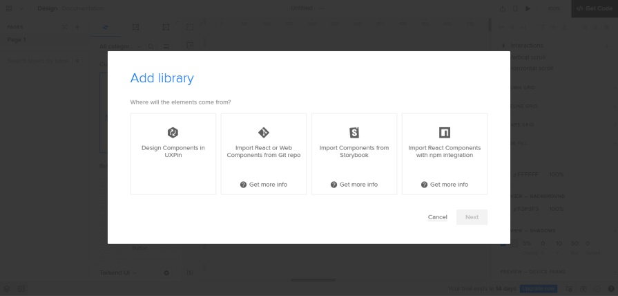
Design tools like Figma have several plugins that convert designs into code for developers. There are even fewer tools available that can do the opposite, and we’ll explore them in this section.
UXPin Merge provides “one environment for designers and devs” to work with a single source of truth. A source of truth is a single reference point containing all the components the designers and developers will pull from when working on a project.
UXPin Merge features an intuitive drag-and-drop design environment where the designers can modify the coded components and create their designs:
All adjustments will behave like the real product. Handoffs are seamless because developers don’t manually recreate the mockups; they can just copy the code and build the product.
This tool lets you import React and web components from Git repositories and StoryBook or paste in code for custom components. You can also use code components from frontend frameworks like Vue, Angular, and more.
You can also sync the design tool with the developer tools, that’s Git or Storybook, so any changes are automatically updated across the project. This will save teams time by eliminating the manual labor of maintaining the UI kit and codebase separately.
PayPal is a notable company that uses UXPin Merge for product design and development. They noted that a code-to-design workflow was “over six times faster” than image-based design methods.
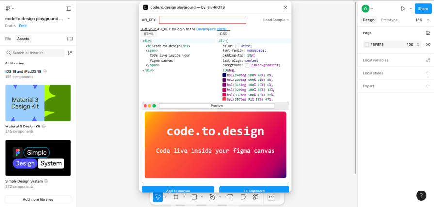
The code.to.design API by <div>RIOTS lets you convert HTML, CSS, and JavaScript code snippets into editable Figma designs.
It has two modes, Clipboard and Plugin. In clipboard mode, the API converts code into clipboard data you can paste into a Figma canvas. In plugin mode, the API transforms code into Figma data you can directly use in a Figma canvas.
This API powers two other code-to-design tools created by <div>RIOTS, story.to.design and html.to.design.
Story.to.design is a Figma plugin that generates and maintains a Figma library with UI components from the code in your Storybook stories.
After installing story.to.design, copy your story’s URL from Storybook, paste it into the plugin, select the components and variants, and click “Import.”
It allows designers and developers to align their designs and codes by keeping the Figma UI kit in sync with the codebase. Any changes to the components will automatically update Figma.
This plugin is also compatible with Histoire, another component-based development tool. While Storybook is widely used across frontend frameworks like React, Vue, Angular, and more, Histoire only works with Vue and Svelte.
The html.to.design plugin allows you to import HTML elements from an existing website into Figma. Thus, you can extract fully editable designs without building each UI component from scratch.
It works like the story.to.design plugin. You copy a website’s URL, paste it into the plugin, click “Import,” and it does the rest.
With html.to.design, you can use other websites as design inspiration, redesign old sites, compare sites with designs, import web components to use as a base for a new design, experiment with visual accessibility, and more.
Miscommunication is one of the flaws of a design-to-code system due to the language barrier between designers and developers. Switching to a code-to-design workflow, however, has the major benefit of bridging this communication gap.
Design comes in two packages — UI and UX. Code-to-design makes it easier to manage the UI side of things, allowing you to put more effort into UX.
A UX designer’s tasks include research, organizing content, creating prototypes, and conducting usability testing. All of these to create seamless user experiences. And implementing a code-to-design workflow will make the job easier.
The concept of teams using a code-to-design UX workflow has existed since around 2021 but hasn’t caught on. One of the benefits of this method is the lack of manual labor for designers. You’ll be given everything you need to create designs.
Code-to-design removes constraints that would typically hold back designers in a traditional system. As a designer working on a product using design-to-code, you must work within available technical constraints to ensure your designs are buildable.
You could argue that code-to-design is just as rigid, and you would have a point. That’s why it’s best for teams working within a component-based architecture with a stable and well-defined design system. A code-to-design system is easy to scale and maintain, and the designs are realistic from the start. There’s only so much code that designers can do, so why shouldn’t designers work with the same constraints?
In a code-to-design system, designers work with ready-to-use UI components that look and work exactly like the real product. You can create high-fidelity prototypes and have smoother handoffs. Since the developers are already familiar with the components in the designs, production is faster, and the chances of inconsistencies in the final product are greatly reduced.
Who says designers and developers can’t live happily ever after?

LogRocket's Galileo AI watches sessions and understands user feedback for you, automating the most time-intensive parts of your job and giving you more time to focus on great design.
See how design choices, interactions, and issues affect your users — get a demo of LogRocket today.
Inclusive design is evolving beyond accessibility alone. This guide explains how UX designers can create more inclusive products through usability, accessibility, neurodiverse UX, adaptive personalization, multimodal design, and culturally aware product experiences.

I was working with an intern on a UX research project, and before we even started, we both had private […]

AI has accelerated design execution, but speed can come at the expense of intentionality. Learn how UX teams can preserve product thinking and judgment.
UX testing is not limited to layouts, copy, and visual design. Full-stack and server-side experiments help teams evaluate how backend logic, APIs, algorithms, and product flows affect the overall user experience.

 Learn more →
