Editor’s note: This article was updated by Oscar Jite-Orimiono on 2 December 2024 to provide actionable best practices for website footer UX, updated and annotated examples of effective footer designs, advice regarding how to improve less effective footers, answers to common questions about website footers, and more.
A website’s footer is the very last section at the bottom of a web page, and it’s often overlooked. A well-designed footer can make a big difference in shaping user experiences, boosting conversion rates, and enhancing SEO.
The footer is like the credits at the end of a movie — it contains important information that isn’t necessarily part of the main content. For example, it might include the name of the site’s owner, copyright information, social proof, contact information, social media links, and links to other pages of the website.
In addition to helping users find what they need on your website, footers are helpful in driving conversions. The footer is a very good place to add a call-to-action since it’s very likely to be the last thing visitors see on your site.
Footers also boost SEO by providing links to key pages on your site. This improves crawlability for search engines to find, index, and understand the relationship between pages on your site.
In this article, we’ll explore tips and best practices for optimizing your website footer UX, and considerations for mobile and responsive footers. By the end, you’ll have everything you need to know to create a footer to enhance the user experience of your website.
Many designers will want to focus on the header/hero section of a website. This is understandable because you only have a few seconds to “trap” a user — you want to give them reasons to stay.
Likewise, you don’t want users to leave your site immediately after they scroll to the bottom. The footer is a chance to offer more to your visitors. A well-designed website footer can:
The content of a footer can vary depending on the website’s purpose and design choice. While there’s no standard lineup, some common, essential elements often included in website footers are contact information, navigation, legal notices, and call-to-action buttons.
Including contact information in the footer provides customers with a convenient way to reach a business. Users may feel frustrated and move on from a business if they can’t find contact information, so it’s crucial to present it correctly or include an accessible link to a contact page.
Here’s a screenshot of a website footer from Figma:
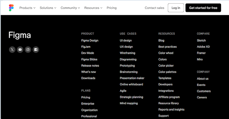
Social media links are one of the most common forms of contact information. With over five billion social media users in the world today, this is not a surprise. Figma includes links to X (formerly Twitter), YouTube, Instagram, and Facebook as their primary contacts.
Some websites are content with providing only social media links, but others go further by providing a physical address and phone number. You can barely find email addresses in footers nowadays, but they remain a very valid form of communication and can be included.
LogRocket’s footer contains an address, number, and social media links, highlighted in the screenshot below. There’s also a link to a dedicated Contact Us page:
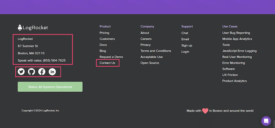
Whether it’s a number, address, or social media links, having contact information in a website footer can help businesses build stronger relationships with customers, and increase the likelihood of them doing business with them.
Footers often contain secondary navigation to help users quickly find information they might need. Think about this section as a store directory in a mall. Users can come here to discover and explore more options on the site and decide where they want to go.
Including secondary navigation in the website footer is particularly useful for sites without a sticky navbar. Users don’t have to scroll back to the top to access the main menu.
Navigation links in the footer can contain the same links from the main navigation menu plus related or relevant links, such as to a career page, about page, support, or a blog:

Some footers have a link to a sitemap, containing every link on the website:

Other footers have even more extensive navigation, essentially serving as sitemaps themselves. Here’s an example from Slack:
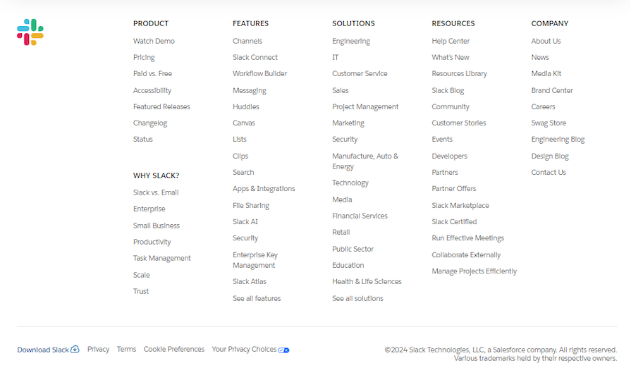
Including navigation in the website footer encourages users to stay and explore the site instead of leaving immediately. Users can find additional links they won’t find on the main navigation menu.
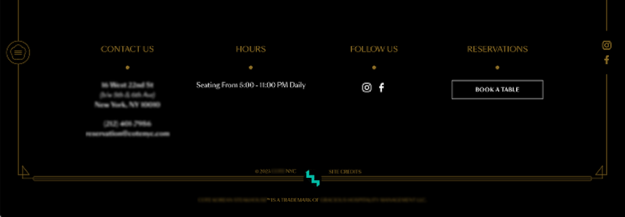
A call to action (CTA) is a button or link that encourages users to take a specific action, such as signing up for a newsletter, downloading an app, or reserving a table:
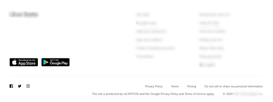
Make your CTA stand out by highlighting it in a different color or styling it differently so that users notice it and take action. This CTA button example is styled as a button, helping it stand out from the other information in the footer:
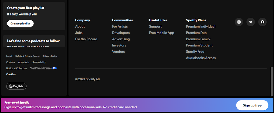
You could also put a CTA on a sticky footer that doesn’t leave the bottom of the page. Here’s an example from Spotify:
Having CTAs in the footer helps to increase conversions in a sales funnel before users leave the website.
If you collect personal information from users, include links to essential legal documents like the privacy policy, cookie preferences, terms of service, and similar policies in the website footer. This is to ensure regulatory compliance and provide transparency to the users.
You can include them in the navigation, like in this footer from Dropbox:
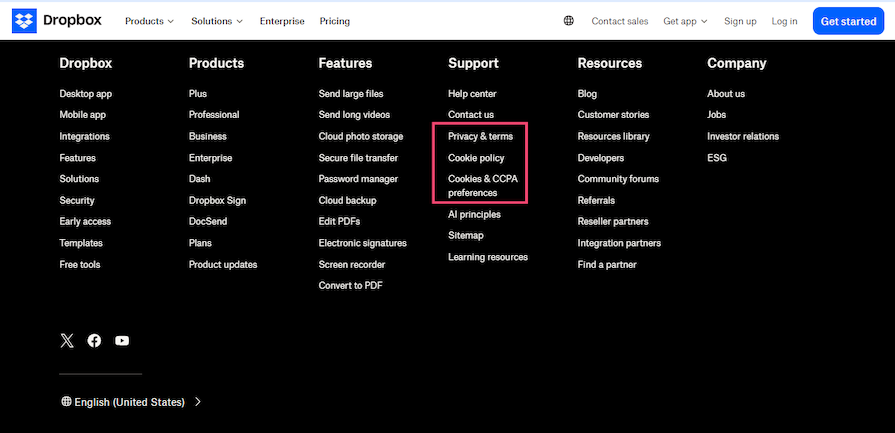
However, these links are usually separated from the navigation and contact information — most likely to maintain clarity, as looking for this info is not a priority for most users.

A copyright notice is a common website footer item that indicates ownership of a site, its content, and how it should be used. While it can be considered a legal notice, it’s common practice to have a copyright notice separate from other elements. Here’s LogRocket’s:

If you use logos or symbols from other companies, it’s a good idea to mention that in your copyright notice. Here’s how Slack does it:

Now that we’ve covered what goes into your footer, let’s explore some design best practices to follow that’ll help you create a footer that is functional and visually appealing to your users.
Your website’s footer is a great place to showcase your brand and increase brand awareness. Brand awareness is about how much people recognize and remember your brand.
With many footers being so monochrome these days, incorporate your logo, brand colors, and messaging in the footer to create a more cohesive look and feel throughout your website that helps your brand stand out.
Grouping your content into columns creates a more organized footer for easy navigation. This can help you fit more information into your footer without it becoming cluttered or overwhelming for users.
Card sorting can be a useful activity to identify how users categorize the different links into groups and what labels they use to identify them.
Headers should be used to label and divide your footer into different sections. A larger font size or different color will create a distinct visual hierarchy and make it easy for users to scan through the footer quickly.
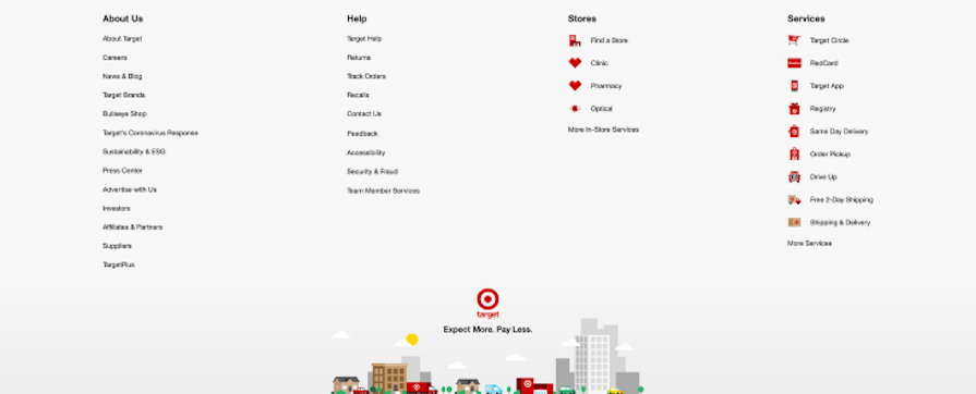
Using white space effectively can create a clean and spacious design that is easier for users to read and navigate. You can separate different sections in a footer and highlight important information with white space, like in Target’s website footer:
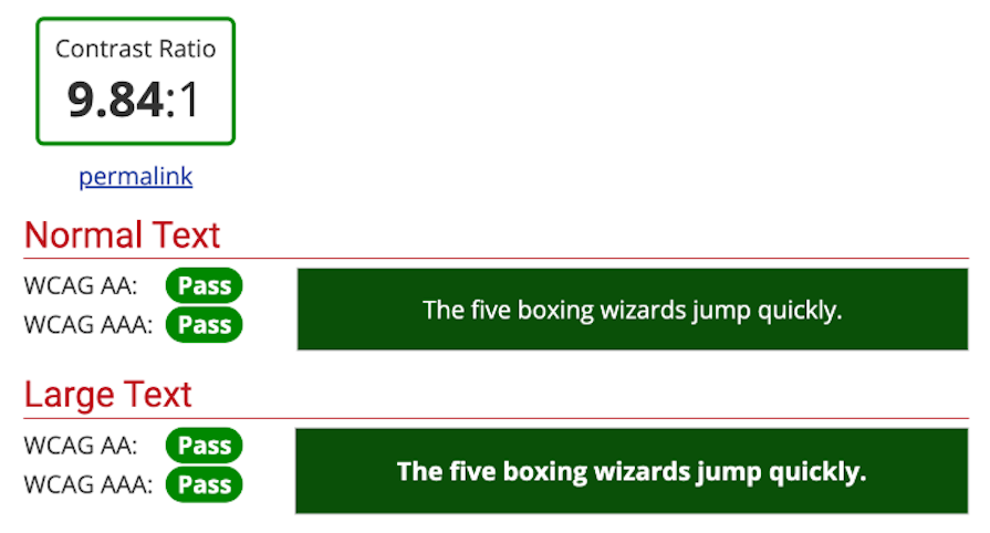
Contrasting colors can create an accessible and visually appealing footer that draws users’ attention to important information. Aim to use contrasting colors that meet WCAG standards, which require a color contrast ratio of at least 4.5:1 for normal text and 3:1 for large text:
Avoid using too much white space; while some is good, too much can make your footer feel empty or unfinished. It also forces the user’s eyes to travel longer distances when scanning the page, making it harder for them to find what they’re looking for.
Choose your color combinations carefully. As mentioned above, contrasting colors can enhance readability and help direct user attention. However, too many contrasting colors in your footer may look overwhelming and distract users from important information.
Weigh the pros and cons of the various colors you use, and aim for a balance between visually striking and aesthetically pleasing. Our guides to clashing colors, analogous color schemes, and color psychology may be helpful.
Don’t use small font sizes or tightly packed text, and definitely don’t use both together. It will be too difficult for users to read the information in the footer if the text is too small or crowded.
Laying out your text correctly is especially important if your typography anatomy includes serifs or long ascenders or descenders. You may need to adjust the kerning to enhance readability for your website footer content.
Now that we know the dos and don’ts of effective footer design, let’s compare examples of well-designed footers and those slightly off the mark.
Here’s a screenshot of Apple’s footer:
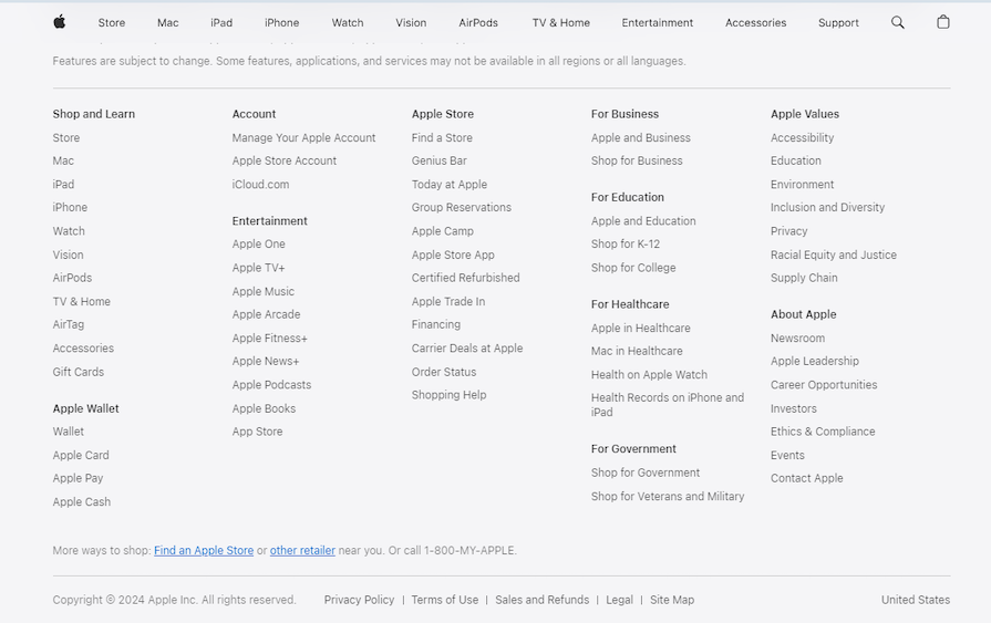
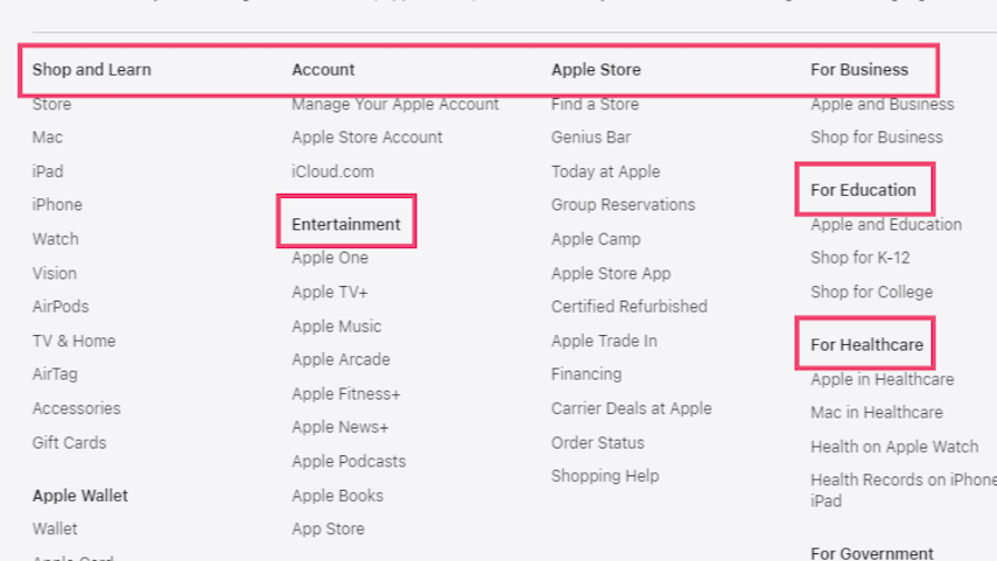
In Apple’s footer, the navigation links are legible despite the small font size due to the consistent typeface and good use of whitespace. The headers stand out without bold formatting because their darker color establishes a clear visual hierarchy:
Meanwhile, here’s the footer from Open AI:
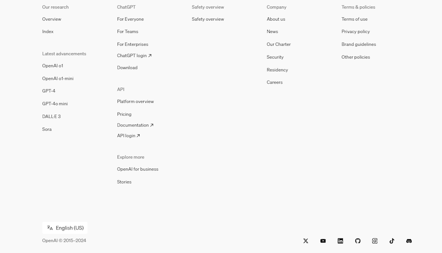
The Open AI site has the same minimalist aesthetic as Apple’s, but its footer isn’t as good. First, it did the opposite with its navigation headers by going lighter, but this means there’s not enough contrast with the links. This could’ve been fixed if they, at least, used the same color as their social media links for the headers.
The second thing that can be fixed is the spacing:
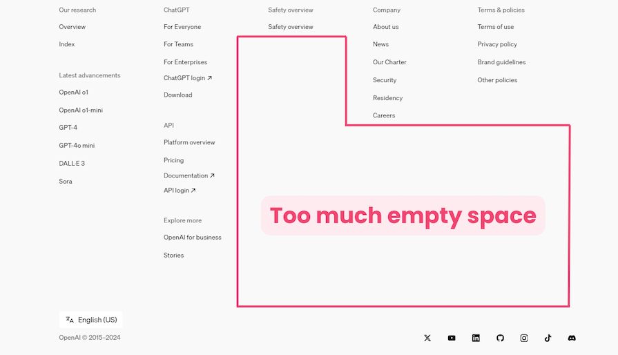
The links could be a little closer because of the small font size, but it’s only an issue because of other factors. Also, the sections can be rearranged to use the space effectively. There’s a column with three link groups and a column with only one (with one link).
Here’s a reimagined OpenAI footer that addresses the issues with the original footer:
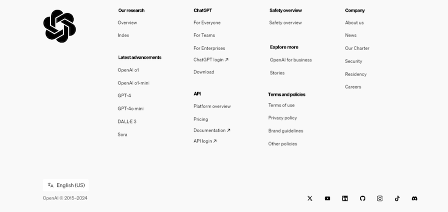
First, the headers now contrast well with the links. OpenAI uses the Inter font for its typeface, which is a thin font, so the bold format is needed to make it stand out. The link groups have been rearranged, reducing the number of columns. Finally, the OpenAI logo is added to tie everything together and cover the excess space.
ZARA’s footer looks like the webpage stopped loading prematurely. Have a look for yourself:
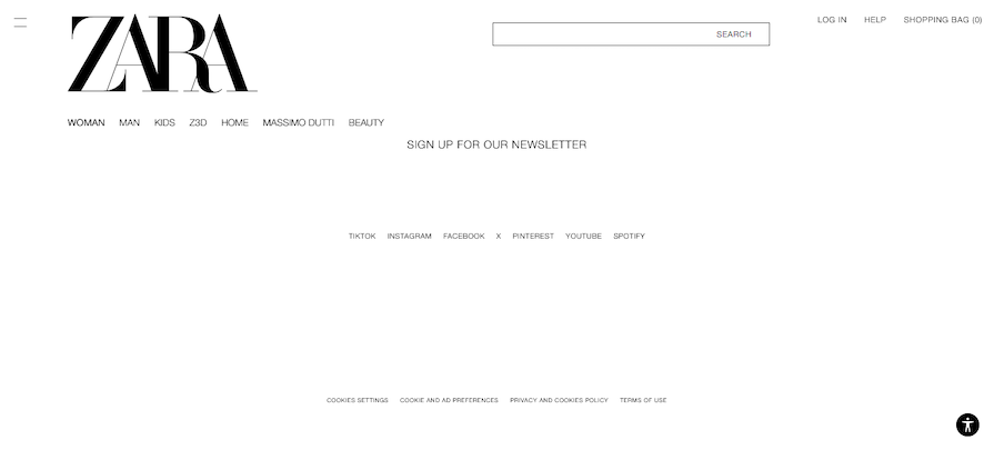
Where do we start? The CTA is not highlighted, the font size is too small for the blinding white background, social media links are spelled out in Zara’s font instead of each platform’s official typeface (making them harder to recognize), and the white space is overwhelming.
To contrast, here’s H&M’s footer:
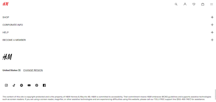
Yes, there’s extensive white space, but everything is aligned to the left side of the webpage, so it still works — the user’s eyes will remain fixed towards the left and won’t have to travel long distances. The social media links in the H&M footer are more recognizable than the text in Zara’s footer.
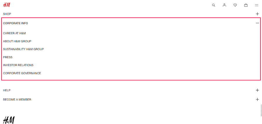
The H&M footer also uses accordions to reveal more navigation:
Here’s a reimagined and more effective ZARA footer:
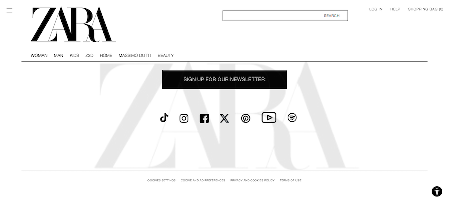
The CTA is now highlighted so users can’t miss it. There are horizontal rules to separate the main navigation from the footer and break up the whitespace. The social media links have been replaced with their icons, and, finally, the ZARA logo has been added to the footer as a watermark.
All these changes were made while maintaining the existing monochrome aesthetic.
Here’s a screenshot of the footer from Hulu’s site:
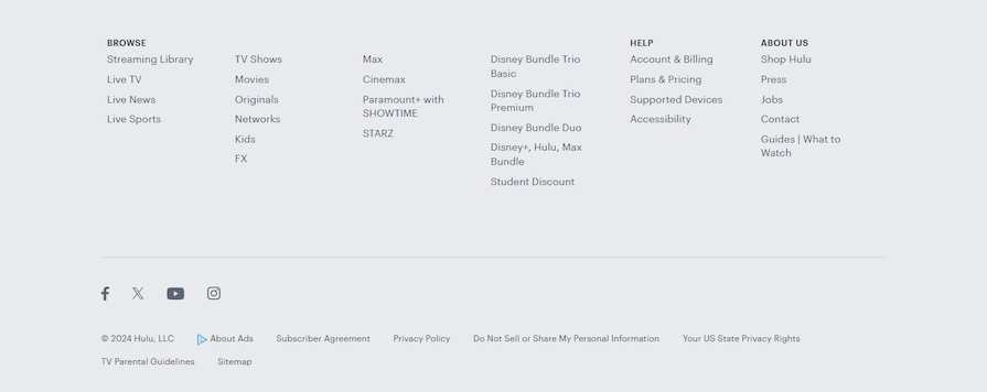
In this footer, not every column has a heading, but the links are all related, so it’s not confusing. There’s good spacing and the user can find the social links and legal information at the bottom. It could have a CTA because it’s a streaming service, but it remains an effective footer.
Now, here’s the Netflix website footer:
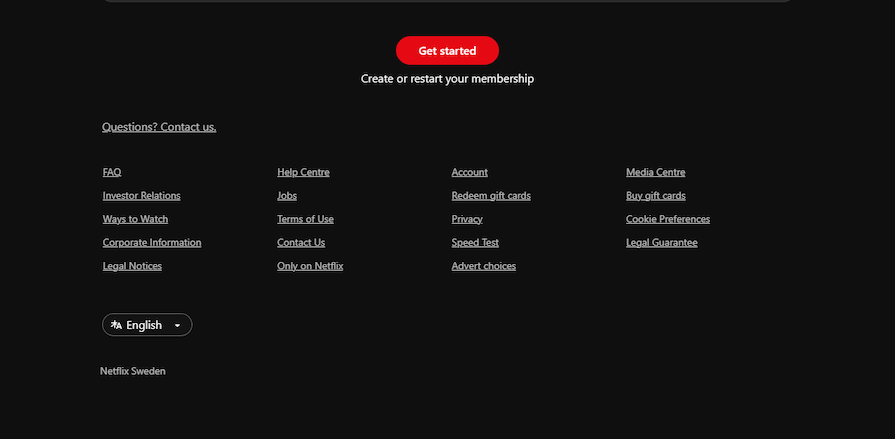
It has some good features, like a clear CTA and good spacing. However, this footer is missing some common elements, like headings and a copyright notice.
The main reason the Netflix footer is not as effective as the Hulu footer is the arrangement of the navigation links. They seem to be thrown together randomly. It also seems the intention was for users to scan left-to-right instead of reading top-to-bottom.
Maybe headings can be left out, but the footer would be more effective if related links were grouped. For example, the links to legal documents, Corporate Information, Terms of Use, Privacy, Legal Guarantee, and Legal Notices can be together in one column. Cookie Preferences and Advert Choices can be on a footnote alongside a copyright notice across the bottom of the page as is common practice.
There are also two contact links leading to the same page:
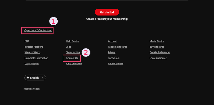
The first one could be replaced with a logo, or social media links if there’s one available for that country.
Many users will access your website from their mobile devices, so your website must be designed responsively. Responsive design enables your website’s content to be displayed flexibly depending on the size and orientation of the mobile screen.
One of the biggest mobile design challenges is fitting all the content into a smaller space without making it too cluttered or hard to read. This can be particularly tricky if you have a lot of links and contact information in your footer. Let’s go through some considerations to keep in mind when designing mobile footers.
To make sure that your footer is easy to navigate on mobile devices, you may want to consider reducing the overall number of links displayed. Think about what your users are looking for as they use your website on a mobile device.
An example of this is Amazon’s mobile website, which greatly reduces the number of links provided in their footer, as opposed to their desktop site:
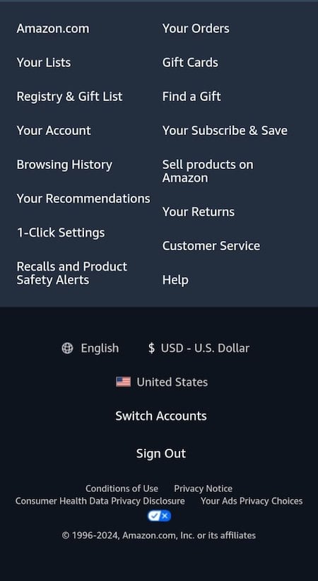
A strategy for responsive mobile footer design is stacking your content vertically instead of using columns side-by-side. Users naturally scroll vertically through a webpage on mobile, so this way, users can easily navigate through the content easily:
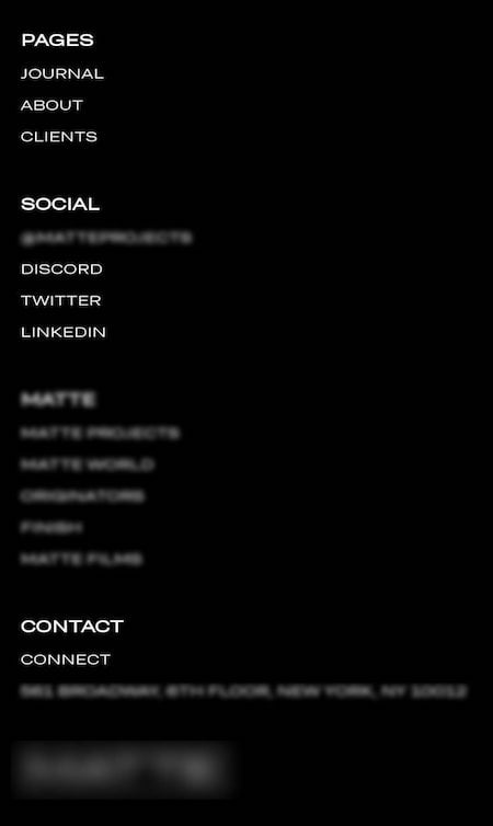
Another approach to responsive mobile footer design is to use accordions, which allow users to expand and collapse different sections of your footer content.
This is a great option if you have a lot of links that you need to include because it allows users to access this information without taking up too much screen space all at once:
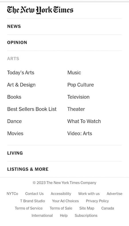
As you design your footer, it’s important to keep in mind the size of the content on mobile devices. You’ll need to make sure that everything fits on the screen without being too small to read.
This may mean that you need to edit down your content or use a smaller font size. However, keep accessibility guidelines in mind, and keep your minimum font size at least 16px for mobile websites.
A/B testing your footer can provide valuable insights into user behavior and help you identify opportunities for improving the UX. By creating multiple versions of your footer and measuring engagement metrics, such as click-through rates, time on page, and bounce rates, you can determine which design and content elements are most effective.
To conduct an A/B test:
For example, if your A/B test reveals that users are more likely to click on links in a specific location, consider incorporating that layout into your final design. Similarly, if your test shows that users respond well to a particular CTA, try incorporating that language into other areas of your website to increase conversions.
Continually testing and refining your footer design can help you tailor your UX to your users’ preferences and encourage greater engagement with your brand. Remember to keep your goals and objectives in mind throughout the testing process to ensure that you are creating a footer that aligns with your overall website strategy.
Footer design varies across different industries. Some are taller than the viewport, others are more like footnotes. Some footers are minimalist while others are colorful and full of content.
No matter how you approach your design process, there has to be a balance between aesthetics and functionality. In this section, we’ll look at a curated selection of exemplary footers to inspire you.
Dizzie is a zero-waste online shop that makes deliveries using reusable packaging:
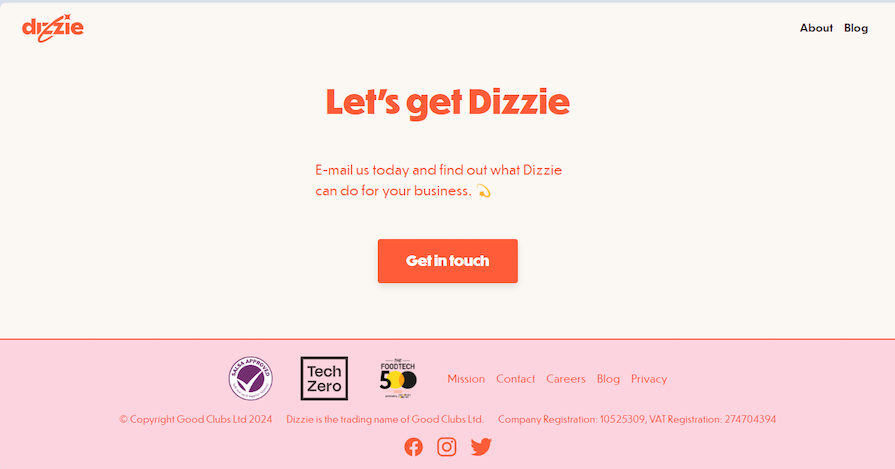
Dizzie’s footer showcases its brand identity well through the colors and typography. There’s a prominent and well-placed CTA that’s sure to grab users’ attention. Its certifications/memberships from relevant bodies are highlighted in the footer alongside the navigation.
There’s good spacing between the items, everything stands out clearly. Overall, it’s a sleek and clean design that does its job efficiently.
The National Park Foundation (NPF) is a charity that supports parks through conservation, preservation, education, and community engagement:
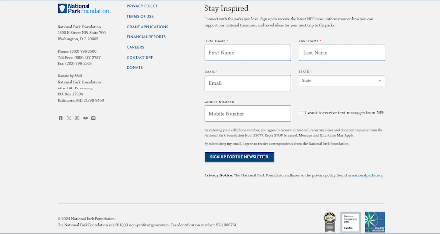
Their footer has something you don’t see every day — a form. There are many different elements in the footer, but it’s not cluttered. The spacing is great, and the colors and typography used are even better. Relevant awards and certifications are included at the bottom. There’s a prominent CTA to sign up for their newsletter.
Adobe is known for its PDF reader and digital editing tools, like Photoshop:
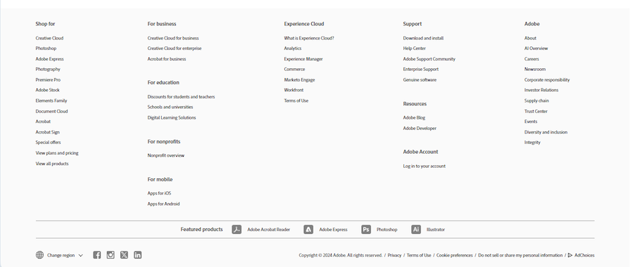
This footer shows that small font sizes can be legible with a good design. The whitespace and background around the navigation are not overwhelming. A clear visual hierarchy is established between the headings and links with good spacing and a slightly bigger font. The featured products and social media links are distinct and accessible.
AliExpress is a Chinese ecommerce site. Its UI is almost as chaotic as the item descriptions, but surprisingly, they have a well-organized footer:
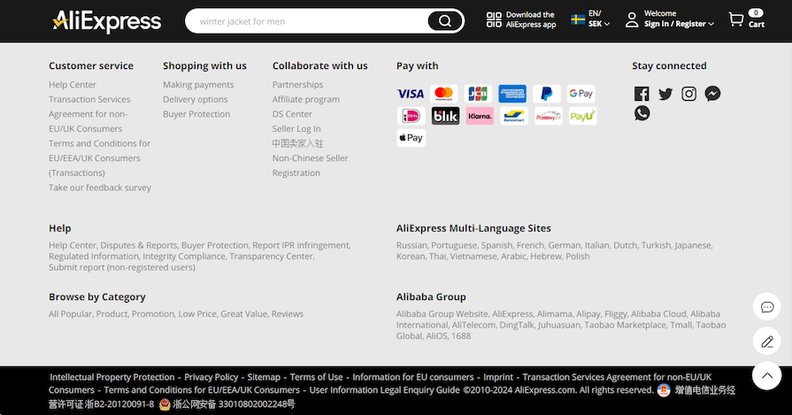
There’s a good contrast between the background and the text. The spacing is great and there’s a clear visual hierarchy. It manages to organize lots of elements without cluttering the space.
Coca-Cola needs no introduction. Here’s the footer from Coca-Cola’s website:
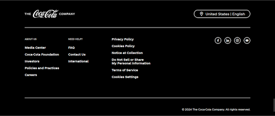
Remember the Netflix footer? This is how they could’ve organized their legal links: all in one column.
Blizzard is a company that develops and publishes video games. This is their footer:
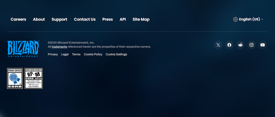
Here, there are links to key pages, including a site map. The logo is well-placed alongside the copyright notice and links to legal documents. Certifications are included just below and the social links are distinct.
The WHO is a specialized United Nations agency responsible for global public health. Let’s have a look at their website footer:
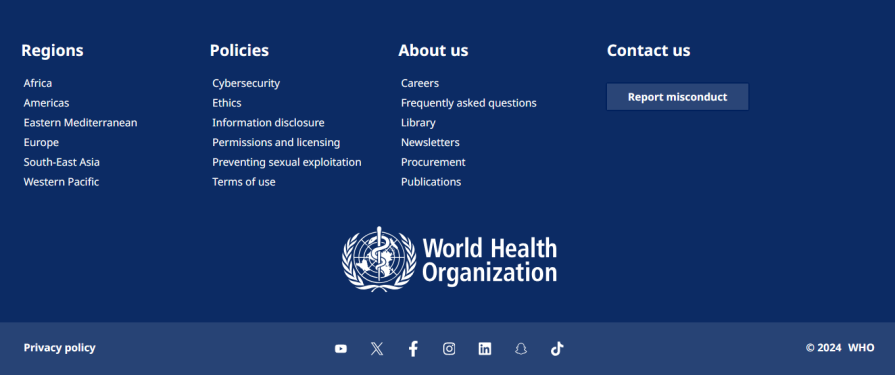
The navigation is divided into columns with bold headings. The WHO logo is featured prominently below the navigation. A footnote contains a privacy policy link, the social media links, and the copyright notice.
Overall, it’s a clean and functional footer with a minimalist design.
Lego is a toy company primarily known for its popular building blocks. Here’s the footer from their website:
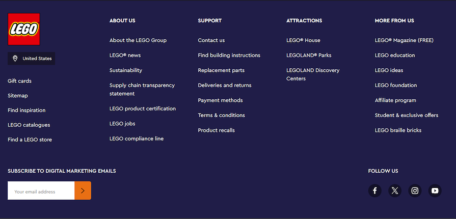
There’s a lot to like about this footer. First, it covers the viewport which creates an immersive experience. Most footers tend to have centralized content.
The colorful logo and text look great against the background, the headings are clear, there’s good spacing between the navigation columns, the social links are well-placed, and the CTA is distinct.
Tailwind is a utility-first CSS framework that helps you build web components. This is the footer from their website:
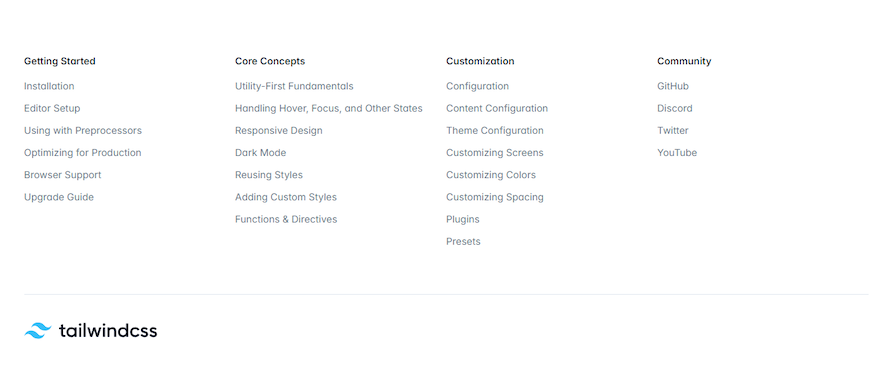
It’s a simple but effective footer. The typeface is legible despite the bright background. There’s a clear visual hierarchy in the navigation between the headers and the links. The horizontal rule just above the Tailwind CSS logo might not seem like much, but it helps break up the white space.
A website’s footer is often the last thing visitors see before leaving a site, which means it’s in a unique position to deliver a great user experience. Footers should be designed to catch visitors’ attention and encourage further engagement with the website.
An effective footer should include contact details like physical addresses, phone numbers, and social media links. You should also provide essential information like links to legal documents to maintain transparency and regulatory compliance.
All these won’t matter without providing good navigation. Ensure there is a clear visual hierarchy and use white space to divide sections for better visibility. Proper navigation can also boost SEO.
To create an engaging website footer, designers should follow best practices such as using white space, contrasting colors, and grouping content. It’s also important to ensure that the footer is responsive on mobile devices, which may involve scaling down the number of links, rearranging columns, and incorporating expandable and collapsible sections.
A footer is an opportunity to promote your brand and raise awareness. Be sure to use consistent colors and typography to enforce your brand identity.
Well-designed footers that enhance user experiences and can significantly impact the success of a website. So, don’t overlook the importance of your website’s footer — give it the attention it deserves and watch your website thrive.
Header image source: IconScout
LogRocket's Galileo AI watches sessions and understands user feedback for you, automating the most time-intensive parts of your job and giving you more time to focus on great design.
See how design choices, interactions, and issues affect your users — get a demo of LogRocket today.

Zero UI works well for screenless, voice-first experiences, but most digital products still require visual interaction. Here’s why multimodal UX offers a more scalable foundation for the future of design.

Multimodal UX goes beyond designing for screens. Learn how context-aware systems, progressive modality, failover modes, and accessibility-first design create better digital product experiences.
Learn how context-aware mode prioritization and seamless transitions improve multimodal UX and reduce mode confusion.

Research is becoming more democratized, product cycles are accelerating, and AI is transforming synthesis and ResearchOps. Here are the three trends shaping UX research in 2026.