UX testing is not limited to layouts, copy, and visual design. Full-stack and server-side experiments help teams evaluate how backend logic, APIs, algorithms, and product flows affect the overall user experience.
In A/B, A/B/n, or multivariate testing scenarios, using p-value with traditional null-hypothesis-based statistical analysis is so common, and most designers […]

Traditional A/B testing splits traffic evenly, but multi-armed bandits dynamically send more users to the better-performing version. Here’s how the method works, where it helps, and when UX teams should use it over classic A/B testing.
AI agent simulations promise faster, lower-risk UX testing by replacing real users with AI-simulated personas. Here’s how the method works, where it falls short, and when designers should rely on simulated users versus real user testing.
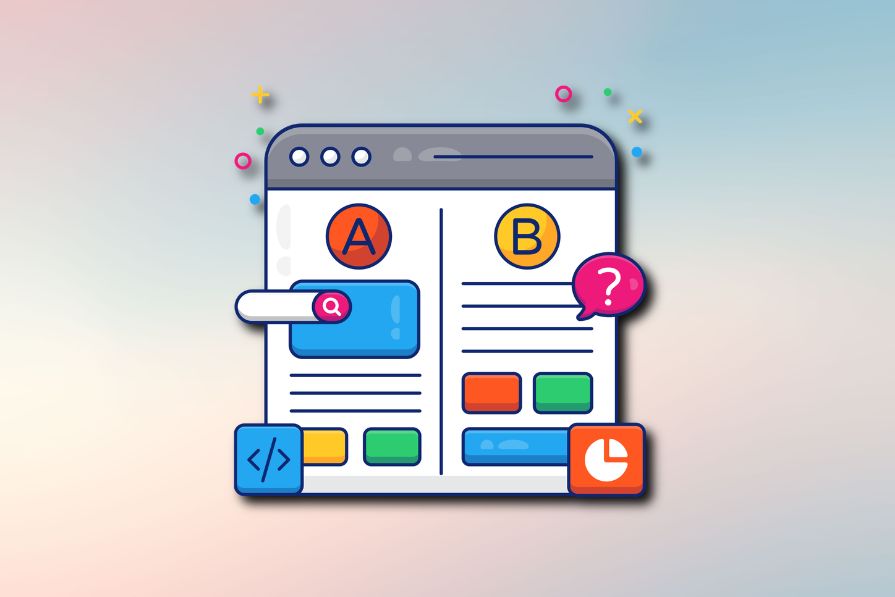
A/B testing is great for comparing two versions of a design, but multivariate testing helps teams evaluate multiple design element combinations at once. Here’s how both methods work, how they differ, and when UX teams should use each one.

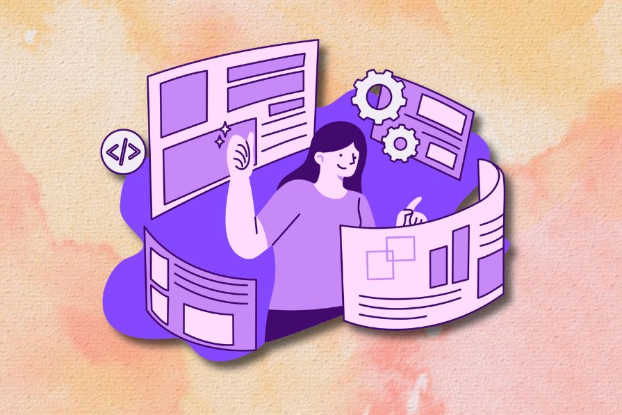
Design engineering has always lived between design and code. But with AI tools turning prompts into interfaces and code into editable canvases, that bridge is becoming a new way of building.
A three-week mobile banking project taught me that the “proper” UX process is not always realistic. Sometimes, the better approach is to work with what you know, identify what you still need to learn, and make the strongest decision possible under real constraints.
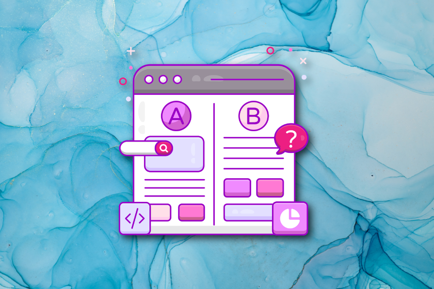
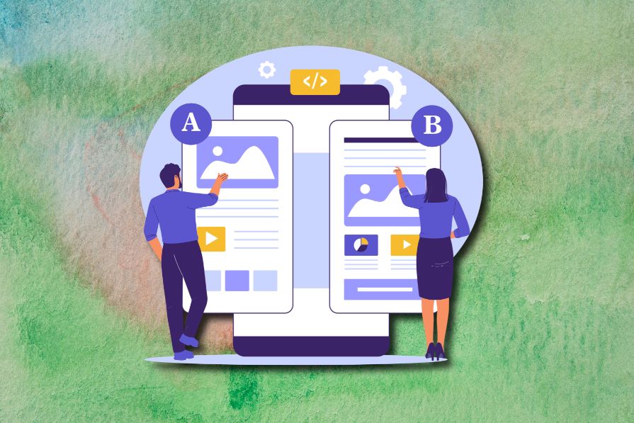
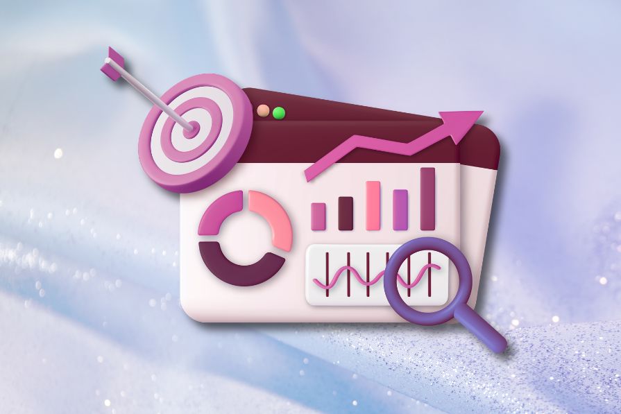
A/B testing compares two versions of a design to see which performs better with real users. Here’s how UX teams can use it to test hypotheses, measure outcomes, and make smarter product decisions.
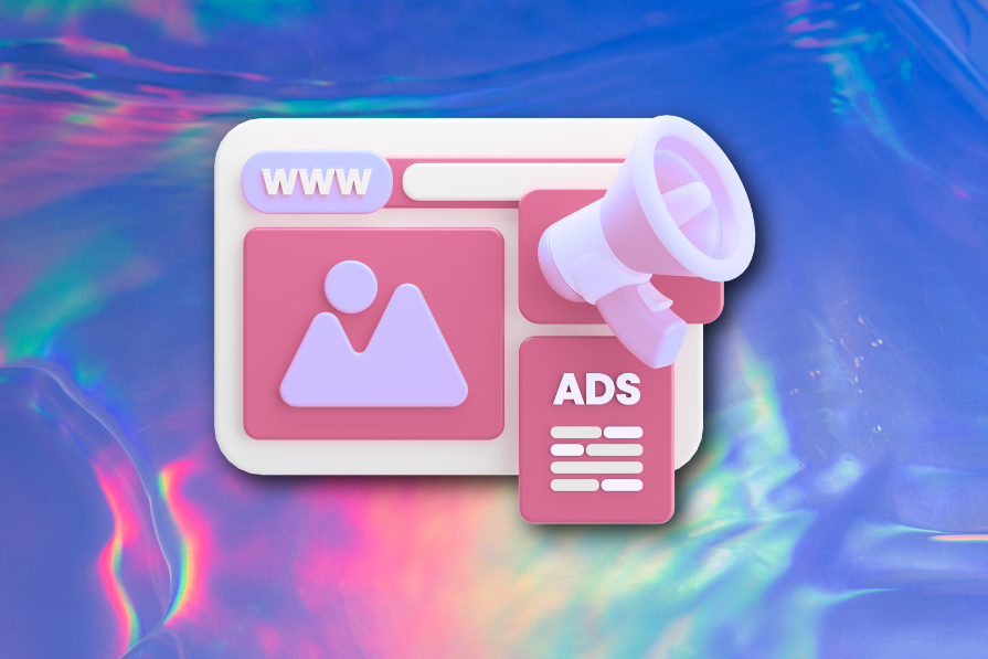
This case study shows how one ad experience redesign increased total ad exposure while lowering perceived friction, proving that timing and context can matter more than raw interruption.

As products evolve into ecosystems, navigation becomes a system-level challenge. This article explores how to align structure, context, and user journeys to create seamless movement across tools without confusion.
Figma’s AI features have exploded in 2026 — from text generation and image editing to full UI drafts and code handoff. But speed isn’t the same as quality. This guide breaks down every major feature, what it’s good at, and where human judgment still does the heavy lifting.
Zero UI works well for screenless, voice-first experiences, but most digital products still require visual interaction. Here’s why multimodal UX offers a more scalable foundation for the future of design.