Editor’s note: This guide to using styled-components in React was last updated by Ohans Emmanuel on 12 June 2023 to reflect recent changes to React. This update also includes new sections on using helper functions, media queries, pseudo-classes/elements, and the animation capabilities of React.

With the advent of modern component-based frontend frameworks, the need to write CSS that is scoped to specific components has increased. And, as with most problems in the frontend sphere, various solutions have sprung up to address them. The most common solution is CSS-in-JS, a pattern that involves writing components and app styles (CSS) in JavaScript.
There are several CSS-in-JS libraries out there today, but perhaps the most popular and enduring one is styled-components. In this article, we will explore how to use styled-components in React. If you want to learn how to use styled-components in React Native, check out our guide here.
Jump ahead:
As polymorphic propattrs constructorThe Replay is a weekly newsletter for dev and engineering leaders.
Delivered once a week, it's your curated guide to the most important conversations around frontend dev, emerging AI tools, and the state of modern software.
Styled-components is a CSS-in-JS library that drastically improves the developer experience for the modern frontend developer while providing a near-perfect UX. Aside from giving developers the ability to write component-scoped CSS, styled-components comes with a number of other benefits.
First, styled-components makes sure that the CSS code we write is automatically vendor-prefixed to work with different browsers. This ensures your application works across different devices and platforms — think supporting older browsers. Secondly, styled-components automatically provides unique class names to avoid global leaks and the need for manually providing distinct class names, saving time and effort as your application grows.
And lastly, styled-components help colocate your component styles with their JavaScript logic. This arguably keeps your codebase organized and improves debuggability. To learn more, check out our article on the benefits of using styled-components in React.
To get started with styled-components, install the styled-components library in your project by running the following:
npm install styled-components
That’s all that is necessary! If you want to enhance your debugging experience and enable server-side rendering support, you can choose to install the styled-components Babel plugin. Here’s how:
npm install --save-dev babel-plugin-styled-components
Then, update your Babel configuration to include the plugin as shown below:
{
  "plugins": ["babel-plugin-styled-components"]
}
It’s worth noting that the installation of the Babel plugin is not mandatory. However, based on my own experience, I suggest considering adding the plugin for more significant projects.
styled API: Where it all beginsNow that we’re properly introduced to the styled-components library, let’s look at a basic use case involving the styled API. The styled API allows us to create a StyledComponent — a component with styles, as the name implies — by using either a regular HTML element or another StyledComponent as a base.
Let’s take a look at the first method. If we want to make styled div and h1 elements into React components, we could write the following:
import React from "react";
import styled from "styled-components";

// the styled div
const StyledDiv = styled.div`
  padding: 1.5rem;
  background-color: skyblue;
`

// the styled h1
const StyledH1 = styled.h1`
  color: blue;
`
And, with that, we have two React components that we can now use as regular components:
function App() {
  return (
      <StyledDiv>
        <StyledH1>A styled H1 element</StyledH1>
      </StyledDiv>
  );
}
The result in the browser should look like this:
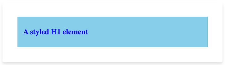
That’s how easy it is to style our components!
Note: You may have noticed that the
styledAPI makes use of backticks (“). This is a feature in ES6 called tagged template literals; it’s the same as calling a function.
As I mentioned earlier, we can also create a new StyledComponent by using other StyledComponents as the base. So, if we wanted to create another StyledComponent that has all the styling properties of <StyledDiv> but with more rounded borders, we could do the following:
const StyledRoundedDiv = styled(StyledDiv)`
  border-radius: 30px;
`
Now, <StyledRoundedDiv> inherits all the styles of <StyledDiv> but with its own style for adjusting the border-radius property. This feature allows us to create different components that all inherit styles from a single base component.
The styled API also allows us to create StyledComponents by using JavaScript to style objects (commonly used in JSX). As stated in the documentation, “This is particularly useful when you have existing style objects and want to gradually move to styled-components.” If we were to recreate our StyledDiv component using style objects, our code would look like this:
const StyledDiv = styled.div({
  padding: "1.5rem",
  backgroundColor: "skyblue"
})
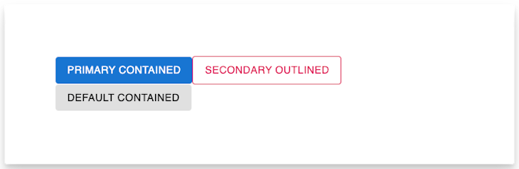
Another powerful feature of styled-components is its ability to alter a component’s styles using props. To better illustrate this concept, let’s take a look at the Material-UI React library. Assume we have a <Button> component that takes in different props, but we want to style the button differently when certain props are passed, e.g., variant and color props.
With the variant, we can determine whether we want our button to be outlined or just filled with the color specified in the color. With the color, we can specify the color of the outline or the color of the button, depending on which value we pass to the variant. If we were to implement such a component using styled-components, our code would probably look a lot like this:
// import styled components + the css helper
import styled, { css } from "styled-components";

// create the Button styled componnet
const Button = styled.button`
  border-radius: 4px;
  padding: 6px 16px;
  min-width: 64px;
  text-transform: uppercase;
  font-weight: 500;
  font-size: 0.875rem;
  letter-spacing: 0.02857em;
  line-height: 1.75;
  font-family: "Roboto", "Helvetica", "Arial", sans-serif;

  /* Use a function value that takes props as argument. Return eventual CSS value in "backgeroundColor" */
  background-color: ${(props) => backgroundColor(props)};

  /* Pass a function to compose key-value styles. The function accepts props as argument. Return eventual CSS property and value in "colorAndBorder" */
  ${(props) => colorAndBorder(props)}
`;
const colorToValue = {
  primary: "#1976d2",
  secondary: "rgb(220, 0, 78)"
};
const colorAndBorder = (props) => {
  var finalColor = "white";
  if (props.variant === "outlined") {
    if (colorToValue[props.color]) {
      finalColor = colorToValue[props.color];
    } else {
      finalColor = "black";
    }
  } else if (props.variant === "contained") {
    if (props.color) {
      finalColor = "white";
    } else {
      finalColor = "black";
    }
  }
  // Use the css helper function to generate CSS from a template literal with interpolations.
  return css`
    color: ${finalColor};
    border: ${(prop) =>
      props.variant === "outlined" ? "1px solid " + finalColor : "none"};
  `;
};
You can see from the above code block that I had base styles for the Button component and dynamic styles for the background-color, color, and border properties, depending on the props. Since the styled and css APIs use tagged template literals, we can inject JavaScript (using string interpolation) into our CSS to dynamically style components, which we did using two custom functions: backgroundColor and colorAndBorder.
The backgroundColor takes in the StyledComponent‘s props and returns the suitable background color of the button as a string. The outer function in the Button component styles can now use that string to style the button.
For the color and border properties, however, we used a function that returns a value we can use directly in our Button‘s styles string instead of just a string to be used by an outer function. This is where the css helper function comes in.
The css helper function generates a value that can be used directly in template literal styles, especially when the template literal passed to the css function contains string interpolation. We can now use our Button component as shown below:
function App() {
  return (
    <>
      <Button variant="contained" color="primary">
        Primary Contained
      </Button>

      <Button variant="outlined" color="secondary">
       Secondary Outlined
      </Button>

      <Button variant="contained">
       Default contained
      </Button>
    </>
  );
}
We’ve already used the css helper function from styled-components in an earlier section. However, the styled-components library provides several useful helper functions for various purposes. Let’s take a look at some of these.
createGlobalStyleBy default, styled-components generate styles that are specific to each component, making them separate from one another. However, we can use createGlobalStyle to create a special styled-component that manages global styles. This can be very useful when handling CSS resets or applying a set of base styles to an application. Consider the example below:
// import the helper function
import { createGlobalStyle } from 'styled-components'


// Create a new styled component using createGlobalStyle
const GlobalStyle = createGlobalStyle`
  /* write global styles here */
  body {
     background: teal;
  }
`

// usage
function App() {
  return (
    <>
      <GlobalStyle />
      {/* Rest of the app ... */}
      <h1>Hello world</h1>
    </>
  );
}

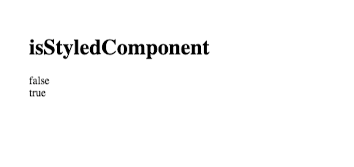
isStyledComponentAs the name of the utility implies, isStyledComponent is used to identify styled-components. The result is a Boolean you can rely on for your application logic if needed. Consider the contrived example below:
import React from "react";
import styled, { isStyledComponent } from "styled-components";

// standard component
const StandardH1 = () => <h1>Standard component </h1>;

// styled component
const StyledH1 = styled.h1`
  color: red;
`;

export default function App() {
  return (
    <>
      <h1>isStyledComponent</h1>
      {/** is StandardH1 a styled component? **/}
      {JSON.stringify(isStyledComponent(StandardH1))}
      <br />
      {/** is StyledH1 a styled component? **/}
      {JSON.stringify(isStyledComponent(StyledH1))}
    </>
  );
}
StyleSheetManagerThe StyleSheetManager is a more advanced helper component for modifying how your styled-component styles are processed; for example, if we were building an application for legacy browsers, we may specify enabling vendor prefixing as shown below:
import React from "react";
// import styled components and the StyleSheetManager helper component
import styled, { StyleSheetManager } from "styled-components";

const Center = styled.div`
  display: flex;
  align-items: center;
  justify-content: center;
`;
export default function App() {
  return (
    {/** Note the enableVendorPrefixes prop passed below  **/}
    <StyleSheetManager enableVendorPrefixes>
      <Center>The styles here include vendor prefixes.</Center>
    </StyleSheetManager>
  );
}
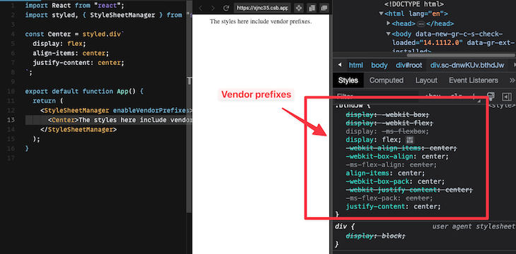
For more advanced cases, take a look at the official documentation for StyleSheetManager.
As polymorphic propIt’s not uncommon to want to maintain a component styling but change the final output rendered, e.g., a different HTML tag or a different custom component. To do this, use the "as" prop. Consider the example below:
import React from "react";
import styled from "styled-components";

// component is a div by default
const Component = styled.div`
  color: red;
`;

export default function App() {
  return (
    <>
      {/* Render as an anchor tag */}
      <Component as="a" href="www.google.com">
        Link
      </Component>
      <br />
      {/* Render as a button */}
      <Component as="button"> Button </Component>
      <br />
      {/* Render as a standard div */}
      <Component> Default div </Component>
    </>
  );
}
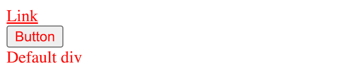
Note how the components above all receive the red color but are all styled differently (native to the browser) depending on the rendered element, for example, anchor tag, button, and div. In more technical terms, a styled-component is a polymorphic component and can be rendered at runtime to a different HTML tag or custom component by using the as prop.
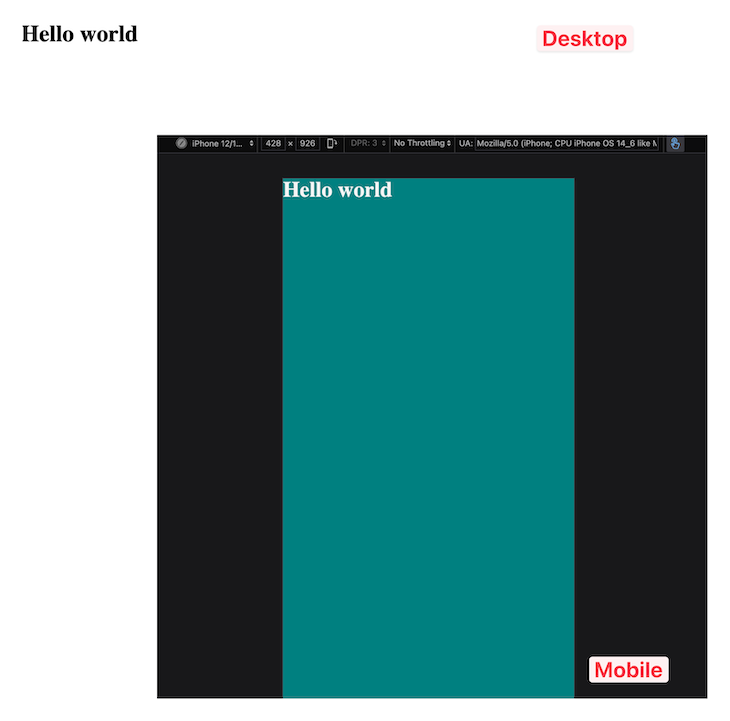
Do you need to define tailored experiences for desktop or mobile devices? No problem!
Styled-components support media queries via the standard @media CSS rule. Consider the following example that defines a different background on mobile devices:
import React from "react";
import styled from "styled-components";

// Create a new styled component
const Background = styled.div`
  /* General styles*/
  min-height: 100vh;
  /* use media query */
  @media (max-width: 600px) {
    background: teal;
    color: whitesmoke;
  }
`;

// Usage
function App() {
  return (
    <Background>
      <h1>Hello world</h1>
    </Background>
  );
}
On mobile devices, we’ll specifically have a teal background and a whitesmoke text color, as shown below:
In CSS, pseudo-classes are denoted by keywords added to a typical selector, indicating a specific state of the selector. For instance, the hover pseudo-class is used to select an element in the hover state, like button:hover. Now, let’s examine how we can express this using styled-components:
import React from "react";
import styled from "styled-components";

const Button = styled.button`
  /* General styles*/
  padding: 1rem 1.5rem;
  margin: 1rem auto;
  /* hover state */
  &:hover {
    color: white;
    cursor: pointer;
    background: teal;
    transform: scale(1.1);
  }
`;

/* Usage */
function App() {
  return (
    <>
      <h1>The best meal kit on the market</h1>
      <Button>Buy now</Button>
    </>
  );
}
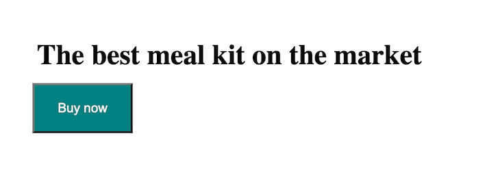
The hover state is defined with &:hover. Note the ampersand! A single ampersand, as shown, is used to select all instances of the styled-component. In this case, we’re selecting all instances of the component and targeting the hover state via &:hover.
Let’s now consider pseudo–elements. In CSS, pseudo-elements are denoted by keywords added to a typical selector, indicating a specific part of the element. For instance, the ::first-line pseudo-element is used to select the first line of an element, such as a paragraph.
Now, let’s examine how we can express this using styled-components:
import React from "react";
import styled from "styled-components";

/* Create the styled component */
const Paragraph = styled.button`
  /* General styles*/
  font-size: 1.3rem;
  padding: 1rem 1.5rem;
  margin: 1rem auto;
  /* pseudo element */
  &:first-line {
    color: blue;
    text-transform: uppercase;
  }
`;

/* Usage */
function App() {
  return (
    <Paragraph>
      Sed ut perspiciatis unde omnis iste natus error sit voluptatem accusantium
      doloremque laudantium, totam rem aperiam, eaque ipsa quae ab illo
      inventore veritatis et quasi architecto beatae vitae dicta sunt explicabo.
      Nemo enim ipsam voluptatem quia voluptas sit aspernatur aut odit aut
      fugit, sed quia consequuntur magni dolores eos qui ratione voluptatem
      sequi nesciunt. Neque porro quisquam est, qui dolorem ipsum quia dolor sit
      amet, consectetur, adipisci velit, sed quia non numquam eius modi tempora
      incidunt ut labore et dolore magnam aliquam quaerat voluptatem. Ut enim ad
      minima veniam, quis nostrum exercitationem ullam corporis suscipit
      laboriosam, nisi ut aliquid ex ea commodi consequatur? Quis autem vel eum
      iure reprehenderit qui in ea voluptate velit esse quam nihil molestiae
      consequatur, vel illum qui dolorem eum fugiat quo voluptas nulla
      pariatur?"
    </Paragraph>
  );
}
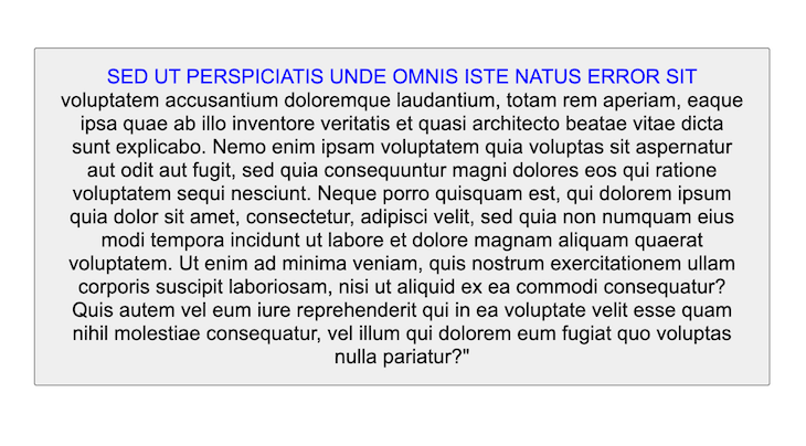
Again, note that we’re using the ampersand: &:first-line. Before moving on, it’s important to note that within a styled-component, all of CSS is supported, even nesting!
const Background = styled.div`
  /* General styles*/
  min-height: 100vh;
  /* media query */
  @media (max-width: 600px) {
    background: teal;
    color: whitesmoke;
    /* ====== NESTED RULE ==== */
    &:hover {
      background: black;
      color: white;
    }
  }
`;
Give this a try:
attrs constructorThe styled-components library also allows additional props or HTML attributes to be added to a component using the attrs method. Using attrs, we can define static props or attributes like the type of an <input> element and dynamic props. Here’s an example of the attrs method in use:
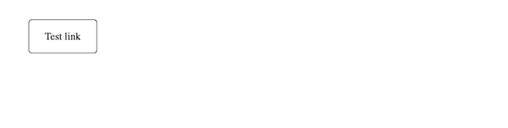
const Link = styled.a.attrs((props) => ({
  href: props.$to,
}))`
  text-decoration: none;
  color: #000;
  border: 1px solid #000;
  padding: 1rem 1.5rem;
  border-radius: 5px;
`;

function App() {
  return (
    <>
      <Link $to="https://blog.logrocket.com">Test link</Link>
    </>
  );
}
In the above code, we attached an href attribute to our <Link> component, whose underlying HTML element was an anchor element. The value passed to the href element was received from the transient prop, $to, of our <Link> component.
Transient props are a feature in styled-components that allow us to use props that will not show up on the DOM. So, if you inspect our Link component, you will notice that it was rendered as simply:
<a href="https://blog.logrocket.com" class="sc-bdfBwQ geNjDe">Test link</a>
Styled-components also supports theming through the use of a ThemeProvider component. We can pass a theme prop to the <ThemeProvider>, and this theme will be passed to all the children of the <ThemeProvider> as a prop.
We can now choose to dynamically style those child components based on the value of the theme prop. Here’s a simple example to show how this works:
const lightTheme = {
  main: "#fff",
};
const darkTheme = {
  main: "#000",
};
const invertColor = (props) => {
  if (props.theme.main == "#000"){
    return "#fff"
  } else {
    return "#000"
  }
}
const Div = styled.div`
  padding: 4rem;
  background-color: ${props => props.theme.main}
`
const Button = styled.button`
  padding: 1.5rem 2rem;
  color: ${props => invertColor(props)};
  border: 1px solid ${props => invertColor(props)};
  background-color: ${props => props.theme.main};
  transition: all 0.5s;
  &:hover{
    color: ${props => props.theme.main};
    background-color: ${props => invertColor(props)};
    border: 1px solid ${props => props.theme.main};
  }
`
/*Default props for the Button component in case it has no theme attached to its props
*/
Button.defaultProps = {
  theme: darkTheme
}
function App() {
  return (
    <>
    <ThemeProvider theme = {lightTheme}>
      <Div>
        <Button>Light Theme button</Button>
      </Div>
    </ThemeProvider>
    <ThemeProvider theme = {darkTheme}>
      <Div>
        <Button>Dark Theme button</Button>
      </Div>
      <Button>Dark Theme button</Button>
    </ThemeProvider>
    </>
  );
}
The result of the code block above in the browser is the following:
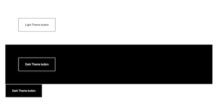
As you can see from the code, there are two objects: lightTheme and darkTheme, to represent the primary colors for the light and dark themes, respectively. There’s also a function called invertColor, which simply takes in props and returns the opposite primary color of the theme attached to the props. Using the theme objects and the invertColor function, we were able to create a light and dark theme and style our components accordingly.
Also, notice that we used the ampersand (&) symbol in the template literal of the <Button> component; its usage is similar to what you would find in a CSS preprocessor like SCSS. The symbol simply represents the component we are styling, so it can be used to style the component’s CSS pseudo-elements or classes, as we did.
useTheme and ThemeConsumer helper functionsIn the previous section, we talked about the ThemeProvider component. It’s common to want to access the current theme from the ThemeProvider. You can achieve this by using either the useTheme Hook or the ThemeConsumer component. Consider the following example with useTheme:
// import useTheme from styled-components
import { useTheme } from 'styled-components'

function SomeComponent() {
  // invoke useTheme and get the current theme
  const theme = useTheme()
  // use the theme object as you see fit
  console.log('Current theme: ', theme)

  // ...
}
Now, with ThemeConsumer:
// import the ThemeConsumer from styled-components
import { ThemeConsumer } from 'styled-components'

function SomeComponent() {
    return (
      <ThemeConsumer>
        {theme => <div>The theme color is {theme.color}.</div>}
      </ThemeConsumer>
    )
}
Note that we’re using the render prop pattern with ThemeConsumer. This is how we get the theme value. Both useTheme and ThemeConsumer rely on the presence of a ThemeProvider higher up in the component tree. However, all styled-components receive a theme prop by default and accessing the theme via useTheme and ThemeContext is only necessary when we need to access the current theme for other reasons, such as within a custom component.
As it should, styled-components also supports CSS animations through the keyframes helper function. This function uses a template literal to define the CSS of the animation and returns a value that can now be interpolated into the css helper function or used with the styled API.
Here’s a simple example from the docs that shows what the keyframes function looks like in our code:
import styled, { keyframes } from 'styled-components'

const fadeIn = keyframes`
  0% {
    opacity: 0;
  }
  100% {
    opacity: 1;
  }
`

const FadeInButton = styled.button`
  animation: 1s ${fadeIn} ease-out;
`

We’ve finally covered what I believe to be the most important and frequently used parts of the styled-components library. You can learn more about the library in the comprehensive documentation here.
Install LogRocket via npm or script tag. LogRocket.init() must be called client-side, not
server-side
$ npm i --save logrocket

// Code:

import LogRocket from 'logrocket';
LogRocket.init('app/id');
// Add to your HTML:

<script src="https://cdn.lr-ingest.com/LogRocket.min.js"></script>
<script>window.LogRocket && window.LogRocket.init('app/id');</script>

Learn what context rot is, why AI agent sessions degrade over time, and how to fix it with compaction, prompt anchoring, context files, plan files, and RAG.

Learn about TypeScript v6’s breaking changes, new ES2025 features, and deprecated options. A complete migration guide from v5 to prepare for v7.

Learn how Vite+ unifies Vite, Vitest, Oxlint, Oxfmt, Rolldown, and Node.js management in one CLI.

AI companies are buying developer tools as coding agents turn runtimes, package managers, and linters into strategic infrastructure.
Hey there, want to help make our blog better?
Join LogRocket’s Content Advisory Board. You’ll help inform the type of content we create and get access to exclusive meetups, social accreditation, and swag.
Sign up now

 Learn more →
