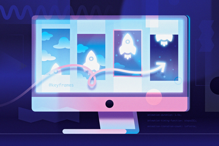
Web animations can be used in a variety of ways to draw attention to certain features of a website or application in a visually stimulating way.
For instance, when you select the speech bubble button on the bottom right corner of the LogRocket website, the speech bubble transitions into a downwards arrow with a spinning animation that adds an extra flourish to the user’s interaction.
Animations can also be used purely decoratively to make using the website more fun and aesthetically appealing to the user, such as on a website’s landing page that would otherwise use a static image or have a blank space.
No matter what you’re using animation for, there are different ways to implement web animations.
The Replay is a weekly newsletter for dev and engineering leaders.
Delivered once a week, it's your curated guide to the most important conversations around frontend dev, emerging AI tools, and the state of modern software.
animation property and @media queriesIn this post, I will cover how to create your own sprite sheet and animate it using CSS. It’s a cool method to learn, and in fact, many popular websites and applications use sprite sheets to animate user functions.
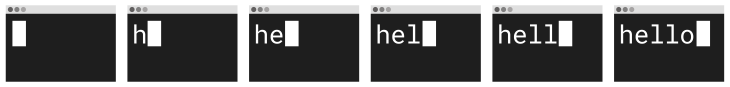
In fact, Twitter uses a sprite sheet to animate its heart button, which fills in and explodes with confetti when you like a tweet. In this tutorial, we will create a simplified graphic of a Terminal window with the text “hello” typed out.
This is how it will look:
To start, open the image editor of your choice. I like using Figma because it is free and you can use it in the browser, as well as Adobe Photoshop, Illustrator, or any resurrections of MS Paint!
I chose to design the graphic at its largest scale for a desktop screen so that I can make it smaller on tablet and mobile screens rather than design it for the smallest screen and stretch it out to a larger screen.
Let’s create a workspace that is desktop sized (1440px x 1024px). Note that each frame of the animation will be an image this size.
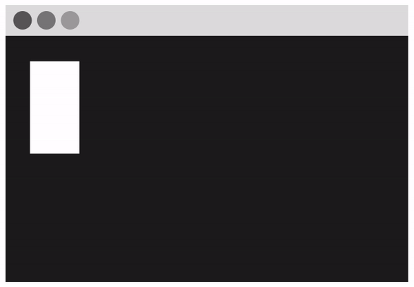
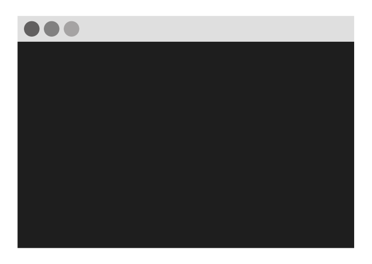
Next, create the graphic by drawing a large dark grey rectangle for the Terminal window. Then add a light grey rectangle at the top for the toolbar and add three grey circles on the toolbar for buttons. Your basic Terminal graphic should look something like this so far:
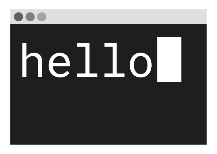
The next step is to map out the final frame, which will contain the full text you want and where on the graphic you want it to go. I chose to use the monospace font Roboto Mono so that the letters are evenly sized and spaced. I typed out the word “hello” and created a rectangle for the text cursor. It looked like this:
Now you will need to create each frame of the animation and save each one as a separate image. I will start with a frame that just shows the text cursor on the Terminal, then move it across to the right as I type out each letter for each frame. This will create six frames in total.
Once you have each frame, you can add them all into one sprite sheet image file. I used a CSS Sprites Generator tool, selecting 0px padding between the elements and aligning left-right.
My downloaded sprites file looked like this:
Now it’s time to add your sprite sheet animation to your web page. Start by adding an empty <div> to your HTML file and give it the class name “terminal”.
This <div> element will act as a “viewport” where each frame of the sprite sheet will be displayed in the animation:
<div class="terminal"></div>
Next, add some CSS styling to the <div>. The height of the div should be the height of the sprite sheet image file (in the case of this tutorial, 1024px), and the width should be the width of each image frame (1440px).
The background URL should be set to the sprite sheet image file. You should see the first frame of your animation cover the background of the <div>.
.terminal {
  height: 1024px;
  width: 1440px;
  background: url("https://i.imgur.com/zLh2Pgs.png");
}
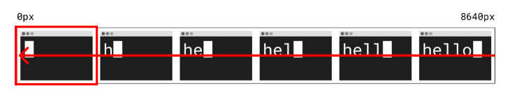
It’s now time to add the CSS animation. In this case, we want to pull the background image into the “viewport” from the right to the left, as demonstrated in the diagram below.
First, define the animation code with the name sprite under a @keyframes block that specifies what styles to apply in the animation.
We want to transition from the starting background-position of 0px to shifting the position left by whole width of the sprite sheet image file (8640px, which is each 1440px width image multiplied by six because there are six frames). This is the code:
@keyframes sprite {
  from { background-position: 0px; }
  to { background-position: -8640px; }
}
The next step is to add this sprite animation to the <div> element that is being styled with the class .terminal.
Apply the animation-name of sprite and set the animation-duration to the length of time you want the animation to take to complete one cycle (I chose a speed of 1.5 seconds). Then, set the animation-timing-function to define how the animation progresses.
Here, we want to use the steps() value, which breaks the transition into equal segments. This is exactly the effect we want — we need each frame to be played in a sequence — so set the number of steps to 6 as there are six frames in the animation.
Finally, define the animation-iteration-count, which sets the number of times an animation should run before stopping. If you want it to run continuously, the value should be infinite. Here’s the code:
.terminal {
  ...
  animation-name: sprite;
  animation-duration: 1.5s;
  animation-timing-function: steps(6);
  animation-iteration-count: infinite;
}
Now that we have understood and broken down how the code works, we can refactor it a bit. We don’t have to specify the from in the @keyframes rule as the background-position is 0px by default.
Also, the block of animation styles can elegantly be combined into one line using the CSS animation shorthand property. Here is the refactored code:
@keyframes sprite {
  to { background-position: -8640px; }
}

.terminal {
  height: 1024px;
  width: 1440px;
  background: url("https://i.imgur.com/zLh2Pgs.png");
  animation: sprite 1.5s steps(6) infinite;
}
At the moment, the animation viewport <div> has the fixed height and width of a desktop screen. This means the <div> takes up the whole screen on a desktop and will overflow on smaller screens.
A good way to make the <div> responsive on different screen sizes is to use transform: scale(0.5) to resize the element by half, and then set the scale to be 1 for all screens larger than 1024px using a @media query.
The CSS scale() function resizes the element from the center, so translate() is needed to keep the element in the same position in the top left corner. The code looks like this:
.terminal {
  ...
  transform: translate(-25%, -25%) scale(0.5);
}

@media only screen and (min-width: 1024px) {
  .terminal {
    transform: scale(1);
  }
}
That’s it! These are the steps to implementing your own CSS animation using a sprite sheet that you made. The final animation and code can be viewed on CodePen:
See the Pen
Making a CSS animation using a sprite sheet by Hannah Gooding (@hannahgooding)
on CodePen.
For the purpose of this tutorial, I kept the graphic simple with a minimal number of frames.
Instead of using a sprite sheet, you can achieve the same effect by positioning text over a static image of a Terminal and used a typing effect to animate the text with CSS or JavaScript.
But the CSS sprite sheet method lends itself better to create more complicated graphics than the one in this tutorial. Happy coding!
As web frontends get increasingly complex, resource-greedy features demand more and more from the browser. If you’re interested in monitoring and tracking client-side CPU usage, memory usage, and more for all of your users in production, try LogRocket.

LogRocket lets you replay user sessions, eliminating guesswork around why bugs happen by showing exactly what users experienced. It captures console logs, errors, network requests, and pixel-perfect DOM recordings — compatible with all frameworks.
LogRocket's Galileo AI watches sessions for you, instantly identifying and explaining user struggles with automated monitoring of your entire product experience.
Modernize how you debug web and mobile apps — start monitoring for free.

Write agent-friendly API documentation with OpenAPI, clear schemas, workflow guidance, and llms.txt for safer AI automation.
Local AI proxy tutorial for detecting, masking, and rehydrating PII before prompts reach cloud LLMs.
Learn how Graph RAG uses connected knowledge structures to improve retrieval beyond simple text similarity.
Learn how sibling-index() enables clean, JavaScript-free stagger animations using native CSS.
Would you be interested in joining LogRocket's developer community?
Join LogRocket’s Content Advisory Board. You’ll help inform the type of content we create and get access to exclusive meetups, social accreditation, and swag.
Sign up now

 Learn more →
