Editor’s note: This tutorial was last updated on 17 July 2023 by Rahul Chhode to include advanced features and demos for a web game built in React. If you’re interested, check out “The complete guide to React Native for Web” for more information.

React is widely recognized as one of the leading options for web app development, enjoying substantial popularity among developers. Thanks to its componentized architecture and unidirectional data flow, React is also an excellent choice for simple browser-based gaming.
In this article, we will explore how React can be used to build a simple balloon popping game by following the fundamental principles of React app development.
Jump ahead:
Balloon componentBalloonGrid componentGame componentReact is efficient for building web games that have relatively simple gameplay and graphics. It excels in handling UIs, managing game state, and facilitating interactive components. Here are some key advantages of using React for web game development:
However, it is important to note that React lacks a built-in game engine. Therefore, it may not always be the most suitable choice for developing complex games that require advanced graphics, physics simulations, or extensive performance optimizations.
For such cases, integrating React with dedicated game engines or libraries specifically designed for game development is a more advisable approach. React Game Engine is a good example.
In this tutorial, we’ll develop a game using React that focuses on simplicity in terms of graphics, logic, state handling, and performance.
The idea of our balloon popping game is similar to the classic “Whac-a-Mole” game from the 70s. The basic idea is that the game will present the user with a grid of randomly appearing balloons, and the objective is to pop them to earn points. Each successful balloon pop will reward the player with five points:
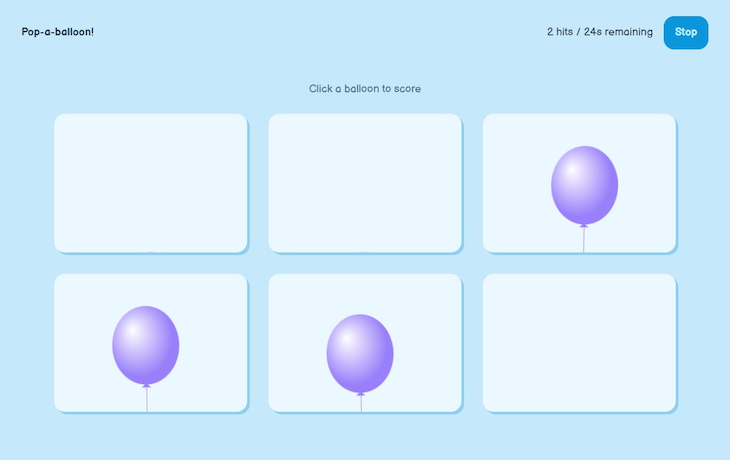
Our game will include a score display at the top, as well as a timer indicating the remaining time for scoring. A start button should be provided to initiate the game, and the player should also have the option to stop the game while playing.
Check out this live CodePen demo to preview what we will build. Or, explore the complete code from the GitHub repo of this project.
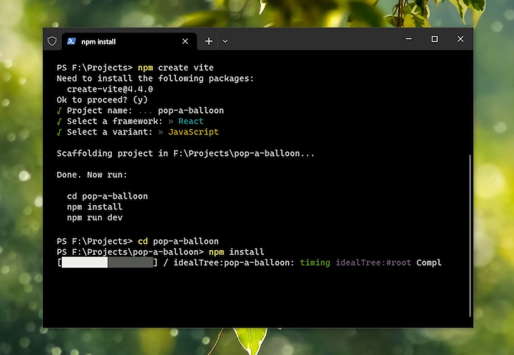
To begin, create a new React app either in your local environment using Vite, or virtually with StackBlitz or Codepen.
Begin by opening a terminal, navigate to the location where you want your app folder to be, and type the following command there. In this case, I am using npm, but feel free to use any package manager of your choice:
npm create vite
Next, follow the instructions provided by Vite. Name your project folder, select React as the framework, and ensure JavaScript is chosen as the variant. Once the installation process is complete, CD into the project folder using the command line and install the necessary dependencies by running npm install or whatever install command your package manager offers:
React allows us to create reusable bits of layouts and functionalities. As a result, we can build units or components of our application that can be reused across various parts of our game app.
To this end, we will build the following components:
Balloon: This balloon unit of our game will be the one that the user will interact with the mostBalloonGrid: This component will use the Balloon component to form a grid of balloons and manage their random appearancesGame: This component handles the layout of the game, as well as the game logic, such as starting the game, scoring, stopping, game over, etc.Upon opening the project folder in a code editor of your choice, here’s the initial project structure you get with a React project:
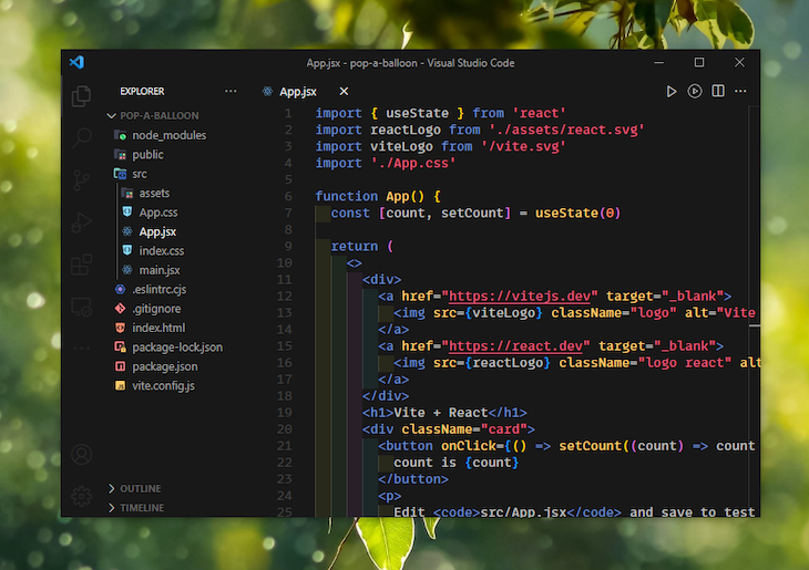
We will primarily focus on the src directory for our work. To start, let’s remove unnecessary items from our project. Delete all the contents of App.js (or App.jsx) and also remove the App.css file.
Because we will be styling components using component-specific CSS files, the App.css file is no longer needed. Instead, we will use the index.css file to define global styles. Open the index.css file and incorporate the CSS reset, custom fonts, etc. of your preference. Alternatively, you can refer to the styles I have implemented in the final GitHub repository.
In the src folder, create another directory called components. This is where our components will be located. Creating separate directories for components and features keeps the project more organized.
Balloon componentThe easiest way to design the balloons in our game would be to select a balloon SVG icon from a reputable icon pack on the web. However, to give this game a more personalized look, we’ll create the balloon from scratch using SVG elements such as <ellipse>, <rect>, and <polygon>.
Inside thesrc/components directory, create another directory called Balloon, and add a file called Balloon.jsx inside it. Now, we can use the <ellipse> element in SVG to draw a balloon-like shape. We will then use the <polygon> and <rect> elements to draw the balloon’s tail and thread.
Let’s create a balloon component and return some SVG XML from inside it to create our balloon shape:
const Balloon = () => {
  const balloonWidth = 200;
  const balloonHeight = 200 * 1.17;
  const threadHeight = 50;

  return (
    <div className="balloon">
      <svg
        xmlns="http://www.w3.org/2000/svg"
        viewBox={`0 0 ${balloonWidth} ${balloonHeight + threadHeight}`}
      >
        ...
      </svg>
    </div>
  );
};
For now, the component is returning a meaningless SVG. However, it has some settings that determine the dimensions of the balloon shape we intend to create. One of these settings is balloonWidth, which specifies the width of the SVG balloon shape.
Ideally, the height of a balloon shape should be oval-shaped, i.e., slightly larger than its width. Multiplying the width by a number slightly greater than one can help us achieve this effect:
const balloonHeight = balloonWidth * 1.17;
The viewBox attribute from the earlier code block controls the positioning and sizing of an SVG shape. In our case, we are using the width of the balloon as the overall width of the SVG, and the combined height of the balloon and the thread as the overall height of the SVG. These calculated values can then be passed to the viewBox attribute to create the perfect size for our balloon shape:
<svg viewBox="0 0 \[Width\] [Height]">...</svg>
We can then use the <defs> element to define a radial gradient filter for our balloon shape. We can experiment with its properties and the gradient stops (<stop>) a bit, and give the filter a unique ID so that we can apply it to our ellipse element later:
const Balloon = () => {
  const balloonWidth = 200;
  const balloonHeight = 200 * 1.17;
  const threadHeight = 50;

  return (
    <div className="balloon">
      <svg
        xmlns="http://www.w3.org/2000/svg"
        viewBox={`0 0 ${balloonWidth} ${balloonHeight + threadHeight}`}
      >
        <defs>
          <radialGradient
            id="balloon-gradient"
            cx="40%"
            cy="40%"
            r="50%"
            fx="30%"
            fy="30%"
          >
            <stop offset="0%" stopColor="#fff" />
            <stop offset="100%" stopColor="currentColor" />
          </radialGradient>
        </defs>
        ...
      </svg>
    </div>
  );
}
Now, it’s time to use the <rect>, <polygon>, and <ellipse> SVG elements to assemble the shape of our balloon. The trick here is to arrange them in a specific layering order, with the last element in the source order appearing at the top.
The x and y attributes of the <rect> element should be calculated based on the values of balloonWidth and balloonHeight. To horizontally align the rectangle at the center of the shape, the x coordinate should be set to balloonWidth / 2. The y coordinate should be set to balloonHeight to position it just below the balloon body. Finally, the width should be set to 1 for a thin line, and the height can be set using the threadHeight variable:
<rect
  x={balloonWidth / 2}
  y={balloonHeight}
  width="1"
  height={threadHeight}
  fill="currentColor"
/>
The points attribute of the <polygon> element defines the vertices of the polygon. Meanwhile, the x and y coordinates are calculated based on the values of balloonWidth and balloonHeight. The center of the balloon body is given by balloonWidth / 2 and balloonHeight / 2. The polygon should be positioned just below the balloon body. Finally, the specific coordinates for the points attribute can be adjusted according to the desired shape and position:
<polygon
  points={`${balloonWidth / 2},${balloonHeight - 3} ${
    balloonWidth / 2 + 8
  },${balloonHeight + 5} ${balloonWidth / 2 - 8},${
    balloonHeight + 5
  }`}
  fill="currentColor"
/>
In the code above, the cx and cy attributes of the <ellipse> element define the center point of the ellipse. Meanwhile, the rx and ry attributes determine the horizontal and vertical radii respectively.
To position the ellipse at the center of the shape, the cx and cy values should be set to balloonWidth / 2 and balloonHeight / 2 respectively. The rx and ry attributes can also be set to balloonWidth / 2 and balloonHeight / 2 to create a circle that matches the dimensions of the balloon body:
<ellipse
  cx={balloonWidth / 2}
  cy={balloonHeight / 2}
  rx={balloonWidth / 2}
  ry={balloonHeight / 2}
  fill="url(#balloon-gradient)"
/>
We start by placing the thread at the top in the source order, followed by the polygon that forms the tail of the balloon, and finally, the ellipse that creates the main air-filled shape of the balloon.
As you may have noticed, we also added the radial gradient filter we previously defined as a fill, using the URL function and the filter’s ID. I’m setting the fill for each element as currentColor. This will help us later, as we will be able to add color to our balloon simply by including a color CSS property in the balloon parent.
After pairing the code discussed above, if we add two props, id and color, to our balloon component and run a quick test, here’s how it should look:
See the Pen
SVG Balloon Component with React by Rahul (@_rahul)
on CodePen.
Balloon componentAnimating the balloon is made easy using CSS transitions and animations. To achieve the desired balloon effect, we can create a motion that simulates left and right movement, imitating the effect of air:
.balloon--moving {
  animation: balloon-moving 5s ease-in-out 1s infinite alternate;
  transform-origin: 50% 300%;
}

@keyframes balloon-moving {
  25% {
    transform: rotate(-2deg);
  }
  75% {
    transform: rotate(2deg);
  }
}
Upon adding the balloon--moving class from the above CSS styling to the balloon div in our Balloon.jsx, here’s what we get:
See the Pen
SVG Balloon Component with React (Animation #1) by Rahul (@_rahul)
on CodePen.
Now, let’s enclose the balloon in an HTML div element that will serve as a cell in the balloon grid. We can set a specific size for this cell to prevent it from overflowing, and then use CSS transforms to initially hide the balloon. Subsequently, we can incorporate animations to make the balloon appear and disappear.
We can also enhance the balloon by adding a popping animation triggered by a click event. When the user clicks the balloon, a click event handler can be added to inject a popping animation class into the balloon component, which plays the popping animation:
.balloon--active {
  translate: 0% 0%;
  transform-origin: 50% 300%;
}

.balloon--popping {
  animation: balloon-popping 0.1s ease-in-out alternate;
  transform-origin: 50% 75%;
  translate: 0% 100%;
}

@keyframes balloon-popping {
  0% {
    transform: scale(1);
  }
  100% {
    transform: scale(5);
    opacity: 0;
    visibility: hidden;
  }
}
The following demonstration is an emulation to show how these two classes will ultimately appear. The appearing/disappearing animation is automatically displayed in the demo. To see the popping animation in action, simply click the balloon:
See the Pen
SVG Balloon Component with React (Animation #2) by Rahul (@_rahul)
on CodePen.
Let’s simplify and improve customizability by creating an object with constant values. This will make changes more effortless and impactful:
const Constants = {
  gameDuration: 60,
  gameCells: 6,
  balloonWidth: 120,
  threadHeight: 50,
  randomnessLimits: { upper: 3000, lower: 1000 },
  balloonColor: "#9980FA",
};
Now, let’s enhance the Balloon component by adding additional functionality and completing it beyond the current fancy emulation. We can achieve this by introducing a few more props to the balloon component:
isActive prop is a Boolean that controls the random appearance and disappearance of balloons in the BalloonGrid componentonClick prop is a function callback used by BalloonGrid to perform specific actions when a balloon element is clickedisPopped state variable stores the popped state of the balloon. It is manipulated in clickHandler and then passed to the click event handler of the balloon elementclickHandler ensures that isPopped is set to true and the onClick callback is executed only when the balloon is clicked:const Balloon = ({ id, color, isActive, onClick }) => {
const [isPopped, setIsPopped] = useState(false);
const classNames = classnames("balloon", {
"balloon--active": isActive,
"balloon--popping": isPopped,
});
const clickHandler = (e) => {
if (!isPopped) {
setIsPopped(true);
onClick();
setTimeout(() => {
setIsPopped(false);
}, Constants.randomnessLimits.lower);
}
};
const balloonWidth = Constants.balloonWidth;
const balloonHeight = balloonWidth * 1.17;
const threadHeight = Constants.threadHeight;
return (
<div className="balloon-cell">
<div
onClick={clickHandler}
className={classNames}
style={{ color: color }}
>
<svg ...>...</svg>
</div>
</div>
);
}
export default Balloon;
BalloonGrid componentThe BalloonGrid component is responsible for rendering a grid of balloons based on the provided props. It accepts two important props: numberOfBalloons and onBalloonClick.
The numberOfBalloons prop determines the exact number of balloons to be displayed in the grid, while onBalloonClick is a callback function that gets triggered whenever any balloon in the grid is clicked. This functionality will be used in the Game component to track and handle balloon clicks.
As part of the initial setup, a click-handler function is declared within the BalloonGrid component. This function takes an id number as a parameter and executes the onBalloonClick callback. Later on, we will pass this click handler function as a prop to the Balloon component:
const BalloonGrid = ({ numberOfBalloons, onBalloonClick}) => {
  const handleBalloonClick = (id) => {
    if (onBalloonClick) {
      onBalloonClick(id);
    }
  };

  return (...);
};
As mentioned earlier, the BalloonGrid component is responsible for managing the logic of randomly appearing and disappearing balloons. To achieve this, we will define a state variable array capable of storing the indices of the randomly selected balloons, which we can mark as active later on:
const [activeBalloons, setActiveBalloons] = useState([]);
We need a function capable of generating a random integer between zero and numberOfBalloons. Upon obtaining the random integer, we can update the activeBalloons state array using the updater pattern. This pattern involves accepting the previous state (prevActiveBalloons in the code below) and returning the new state based on the specified logic:
const generateRandomBalloon = () => {
  const randomBalloonId = Math.floor(Math.random() * numberOfBalloons);

  setActiveBalloons((prevActiveBalloons) => {
    if (prevActiveBalloons.includes(randomBalloonId)) {
      return prevActiveBalloons.filter(
        (activeId) => activeId !== randomBalloonId
      );
    } else {
      return [...prevActiveBalloons, randomBalloonId];
    }
  });
};
The updater function ensures that if the activeBalloons array already includes the randomly selected ID, a new array is returned without that specific ID. Conversely, if the state array does not include the random ID, a new array is returned that includes all the previous IDs along with the random ID.
With this updated array, we can iterate through the indices from zero to numberOfBalloons and set the isActive prop to either true or false when mounting the Balloon component. To achieve random intervals, we can use the following iteration:
for (let i = 0; i < numberOfBalloons; i++) {
  const randomInterval = getRandomNumber(
    Constants.randomnessLimits.lower,
    Constants.randomnessLimits.upper
  );

  const intervalId = setInterval(generateRandomBalloon, randomInterval);
  intervalIdsRef.current.push(intervalId);
}
The getRandomNumber function used above returns a random number within a specified range of values. It generates a random number between two given values and provides it as the output:
const getRandomNumber = (min, max) => {
  return Math.floor(Math.random() * (max - min + 1)) + min;
};
To properly set up intervals for the random balloons, we can organize the logic with a useEffect Hook. This allows us to manage the intervals effectively and ensure everything functions correctly. Additionally, it’s important to perform a cleanup to prevent any memory issues from arising:
const BalloonGrid = ({ numberOfBalloons, onBalloonClick, isGameStarted }) => {
  ...
  const [activeBalloons, setActiveBalloons] = useState([]);
  const intervalIdsRef = useRef([]);

  useEffect(() => {
    intervalIdsRef.current = [];

    const generateRandomBalloon = () => {
      ...
    };

    for (let i = 0; i < numberOfBalloons; i++) {
      ...
    }

    return () => {
      intervalIdsRef.current.forEach((intervalId) => clearInterval(intervalId));
    };
  }, []);
  ...

  return (...);
};
Now, we can iterate through the numberOfBalloons property and populate an empty array with optimized Balloon components during each iteration. We can assign the isActive prop to each Balloon component by checking if the activeBalloons array includes the index of the current iteration.
Based on the logic we discussed earlier in the Balloon component, this approach guarantees that each Balloon component in the grid will be appropriately activated or deactivated:
const BalloonGrid = ({ numberOfBalloons, onBalloonClick }) => {
  ...

  const balloons = [];
  for (let i = 0; i < numberOfBalloons; i++) {
    balloons.push(
      <Balloon
        key={i}
        id={i}
        color={Constants.balloonColor}
        isActive={activeBalloons.includes(i)}
        onClick={() => handleBalloonClick(i)}
        isGameStarted={isGameStarted}
      />
    );
  }
  return (
    <div className="balloon-grid-wrapper">
      <p className="balloon-grid-caption">Click a balloon to score</p>
      <div className="balloon-grid">{balloons}</div>
    </div>
  );
};

export default BalloonGrid;
After organizing the optimized Balloon components, we can easily add them to the JSX returned by the component. These components will be inserted into the balloon-grid division, which uses the CSS grid and features a 3-column layout:
.balloon-grid {
  transition: opacity 250ms ease-in-out;
  gap: 2em;
  display: grid;
  grid-template-columns: repeat(2, 1fr);
}

@media only screen and (min-width: 800px) {
  .balloon-grid {
    grid-template-columns: repeat(3, 1fr);
  }
}
Once the BalloonGrid component is exported, we can proceed with building the Game component for our application.
There are several auxiliary components in our game app that assist in laying out small elements such as scorecards, buttons, toast messages, and cover screens.
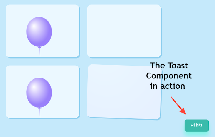
Toast componentThe Toast component accepts two props: message, the contents of the toast message, and trigger, a Boolean value that determines whether the toast should be displayed.
Inside the component, we use the CSSTransition component from the react-transition-group library to animate the toast message. This library offers various features, including the CSS Transition component that accepts multiple props:
One of these props is in, which enables the animation of elements based on conditional rendering. The (state) parameter represents a callback function passed to the CSSTransition component. It allows us to construct CSS classes that can be applied to the elements within. These CSS classes can be defined in separate CSS files to handle animation and transition styles:
import { CSSTransition } from "react-transition-group";
import "./Toast.css";

const Toast = ({ message, trigger }) => {
  return (
    <CSSTransition
      in={trigger}
      timeout={250}
      classNames="toast"
      mountOnEnter
      unmountOnExit
    >
      {(state) => <div className={`toast toast--${state}`}>{message}</div>}
    </CSSTransition>
  );
};
export default Toast;
CoverScreen componentThe screens preceding the BalloonGrid component are managed by the CoverScreen component. It accepts three props: score, onStartGame, and duration. The score prop is used to display the game score, onStartGame is for the main action button to start the game, and duration represents the remaining duration of the game:
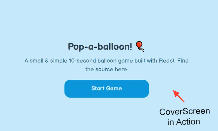
const CoverScreen = ({ score, onStartGame, duration }) => (
<div className="intro">
<h1 className="title">{score > -1 ? "Game over!" : "Pop-a-balloon! 🎈"}</h1>
{score > -1 ? (
<p className="description">
{`You scored ${
score === 0 ? "nothing" : `${score} ${score > 1 ? "hits" : "hit"}`
}`}
</p>
) : (
<p className="description">
A small & simple {duration}-second balloon game built with React.
Find the source here.
</p>
)}
<div className="action">
<Button onClick={onStartGame} width={"wide"}>
{score > -1 ? "Play again" : "Start Game"}
</Button>
</div>
</div>
);
export default CoverScreen;
Button componentWith the help of the associated Button.css file, we can create a small component to render buttons. Additional styles can be incorporated to accommodate future expansions of the app:
const Button = ({ width, onClick, children }) => {
  const widthMap = {
    wide: "btn--wide",
    full: "btn--full",
  };
  const buttonClassNames = `btn ${widthMap[width] || ""}`;
  return (
    <button className={buttonClassNames} onClick={onClick}>
      {children}
    </button>
  );
};
export default Button;
See the Pen
Button.jsx by Rahul (@_rahul)
on CodePen.
ScoreCard componentA simple component that takes the score and time as props is the ScoreCard component. It renders a <div> element and displays the score followed by the remaining time in seconds:
const ScoreCard = ({ score, time }) => {
  return (
    <div className="game-score">
      {score} hits / {time}s remaining
    </div>
  );
};
export default ScoreCard;
Game componentThe Game.jsx file is the main component responsible for controlling the overall game logic and rendering the final game interface. We will manage multiple states here to store different pieces of information, such as the score, time, hits, active balloons, and more.
The component takes two props, numberOfBalloons and gameDuration. Let’s begin by defining some state variables. The following code handles the logic associated with clicking a balloon and updating the relevant states:
const Game = ({ numberOfBalloons, gameDuration }) => {
  const [gameStarted, setGameStarted] = useState(false);
  const [activeBalloons, setActiveBalloons] = useState([]);
  const [score, setScore] = useState(-1);
  const [timeRemaining, setTimeRemaining] = useState(gameDuration);
  const [stop, setStop] = useState(false);
  const [hit, setHit] = useState(false);

  const handleBalloonClick = (id) => {
    setScore((prevScore) => prevScore + 1);
    setHit(true);

    setActiveBalloons((prevActiveBalloons) =>
      prevActiveBalloons.filter((activeId) => activeId !== id)
    );

    setTimeout(() => {
      setHit(false);
    }, Constants.randomnessLimits.lower);
  };

  ...
}
When a balloon from BalloonGrid is clicked, the handleBalloonClick function updates the score, triggers the hit state, removes the clicked balloon from the list of active balloons, and then resets the hit state after a specified duration:
const Game = ({ numberOfBalloons, gameDuration }) => {
  ...

  const startGame = () => {
    setGameStarted(true);
    setScore(0);
    setActiveBalloons([]);
    setTimeRemaining(gameDuration);
    setStop(false);
  };

  const stopGame = () => {
    setGameStarted(false);
    setStop(true);
  };

  ...
};
The startGame function initializes the game state by setting the starting score to zero and clearing any values saved in the activeBalloons state array. It also sets the timeRemaining state to the value of the gameDuration prop to ensure the correct game duration.
On the other hand, the stopGame function stops the game. It toggles the stop and gameStarted states in the opposite manner compared to the startGame function:
const Game = ({ numberOfBalloons, gameDuration }) => {
  ...

  useEffect(() => {
    if (gameStarted && !stop) {
      timerRef.current = setInterval(() => {
        setTimeRemaining((prevTimeRemaining) => {
          if (prevTimeRemaining > 0) {
            return prevTimeRemaining - 1;
          } else {
            clearInterval(timerRef.current);
            setGameStarted(false);
            return 0;
          }
        });
      }, 1000);
    }

    return () => {
      clearInterval(timerRef.current);
    };
  }, [gameStarted, stop]);

  ...
};
To ensure proper functionality of gameStarted and stop, we need to use the useEffect Hook with gameStarted and stop as dependencies. This hook sets up a timer interval when gameStarted is true and stop is false. The interval updates the timeRemaining state every second until the time remaining reaches zero, indicating the end of the game.
The cleanup function at the end clears the interval to ensure proper cleanup when the component unmounts or when the dependencies change:
const Game = ({ numberOfBalloons, gameDuration }) => {
  ...

  return (
    <div className="game-container">
      {(!gameStarted || stop) && (
        <CoverScreen
          score={score}
          onStartGame={startGame}
          duration={Constants.gameDuration}
        />
      )}
      <CSSTransition
        in={gameStarted}
        timeout={250}
        classNames="balloons-screen"
        mountOnEnter
        unmountOnExit
      >
        {(state) => (
          <div className={`balloons-screen balloons-screen--${state}`}>
            <div className="game-nav">
              <h1 className="game-title">Pop-a-balloon!</h1>
              <div className="game-settings">
                <ScoreCard score={score} time={timeRemaining} />
                <Button type={"alert"} onClick={stopGame}>
                  Stop
                </Button>
              </div>
            </div>
            <GameGrid
              numberOfBalloons={numberOfBalloons}
              activeBalloons={activeBalloons}
              onBalloonClick={handleBalloonClick}
              isGameStarted={gameStarted}
            />
          </div>
        )}
      </CSSTransition>
      <Toast message={"+1 hits"} trigger={hit} />
    </div>
  );
};

export default Game;
Finally, we will use the GameGrid component. The game interface consists of a conditional rendering of the cover screen, animated transitions for the game screen using the CSSTransition component from the react-transition-group library, displays of the game title, score, time, “Stop” button, game grid, and a toast message. The rendering logic relies on the gameStarted, stop, and hit states to determine the appropriate display.
One final step is to import the Game component into App.jsx and provide the appropriate values to the two props using our Constants object:
const App = () => {
  return (
    <Game
      numberOfBalloons={Constants.gameCells}
      gameDuration={Constants.gameDuration}
    />
  );
};

export default App;
Here’s a live preview of the final outcome. Because the game is designed with desktop users in mind, it’s recommended to try the demo in a separate tab and view it in full-page mode for the best experience:
See the Pen
Pop-a-balloon game made with React by Rahul (@_rahul)
on CodePen.
Creating simple, lightweight games in React for the web is a good idea. However, for high-fidelity games, it is recommended to use a dedicated solution with robust game engine support.
Feel free to explore the GitHub repository of this project for more information, and don’t hesitate to ask any questions you may have.
Install LogRocket via npm or script tag. LogRocket.init() must be called client-side, not
server-side
$ npm i --save logrocket

// Code:

import LogRocket from 'logrocket';
LogRocket.init('app/id');
// Add to your HTML:

<script src="https://cdn.lr-ingest.com/LogRocket.min.js"></script>
<script>window.LogRocket && window.LogRocket.init('app/id');</script>

Learn how to build smooth staggered animations in CSS using modern features like sibling-index(), complete with practical examples, fallbacks, and accessibility tips.

Compare the top AI development tools and models of July 2026. View updated rankings, feature breakdowns, and find the best fit for you.

Learn how to detect unused and ghost dependencies in JavaScript projects using Knip, a project-level linter that keeps your dependency graph accurate.

Learn how Storybook MCP enables AI agents to understand your component library, generate accurate UI, and validate code using documentation, stories, and automated tests.
Would you be interested in joining LogRocket's developer community?
Join LogRocket’s Content Advisory Board. You’ll help inform the type of content we create and get access to exclusive meetups, social accreditation, and swag.
Sign up now

 Learn more →
