Developers working with CSS historically relied on predefined color keywords or obscure HEX values to select and apply colors. However, as CSS evolved, more user-friendly, flexible alternatives became available, such as RGB (red, green, blue) and HSL (hue, saturation, lightness) functions. There was also the introduction of the alpha channel, allowing for the control of transparency.

Some CSS improvements focused on ease of implementation, rather than functionality. For example, opacity was initially specified using a separate color function, rgba(), but then progressed to being available as a fourth parameter in the RBG function. Here’s a comparison of how we would define pure black using different CSS color functions: hex(# 000000),rgb(0, 0,0), rgba(0, 0, 0, 0.4), and HSL(0, 0%, 0%).
The CSS Color Module Level 5 provides a host of new color functions and improvements, opening up a world of new possibilities for developers. One example is the LCH color function, which provides access to approximately 50 percent more colors.
In this article, we’ll introduce some of the new color specification methods available with CSS Color Module Level 5. We’ll review their advantages and we’ll show how these color functions may be used. We’ll also discuss browser support for these new methods.
We’ll look at the following CSS color functions and methods:
Let’s begin!
The Replay is a weekly newsletter for dev and engineering leaders.
Delivered once a week, it's your curated guide to the most important conversations around frontend dev, emerging AI tools, and the state of modern software.
HWB (hue, whiteness, blackness) is a color specification method that is similar to HSL. The hue argument can be any number between 0 and 360, and it refers to a specific color on the color wheel (red, blue, teal, plum, etc.).
Whiteness specifies how much white is mixed into the hue, from 0-100 percent. Similarly, blackness specifies how much black is mixed into the hue, from 0-100 percent.
Equal proportions of whiteness and blackness will generally make the hue appear grayer. A 100 percent whiteness and 0 percent blackness will result in pure white. A 100 percent blackness and 0 percent whiteness will result in pure black.
There’s also an optional fourth argument, the alpha parameter, that may be added to the mix to specify the color’s opacity.
In this CSS syntax example for HWB, we specify a hue of 0 with 20% whiteness, 40% blackness, and .3 opacity:
hwb(0 20% 40%)
//with an optional alpha argument for specifying the opacity
hwb(0 20% 40% / .3)
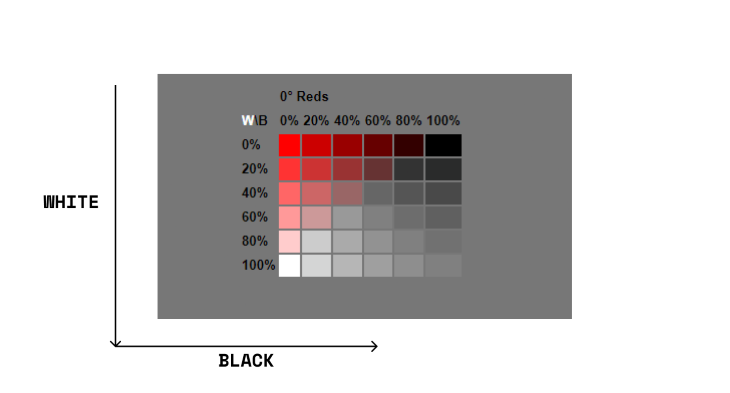
The below chart shows the range of colors for a red hue with various percentages of whiteness and blackness:

We can see that as the whiteness or blackness reaches 100 percent, the selected hue becomes white or black, respectively, leaving no trace of the chosen hue.
LAB color functions are based on the CIELAB color space. which represents colors in a way that closely matches human perception. This color function provides access to a wider spectrum of colors than offered by the traditional RGB color space. LAB colors are referred to as device-independent colors.
The L in LAB indicates lightness, while A and B are chromaticity coordinates. More specifically, A and B are color directions. The red-green axis is represented by positive A at the red end of the axis and negative A at the green end of the axis. Similarly, the yellow-blue axis is represented by positive B at the yellow end of the axis and negative B at the blue end of the axis.
The LAB color space represents light more successfully than the HSL color space. It’s important to note that the lightness axis in LAB should not be confused with the L axis in HSL.
Here’s a good example as stated in the specifications:
In HSL, the sRGB colors blue (# 00F) and yellow (# FF0) have the same value of L (50%) even though visually, blue is much darker. This is more evident in LAB: sRGB blue is lab(29.567% 68.298 -112.0294) while sRGB yellow is lab(97.607% -15.753 93.388). In both LAB and LCH, if two colors have the same L value, they have identical visual lightness.
lab(20% 100 20)
// with an optional alpha argument for specifying opacity
lab(20% 100 20 / .3)
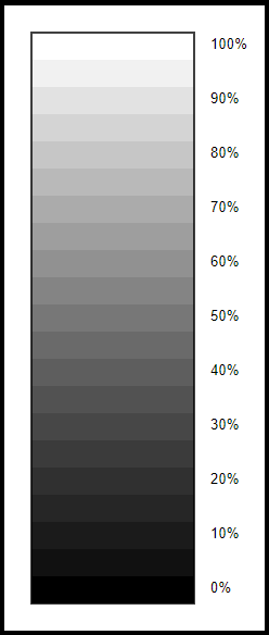
Here’s an example illustrating the lightness axis of the LAB color space:

The L axis of the LCH color space is identical to that of the LAB color space. In fact, both color spaces allow access to a far wider range of colors because they are meant to cover the full spectrum of human vision.
The L in LCH is a percentage that stands for light channel, and it can exceed 100 percent. C, or chroma, indicates the amount of color in the mix. We think of this value as saturation in the HSL color space. In LCH, it can exceed 100 percent. When it does, the color will be outside the gamut of today’s browsers. Finally, H stands for hue. This can be a number between 0 and 360, analogous to that of HSL or HWB.
Unlike HSL or RGB, where adjusting lightness has a varying effect depending on the hue, LCH is perceptually uniform. The same numerical change in coordinates results in the same perceptual color difference, making it flexible enough for color manipulation.
For more in-depth information about the LCH color space, refer to this detailed article by Lea Verou: LCH colors in CSS: what, why, and how?
lch(80% 80 80)
// with an optional alpha argument for specifying opacity
lch(80% 80 80 / .3)
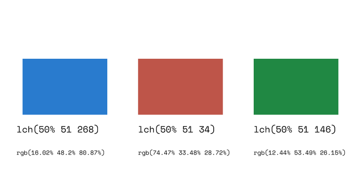
Below are the three colors defined in the LCH color space, shown with identical light value (50%). Because LCH is perceptually uniform, these colors are perceived to have the same lightness; this is not the case for the HSL color function.

color-mixThe color-mix() function returns the result of two colors mixed in specified percentages. For example, color-mix(in lch, purple 50%, plum 50%) produces a mixture of 50% purple and 50% plum.
If you’ve worked with Sass previously, this probably looks familiar. It is very similar to the Sass color mix function: mix($color1, $color2, [$weight]), where the $weight parameter specifies the percentage of $color1 to be added.
color-mixcolor-mix(in lch, purple 50%, plum 50%)
Here are some additional items to note when working with the CSS color-mix() function:
in lch parameter refers to the color space where the colors are mixed. Depending on the color space that is specified, mixing or combining colors can produce varied outcomescolor-contrastThe color-contrast() function helps developers build websites that are accessible to people with differences or impairments in vision. Higher color contrast between the content and background improves the readability of text and non-decorative images.
color-contrast() compares the values of two colors from a list. The colors are examined from left to right, and the browser chooses the first color that matches the specified color ratio. If no color matches the desired color ratio, the color with the highest value (highest contrast) is selected.
color-contrast//here no color ratio is stated, so it picks the color with the highest contrast ratio color-contrast(wheat vs tan, sienna, #b22222, #d2691e) // here a color ratio is stated and the color in the list that meets the specified ratio is picked. color-contrast(wheat vs bisque, darkgoldenrod, olive, sienna, darkgreen, maroon to AA)
Code example from MDN.
Here are some additional details regarding the color-contrast() function:
vs keyword and before the to keyword are examined sequentially from left to right. The color with the highest contrast is selected as the temporary winnercolor()As specified in the CSS Color Module Level 4, the color() function allows the browser to display colors in any color space. This includes the display-p3 color space, which can display a larger range of colors compared to the conventional sRGB color space. In the new Level 5 specifications, the color() function is allowed to extend to custom color spaces.
color()color(display-p3 -0.6112 1.0079 -0.2192); //with an optional alpha channel color(display-p3 -0.6112 1.0079 -0.2192 / .3);
The color() function syntax takes the following form:
accent-colorStyling form controls can be tedious and frustrating. Developers are often faced with the choice of adopting the browser’s default styles or designing them from scratch in order to have styling freedom. The CSS accent-color property allows us to change the color of accented form controls provided by the browser’s default styles to a custom color value.
accent-color.element{
accent-color: #010101;
}
The accent-color property is great for styling form controls, but we can currently only use it on specific elements, namely: checkbox, radio button, range, and progress.
One notable feature of the accent-color property is that it respects color schemes. For example, if a user has selected light appearance for their OS setting preference, the browser would analyze the accent-color value and choose an acceptable UI color. This ensures a perceptible color difference between the browser’s UI and the accent.
Some of the methods introduced above are still considered experimental, since they do not have full browser support as of the time of this writing. Below is a summary of current browser support for the CSS color methods discussed in this article.
| Color function | Support |
|---|---|
| HWB | currently only supported in the most recent version of the Firefox and Safari web browsers |
| LAB | currently only supported in the latest release version of the Safari web browser |
| LCH | currently only supported in the latest release version of the Safari web browser |
| color-mix | not available by default on the latest release of any web browsers; however, it can be enabled on Safari with the CSS color-mix() flag and on Firefox by setting layout.css.color-mix.enabled to true |
| color-contrast | not available by default on the latest release of any web browsers, but it can be enabled with the CSS color-contrast() flag on Safari |
color |
not available by default on the latest release of any web browsers, but it supports the display-p3 predefined color profile on Safari |
accent-color |
currently supported on all browsers except for Internet Explorer |
The new CSS color features are incredible, providing access to a much wider spectrum compared to the traditional RGB color space. They will enable developers to represent colors in ways that more closely resembles human perception. Of course, some of these features are still experimental and subject to changes or revisions. But, for now, it certainly looks like a promising future for colors on the web!
As web frontends get increasingly complex, resource-greedy features demand more and more from the browser. If you’re interested in monitoring and tracking client-side CPU usage, memory usage, and more for all of your users in production, try LogRocket.

LogRocket lets you replay user sessions, eliminating guesswork around why bugs happen by showing exactly what users experienced. It captures console logs, errors, network requests, and pixel-perfect DOM recordings — compatible with all frameworks.
LogRocket's Galileo AI watches sessions for you, instantly identifying and explaining user struggles with automated monitoring of your entire product experience.
Modernize how you debug web and mobile apps — start monitoring for free.

When should you move API logic out of Next.js? Learn when Route Handlers stop scaling and how ElysiaJS helps.

Explore how Dokploy streamlines app deployment with Docker, automated builds, and simpler infrastructure compared to traditional CI/CD workflows.

A side-by-side look at Astro and Next.js for content-heavy sites, breaking down performance, JavaScript payload, and when each framework actually makes sense.

AI-generated tests can speed up React testing, but they also create hidden risks. Here’s what broke in a real app.re
Would you be interested in joining LogRocket's developer community?
Join LogRocket’s Content Advisory Board. You’ll help inform the type of content we create and get access to exclusive meetups, social accreditation, and swag.
Sign up now